Shafeen Alam
All work
VoyceMeCreator content & monetization platformDesign leadership

Building a design function in three months, then leaving it standing

VoyceMe centralizes the manga and anime fandom in one place: read, watch, buy, talk to the artists, and make your own series. Two million people a month use it. When I joined there were three designers across two continents and no design function to speak of. I was brought in for three months to build one.

Role
Lead Product Experience Designer
Team
3 designers, Philippines and Canada
Brief
Establish the design function
Term
3 month contract, 2024
case.md
$ cat summary
users: 2M a month
design_function: built in 3 months
Why it mattered

With 2M monthly active users and no design function, product decisions had no shared standard behind them.

60-second read

Problem

A 200 person startup with 2M monthly active users, three designers across two continents, and no design function. No shared process, no cadence, no roadmap.

System decision

Treat the operating model as the deliverable. Audit first, then install a meeting cadence, a roadmap, and a prioritization practice the team could run without me.

My contribution

Player coach. Audited the product in week one, built the cadence and roadmap, coached three designers, and designed alongside them on the AI tool, the Web3 platform, and the shop.

Constraint

Three months, and a team spread sixteen hours ahead of me. Whatever I built had to survive my leaving.

01 · The brief

Establish the design function, put proper process in place, and coach the designers as the company scaled. A player coach brief, with a hard stop at three months.

2M
monthly active users on the platform
31
page audit delivered to executive management in week one
3
designers coached across two continents

02 · The company

Roughly 200 people, and a product doing several things that rarely sit together: a reader, a video platform, a storefront, a social layer between fans and creators, and an authoring tool. Most companies would ship those as five products. VoyceMe's bet was that the fandom wants one place.

For creators, the pitch was democratization: a proprietary generative tool, trained on VoyceMe's own dataset, meant to reduce burnout for professional artists and let anyone else make manga at all. That is a genuinely hard design problem, because those two users want opposite things from the same tool.

03 · Week one

Same thing I do at every company I join: an extensive audit of the current experience, with fresh eyes, before I have any loyalty to how things are.

It came out as a 31 page deck I presented to executive management. The format was deliberately repetitive: a screenshot, a red markup naming the observation, and a third column with what to change and how to go about it. Repetition is the argument. One marked up screen is an opinion, thirty one is a pattern nobody can wave off.
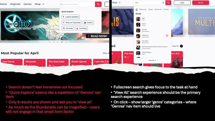
An audit page showing two search screenshots above a torn black divider, with red bullet observations on the left reading that search does not feel immersive nor focused, that Quick Explore repeats the Genres nav item, that only six results are shown before asking you to view all, and that thumbnails are too small to engage with, and recommendations on the right for a fullscreen search, making View All the primary search experience, and surfacing larger genre categories on click
One page from the audit, in the format all 31 used: the screen, red observations naming what is wrong, and the recommendation beside it. This one takes apart search. The sharpest line is not about aesthetics, it is that “Quick Explore” duplicated the Genres nav item, so two controls were competing to do one job.↗ open full size

04 · The operating
cadence

Two designers in the Philippines, sixteen hours ahead, and one in Canada. My day started at 4 AM Pacific to give them real overlap rather than asynchronous notes, and ended around 1 PM. I took the inconvenience because shifting one person's schedule is cheaper than shifting three.

Then I installed a cadence. This is the part that reads as unglamorous and is actually the whole job.

1-on-1
Weekly, 30 to 60 minutes
Each designer, individually. The only meeting I would never cancel.
Design team meeting
Weekly
Designers share current work and raise blockers. Explicitly a safe space to ask for help.
Design stand up
Twice weekly, added later
Introduced once the team was ready for it, not on day one.
POD stand up
Daily
Product, engineering, and design together for walkthroughs and handoffs.
Sprint planning
Every two weeks
Design specific, so priorities were set rather than inherited.
No Meeting Thursdays
Weekly, protected
A distraction free day. The cadence only works if something defends the making.

Note the order. The stand up came later, once the team could use it. Adding every ritual on day one is how you get a calendar instead of a practice.

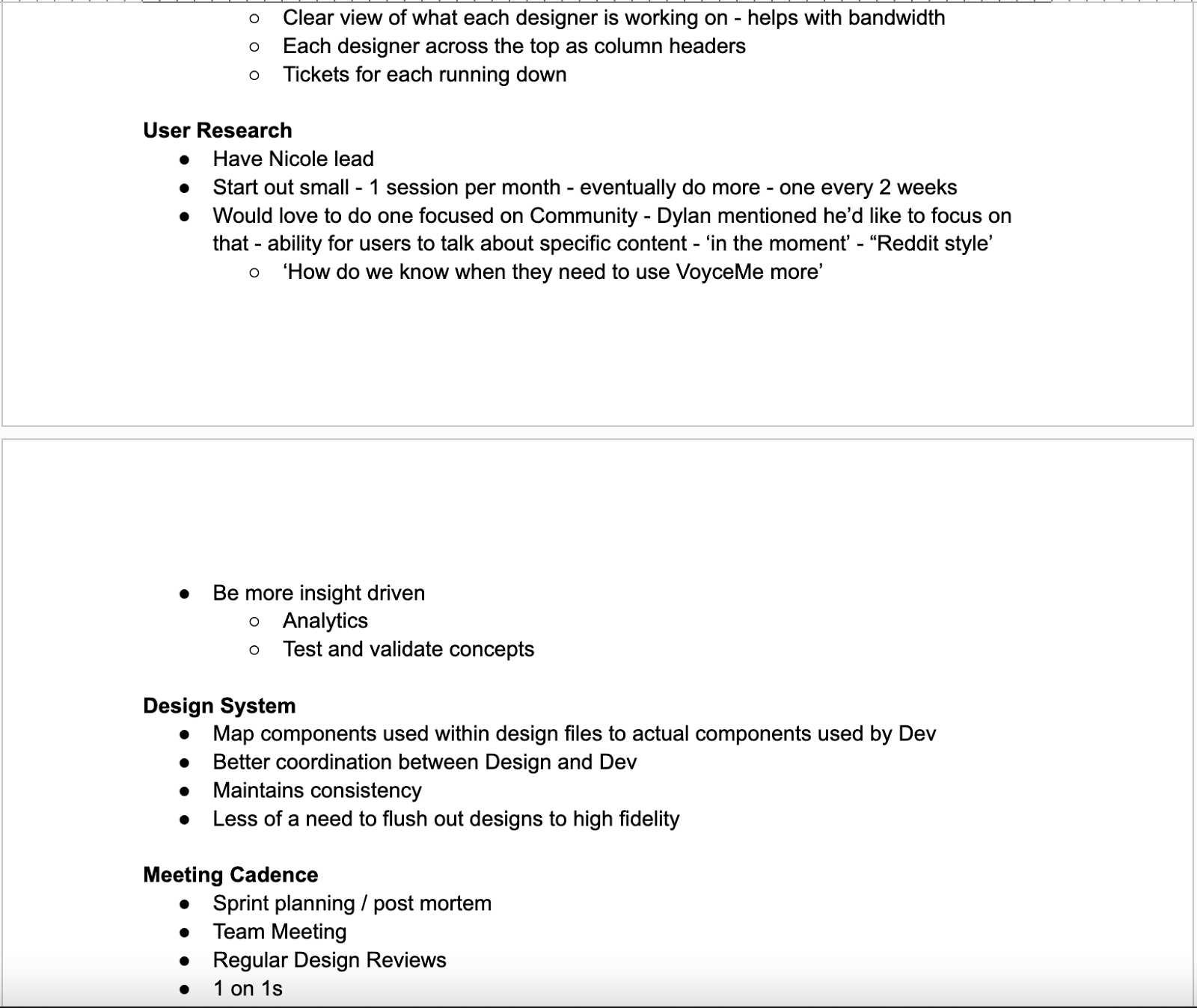
The proposal I brought to the team

None of this was imposed. I wrote it up as a set of proposals and questions, took it to the designers, and let them shape it. Note that the no meeting day and the 4 AM start both appear here with question marks.
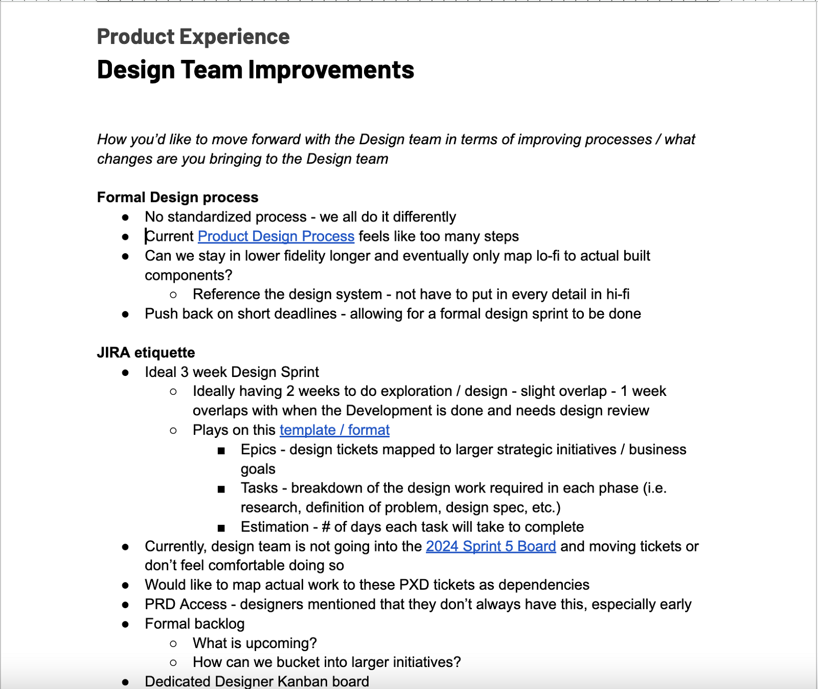
A Design Team Improvements document covering formal design process, noting there is no standardized process and everyone does it differently, that the current process feels like too many steps, asking whether the team can stay in lower fidelity longer and reference the design system rather than detailing everything in high fidelity, and pushing back on short deadlines to allow a formal design sprint, followed by JIRA etiquette covering an ideal three week design sprint with epics mapped to strategic initiatives, tasks broken down by phase, estimation in days, PRD access, a formal backlog and a dedicated designer Kanban board
Process and JIRA. “No standardized process, we all do it differently” is the diagnosis, and staying in lo-fi longer against the design system is the fix.↗ open full size
Continued document covering a Kanban board with each designer as a column header and their tickets running down, user research with Nicole leading and starting at one session a month building to every two weeks, being more insight driven through analytics and validating concepts, a design system mapping design file components to the components used by development, and a meeting cadence listing sprint planning and post mortem, team meeting, regular design reviews and one on ones
Research, design system, cadence. “Have Nicole lead” is the line I would point to: the practice belonged to a designer on the team, not to me.↗ open full size
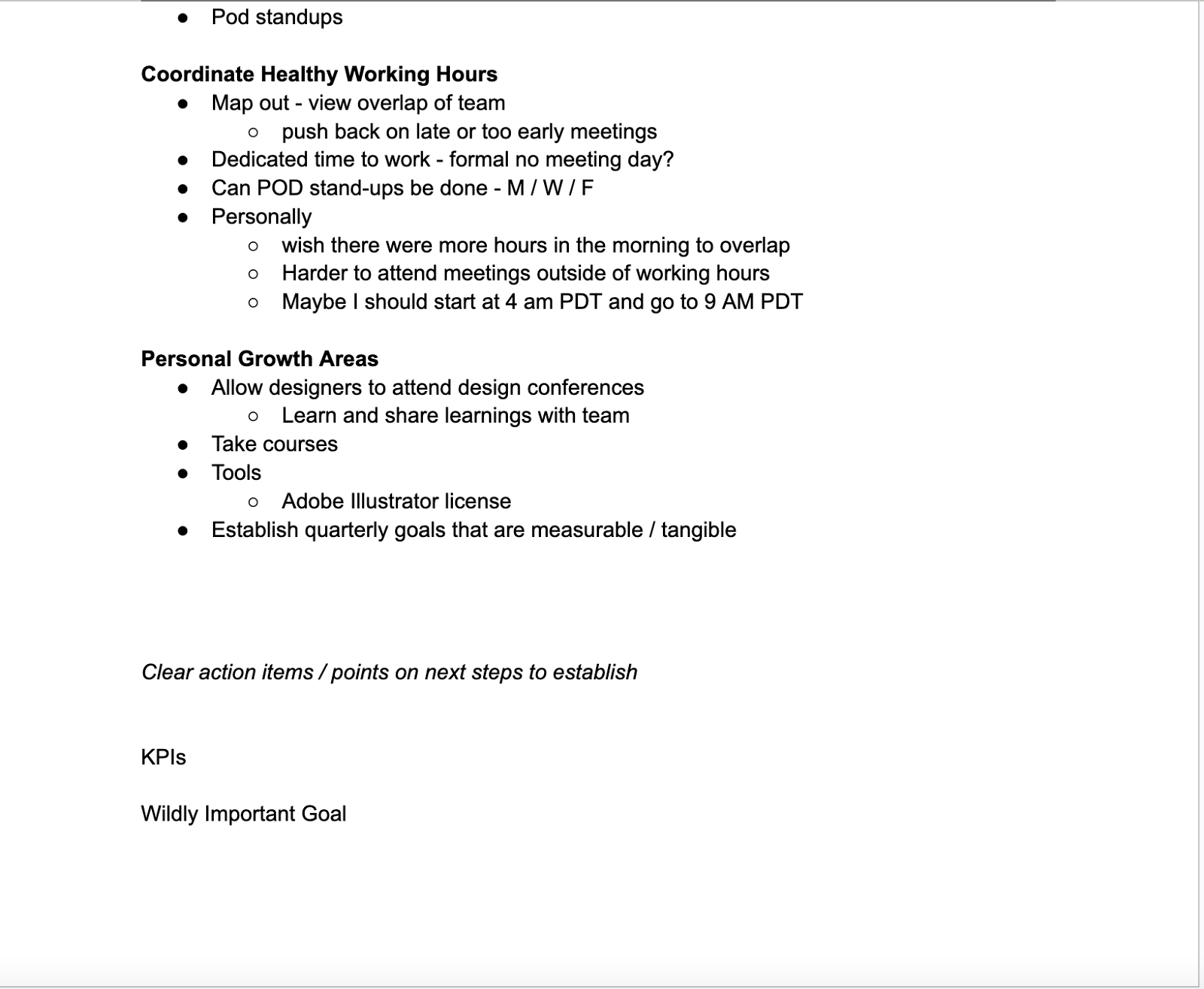
Continued document covering pod standups, coordinating healthy working hours by mapping team overlap and pushing back on late or early meetings, asking about a formal no meeting day and whether pod stand-ups can run Monday Wednesday Friday, a personal note wishing for more morning overlap and proposing a 4 AM to 9 AM Pacific shift, then personal growth areas including design conferences, courses, an Adobe Illustrator license and establishing measurable quarterly goals
Healthy hours and growth. Pushing back on late or early meetings for the team, while volunteering to move my own day to 4 AM, and budget requests as small and concrete as an Illustrator license.↗ open full size

05 · Plan and
roadmap

Off the back of the audit I put together a formal plan, set a design roadmap against it, and got design into product planning and prioritization rather than receiving decisions already made. On a three month term that sequencing matters: the plan has to exist early enough that the team is executing it while I am still there to correct it.
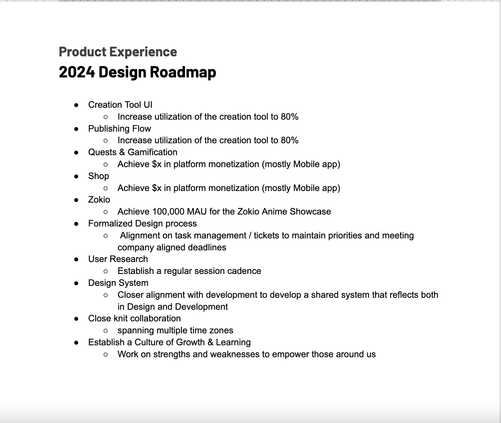
The 2024 Design Roadmap listing Creation Tool UI and Publishing Flow against increasing creation tool utilization to 80 percent, Quests and Gamification and Shop against platform monetization targets mostly on the mobile app, Zokio against achieving 100,000 monthly active users for the Zokio Anime Showcase, then formalized design process, user research cadence, a design system aligned with development, close knit collaboration across time zones, and establishing a culture of growth and learning
The roadmap, and the reason it works: every design item carries the business outcome it is meant to move. Creation tool UI is not a project, it is 80% utilization. Zokio is not a project, it is 100,000 monthly actives on the anime showcase. The last four items are the function itself, sitting on the same roadmap as the features, which is how process work survives prioritization. These are the targets we set, not results I am claiming.↗ open full size
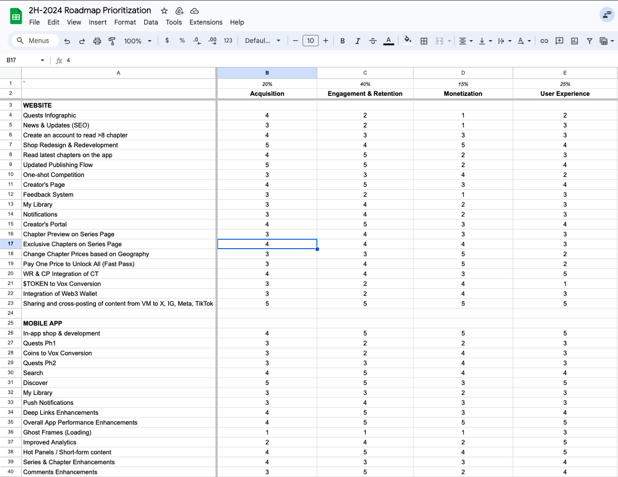
A spreadsheet titled 2H-2024 Roadmap Prioritization with weighted columns for Acquisition at 20 percent, Engagement and Retention at 40 percent, Monetization at 15 percent and User Experience at 25 percent, scoring around forty website and mobile app initiatives from one to five against each criterion
Prioritization with the weights declared up front: engagement and retention at 40%, user experience at 25%, acquisition at 20%, monetization at 15%. Roughly forty initiatives scored against all four. The value is not the arithmetic, it is that the argument moves from whose idea it was to which column we said mattered most.↗ open full size

06 · What we
shipped

Player coach means designing too. Three surfaces, each on a different part of the business.

Generative AI creation tool

A proprietary tool trained on VoyceMe's own dataset, positioned as ethical because the training data was theirs rather than scraped. Two audiences at once: professional artists who needed relief from burnout, and readers who wanted to make manga and had no skill to draw it. Those are different products wearing one interface, and reconciling them was the design problem.

Zokio, a Web3 platform

A collection of 6,000 NFTs, and an IP model rather than a drop. Holders could turn a profile picture into a full character inside the Zokioverse content ecosystem, so the asset became a stake in a franchise that could travel across mediums.

Shop

Commerce for merchandise, anime purchases, and creator goods, inside the same platform as reading and creating.

The creation tool, start to finished panel
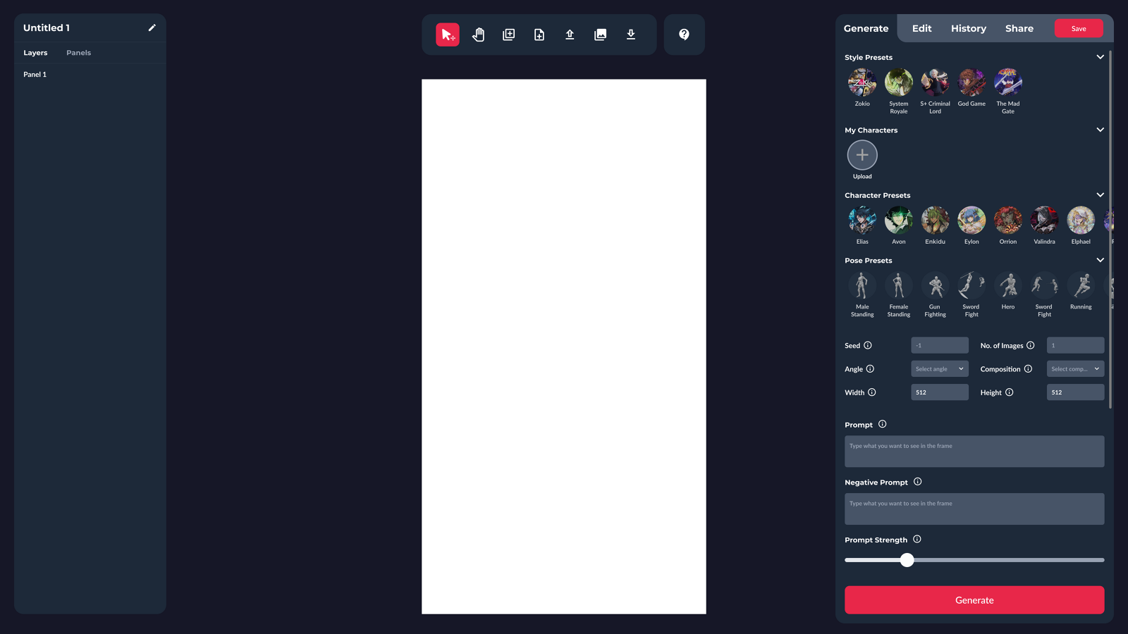
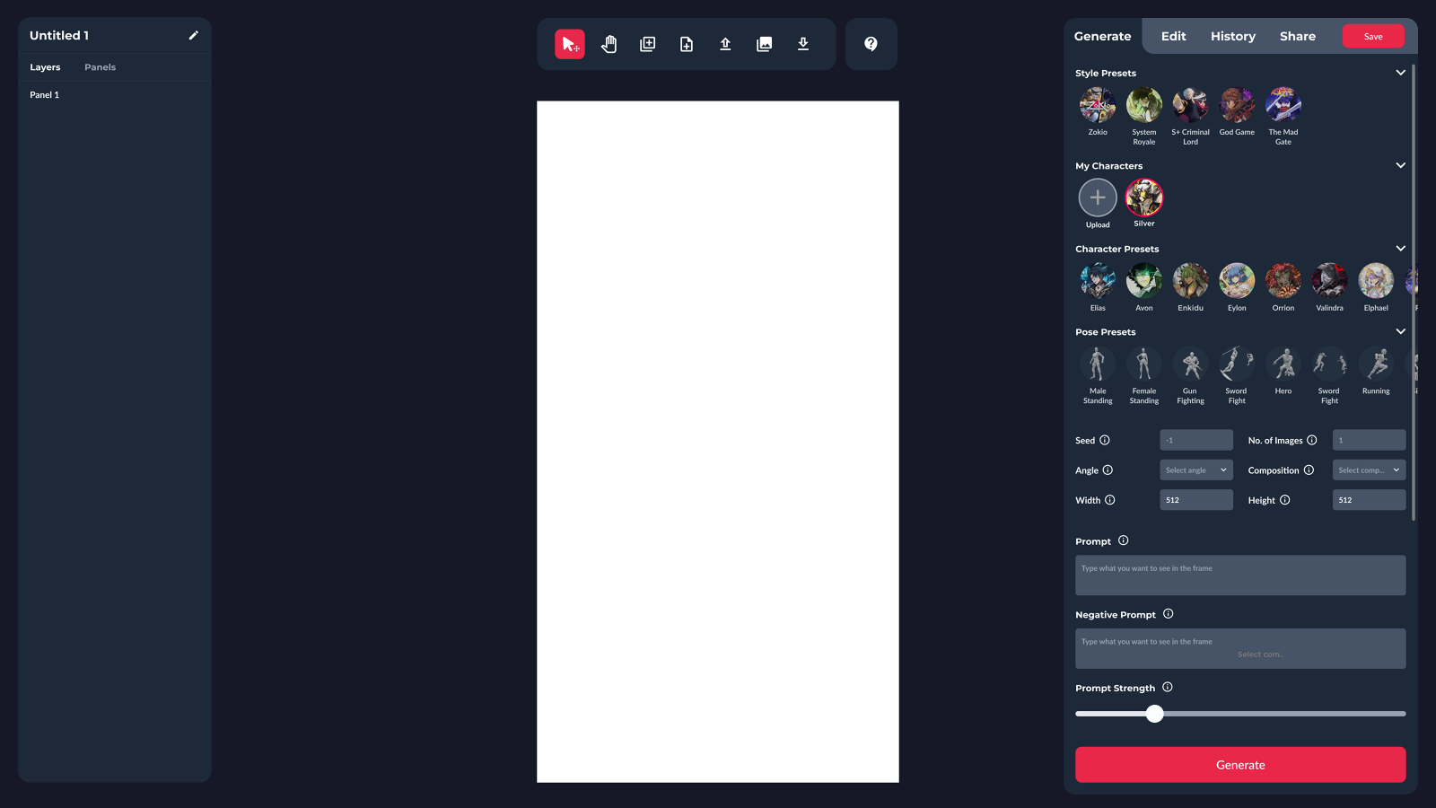
The creation tool on a blank canvas, with a right panel offering style presets, an empty My Characters row containing only an Upload button, character presets, pose presets, seed and image count, angle and composition, width and height, prompt and negative prompt fields, a prompt strength slider and a Generate button
The empty state. Presets are offered before the prompt field, so a first-time user has somewhere to start that is not a blank text box.↗ open full size
The same tool with a character named Silver now saved into the My Characters row and selected, canvas still blank
A character saved into My Characters. Consistency across panels is the hard part of making manga, so the character becomes a reusable object rather than a prompt you retype.↗ open full size
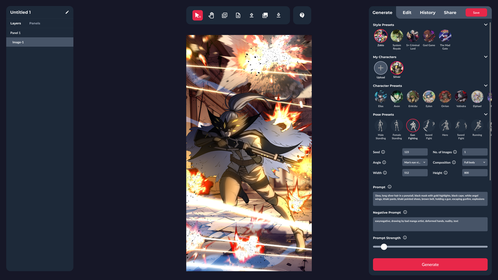
The tool with a generated panel on the canvas showing a masked figure with silver hair, a black cape and white wings escaping gunfire and explosions, with Gun Fighting selected among pose presets, seed 123, angle set to man's eye view, composition full body, and the prompt and negative prompt filled in
Generated, with the controls that produced it still visible: pose preset, angle, composition, seed. Exposing the seed matters, because a reproducible result is the difference between a tool and a slot machine.↗ open full size
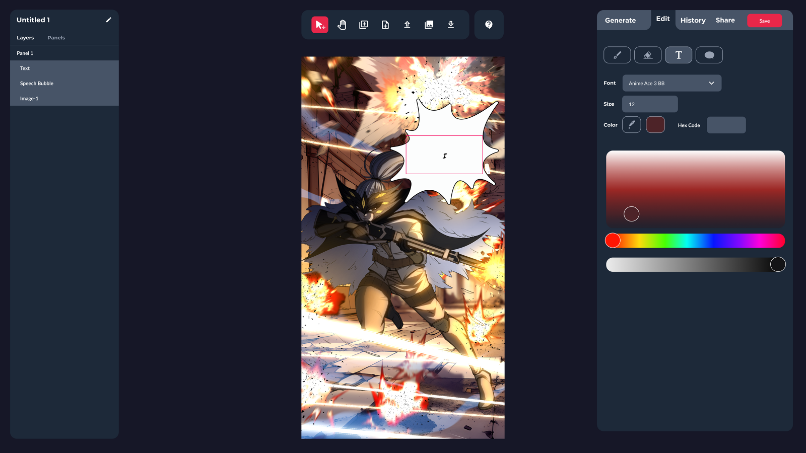
The Edit tab of the same tool with brush, eraser, text and speech bubble tools, font set to Anime Ace 3 BB, size and color controls with a picker, and a layers list showing Panel 1, Text, Speech Bubble and Image-1 over the generated panel with an empty speech bubble placed on it
Then the part that makes it manga rather than an image: layers, speech bubbles, and lettering in an actual comic typeface. The generated art is one layer among several, which is the right relationship between an AI tool and an author.↗ open full size
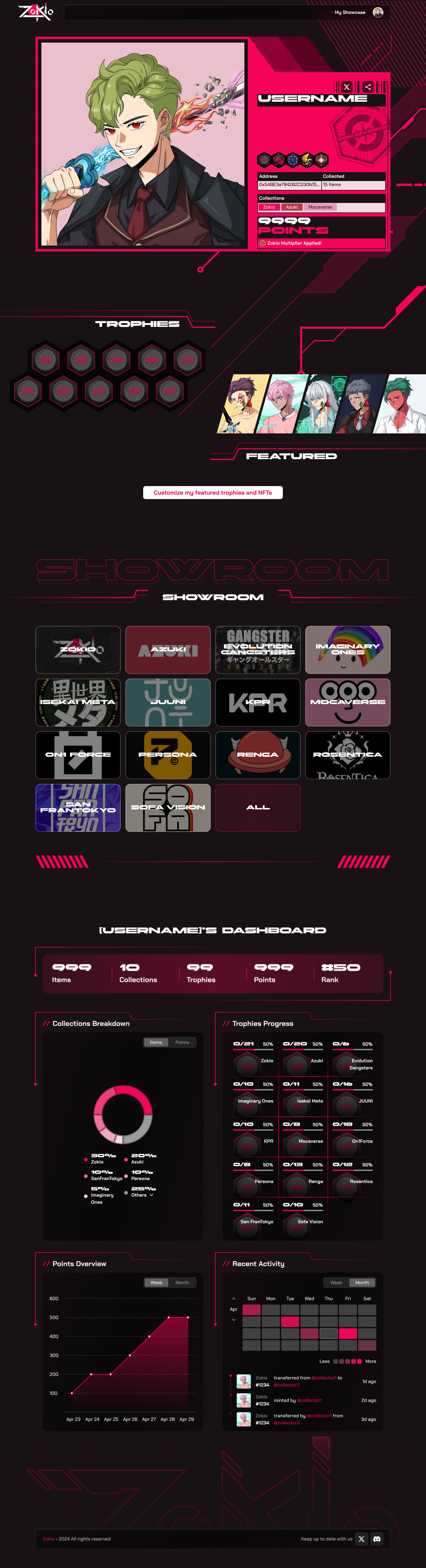
The Zokio showcase page, with a collector card showing a character, wallet address, items collected, collections and a 9999 points total with a Zokio multiplier applied, a row of trophy hexagons, a featured strip, a showroom grid of collection tiles including Zokio, Azuki, Evolution Gangsters, Imaginary Ones, Isekai Meta, JUUNI, KPR, Mocaverse, On1 Force, Persona, Renga, Rosentica, San FranTokyo and Sofa Vision, and a dashboard with items, collections, trophies, points and rank, a collections breakdown donut, trophies progress, a points chart and a recent activity heatmap and feed
Zokio, designed as a showcase rather than a marketplace. The dashboard treats a collection like a profile: what you hold, how far through each set you are, points over time, and an activity heatmap. It also displays collections from outside Zokio, which is the IP argument made in the interface. The holder is a collector with a history, not a wallet with a balance.↗ open full size
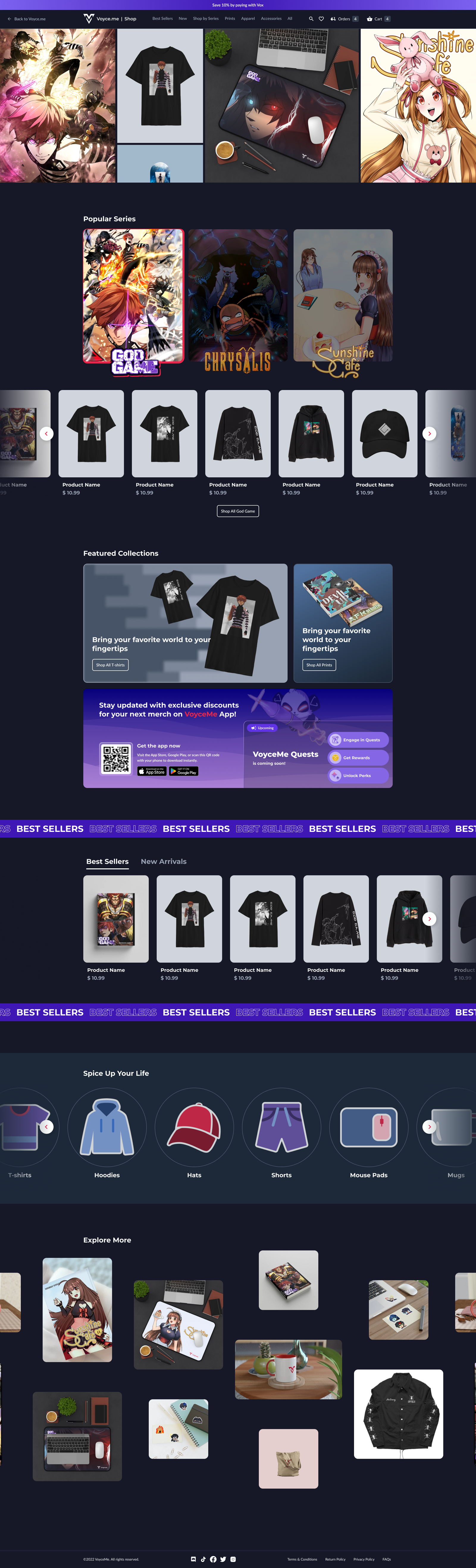
The VoyceMe shop page, with a four panel hero of merchandise and character art, a Popular Series row for God Game, Chrysalis and Sunshine Cafe, a product carousel, featured collections for t-shirts and prints, a promotion for the mobile app with a QR code and an upcoming VoyceMe Quests panel, a Best Sellers marquee band with a product carousel, a Spice Up Your Life row of category circles for t-shirts, hoodies, hats, shorts, mouse pads and mugs, and an Explore More masonry grid
The shop, built around series rather than product categories. A fan arrives loyal to God Game or Sunshine Cafe, not to hoodies, so popular series sits above the product carousels and the category row comes much later. The Quests panel is there because monetization was meant to run through engagement rather than beside it.↗ open full size

07 · What I left
behind

A design function that existed: a cadence the team ran themselves, a roadmap tied to a plan leadership had seen and agreed to, a seat for design in prioritization, and three designers who had each had twelve weeks of consistent one to one coaching.

A contract role forces a useful discipline. Anything that only works while you are in the room is not a function, it is a dependency. I optimized for what would still be running after I left.

This was a three month engagement, so post-engagement adoption and retention figures are not mine to claim, and none are stated here.

08 · Takeaways

01 When you are hired to build a function rather than a feature, the operating model is the deliverable. Ship the cadence.
02 Audit before you propose. A screenshot, an observation, and a recommendation, repeated 31 times, is harder to argue with than an opinion.
03 A cadence of meetings is only humane if something protects the making. No Meeting Thursdays was the load bearing one.
04 Distributed teams run on whoever is willing to move. I took the 4 AM start because asking three people to shift was worse than shifting once.
05 On a three month contract, anything that depends on you is a failure. Build what outlasts you.
That's the last oneBack to all workSelected work