Archive
WEBEXWebEx ConnectVisual design

A glass interface for enterprise messaging

Cisco WebEx Connect was a rich client for enterprise presence, IM, and shared team spaces, built on a three-color system of blue, gray, and yellow. I explored what the interface would look like as translucent panes of glass, then brought that thinking back down to the presence, space, and recording features that shipped.
Role
Visual / UX designer
Timeline
2008
Surfaces
Rich client, IM, spaces, mobile
Stack
Adobe Flash prototypes, Adobe Fireworks
case.md
$ cat summary
explored: translucent glass panes
palette: blue, gray, yellow
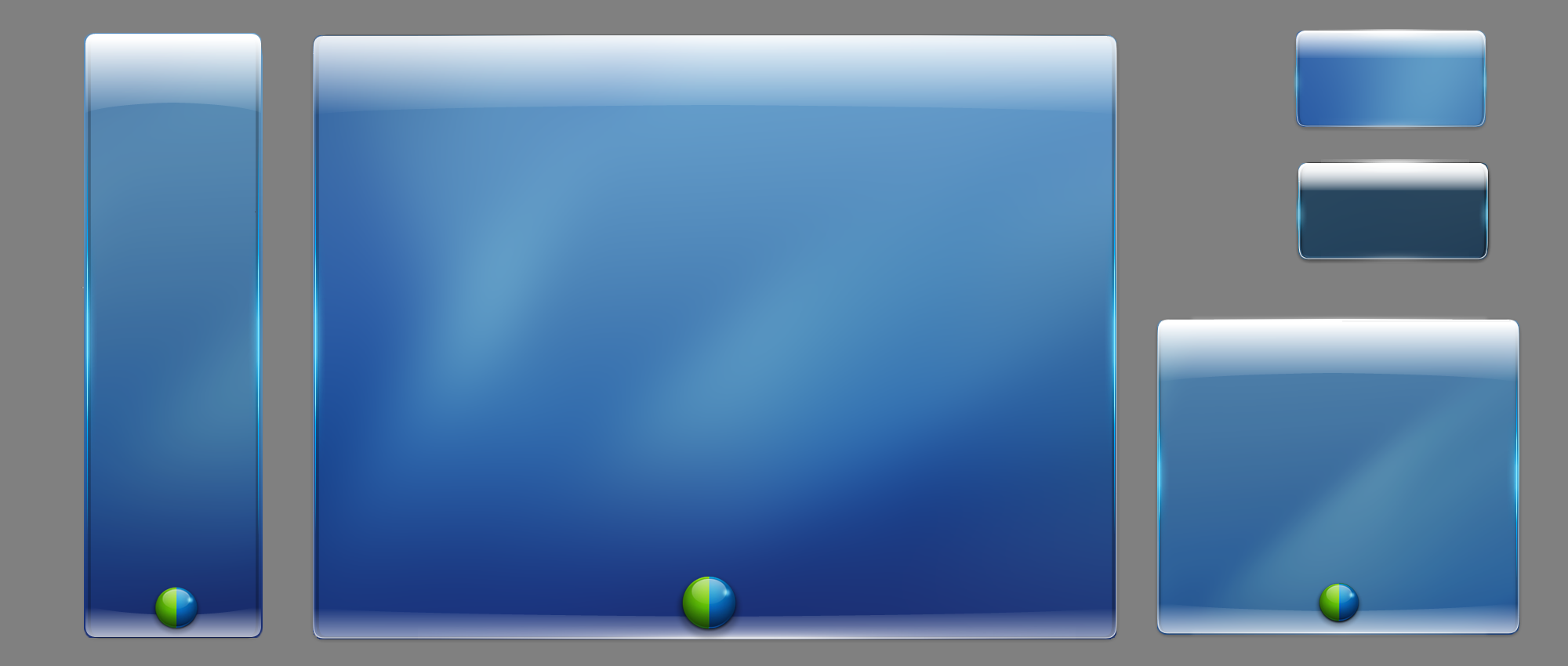
A set of glass container studies: tall, wide, and small translucent blue panes with rounded corners and a two-tone glass dot, exploring what a fully transparent version of the WebEx Connect interface could look like
The starting question: what if the client were panes of glass sitting on the desktop, catching light the way an actual window would.↗ open full size
Why it mattered

Color with no consistent meaning cannot tell people anything about presence or status.

60-second read

Problem

Connect's blue, gray, and yellow palette had grown ad hoc across presence, IM, and space features, with no shared logic for when each color applied.

System decision

Push the palette to an extreme, a fully translucent glass client, to find where color actually carried meaning versus where it was just decoration.

My contribution

Ran the color and glass exploration, then designed the presence, space, and recording interfaces that carried it into the shipped client.

Note

This is 2008 concept and visual design work. There are no adoption metrics to report, it is here for the craft.

01 · The color system

Blue, gray, and yellow, run through more than a dozen combinations to find a set with enough contrast between states to mean something.

Given my background as an artist, I was asked to explore what those three colors could do together: which pairing read as available versus idle, which felt native to a glass surface, and which one clashed the moment it sat next to real product chrome.
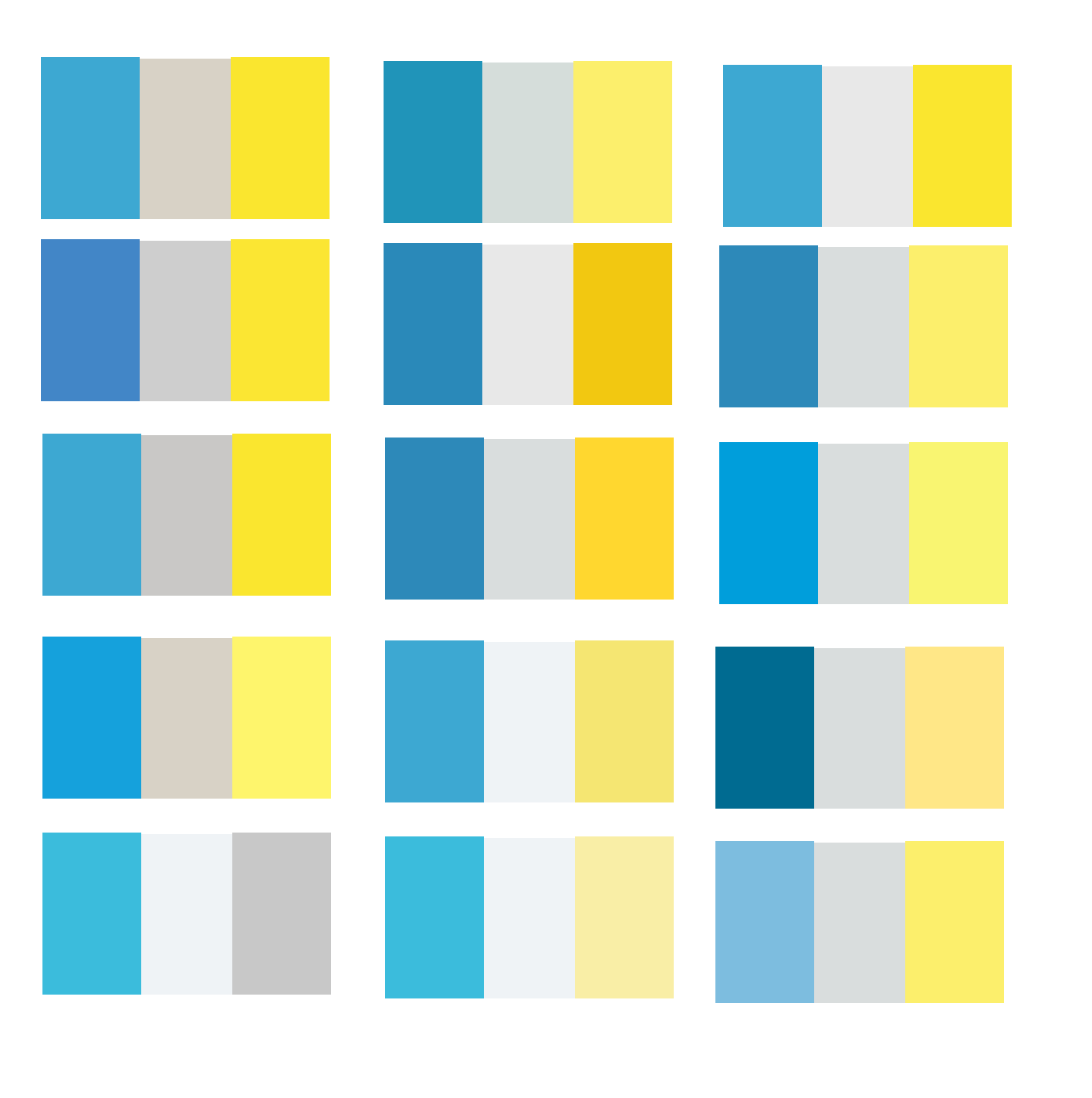
Fifteen candidate three-color palettes, each a blue, gray, and yellow swatch trio, exploring saturation and warmth
Fifteen variations on the same trio. The differences look small side by side, but at IM-window size a warm gray read as a bug and a cool one read as intentional.↗ open full size
Glass container studies in blue, at several sizes, each with a rounded top highlight and a two-tone status dot
Applied to a container instead of a swatch. The blue carries the glass, the status dot is the only place yellow survives once the surface goes translucent.↗ open full size

02 · Panes of glass

The concept was full transparency: the client living on the desktop like actual glass, with light refracting across it rather than sitting in an opaque chrome window. I extended that logic outward, from a minimized state small enough to sit at the edge of a screen, to a 1,000-foot view of a day's activity rendered as nodes you could open.
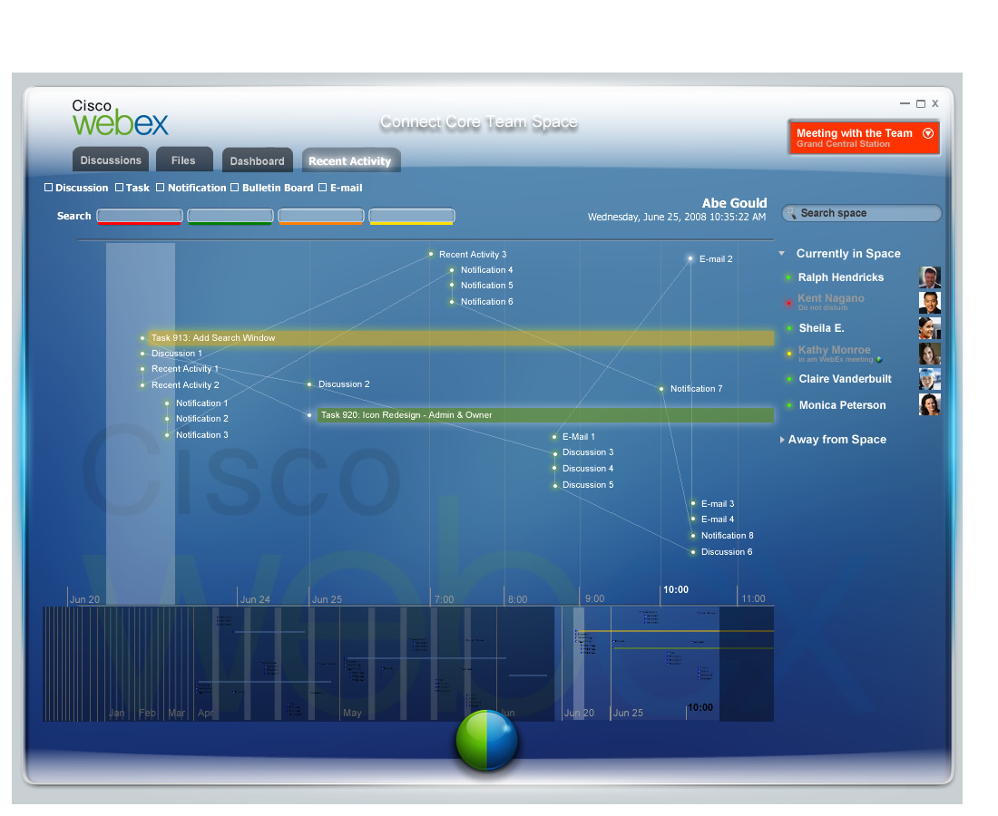
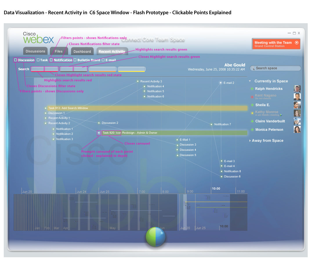
A team space rendered as a node timeline: discussions, tasks, notifications, and emails plotted as dots along a horizontal day and month axis, with connecting lines showing related activity
A day of team activity as nodes rather than a message list. Each dot is a discussion, task, notification, or email, positioned by when it happened and linked to what it touched.↗ open full size
The same node timeline built as a working Flash prototype, with a live cursor and highlighted task bars for Add Search Window and Icon Redesign
Built as a working Flash prototype, not a static comp, so interaction designers could actually click through the zoom between a week and a single hour.↗ open full size

03 · Shipped: presence, spaces, recording

The glass concept did not ship as-is. What carried forward from it was restraint: fewer opaque panels, a status dot that did real work, and a lighter touch on chrome across the interfaces that did reach production.
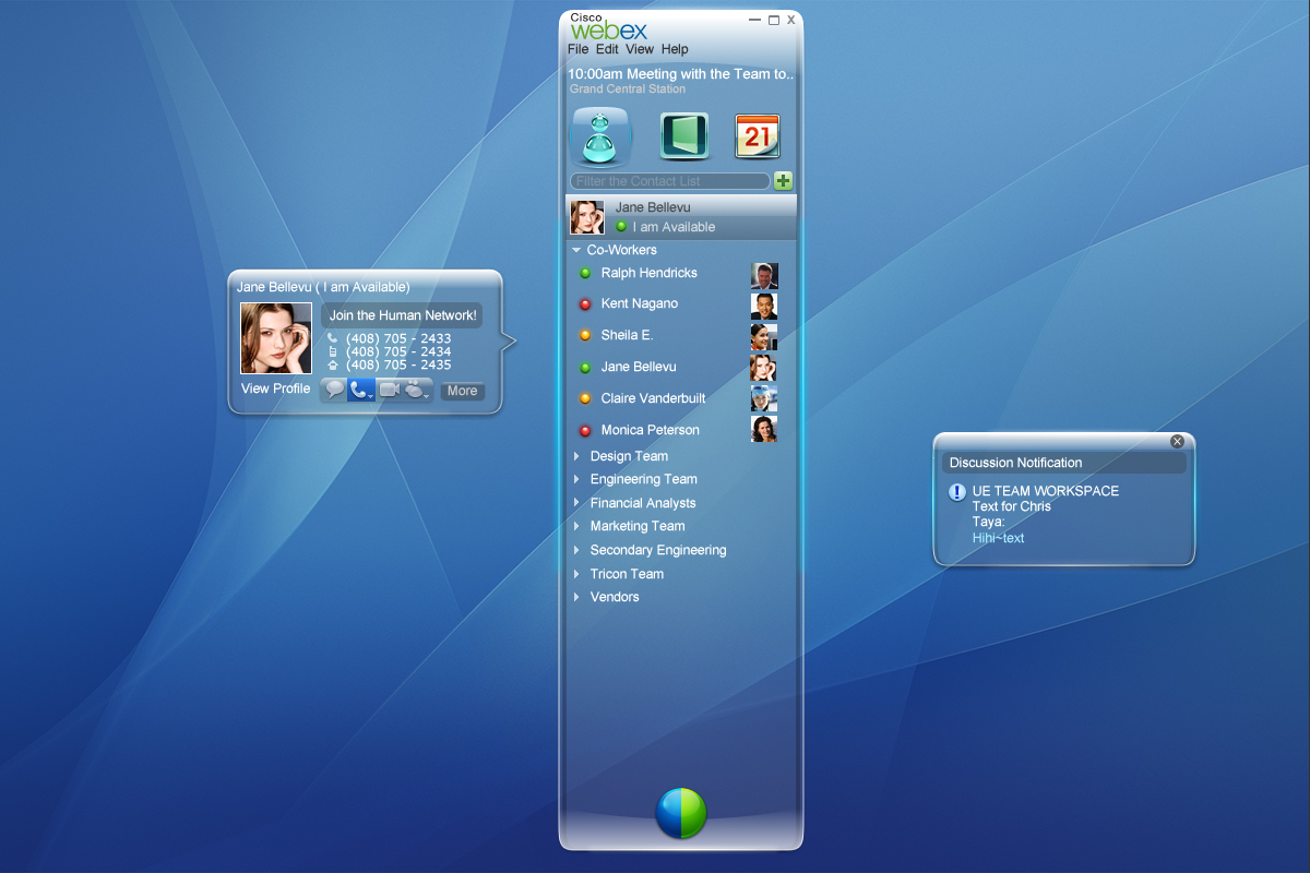
A WebEx Connect team space showing discussion topics sized by activity, a message thread, a How Do I help panel, and a currently in space roster on the right
A team space. Topic size scales with activity, so the busiest conversation is legible without opening it.↗ open full size
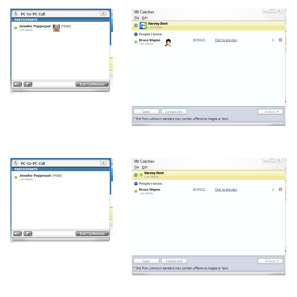
A PC-to-PC call window beside an IM Catcher window listing people the recipient knows, so an unknown sender's message can be previewed before it interrupts
The IM Catcher. Messages from people outside your known list land here first, previewable without opening a full conversation window.↗ open full size
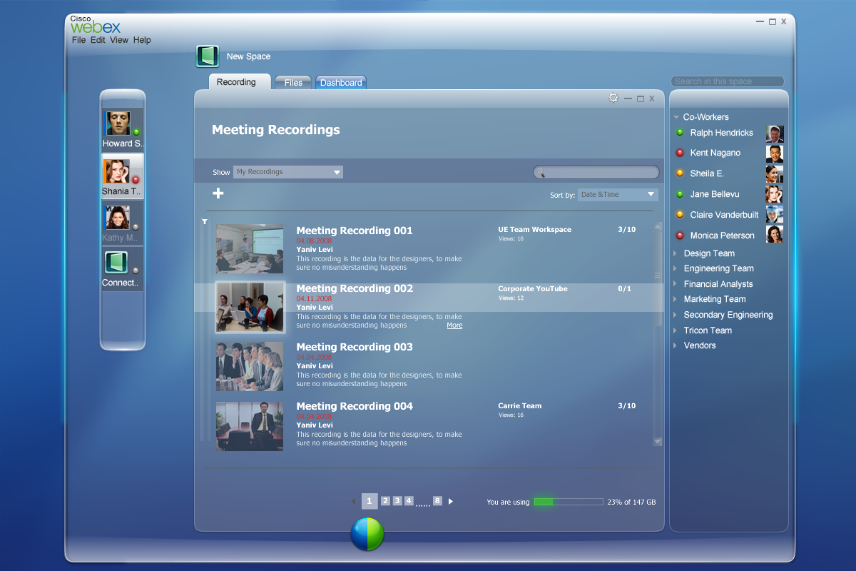
A meeting recordings panel listing four recordings with thumbnails, viewer counts, and destinations including a UE team workspace and a corporate YouTube channel
Meeting recorder. Recordings could route to a private space or an internal video channel, so a meeting's afterlife was a publishing decision, not an afterthought.↗ open full size

04 · Starting a meeting by walking in the room

One storyboard set explored a future further out than what was buildable in 2009: a mobile phone signaling over Bluetooth to a conference room's Cisco hardware, so walking in with your phone was the whole act of starting the meeting.
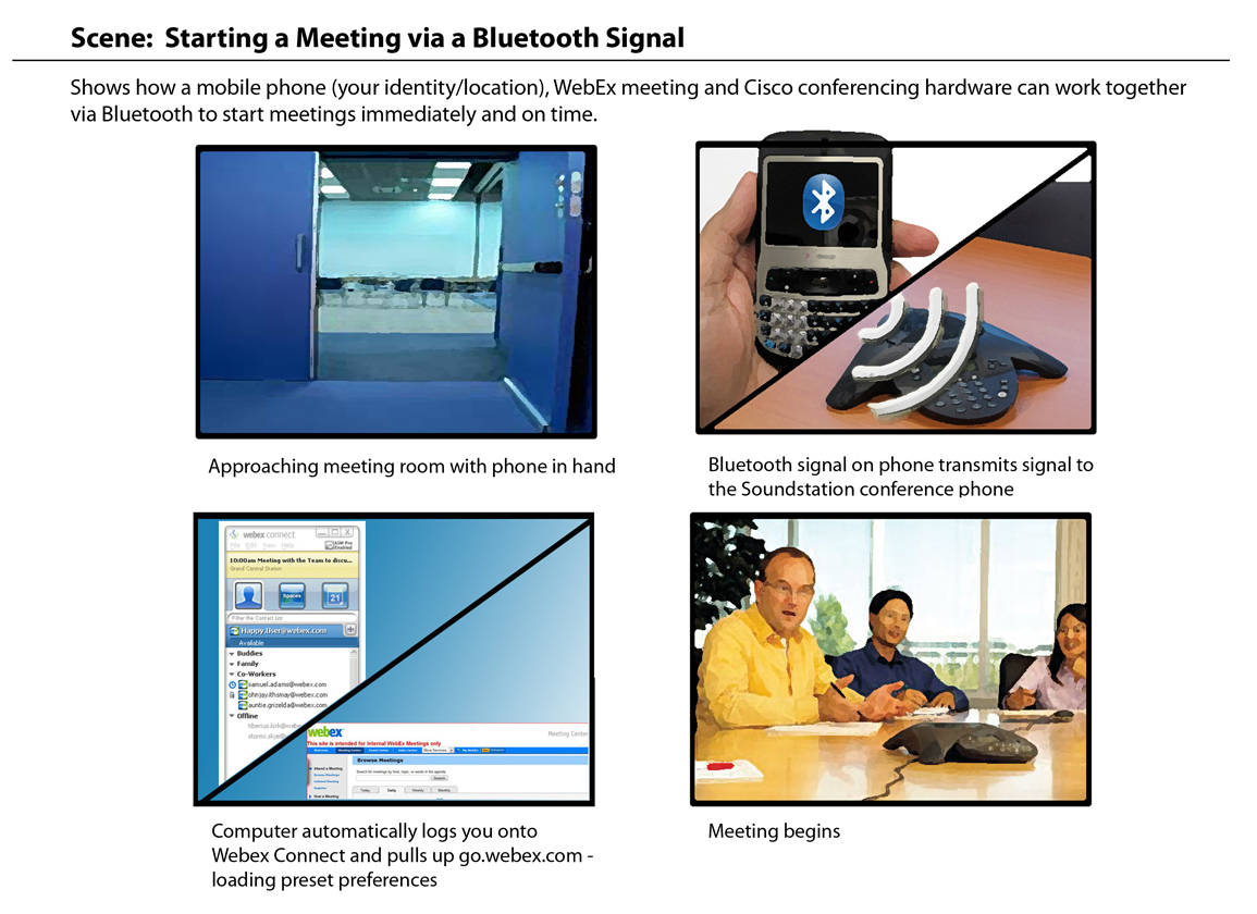
A four-panel storyboard: approaching a meeting room with phone in hand, a Bluetooth signal transmitting to a Cisco conference phone, a computer automatically logging into WebEx Connect and loading preset preferences, and the meeting beginning
Identity carried by the phone in your pocket, not a login screen. The room recognizes you before you sit down.↗ open full size

Trade-offs

What I chose not to doWhyWhat it protected
Ship the glass concept as the production surface Full transparency looked good in a still frame and read poorly over a busy desktop background in daily use. Legibility of presence and messages across every desktop, not just the demo one.
Recolor every existing surface at once Connect had a large surface area already in market. A full recolor would touch every workflow at the same time. Room to test the palette on presence and spaces first, where the status dot's meaning mattered most.
Build the Bluetooth meeting-start concept as a working prototype The hardware pairing behavior it depended on did not exist yet on either the phone or the conference room side. Time spent on the storyboard's real job, communicating the idea to stakeholders, not proving out unavailable hardware.

Push the concept past shippable, then bring back what earns its place.

Discuss this project
Next case studyA generative AI control layer for enterprise securityRead the case study