Shafeen Alam
Archive
AmazonKindle, first generationConnected hardware

Designing an interface with sixteen grays and a scroll wheel

The first generation Amazon Kindle had no color, no backlight, and a display that held its last frame instead of animating. I designed its screensavers, iconography, and home screen inside those limits, and wrote the UI style guidelines engineering built against.
Role
UI, interaction, and visual designer
Product
Kindle, first generation
Display
4-bit grayscale e-ink
Input
Scroll wheel and OLED indicator
case.md
$ cat summary
shipped: 1st-gen Kindle
carousel: later on Amazon.com
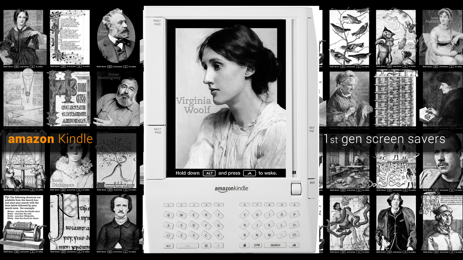
A wall of Kindle first-generation screensavers in grayscale surrounding a device showing the Virginia Woolf screensaver with the caption hold down ALT and press A to wake
The screensavers as a set. Authors, illuminated manuscripts, botanical and astronomical plates, and reading tips, all drawn to survive a display with sixteen grays and no backlight.↗ open full size
Why it mattered

If the interface fought the hardware, the first Kindle would feel broken before anyone read a page.

60-second read

Problem

A reading device with no touch, no color, no backlight, and a display that could not animate. Every convention I had for interface design assumed at least one of those.

System decision

Design to the constraint rather than around it. Grayscale depth through dithering, navigation built for a scroll wheel, and a home screen that made the passing of time legible.

My contribution

Screensavers, iconography for the quick navigation bar and book genres, the home screen look and feel, and the UI style guidelines engineering built against.

Outcome

Shipped on the first Kindle. The recommendation carousel later moved to Amazon.com, and the touch patterns I explored arrived on the hardware that followed.

01 · The constraints came first

A hardware-driven design

Navigation was a scroll wheel and an OLED indicator strip beside the screen. There was no cursor to place and no target to tap, so the interface could not be a plane of options. It had to be a list you moved through, one position at a time.

That single input decided the information architecture before any screen was drawn, which is the clearest case I have worked on of hardware setting the design brief.

Sixteen grays

E-ink gave us sixteen levels of gray and no backlight. Shadow and depth could not be rendered as tone, so they had to be built by dithering, arranging patterns of dots that read as an intermediate value from reading distance.

The display also held its last frame rather than refreshing continuously, so nothing could be communicated through motion. Change had to be carried by composition and sequence.
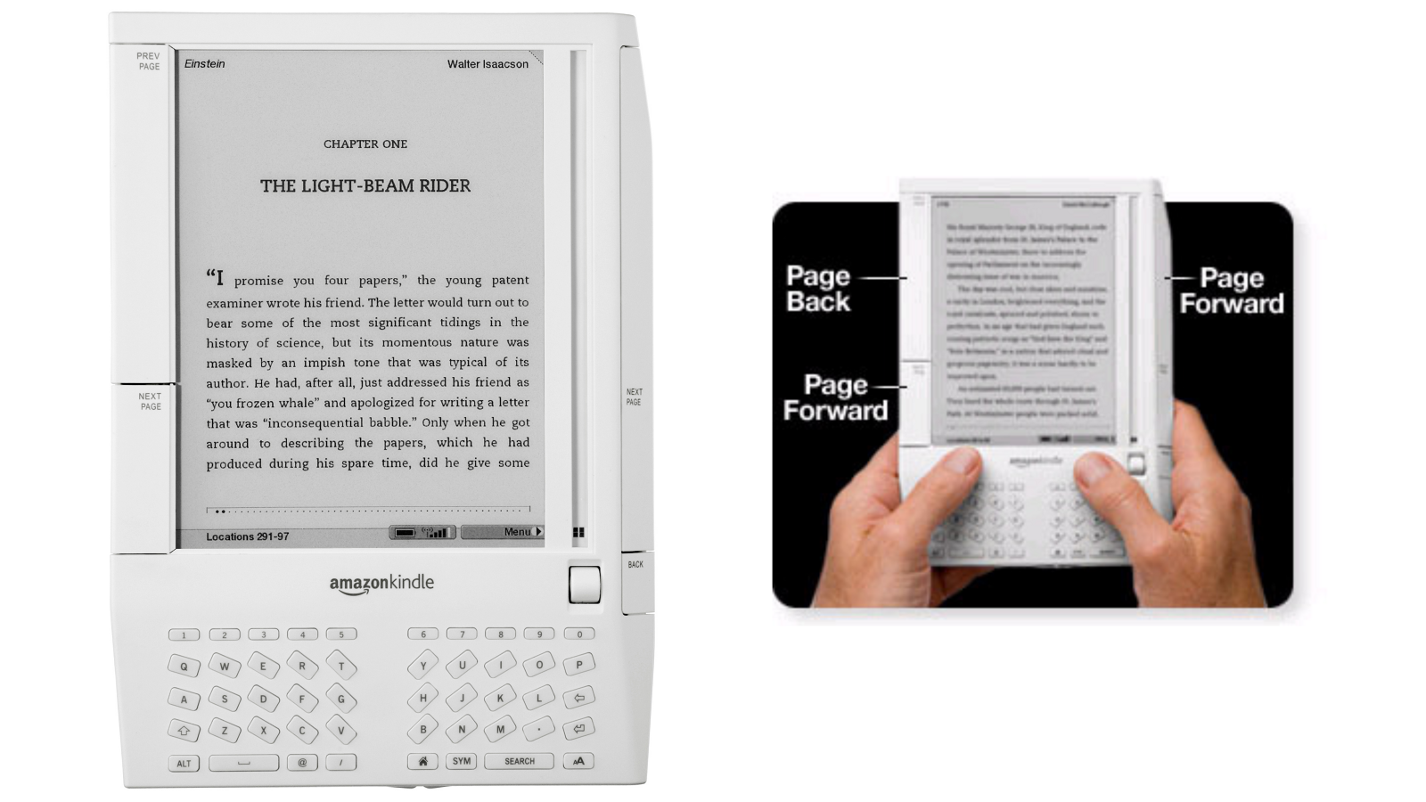

The first Kindle with PREV PAGE, NEXT PAGE and BACK buttons labelled along both edges, beside a photograph of the device held in two hands with Page Back and Page Forward callouts
The hardware I was designing into. Paging sat on both edges so the device worked in either hand, and the scroll wheel lived beside a narrow indicator strip rather than on the screen.↗ open full size
A sixteen-step grayscale ramp from black to white arranged as two rows of eight swatches
The whole palette: sixteen grays, black to white. Everything else, shadow and depth included, had to be built by dithering these against each other.↗ open full size

02 · What I designed

I worked across the interface as a UI, interaction, and visual designer, and collaborated on concept development and ideation so engineering could prototype and document the UI assets.

Screensavers

Illustrations of famous authors, plus basic tips and definitions, drawn for 4-bit grayscale. The screensaver is the only thing a Kindle shows when it is doing nothing, so it had to be worth looking at rather than a placeholder.

Iconography

Icons for the quick navigation bar and for book genre designations, at a size and weight that survives a display with no antialiasing to lean on.

Home screen

A new look and feel built so the interaction read as intuitive to the passing of time, rather than as a static list of files.

Recommendation carousel

Helped develop the look and feel of the book recommendation carousel in the over-the-air Kindle Store. It was later used on the Amazon.com website.

Style guidelines

Defined the UI style guidelines engineering built against, so the same decisions did not have to be relitigated per screen.

Concept work

Interaction flows, conceptual diagrams, site maps, storyboards, typography, color palettes, and screen schematics, static and animated, for approval.

03 · Screensavers and iconography

On a display that holds its last frame indefinitely, the screensaver is the state people see most. It had to be worth looking at rather than a placeholder.
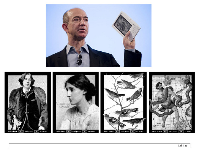
Jeff Bezos holding the first Kindle at launch, above four screensaver designs: Oscar Wilde, Virginia Woolf, a botanical bird plate, and an antique star chart
Four of the screensavers, and the device at launch. Each carries the wake instruction along the bottom edge, so the idle state doubles as the only instruction a new owner needs.↗ open full size
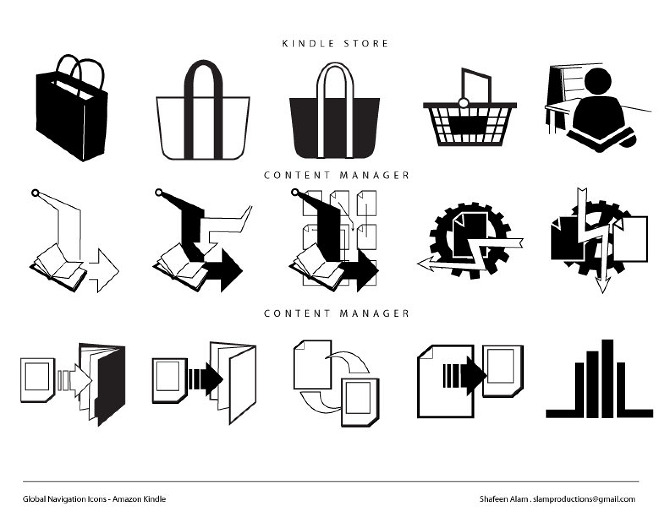
A sheet of global navigation icons for the Kindle Store and Content Manager, including shopping bags, a basket, a reader figure, and page and file transfer marks
Global navigation icons for the Kindle Store and Content Manager. With no color and no antialiasing to lean on, each mark had to read from silhouette alone, which is why most ended up solid rather than outlined.↗ open full size
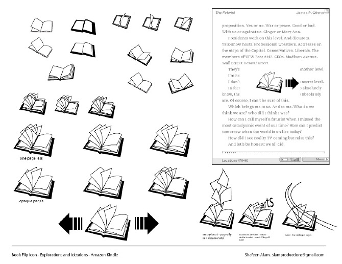
Dozens of ink explorations of an open book icon at different angles and page states, labelled one page less and opaque pages, with in-context reader views showing pages flying in during a data transfer
The book flip icon, explored to exhaustion. The bottom row is the payoff: pages flying out of an open book to show a transfer in progress. On a device that cannot animate, the metaphor has to carry the motion the screen will not.↗ open full size

04 · Home screen and recommendations

The home screen had to hold books, periodicals, and store content in one wheel-navigable list, and make the passing of time legible rather than presenting a static directory of files.
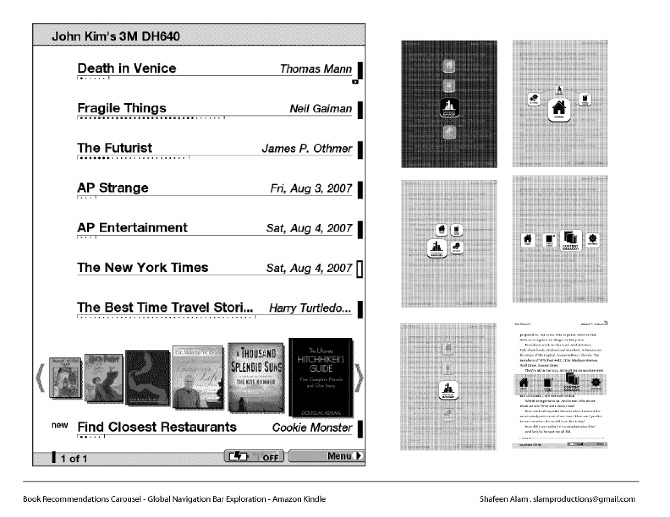
A Kindle home screen listing books and periodicals with dates and a carousel of book cover thumbnails along the bottom, beside six explorations of the global navigation bar in different positions and states
The book recommendation carousel on the home screen, with six explorations of the global navigation bar beside it. The carousel treatment was later used on the Amazon.com website.↗ open full size

05 · Interaction specification

Behavior had to be documented frame by frame so engineering could build against it. Because every interaction was mediated by a wheel rather than a pointer, the number of clicks was a design decision rather than an implementation detail.

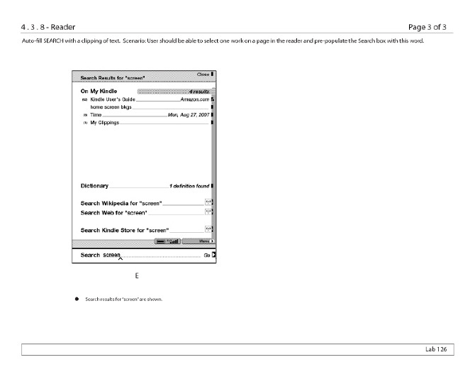
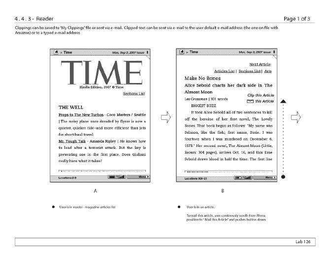
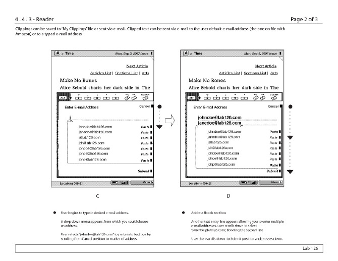
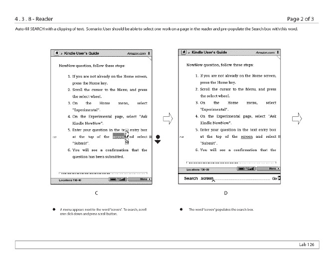
Two sequences: auto-filling a search from a clipping of text, and saving or emailing a clipping, each specified through to its result state.
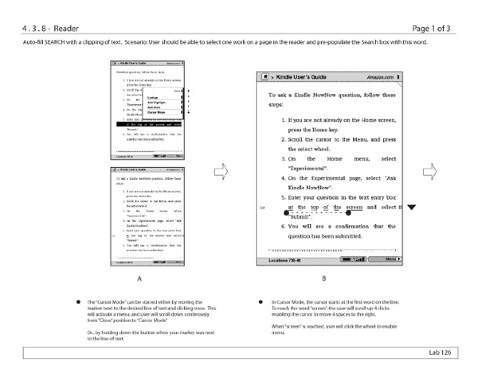
Reader specification page one of three for auto-filling search, showing cursor mode entered from a menu and the cursor stepping four spaces per wheel click
Cursor mode, entered from the menu or by holding the button. The note that the cursor moves four spaces per click is the kind of detail a wheel forces you to settle.↗ open full size
Reader specification page two of three, showing a word selected on the page and that word populating the search box
Selecting a word on the page, then watching it populate the search box.↗ open full size
Reader specification page three of three, showing search results for the selected word across the device, dictionary, Wikipedia, web, and Kindle Store
The result: one selected word searched across the device, the dictionary, Wikipedia, the web, and the store.↗ open full size
Reader specification for clippings, page one of three, showing a Time magazine issue and an article with Clip this Article and email options
Clippings from a periodical, starting inside the article rather than in a menu.↗ open full size
Reader specification page two of three, showing an email address field with a dropdown of stored addresses and a second address being added
Address entry with recall, specified down to how a second address floods the field. Typing on this device was expensive, so remembering was the feature.↗ open full size
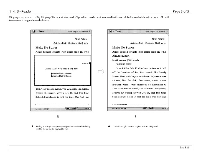
Reader specification page three of three, showing a confirmation that the article is being sent and the reader returning to the original article
Confirmation, then return to exactly where the reader was. The last frame of a spec matters as much as the first.↗ open full size

06 · The touchscreen we did not ship

Alongside the shipping design I explored what the device would be with direct input. These are speculative. The first Kindle shipped with a scroll wheel and none of this reached a customer.

They are worth showing because the questions turned out to be durable: touch targets sized for a finger rather than a cursor, pop-up menus placed where a hand would not cover them, and text selection by drag. All in 2007, before any of those patterns were settled.
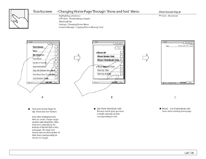
Touchscreen exploration for changing the home page through a Show and Sort menu, with a hand tapping the button and notes about enlarging titles to create a larger selection target
Show and Sort by touch, with a note that enlarging titles to make a bigger target pushes items onto the next page. The tradeoff is named rather than ignored.↗ open full size
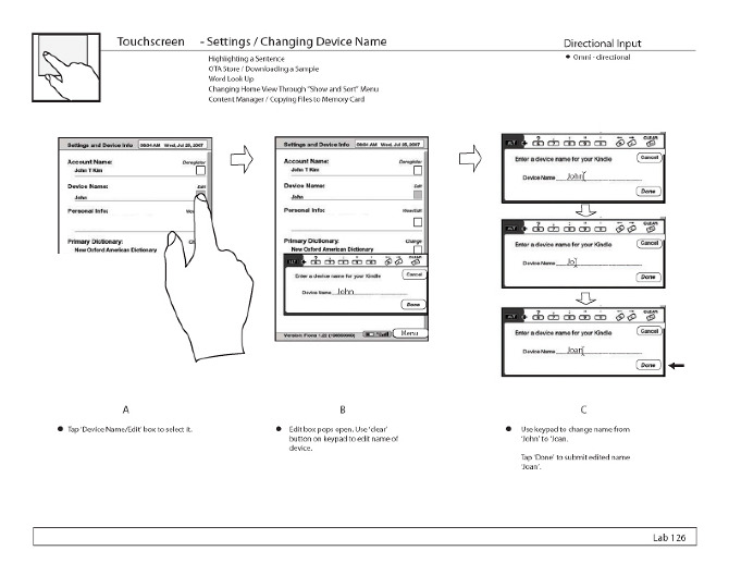
Touchscreen exploration for settings and changing the device name, showing an on-screen keyboard editing the name from John to Joan
Renaming the device with an on-screen keyboard, specified letter by letter.↗ open full size
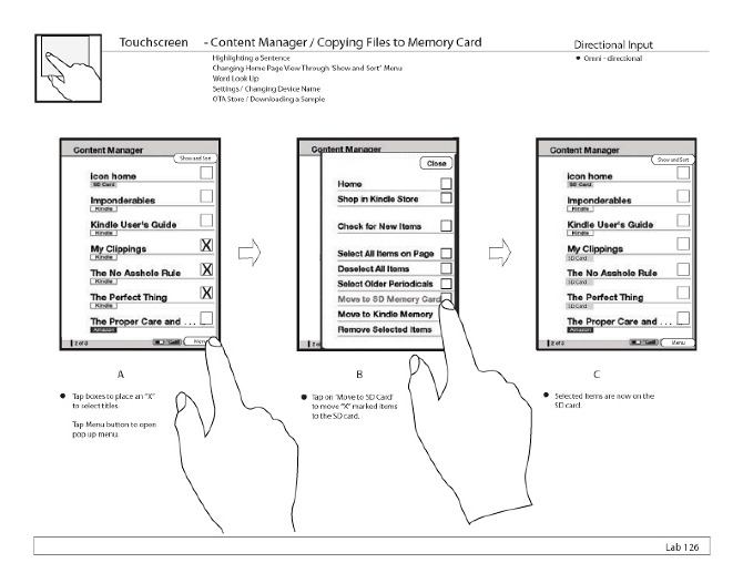
Touchscreen exploration for the Content Manager, showing titles marked with an X and a menu option to move them to the SD memory card
Content Manager by touch: mark titles, then move the selection to the memory card.↗ open full size
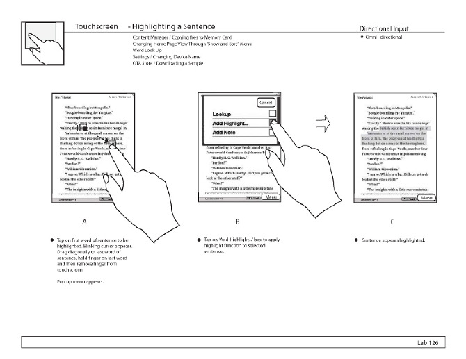
Touchscreen exploration for highlighting a sentence, showing a finger dragging diagonally across text and a pop-up menu with Add Highlight and Add Note
Highlighting by dragging a finger across the text, then a pop-up offering highlight and note. Drag-to-select with a contextual menu arrived on other devices years later.↗ open full size
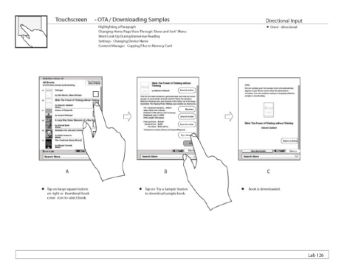
Touchscreen exploration for the over-the-air store, showing a book selected from a list, a detail page with Try a Sample, and the sample downloaded
The over-the-air store, from browse through to sample download.↗ open full size
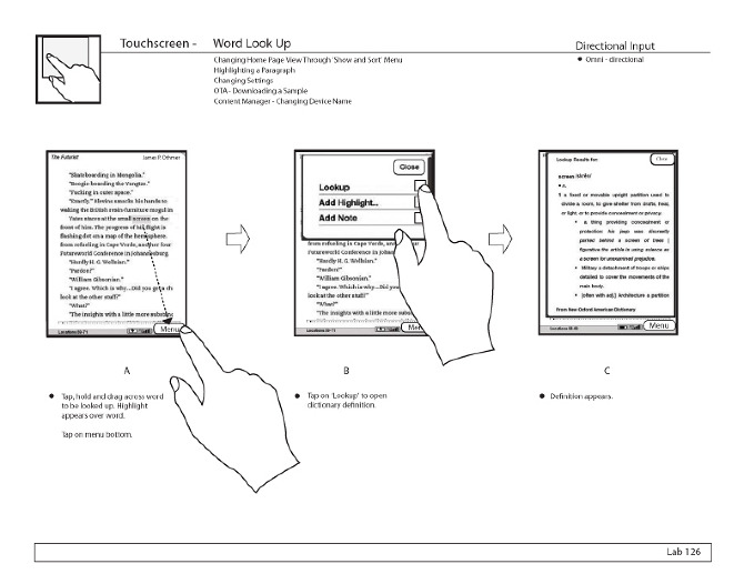
Touchscreen exploration for word look-up, showing tap and hold on a word, a lookup menu, and the dictionary definition panel
Tap and hold a word, then look it up. This is the interaction the Kindle eventually shipped, on later hardware.↗ open full size

07 · Takeaways

01 A hardware constraint is a design brief, not an obstacle. The scroll wheel decided the navigation model before any screen was drawn.
02 Dithering is a reminder that depth is a perceptual effect, not a color value. With sixteen grays, shadow had to be built from pattern.
03 The screensaver mattered more than it looked like it should. On a device that holds its last frame indefinitely, the idle state is the state people see most.
04 Style guidelines are how a small design team scales into an engineering org. Writing them was the least glamorous and most reused thing I did.
05 Designing for a display that cannot animate teaches you to convey change through composition and sequence rather than motion.
06 Explore the input the product does not have. The touch work never shipped, and it is the clearest record of what we actually understood about the device.

This predates my product design career and the analytics culture that came with it, so there are no adoption or engagement figures to report. What shipped, shipped on the first Kindle.

Sixteen grays, one wheel, and no animation. The constraint was the brief.
Cisco wearables
Next case studyChildren's mobile streaming appRead the case study