Shafeen Alam
Archive
CiscoIPICS incident coordinationWearables

Designing for first responders on hardware that barely existed

Cisco IPICS let organizations coordinate an incident across land mobile radio systems and IP devices. I redesigned its dispatch console, then designed incident experiences for the WiMM One, the first Android smartwatch, and for Recon heads-up display goggles. This was 2011, years before anyone had settled what a wrist interface should be.
Role
Lead User Interface Designer
Timeline
2010 to 2014
Surfaces
Dispatch console, watch, HUD, mobile
Stack
XAML, WPF, .NET, Android
case.md
$ cat summary
devices: WiMM One, Recon goggles
also: dispatch console redesign
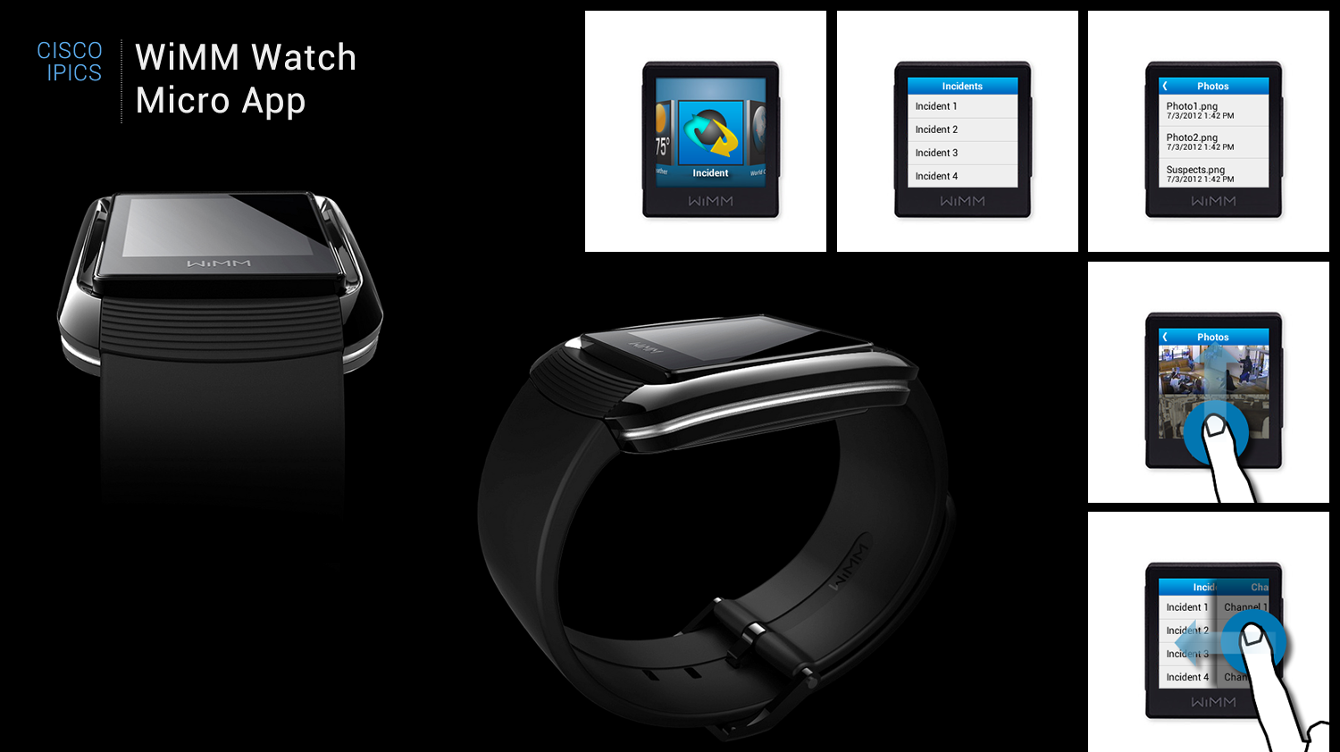
A presentation board titled Cisco IPICS WiMM Watch Micro App, showing two renders of the WiMM One smartwatch alongside five interface states: an app launcher carousel with Incident selected, an Incidents list, a photo list, a photo being tapped, and a swipe between the Incidents and Channels columns
The WiMM One, released in 2011 and the first Android smartwatch. The screen is roughly an inch and a half across, there is no keyboard, and the person wearing it is responding to an incident.↗ open full size
Why it mattered

Responders in the middle of an incident cannot stop to read a screen.

60-second read

Problem

Cisco IPICS coordinated incidents across land mobile radio systems and IP devices, but the people it served were in the field with their hands and eyes already committed.

System decision

Treat each device as a different amount of attention rather than a different screen size. The watch gets a decision, the goggles get a direction, the phone gets the record.

My contribution

Redesigned the dispatch console, then designed net new incident experiences for a smartwatch, heads-up display goggles, and mobile.

Note

This is 2011 wearable work, so there are no adoption metrics to report. It is here for the interaction thinking, not the numbers.

01 · Shipped

A rebuilt dispatch console, plus net new incident interfaces across three devices that demanded three different amounts of a responder's attention.

I owned the direction and produced the assets: icons, wireframes, interaction, storyboards, and a sticker sheet, then worked with engineering to get it implemented in XAML, WPF and .NET against Cisco's existing standard.
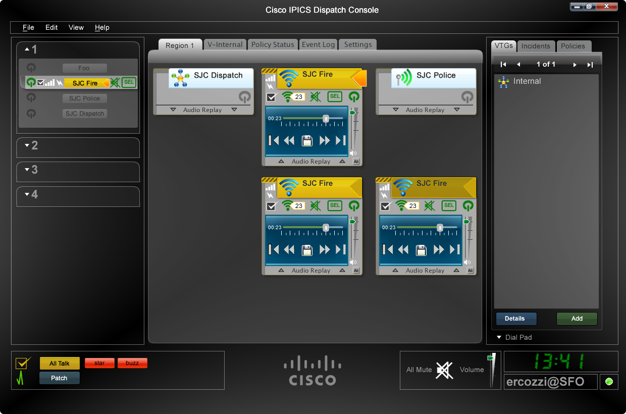
The Cisco IPICS Dispatch Console: a region tree on the left, five talk group panels for SJC Dispatch, SJC Fire and SJC Police each with its own audio replay transport, a VTGs, Incidents and Policies panel on the right, and a footer of All Talk, patch and mute controls beside a live clock and signed-in operator
The console. Every talk group carries its own audio replay transport, so a dispatcher can scrub back through one channel without leaving the other four.↗ open full size
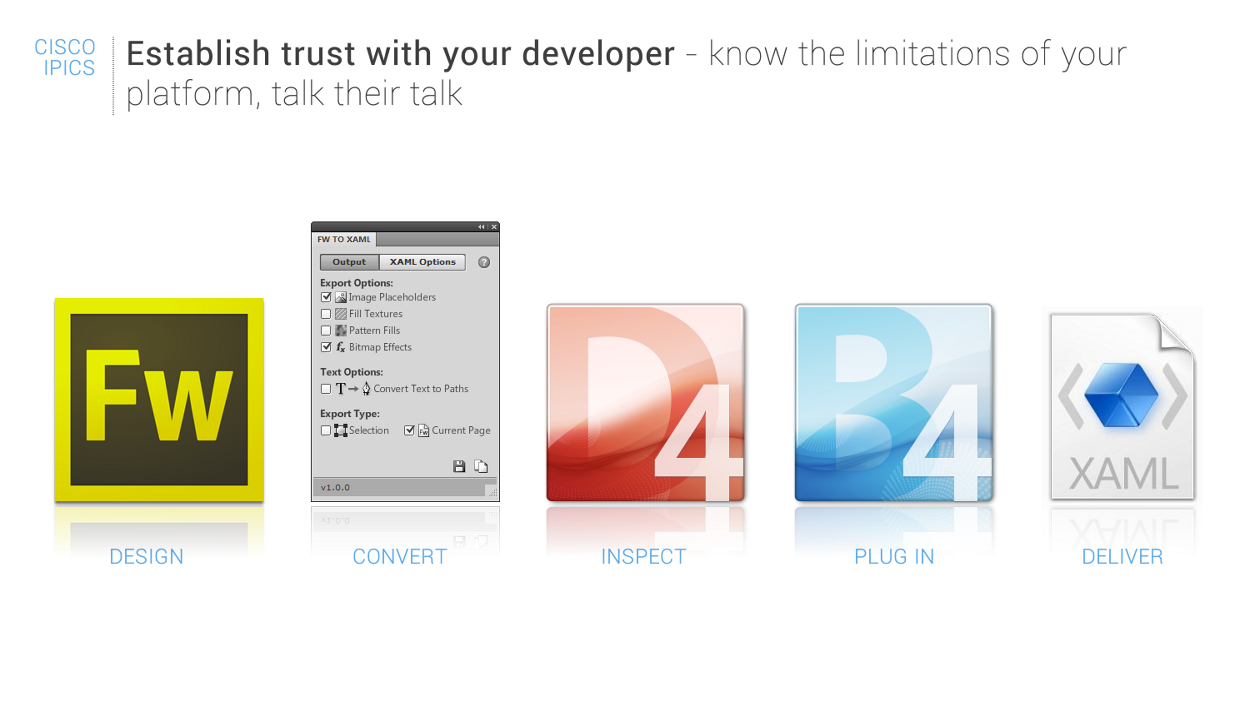
A process slide headed Establish trust with your developer, know the limitations of your platform, talk their talk, showing five stages: Fireworks for design, a Fireworks to XAML export panel for convert, Expression Design 4 for inspect, Expression Blend 4 for plug in, and a XAML file for deliver
How the work actually reached production. Design in Fireworks, export to XAML, inspect and plug into Blend, deliver. Learning the developer's toolchain is what earned the trust to ask for anything unusual.↗ open full size
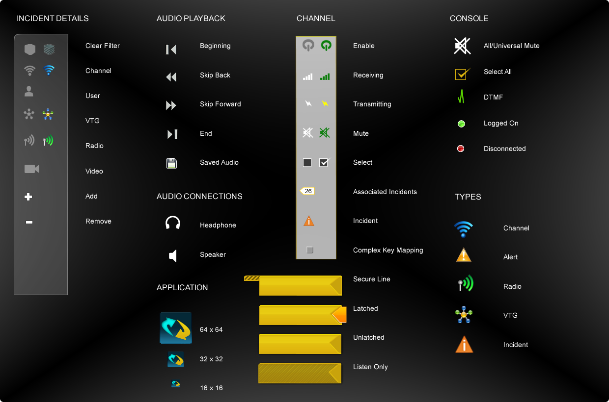
The IPICS icon sticker sheet, organized into incident details, audio playback, audio connections, application sizing at 64, 32 and 16 pixels, channel states from enable through complex key mapping, secure line, latched, unlatched and listen only bars, console controls, and types for channel, alert, radio, VTG and incident
The sticker sheet. Channel states are the interesting column: enable, receiving, transmitting, mute, select, associated incidents, and complex key mapping each needed to be distinguishable at 16 pixels.↗ open full size

02 · Three devices, three amounts of attention

The usual way to approach this is as three screen sizes. That is the wrong unit. A dispatcher at a console has a desk, two monitors, and time. A responder walking toward a security breach has neither hand free and about a second of spare attention.

So I designed against attention rather than resolution, and let that decide what each device was allowed to ask for.

The watch

A glance

One or two seconds, one hand, no reading. So the screen holds a single decision with two answers.

The goggles

No hands at all

Peripheral vision while moving. Direction and proximity only, never a list.

The phone

Full attention, later

Where the incident gets documented, escalated, and streamed, once someone can actually stop and look.

03 · On the wrist

There were no conventions to borrow in 2011. No wearable guidelines, no established navigation model, no precedent for what an alert on a wrist should even look like. What the hardware gave me was a small square screen, a touch surface, and a launcher carousel.

I built the whole app as a chain of single decisions. Each screen states one thing and offers two responses, so it can be resolved without reading and without stopping.
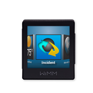
The WiMM One launcher carousel with the Incident app selected in the centre, weather to the left and a world clock to the right
Launch. Incident sits in the watch's own carousel, between weather and a world clock. It had to earn its place next to the mundane.↗ open full size
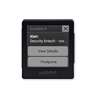
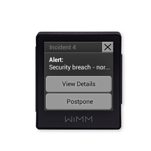
A WiMM watch alert for Incident 4 reading Alert, security breach, with View Details and Postpone buttons and a close X
Alert. A truncated headline and two answers. Postpone matters as much as View Details, because a responder mid-task needs a way to defer that is not ignoring it.↗ open full size
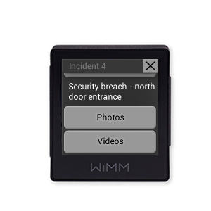
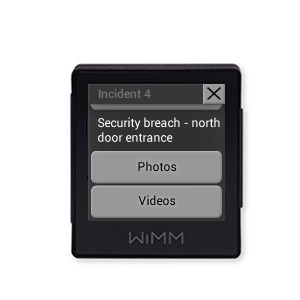
A WiMM watch detail screen reading security breach, north door entrance, with Photos and Videos buttons
Detail. The full line, then the two things worth opening on a wrist: photos and video from the scene.↗ open full size
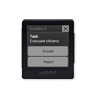
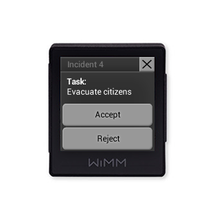
A WiMM watch task screen for Incident 4 reading Task, evacuate citizens, with Accept and Reject buttons
Task. Dispatch assigns, the responder accepts or rejects from the wrist. This is the screen that makes the watch worth wearing, because it closes the loop without a radio call.↗ open full size
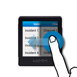
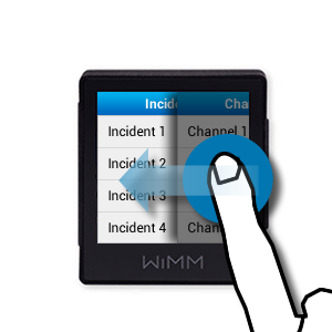
A WiMM watch showing a horizontal swipe gesture between an Incidents column and a Channels column, with a hand illustration and directional arrows
Navigate. Incidents and Channels as two columns you swipe between, because there was no room for tabs and no convention to fall back on.↗ open full size

04 · The flow, end to end

Eight screens in order, from the watch face to a declined task. Worth reading as a sequence rather than a gallery, because every screen makes the same decision: what is the smallest thing this person needs right now, and what is the one action that follows from it.

Two buttons per screen, maximum. No scrolling inside a card. Nothing that needs a sentence read to understand what happens next.
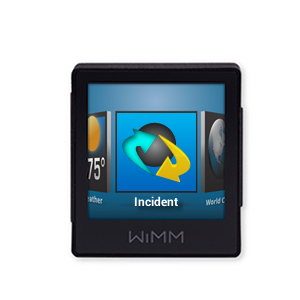
A WIMM smartwatch carousel with an Incident tile centered between a Weather tile showing 75 degrees and a World Clock tile
01 · Entry The Incident app sits in the watch's carousel beside Weather and World Clock, so it is reached the same way as anything else on the device rather than through a special mode.
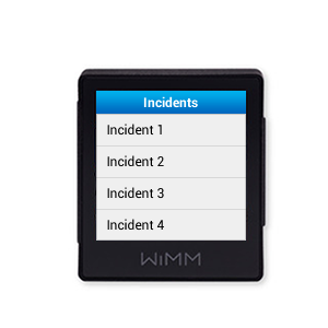
The Incidents screen listing Incident 1 through Incident 4 as four plain rows under a blue header
02 · The queue Four incidents, one per row, with nothing else on screen. No counts, no severity chips, no filters. At this size a list that can be read at a glance beats a list that carries more information.
A horizontal swipe gesture in progress, sliding from the Incidents column toward a Channels column, with a finger on the screen
03 · Sideways is a second axis Swiping horizontally moves between Incidents and Channels. Vertical scrolls the list, horizontal changes what the list is. Two dimensions of navigation without a single chrome element.
An alert card reading Security breach with View Details and Postpone buttons
04 · The alert arrives Security breach, north door entrance, truncated to fit. Two responses: View Details, or Postpone. Postpone is the important one, because a responder with both hands occupied needs a way to acknowledge without acting.
The expanded alert showing Security breach, north door entrance with Photos and Videos buttons
05 · Evidence, offered not pushed The full alert text, then Photos and Videos as explicit choices. Nothing auto-plays on a wrist during an incident.
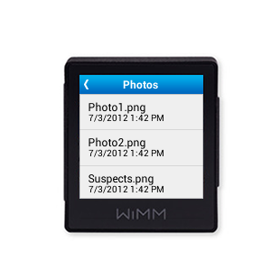
A Photos list showing Photo1.png, Photo2.png and Suspects.png, each with a date and time of 7/3/2012 1:42 PM
06 · Named, timestamped Photo1, Photo2, Suspects, each stamped 7/3/2012 1:42 PM. Filenames rather than thumbnails, because a filename is legible at this size and a thumbnail is not.
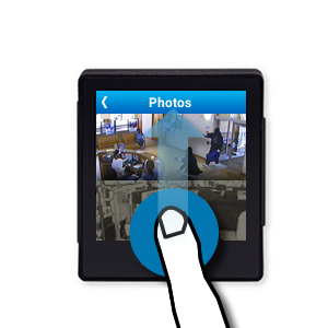
A surveillance photograph filling the watch display, with a finger tapping the screen
07 · Then the image Tapped through to the photograph itself, filling the display. The evidence gets the whole screen once you have chosen to look at it.
A task card reading Task, Evacuate citizens, with Accept and Reject buttons
08 · Accept or Reject Task: Evacuate citizens. A responder can decline. In 2011 that was an unusual thing to put on a watch, and it is the same argument as one action, one confirmation.

05 · In the field of view

Recon Instruments built heads-up displays for skiing and cycling, mounted inside goggles and read in peripheral vision. Cisco wanted to know whether the same thing could serve a responder. The design question is harsher than the watch: you are looking through this while moving, so anything that requires focus is a hazard.

I kept it to a map, a heading, and one message at a time. No lists, no scrolling, nothing that asks you to stop walking.
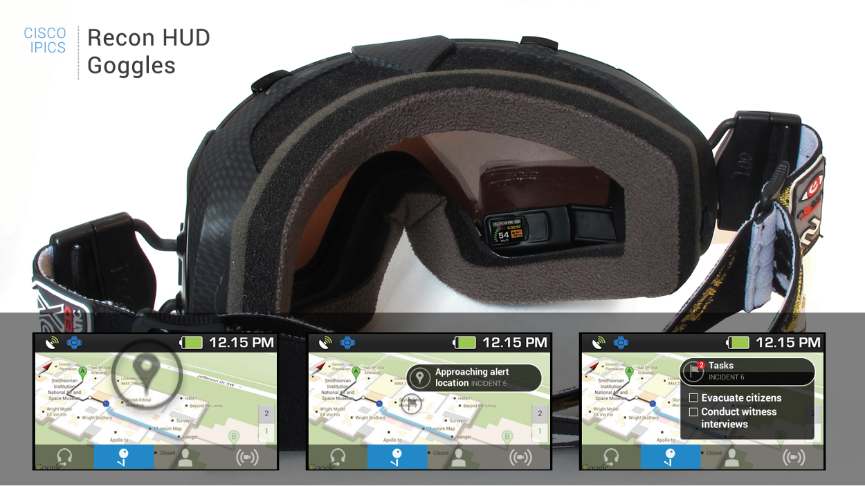
A presentation board titled Cisco IPICS Recon HUD Goggles, showing a photograph of the goggles with the display module visible inside the frame, above three interface states over a map: a plain map view, an Approaching alert location message for Incident 6, and a Tasks panel for Incident 6
The hardware and the three states. That small module inside the goggle frame is the entire display, positioned to sit at the edge of vision rather than in front of it.↗ open full size
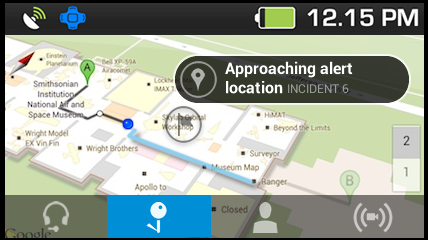
A heads-up display view over a street map reading Approaching alert location, Incident 6, with a route drawn and a bottom bar of four icons
Proximity, not navigation. The map is context. The only message is that you are getting close, which is the one thing worth saying to someone who is already moving.↗ open full size
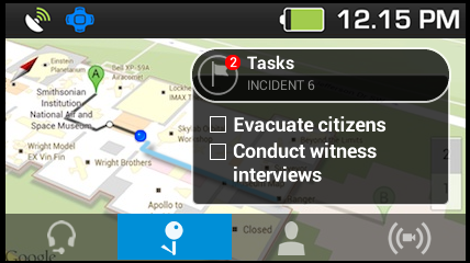
A heads-up display Tasks panel for Incident 6 with a badge showing two items, listing checkboxes for evacuate citizens and conduct witness interviews
Two tasks, checkable. Evacuate citizens, conduct witness interviews. A count in the badge so you know the list is short before you read it.↗ open full size

06 · On the phone

The phone is where the incident becomes a record. It is also the only device with enough screen to carry things the watch and the goggles cannot: a live video stream from the scene, a structured report, and biometrics from the responder themselves.

That last one is the part I would still defend. Monitoring a responder's heart rate against a set threshold, with weapon status alongside it, treats the person in the field as part of the incident rather than just a resource assigned to it.
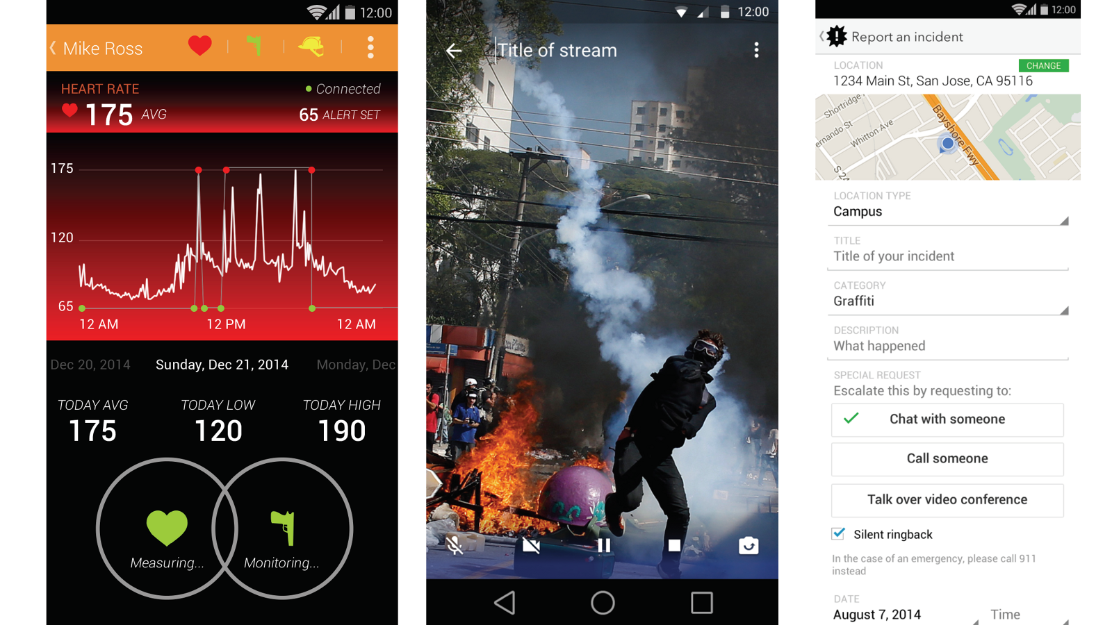
Three Android screens from the Cisco Incident app: a responder profile for Mike Ross showing a heart rate of 175 average against an alert threshold of 65 with a graph across the day and Measuring and Monitoring indicators, a live video stream from a scene with fire and smoke, and a Report an incident form with location, category, description and escalation options including chat, call and video conference
Left, responder vitals with an alert threshold and weapon status. Centre, live video from the scene. Right, the report form, where escalation is three explicit choices rather than a generic submit.↗ open full size

Note the escalation block on the report form: chat with someone, call someone, talk over video conference, with a silent ringback option. Under it, a line telling you to call 911 instead in a real emergency. Knowing what your product is not for is part of designing it.

07 · Why it still matters

I have no adoption numbers from this work, and it is fifteen years old. I keep it because it is the beginning of a line that runs through everything I have designed since.

Incident coordination at Cisco, then emergency response at Envoy, then AI decision support for security analysts at Interpres. The same problem each time: tell a person under pressure what is happening, and what to do about it, on whatever they are holding.

The same argument, later

Accept or Reject on a 2011 watch face is the same commitment as one action, one confirmation in the Interpres AI guardrail. Give the person the decision, and a real way to decline it.

08 · Takeaways

01 Device constraints are attention constraints. A watch is not a small phone, it is a different amount of a person's focus.
02 On a two-inch screen the design work is deciding what not to show. Every state here answers one question with two buttons.
03 Postpone and Reject had to be as easy as Accept. A responder who cannot decline a task will stop looking at the device.
04 Working in XAML, WPF and .NET to an existing Cisco standard meant the design had to survive the platform rather than fight it.
05 Fifteen years later I am still designing the same problem: how a system tells a person under pressure what is happening and what to do next.

A watch is not a small phone. It is a smaller amount of someone's attention.
Amazon Kindle
Next case studyA glass interface for enterprise messagingRead the case study