Shafeen Alam
All work
BlackBerryAdaptive cyber operations dashboard infrastructurePlatform architecture

Unifying four security products into one adaptive control plane

After BlackBerry acquired Cylance, its cybersecurity portfolio ran as powerful but disconnected systems, and analysts moved between consoles to correlate signals across endpoints, policies, and incidents. I led the UX architecture transformation that unified endpoint protection, detection and response, device management, and Zero Trust access into a single adaptive platform. This was not a UI redesign. It was a platform-level systems unification.
Role
Led UX architecture
Context
Post-acquisition portfolio unification
Products
PROTECT, OPTICS, UEM, GATEWAY
Domains
EPP, EDR, UEM, ZTNA
case.md
$ cat outcome
mean_time_to_detect: 37% faster (pilot)
duplicate_triages: 28% fewer
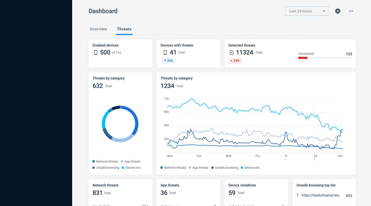
The unified control plane dashboard: a dark left navigation with Dashboard, Incidents, Devices, Policies and Compliance, and a light content area headed Dashboard with Overview and Threats tabs, a Last 24 hours range control, and cards for enabled devices 500 of 714, devices with threats 41, detected threats 11,324 with 123 unresolved, threats by category as a donut and as a time series, plus network threats, app threats, device violations and an unsafe browsing top list
The unified console. Prevention, detection, and device management on one surface, with a single time range governing everything on it. Four products' worth of signal, one operational picture.↗ open full size
Why it mattered

Every console switch cost analysts time and context while they tried to connect a single incident.

60-second read

Problem

After BlackBerry acquired Cylance, the portfolio ran as powerful but disconnected consoles. Analysts moved between them to correlate signals across endpoints, policies, and incidents.

System decision

Align the underlying information model before designing any surface. One incident and asset abstraction, then governed dashboard infrastructure on top of it.

My contribution

Led the UX architecture translation: data abstraction layer, cross-product navigation, micro-frontend alignment, widget governance, and the investigation model.

Impact

37% faster mean time to detect in pilot. 28% fewer duplicate triages. 3× dashboard engagement.

01 · Shipped

A single console over four acquired products, governed dashboard infrastructure, role-based provisioning, AI-clustered incident modeling, and a two-mode investigation surface.

37%
faster mean time to detect, in pilot
28%
reduction in duplicate alert triage
3×
increase in dashboard engagement

02 · Vision to
architecture

The mandate arrived as one sentence from leadership. My job was turning it into a system.

“Single console. One place to understand risk.”

Translating that meant a unified data abstraction layer, a cross-product navigation architecture, micro-frontend alignment with engineering, and a UX system that could hold several security domains at once. That work became the foundation of the Unified Endpoint Security platform.
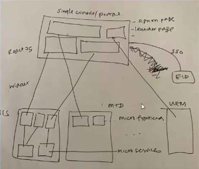
A hand-drawn architecture sketch headed single console slash portal, showing a React JS shell containing a sign-on page and launcher page, an SSO connection to an external identity provider, and widgets wiring down into separate boxes labelled OPTICS, MTD and UEM as micro frontends over micro services
Where it started. The sketch that established the shell: one React portal with sign-on and launcher, single sign-on out to the identity provider, and each acquired product entering as a micro-frontend over its own services. Deciding this early is what made a shared design system possible later rather than aspirational.↗ open full size

03 · Diagnosing fragmentation

CylancePROTECT, CylanceOPTICS, and BlackBerry UEM each surfaced devices, policies, and alerts. Each also maintained its own schema, dashboards, and workflows for them, so the same three concepts existed three times with three definitions.

This is why the work started underneath the interface. Before designing any new surface, we aligned the information model, because navigation cannot reconcile schemas that disagree.
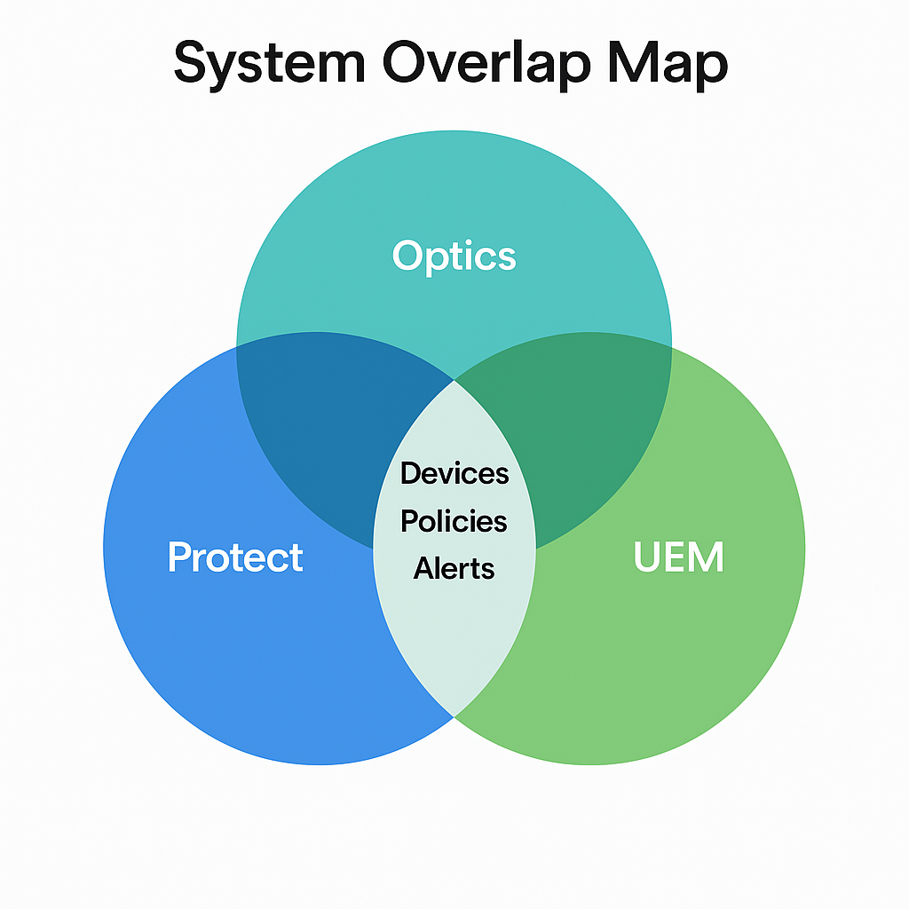
A three-circle Venn diagram titled System Overlap Map, with Protect, Optics and UEM overlapping, and Devices, Policies and Alerts sitting in the shared center
The overlap, drawn plainly. Devices, policies, and alerts sat in the intersection of all three products, which is exactly where the duplicate work came from.↗ open full size

Duplicate triage work

The same alert investigated twice because two consoles surfaced it.

Conflicting mental models

A device meant something different depending on which product you opened.

Rising mean time to detect

Correlation happened in the analyst's head, so it happened slowly.

Alert fatigue

Volume without consolidation trains people to stop looking.

04 · The unified control plane

We consolidated CylancePROTECT, CylanceOPTICS, BlackBerry UEM, and CylanceGATEWAY into a shared incident and asset abstraction. Four products stopped being four products.

  • One login, one console
  • Correlated endpoint, network, and identity signals
  • A standardized navigation model across legacy surfaces
  • A cohesive design system spanning four acquired products

That consolidation is what positioned BlackBerry to compete in extended detection and response, where the whole premise is correlation across domains.
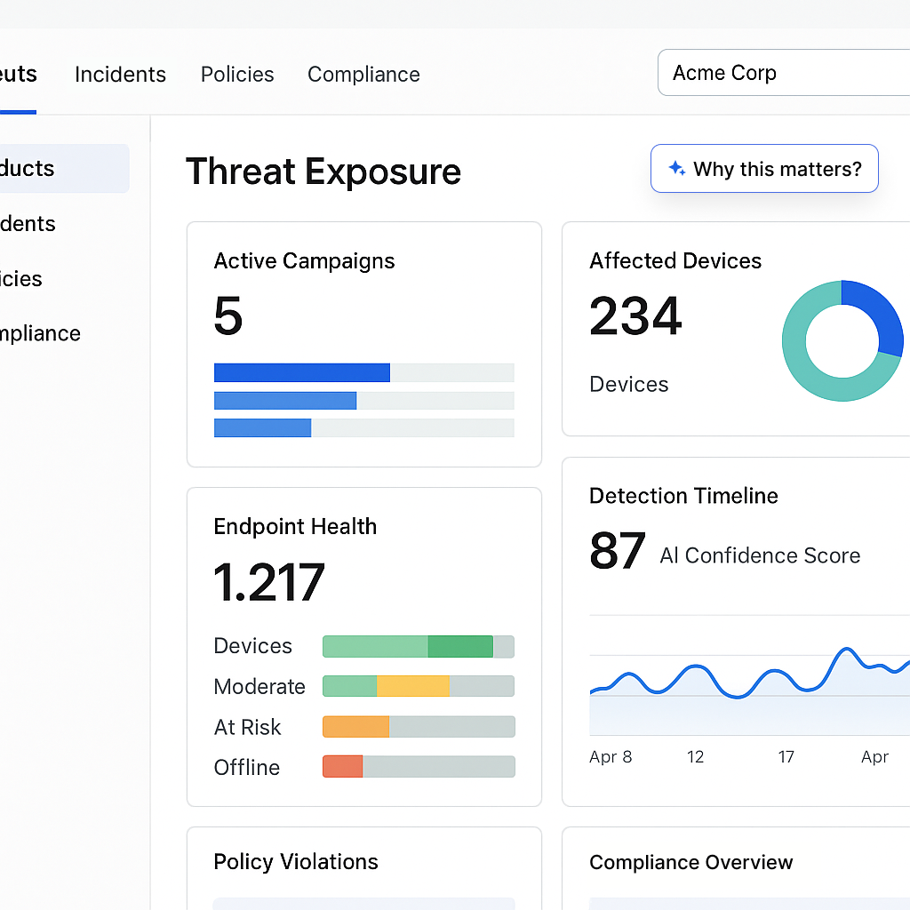
A Threat Exposure dashboard with a Why this matters button, showing Active Campaigns 5 with three ranked bars, Affected Devices 234 with a donut chart, Endpoint Health 1,217 broken into devices, moderate, at risk and offline bars, a Detection Timeline with an AI confidence score of 87, plus policy violations and compliance overview cards
Threat exposure as a first-class concept. Active campaigns, affected devices, endpoint health, and detection confidence in one model, with a “Why this matters” affordance so the posture can explain itself.↗ open full size

05 · Exposure over alerts

The dashboard stopped being a collection of widgets and became a structured exposure model: active campaigns, affected devices, endpoint health, detection confidence.

The goal moved from “see alerts” to understand exposure posture at a glance.

That reframing is what let one surface serve both an executive and an operator, because posture is legible at both altitudes in a way that a list of alerts is not.
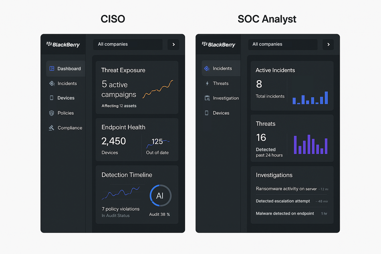
Two dark dashboards side by side, labelled CISO and SOC Analyst. The CISO view navigates Dashboard, Incidents, Devices, Policies and Compliance and shows Threat Exposure with 5 active campaigns affecting 12 assets, Endpoint Health of 2,450 devices with 125 out of date, and a Detection Timeline with 7 policy violations and an audit status of 38 percent. The SOC Analyst view navigates Incidents, Threats, Investigation and Devices and shows 8 active incidents, 16 threats detected in the past 24 hours, and an investigations list of ransomware activity on a server, a detected escalation attempt and malware detected on an endpoint with elapsed times
The same data model through two lenses. A CISO works in risk posture and compliance, an analyst works in active incidents, and their navigation differs accordingly. Note the analyst view leads with elapsed time on each investigation, because for them the clock is the priority signal.↗ open full size

06 · Dashboards as infrastructure

To scale across enterprises, dashboards had to be composable rather than authored. Modular widget architecture, drag-and-drop composition, KPI-driven layout, and deep links from a metric into the investigation behind it. Then, predictably, configurability produced duplication, so the registry had to be governed.
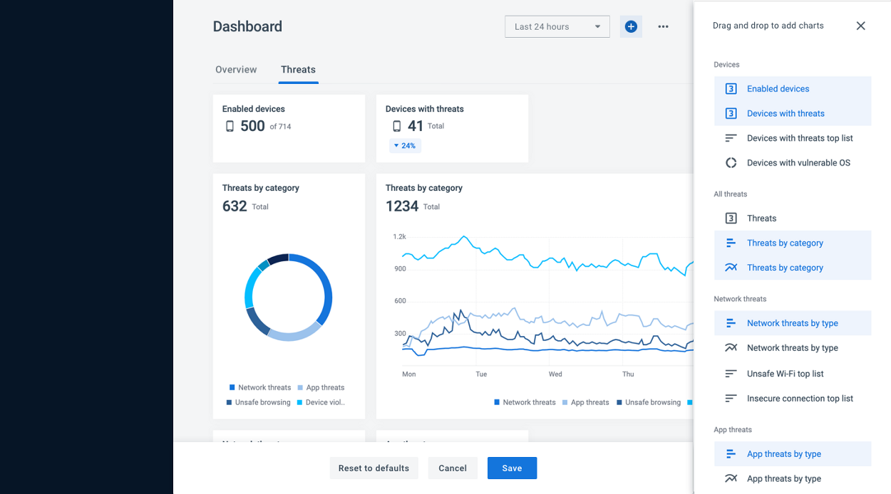
The dashboard in configuration mode, with a Drag and drop to add charts panel open on the right listing widgets grouped under Devices, All threats, Network threats and App threats, several already highlighted as placed, and Reset to defaults, Cancel and Save actions pinned at the bottom
Composition mode. Widgets are grouped by domain, already-placed ones are marked, and the whole edit is transactional: reset, cancel, or save. Editing a live operational surface needs an undo story before it needs a drag interaction.↗ open full size
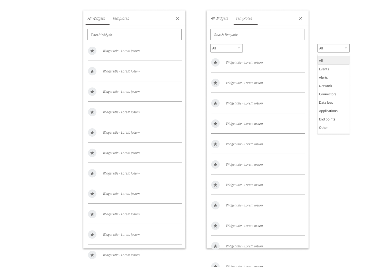
A widget discovery panel with All Widgets and Templates tabs, a search field, a scrolling list of widget entries each with a favorite star, and a category dropdown expanded to show All, Events, Alerts, Network, Connectors, Data loss, Applications, End points and Other
The governed registry. One tab for widgets and one for templates, search across metadata, favorites, and a category taxonomy. This is the layer that stopped four products from redefining the same widget four times.↗ open full size
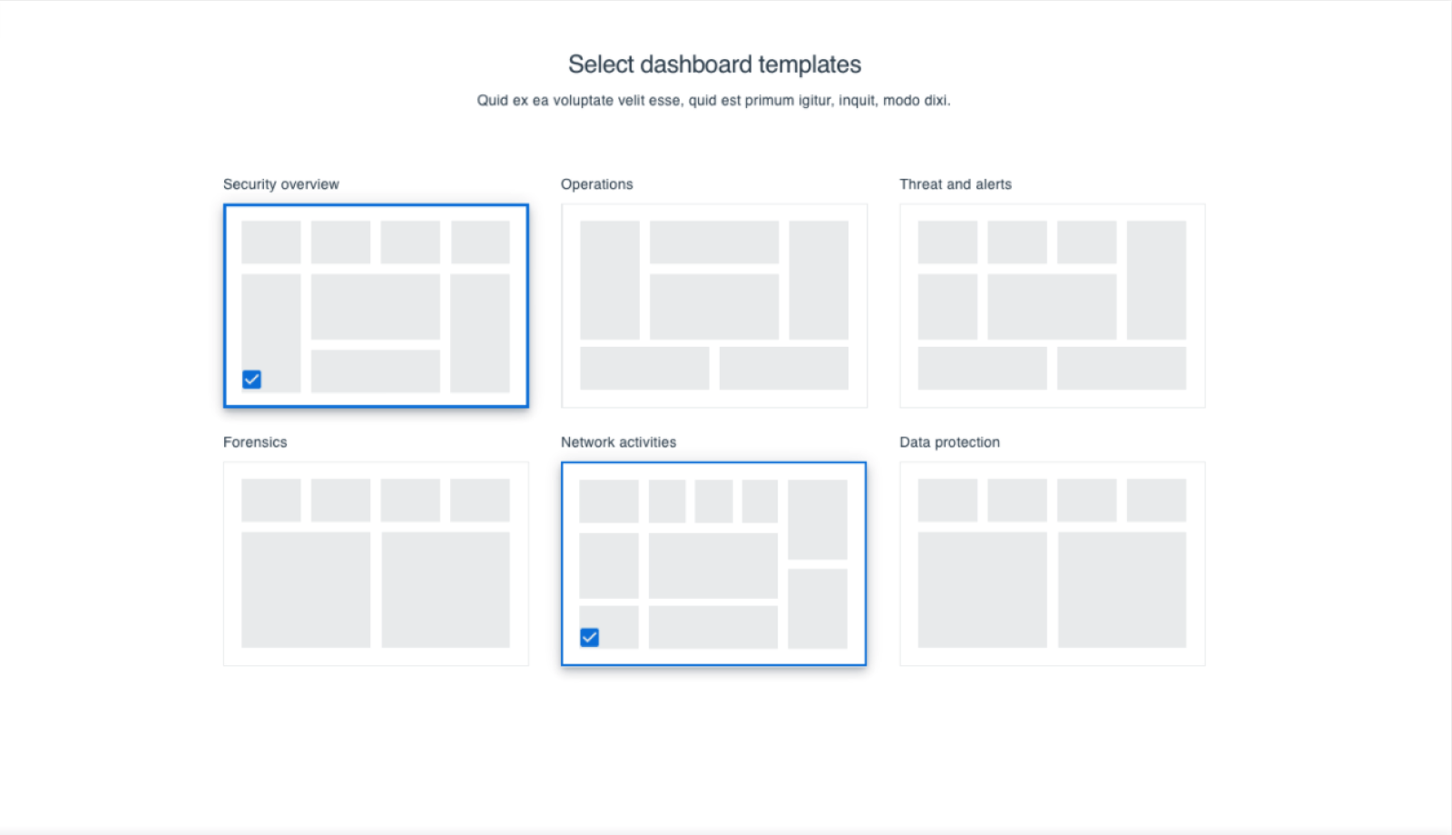
A Select dashboard templates screen showing six layout thumbnails labelled Security overview, Operations, Threat and alerts, Forensics, Network activities and Data protection, with Security overview and Network activities checked
Template provisioning. An enterprise picks the operational patterns it runs on and gets structured dashboards, rather than assembling them from an empty canvas. This is what turned customization into onboarding.↗ open full size
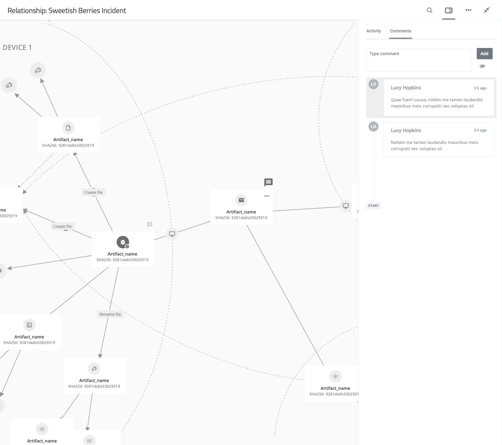
The incident topology with a right-hand panel open on a Comments tab, showing a type comment field with an Add button and two threaded comments from Lucy Hopkins three hours ago, with comment indicators pinned to nodes in the graph and an Activity tab alongside
Collaboration and audit, embedded in the investigation rather than bolted beside it. Comments pin to specific nodes, and the Activity tab keeps the compliance record. SOC work runs across shifts, so the handover has to live inside the artifact.↗ open full size

07 · Alert intelligence

The problem

High-volume alert streams were compressing analyst capacity. Triage at the level of the individual alert does not scale, because a single campaign generates hundreds of them and each one arrives looking like new work.

The shift

We moved from alert-level triage to incident-level intelligence: AI-based clustering, MITRE lifecycle mapping, a high-density triage layout, and containment actions inline.

Fewer duplicate investigations, faster prioritization, and, because the clustering showed its lifecycle reasoning, more trust in automated findings.

08 · Relationship-driven investigation

Security incidents are systems of relationships, and a table cannot represent propagation. So the investigation surface carried two modes, deliberately: a graph for structural reasoning, a timeline for causal reasoning.

Together they cut the reconstruction an analyst previously did in their head.
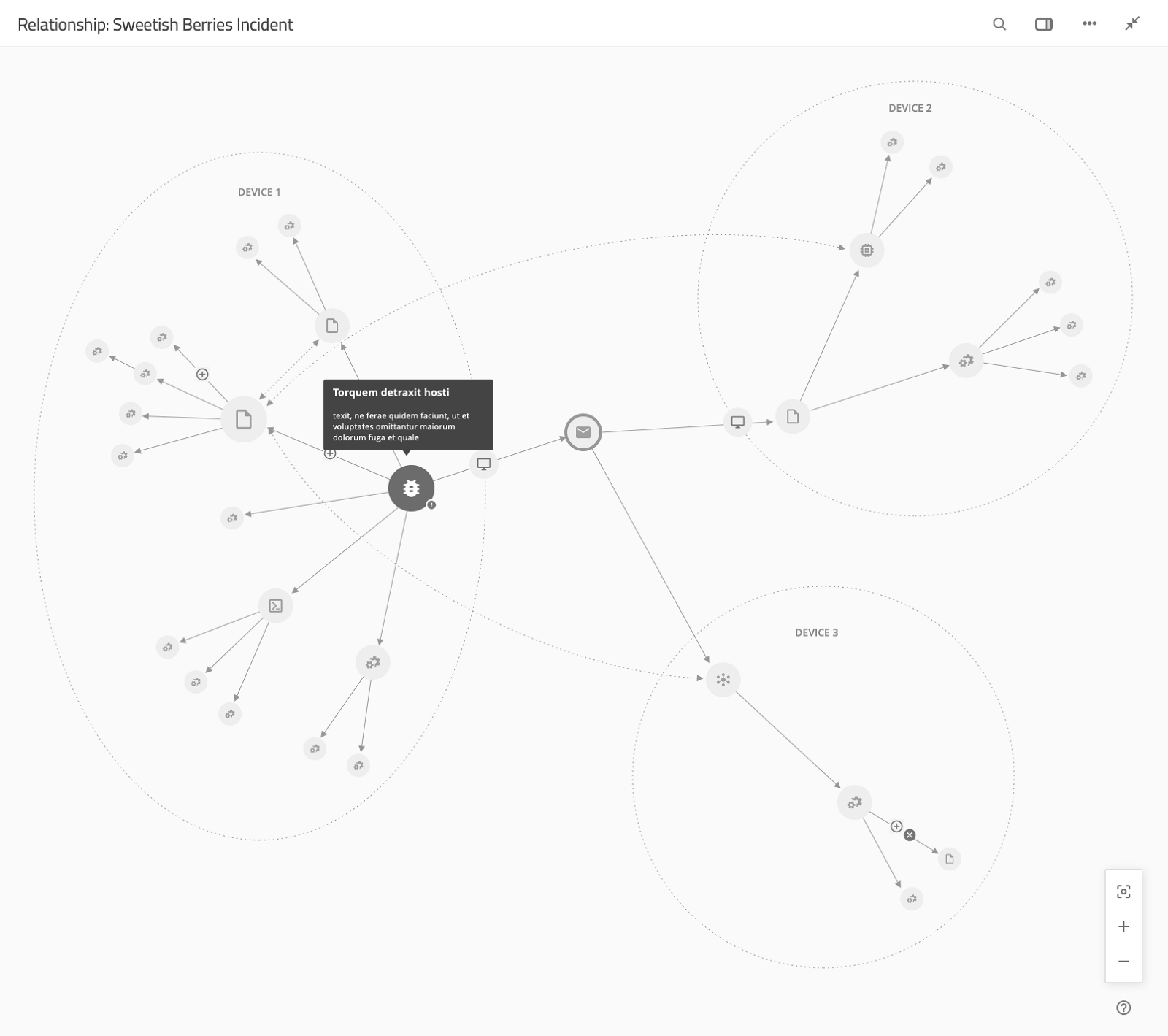
An incident topology view titled Relationship: Sweetish Berries Incident, with three dotted device boundaries labelled Device 1, Device 2 and Device 3, artifact nodes connected by solid and dashed edges showing propagation between them, a tooltip open on one node, and zoom and fit controls
Cross-device propagation, drawn as it actually behaves. Device boundaries are dotted rather than solid because the interesting activity is the traffic across them. Lateral movement stops being an inference and becomes something you can point at.↗ open full size
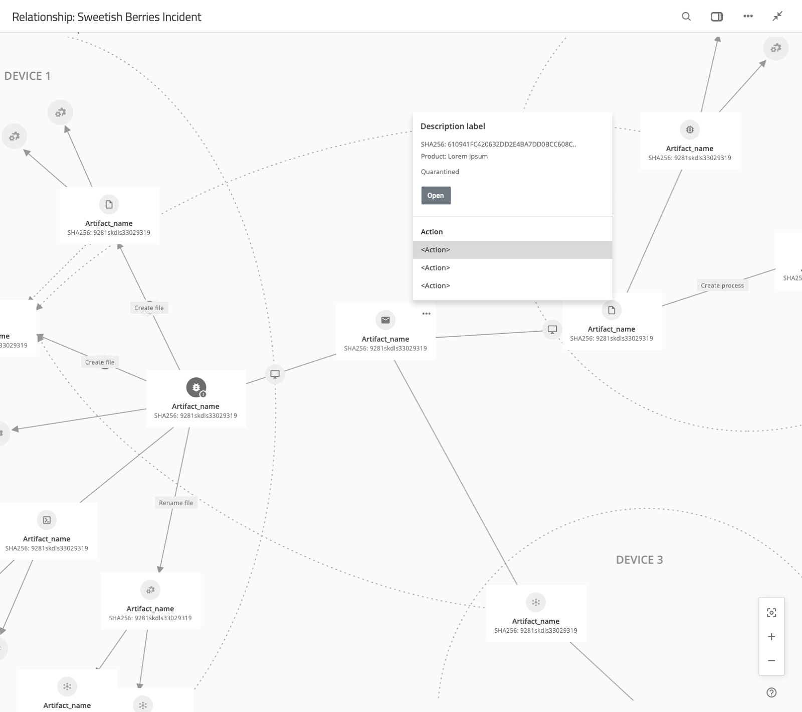
The same topology zoomed in, with artifact nodes labelled by name and SHA-256 hash, edges annotated with Create file, Rename file and Create process, and an open panel showing a description label, SHA-256, product, a Quarantined status, an Open button and an Action list
Node-level containment. Zoomed in, the edges carry the operation that created them, and the node panel exposes the hash, its quarantine state, and the actions available. The point is that containment happens here, at the moment of insight, rather than three screens away.↗ open full size
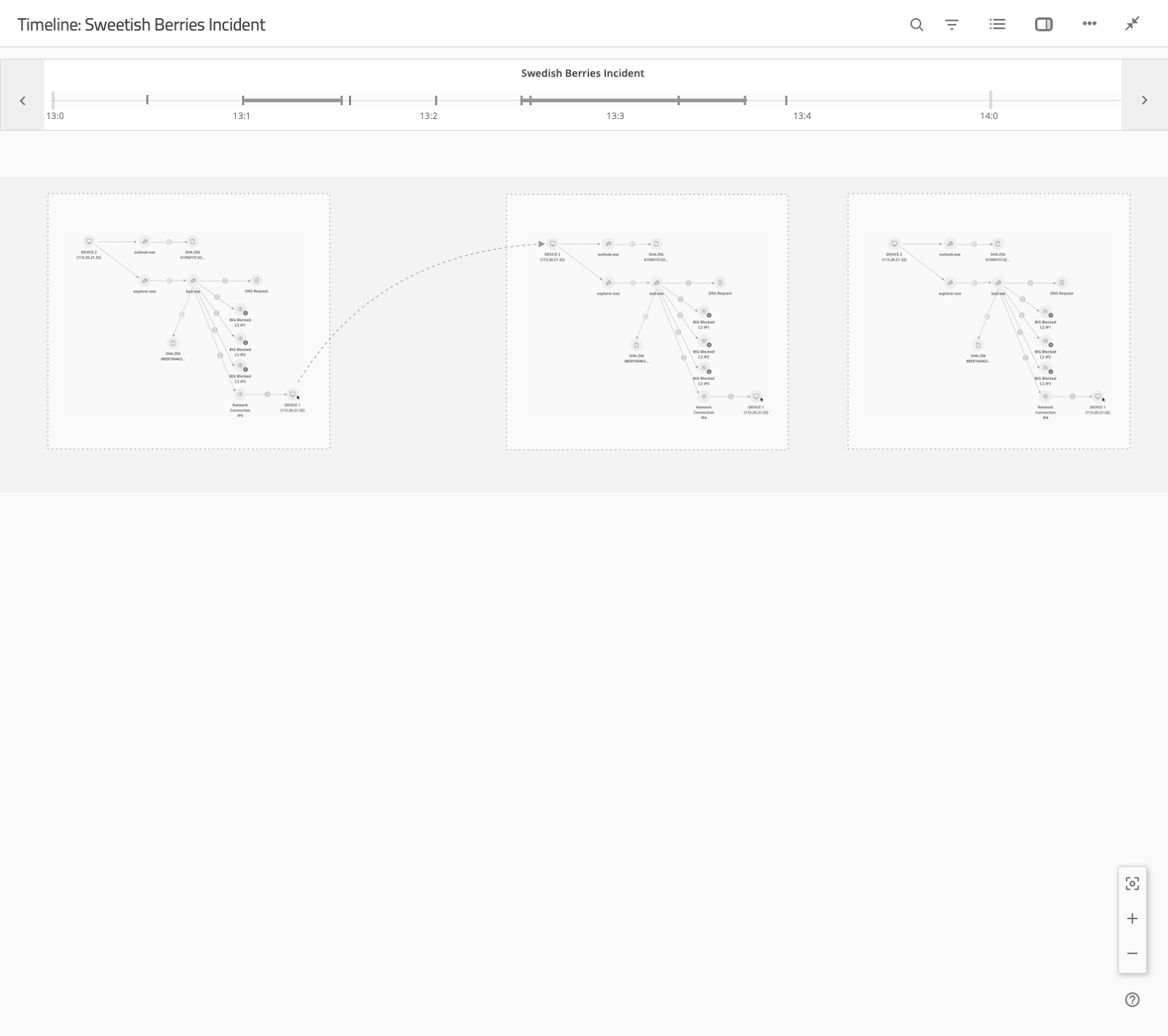
A temporal reconstruction view titled Timeline: Sweetish Berries Incident, with a scrubbable time axis from 13:0 to 14:0 above three sequential process-chain snapshots showing outlook.exe and explorer.exe spawning bad.exe, a DNS request, three blocked command-and-control IPs, and a network connection reaching Device 1
Temporal reconstruction. The same incident replayed along a scrubbable axis, so process execution, the DNS request, the blocked C2 attempts, and the jump to a second device fall into causal order. The graph answers what is connected. This answers what happened first.↗ open full size

09 · Measured

Mean time to detect
pilot
37% faster
Duplicate alert triage
incident-level clustering
down 28%
Dashboard engagement
after role templates and composition
3×
Widget duplication across products
governed registry
eliminated

Mean time to detect is the number that matters, because it is the one the fragmentation was inflating. Analysts were correlating across consoles manually, so every minute of that was detection time an attacker kept.

10 · Takeaways

01 Align the information model before you design a surface. Four products calling the same thing by four names cannot be fixed with navigation.
02 Configurability without governance becomes sprawl. The widget registry existed because we gave people composition first and watched duplication appear.
03 Roles are time horizons, not permission sets. A CISO and an analyst need the same data model rendered through different lenses.
04 A graph carries structural reasoning and a timeline carries causal reasoning. Investigations need both, because analysts are answering two different questions.
05 Put the action at the point of insight. Every context switch between seeing something and doing something about it is time an attacker keeps.
06 Design for shift handover, not for the demo. Real SOC work is continuous and the product has to survive the person changing.

Trade-offs

What I chose not to doWhyWhat it protected
Hiring a large central team up front Headcount without trust from product leads would have sat idle. Designers embedded in product lines, earning a seat early.
One mandated process for every group Each product line shipped on a different cadence. Shared principles and reviews, local rituals.
Research owned by each team in isolation Findings were getting repeated and lost. One shared research repository across the org.

Four consoles made the analyst the integration layer. That was the bug.
Envoy compliance integrity
Next case studyEnterprise design governanceRead the case study