Shafeen Alam
All work
BlackBerryEnterprise design governanceDesign systems

Six products that did not feel like one company

When I joined BlackBerry in June 2017 there was no formal design system. Customers told us moving between our products did not feel like the same experience, because it was not one. I proposed Material Design as a starting point, won engineering over before I won executives over, and spent six years turning it into 45 governed components. Then Figma arrived and we rebuilt all of it.
Role
Director of Product Design
Timeline
2017 to 2023
Scope
6 product surfaces, 3 platforms
Partners
Front-end engineering, Product, HR
case.md
$ cat outcome
components: 45 documented
maintained: 6 years
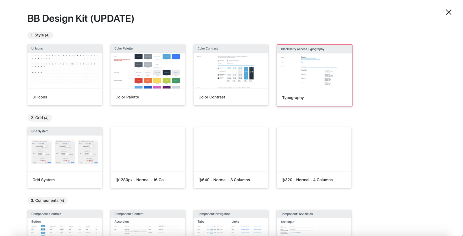
The BB Design Kit published in InVision, organized into numbered sections: Style with UI Icons, Color Palette, Color Contrast and Typography; Grid with a grid system and 1280, 640 and 320 pixel column definitions; and Components with Controls, Content, Navigation and Text fields
The published kit. Style, Grid, then Components, each bucket numbered and countable, because a system nobody can navigate is a folder.↗ open full size
Why it mattered

Customers moving between products felt like they were dealing with different companies.

60-second read

Problem

No formal design system. Products looked and behaved differently, and customers told us it did not feel like the same company moving between them.

System decision

Start from Material Design rather than inventing a language, so there was something to scale and customize instead of a blank page.

My contribution

Proposed it, won engineering and executive buy-in, ran the audit and interviews, published it, and chaired the working session that kept it alive for six years.

Outcome

45 documented components with full prop and state matrices, built with front-end, and rebuilt from scratch after the Figma migration.

01 · Shipped

A governed component library co-owned by design and front-end, published where the whole organization could reach it, and maintained through a weekly intake for six years.

45
components documented with full variant, size and state matrices
6 years
of continuous governance, not a one-time deliverable
3 months
to rebuild the entire library after the Figma migration

02 · What customers were telling us

Our experiences did not feel like one family. They lacked consistency, and the feedback we kept getting from customers was blunt: it did not feel like the same experience. Things behaved differently and looked completely different when you moved from one product to another.

That is not a visual complaint. A customer who has learned one of your products should not have to relearn navigation, states, or terminology to use the next one. Inconsistency is a tax you charge your own users.

What I set out to do

Bring the work under one central team. Establish one style through a single design system. Standardize the process and the tools so iteration got faster, delivery got predictable, and feedback had somewhere to go.

The team rebuild is its own story. This one is about the system.

03 · Buying a starting point

After many discussions with executive management, and especially with the very large engineering development organization, I proposed we use Google's Material Design as the basis. Not as the final answer, but as a starting point we could scale and customize along the way.

Designing a proprietary language from nothing would have made the first argument about aesthetics. Adopting a credible public one made the argument about adoption instead, which is a much easier argument to win and a much faster one to start.
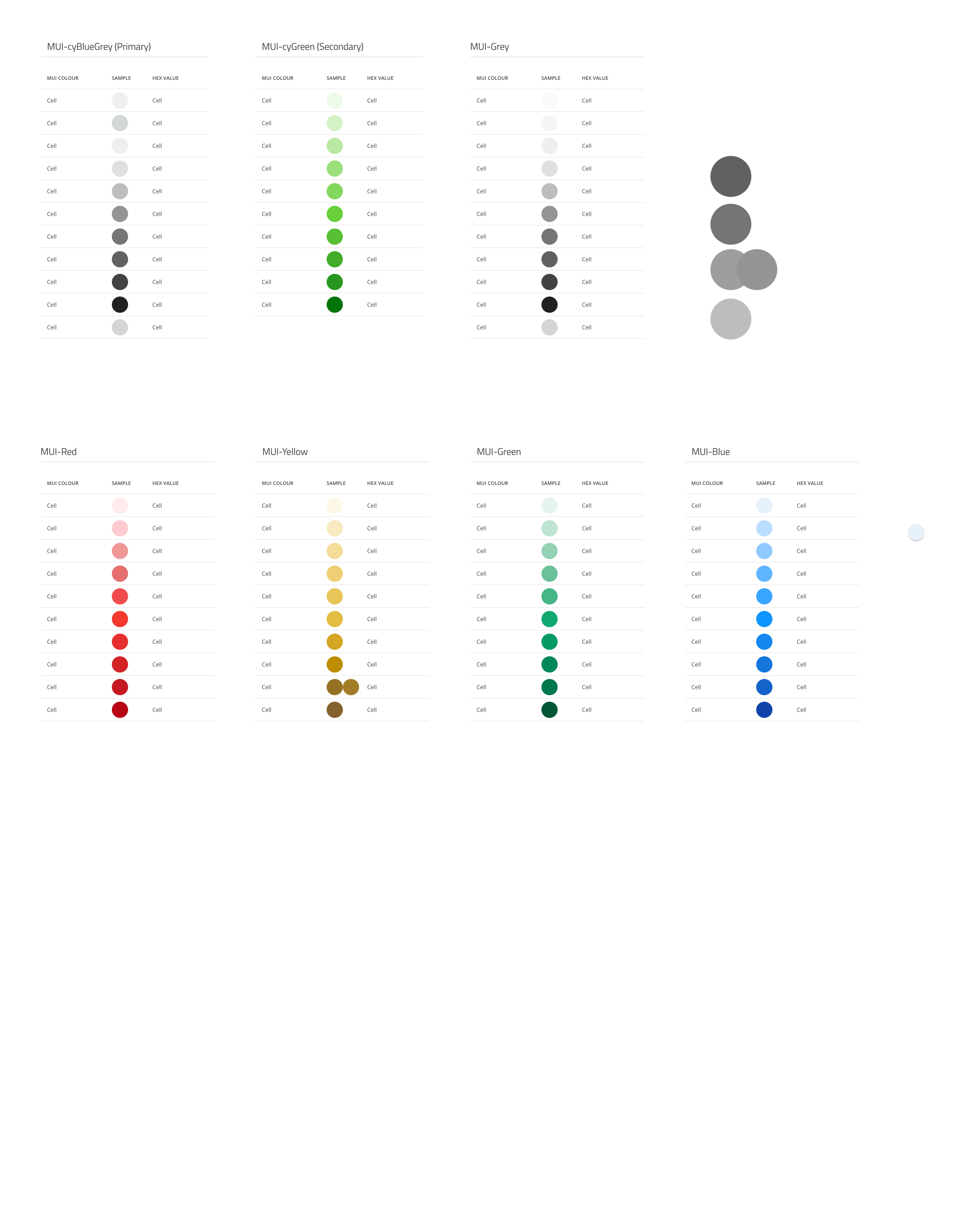
A specification of MUI theme color ramps, with cyBlueGrey as primary and cyGreen as secondary alongside Grey, Red, Yellow, Green and Blue scales, each laid out as a table of color name, sample swatch and hex value
Material's theme structure, remapped to BlackBerry. cyBlueGrey as primary and cyGreen as secondary, with every supporting ramp defined as a table of name, sample, and hex so there was one place to look.↗ open full size

04 · Three steps before building anything

Step 01

Internal audit

We catalogued every component and behavior across every product surface and sorted them into logical buckets, structured the way Atomic Design structures them. You cannot consolidate what you have not counted.

Step 02

Stakeholder interviews

I interviewed stakeholders to map expectations and find shared goals. The real outcome was a partnership with engineering, because that is who would have to build it with us.

Step 03

A publishing plan

We picked the easiest path to distribution rather than the most sophisticated one. InVision, because the org was already there for specs and designs, so the system was accessible on day one.

First we had to define the words

Before the organization could formalize anything, we had to answer three questions in writing. Obvious in hindsight, and the reason the proposal survived contact with people outside design.

  1. What is a design system?
  2. What is the difference between a design system and a pattern library?
  3. What goes into a design system?

Then I deliberately narrowed the first release to three things: navigation, color, and iconography. Enough to be visibly useful, small enough to finish.
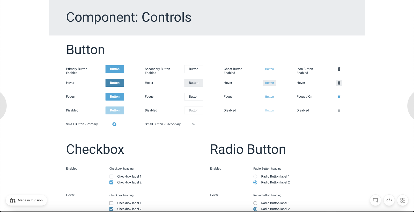
An InVision page headed Component: Controls, specifying Button in primary, secondary, ghost and icon variants each across enabled, hover, focus and disabled states, plus small button variants, and Checkbox and Radio Button with enabled and hover states
The early library in InVision, before any tooling sophistication. Four button variants across four states each, then checkbox and radio. Every state drawn rather than described, which is the whole difference between a system and a mood board.↗ open full size

05 · Expanding it

Once the first three were refined, we expanded. We collaborated with development to build out a Storybook while the design team built the library in Sketch, and the documentation grew to cover the thing most libraries skip: the anatomy and the per-product scoping.
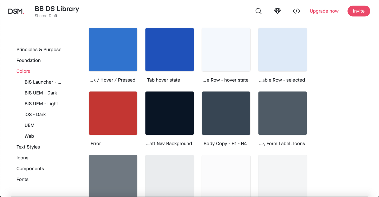
A design system manager view of the BB DS Library colors, with a left navigation listing Principles and Purpose, Foundation, Colors with sub-entries for BIS Launcher, BIS UEM Dark, BIS UEM Light, iOS Dark, UEM and Web, then Text Styles, Icons, Components and Fonts, beside named swatches including tab hover state, table row hover, table row selected, error, left nav background and body copy
Color, scoped per product and per theme. BIS Launcher, BIS UEM dark and light, iOS dark, UEM, and Web each get their own set, and every swatch is named for its job rather than its hue. This is what solving the disjointed-products problem actually looks like underneath.↗ open full size
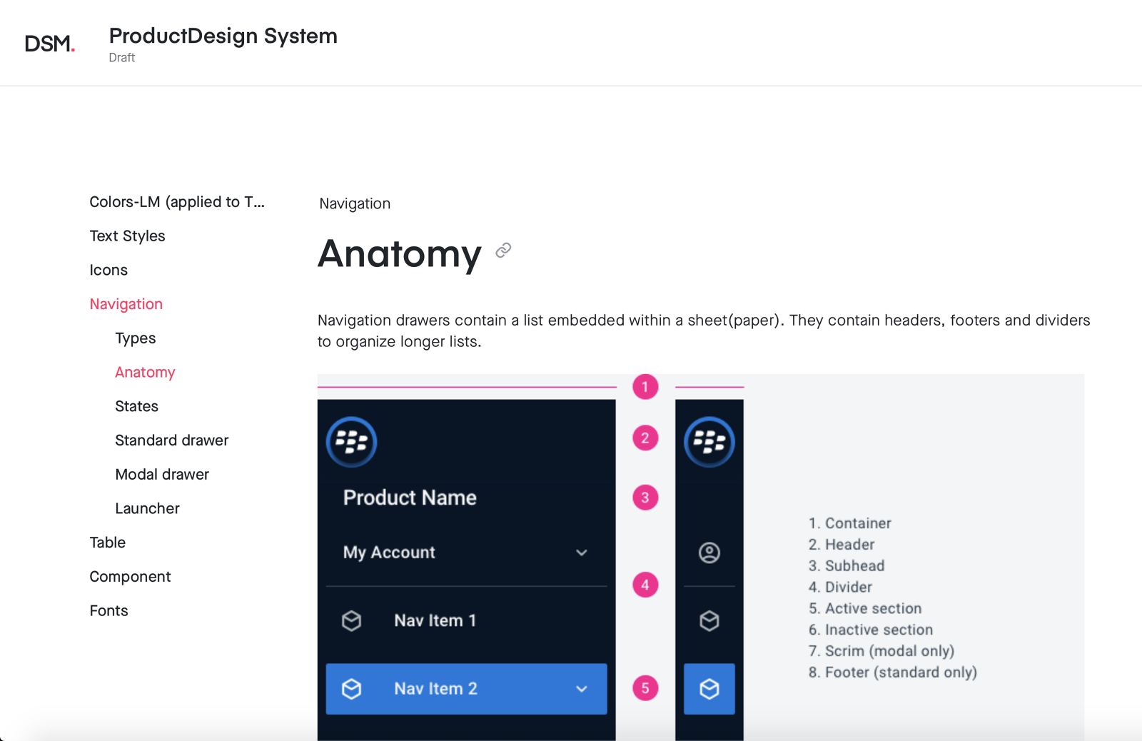
A design system page documenting navigation drawer anatomy, with a standard and a collapsed drawer annotated one through eight and a legend naming container, header, subhead, divider, active section, inactive section, scrim for modal only, and footer for standard only
Navigation anatomy, numbered and named down to which parts exist only in the modal variant and which only in the standard one. Components are easy. Documenting the parts so two teams describe them the same way is the part that scales.↗ open full size

06 · Keeping it alive

A design system is never truly done. It is fluid, and it changes as the design evolves, which means the governance matters more than the library.

Weekly working session

A standing meeting with the design team plus our product and engineering counterparts. It functioned as an intake: new components introduced, existing ones optimized, decisions made in the room.

Front-end pairing

Each designer worked directly with front-end to prioritize components, so a pattern went live roughly as the design was finished rather than months later.

Jira tickets

Every component tracked with an owner and a deadline. Unglamorous, and the reason the system did not quietly stall.

07 · Then we migrated to Figma

The part that did not go to plan

All of it went well until we moved to Figma and discovered we could not meaningfully migrate the Sketch library. There was no import path that preserved what we had built. We would have to rebuild it.

Six years of accumulated decisions, and the tooling change reset the artifact. Not the decisions, which is the saving grace of having documented behavior rather than appearance, but every component had to be rebuilt by hand.

Three months, one component at a time

  1. Imported each existing component one at a time.
  2. Observed exactly where it broke rather than assuming.
  3. Made the necessary structural changes, since Figma components are not Sketch symbols.
  4. Shared progress regularly so teams could test drive it and tell us what was wrong.
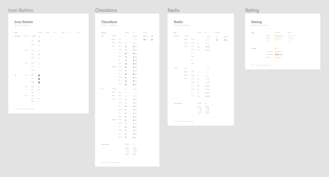
Four Figma component specification pages laid out side by side, titled Icon Button, Checkbox, Radio and Rating, each a dense matrix of variants and states
The rebuild, in progress. Each component became its own documented page again, which is roughly when the three months started to feel worth it.↗ open full size

08 · Where it landed

45 components, each documented as a full matrix rather than a happy-path example. Variant, size, icon placement, and state, crossed against each other and drawn. These are on MUI 5, which is the Material foundation from the original 2017 proposal, six years and one tool migration later.
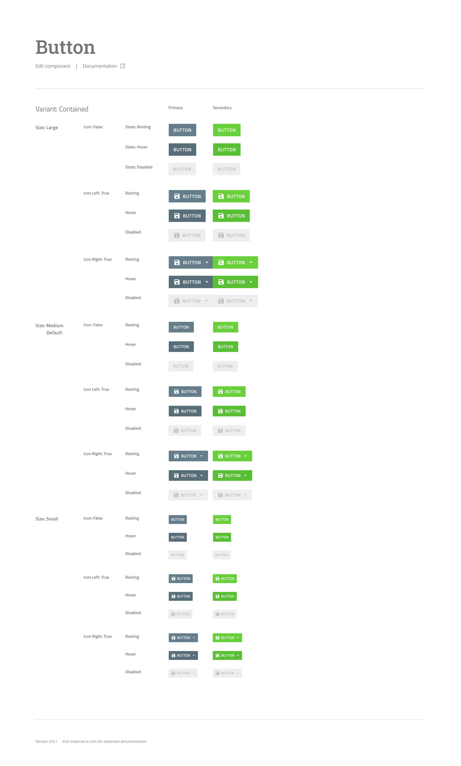
A Figma specification page for the contained button variant, crossing large, medium and small sizes against no icon, icon left and icon right, each in resting, hover and disabled states, for both primary and secondary colors
Button, contained variant only. Three sizes against three icon configurations against three states, in two colors. Fifty-four cells for one variant of one component, which is why nobody improvises a button once this exists.↗ open full size
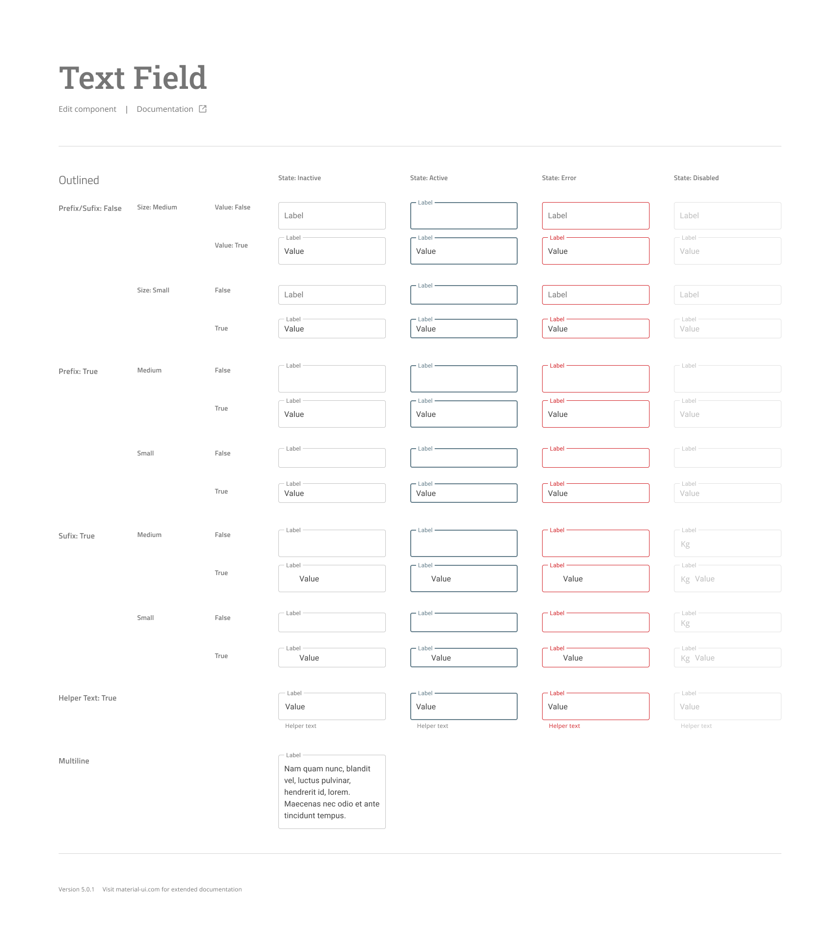
A Figma specification page for the outlined text field, crossing prefix and suffix options and medium and small sizes against inactive, active, error and disabled states, with helper text and multiline examples
Text field, outlined. Prefix and suffix, two sizes, empty and filled, across inactive, active, error, and disabled, plus helper text and multiline. The error column is the one that saves you in production.↗ open full size
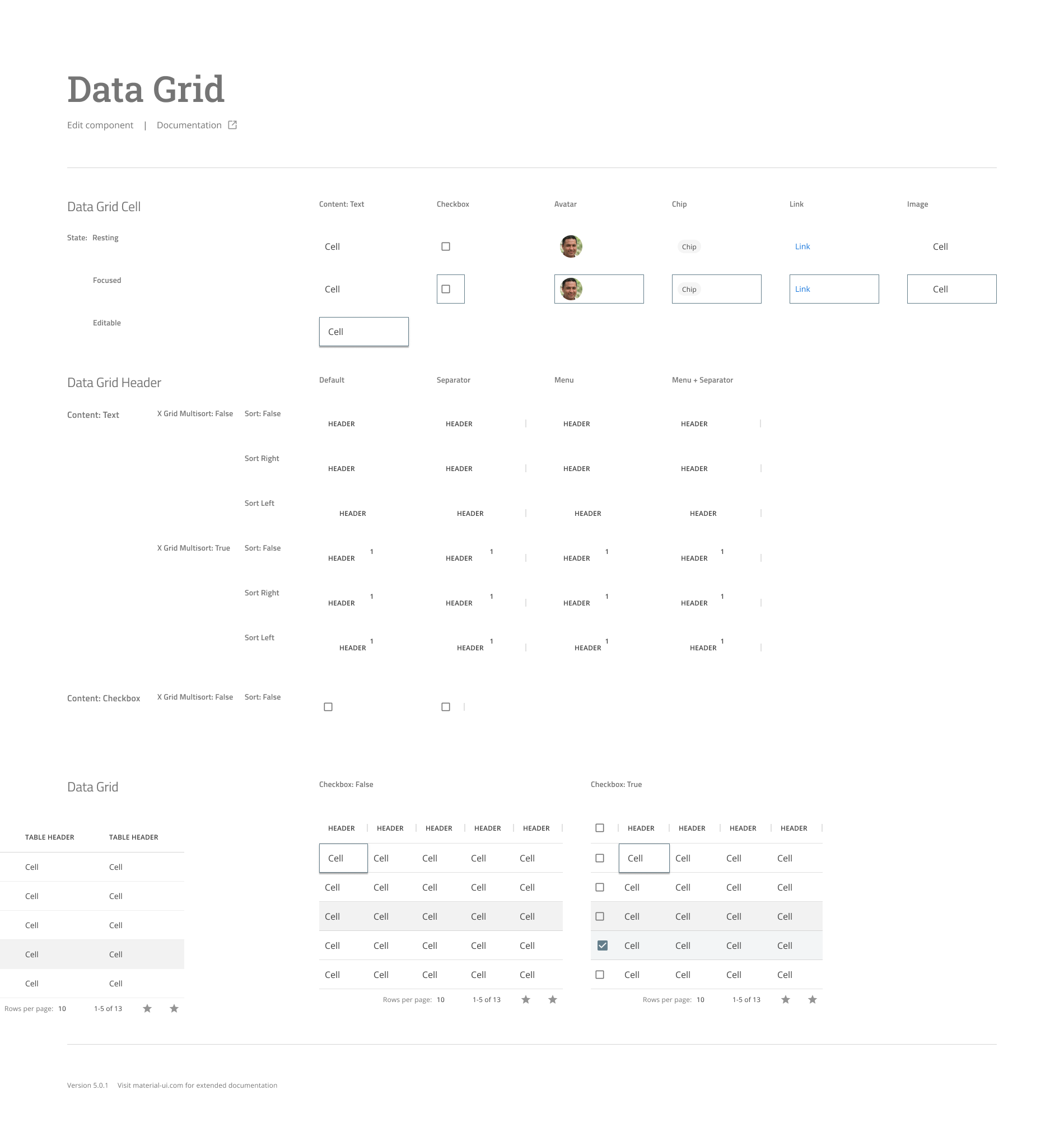
A Figma specification page for the data grid, documenting cell content types including text, checkbox, avatar, chip, link and image across resting, focused and editable states, header sort and multisort behaviors, and assembled grid examples with and without checkboxes
Data grid, specified from the cell up. Six content types across three cell states, then header sort and multisort behavior, then the assembled grid. Enterprise products live or die on this component.↗ open full size
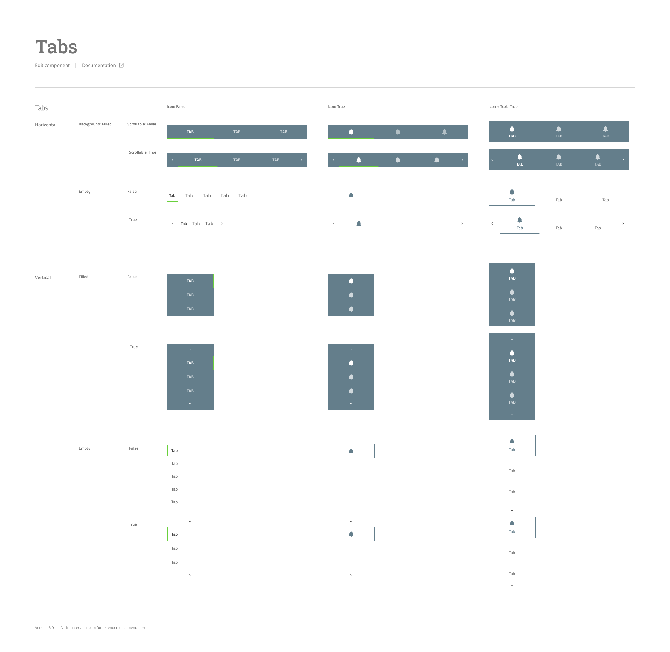
A Figma specification page for tabs, documenting horizontal and vertical orientations across filled and empty backgrounds, scrollable and non-scrollable, with icon only, text only and icon plus text configurations
Tabs, horizontal and vertical, filled and empty, scrollable and not, with icon, text, or both. The scroll affordances are drawn rather than left to the implementer, which is the kind of detail that makes six products agree.↗ open full size

09 · What changed

For customers

  • Products started to read as one family rather than six acquisitions.
  • Navigation and states behaved the same way across surfaces.
  • Learning one product made the next one easier instead of neutral.

For the team

  • Designers and front-end shared one source of truth and one vocabulary.
  • Components shipped roughly as the design finished, not months after.
  • New work started from existing patterns rather than a blank file.
  • A standing intake meant the system absorbed change instead of decaying.

The library was the artifact. The weekly working session with product and engineering in the room was the actual system.

10 · Takeaways

01 Do not invent a design language when a credible one exists. Starting from Material Design meant the argument was about adoption, not about taste.
02 The audit is the persuasion. Showing executives how many different buttons we shipped was more effective than any slide about consistency.
03 Engineering has to co-own it or it is a style guide. I pitched the value in their terms, shared codebase and shared components, before I pitched it in mine.
04 Publish where people already are. InVision was not the best tool, it was the one nobody had to be convinced to open.
05 Define the vocabulary first. We had to formally answer what a design system even is before the org could agree to build one.
06 A design system is never done. The weekly working session, not the library, is what kept it true for six years.
07 Tool migrations cost more than anyone budgets for. Three months to rebuild what already existed, and the only way through was one component at a time.

Trade-offs

What I chose not to doWhyWhat it protected
Mandating adoption by decree Forced adoption breeds workarounds. Made the system the easiest path, so teams chose it.
Per-product component forks Forks drift within months. One source of truth with themed variants.
Documenting everything before release Waiting for completeness would have delayed value by quarters. Core components shipped first, docs grew with use.

Consistency is not a visual preference. It is the difference between learning a product once and learning it six times.

How I rebuilt the team The Interpres system
Next case studyPersonalized college matching engineRead the case study