Shafeen Alam
Matching students to colleges that would actually fit them
Students leave college because it turned out to be unaffordable, because they were not prepared, or because the place was never a good fit. Those are decisions made in high school, mostly unaided. I led design on a 0 to 1 product to make that decision better, built on 200 student interviews and a change to how the team worked.
The choices that lead students to drop out are made in high school, with almost no help.
60-second read
Students drop out because college was unaffordable, they were not prepared, or the school turned out not to fit them. All three are decisions made in high school, with almost no help.
Match on fit rather than rank, and show the reason for every match, so a student can judge whether the reasoning applies to them.
Hands-on design manager across three verticals. Framed the hypotheses, ran the research program with 200 students, and changed how the team worked.
2,000 organic downloads in two weeks. 88% took the quiz, 41% converted, and on the school page that followed, add-to-list conversion went from 5% to 11% against a 10% goal.
01 · Shipped
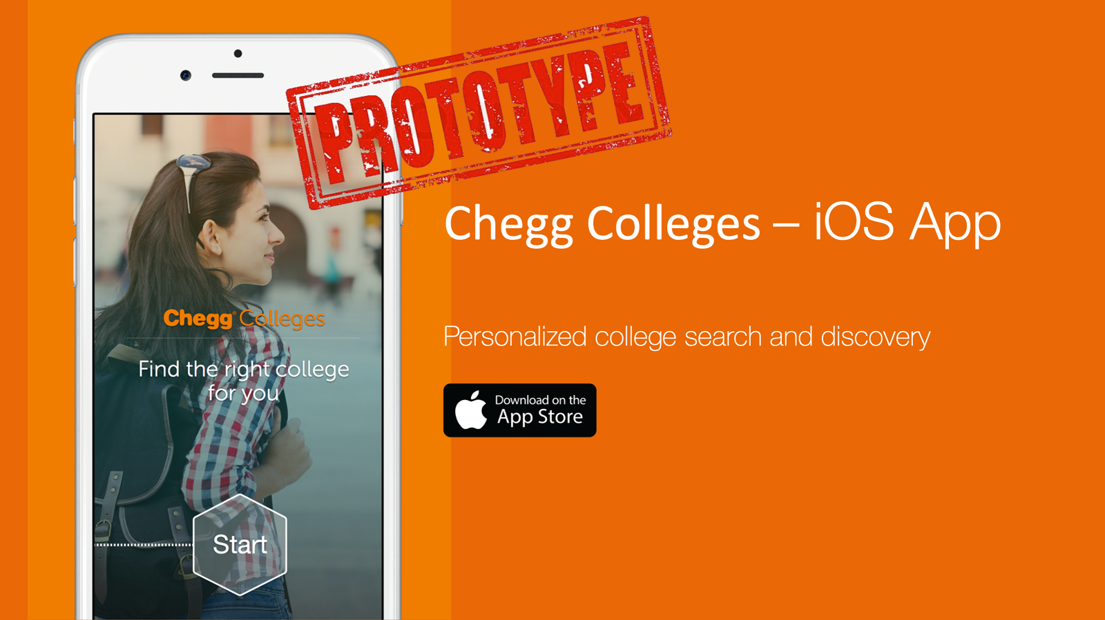
A prototype on the App Store on April 20, 2015, deliberately shipped as a proof of concept rather than a finished product. It reached 2,000 organic downloads inside two weeks.
02 · Why it
matters
The top reasons students drop out of college are affordability, not being academically or mentally prepared, and the realization that the school they chose was never a good cultural fit. All three are consequences of a decision made in high school, usually with a ranked list and a campus visit.
So the objective was not a better college search. It was helping a student find the college where they had a higher chance of both getting in and succeeding once there. Fit, not rank.
Vision
Become the essential destination for all high school students seeking college entrance.
Strategy
Unlike other services, Chegg helps students and parents discover and get into their best fit schools.
03 · A 0 to 1
audience
High school students were a very small slice of Chegg's users, and most of them arrived through the acquisition of Zinch, a scholarship search site. So we were not iterating on an existing relationship. We were introducing the company to an audience that had no reason to know it, at the single highest-stakes moment of their academic lives.
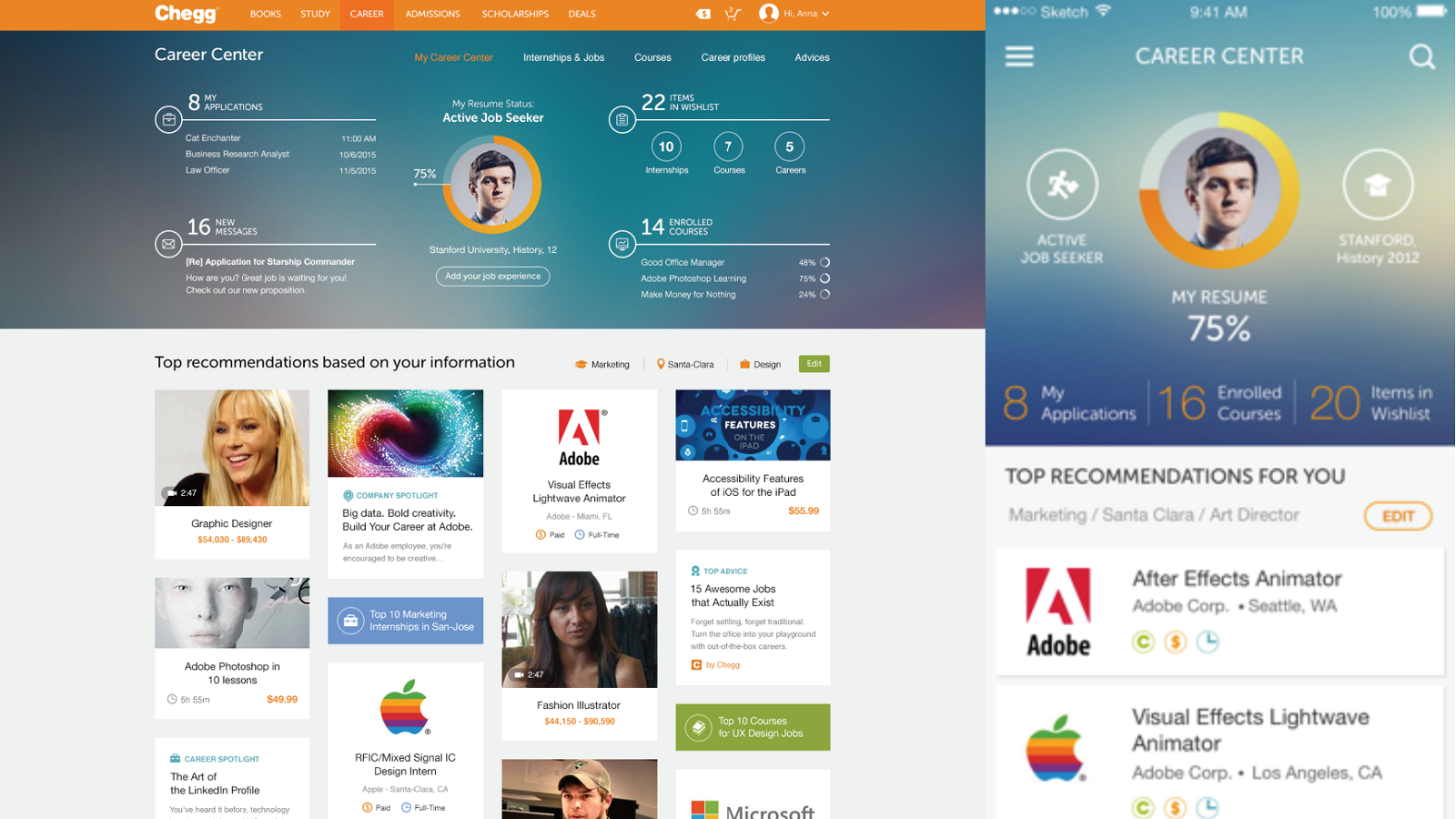
I managed three verticals at the time: Admissions, helping high school students find their best-fit college; Careers, helping college students land a first internship or job; and Enrollment Services, the business-to-business side. This is the Admissions story, and the Career Center work is its sibling.

04 · Four
hypotheses
Rather than scope a product, we built the simplest flow that could test whether the product should exist. Four hypotheses, ordered so the cheapest thing to be wrong about came first. The right column is what the launch data said about each.
Hypothesis · Verdict
05 · Research, and what
came out of it
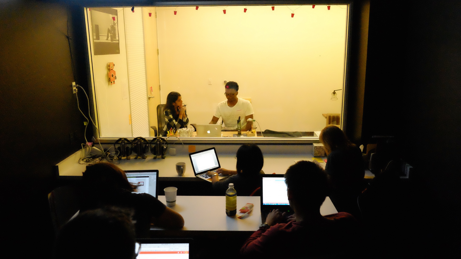
We then ran the largest research effort the company had done: over 200 students across three months, with a researcher on the team rather than borrowed. Testing focused on two things only, feature sets and messaging.
What we collected on behavior
- How they researched colleges, and which schools they were drawn to
- Intended major
- Which resources and devices they used, phone against computer
- How they gathered application requirements
- What they were most excited about, and most worried about
- How they planned to pay for school
- Five words they would use to describe their own search
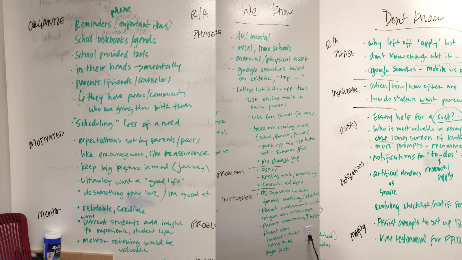
Then we sorted it three ways
What we know. What we do not know. What we still want to find out. Identifying the user stories, tasks, questions, and emotions students felt across the search and application experience is how the larger themes appeared, and the themes are what we built feature sets around.
To settle what we were actually making, we ran one deliberately blunt exercise: complete the sentence “this is an app that ____.” It is harder than it sounds, and it ends arguments. What we landed on: this app helps students discover and get matched to colleges that are the best fit for them.
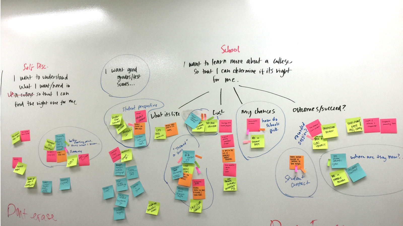
Research only counts if it survives the trip into artifacts a team can build from. Four did the work here, and the journey map was the one everything else hung off.
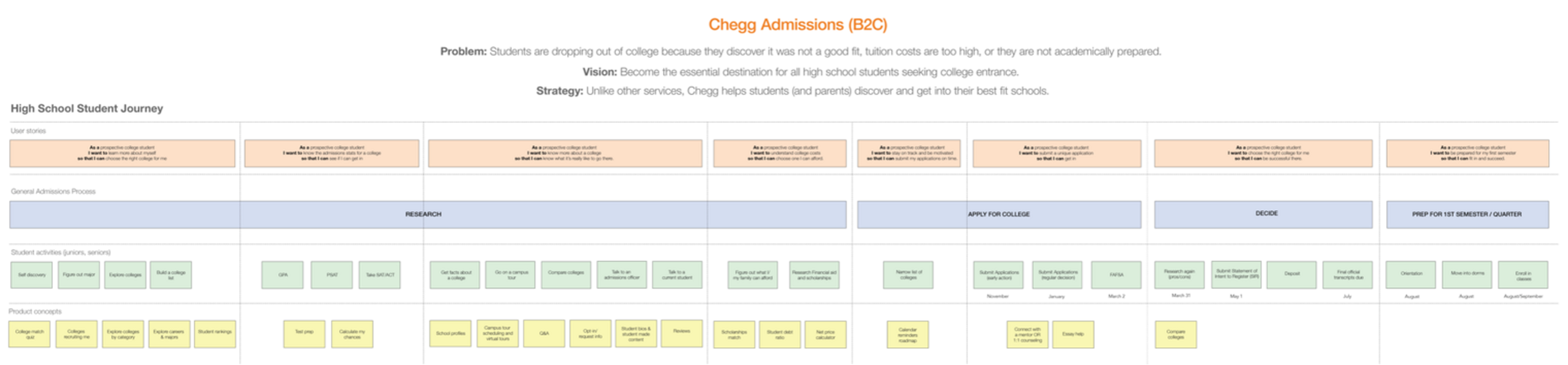
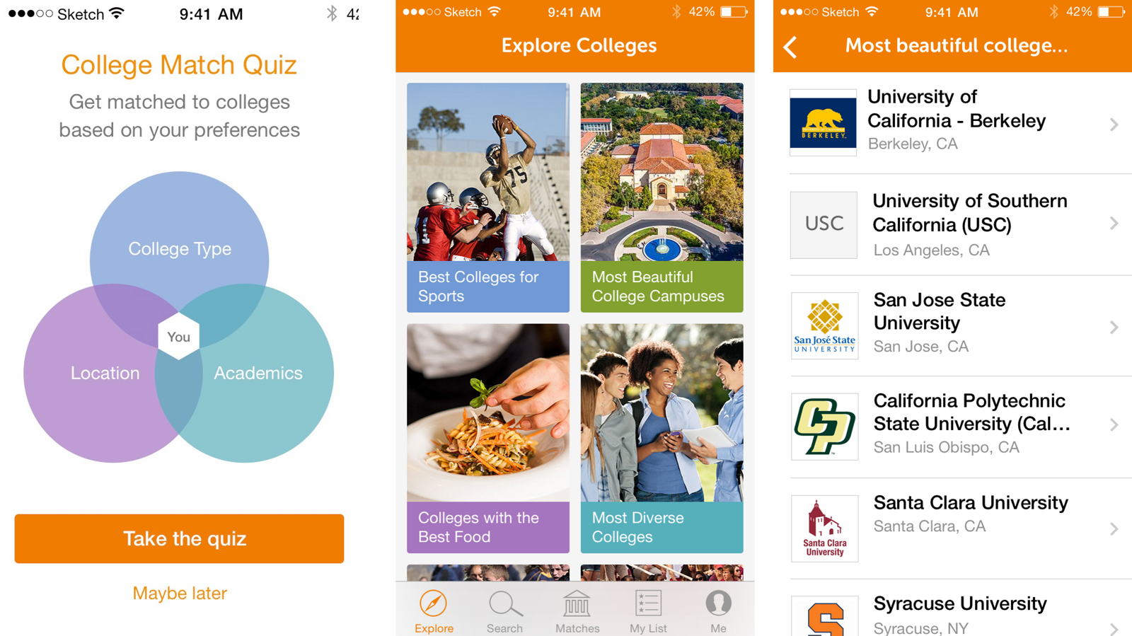
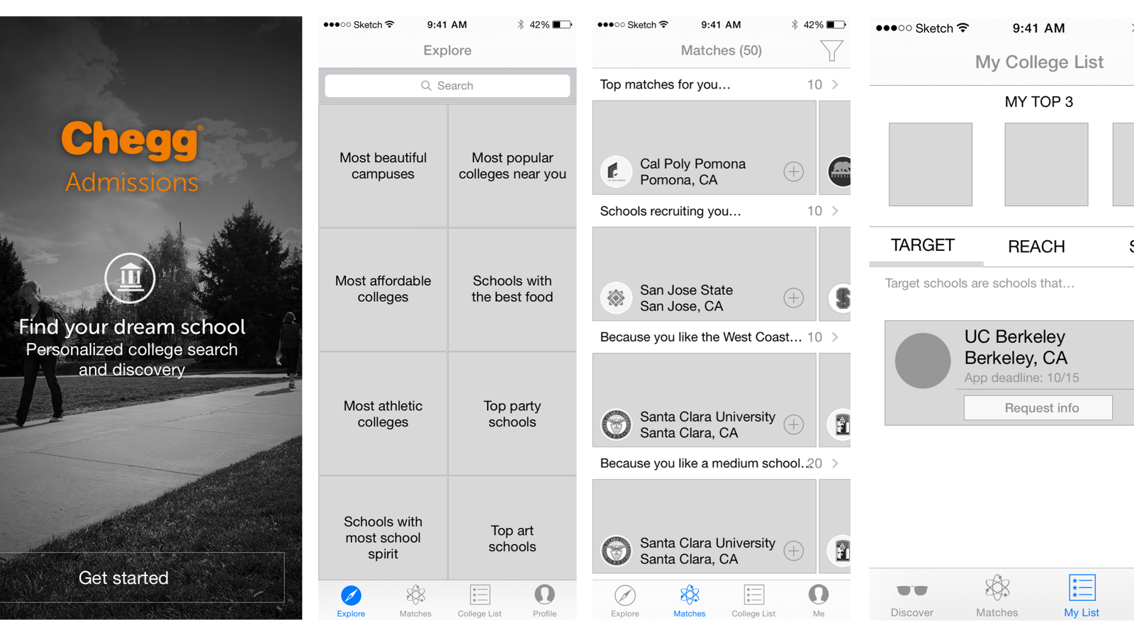
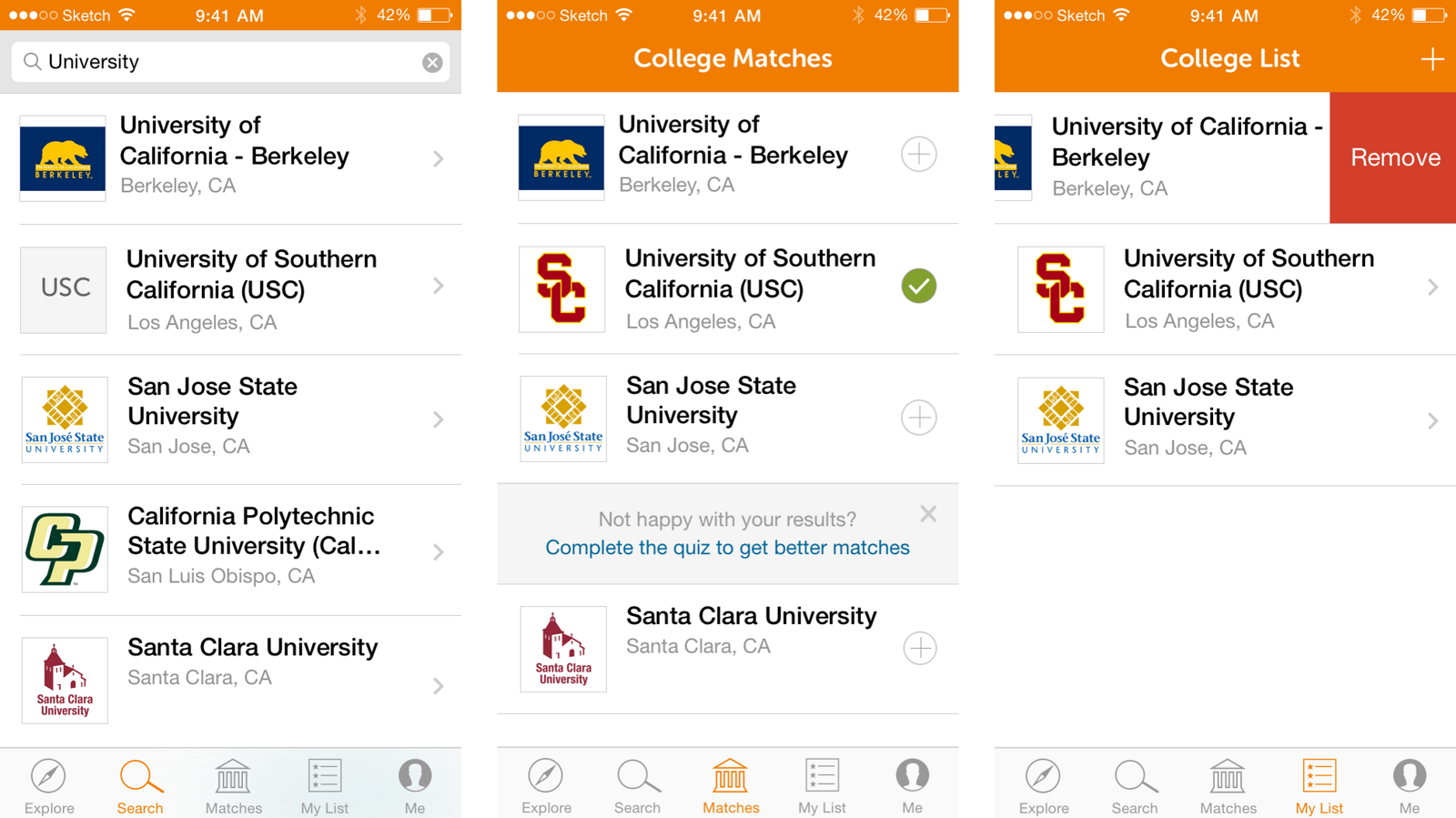
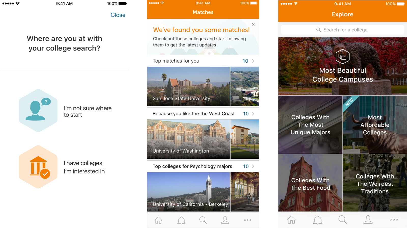
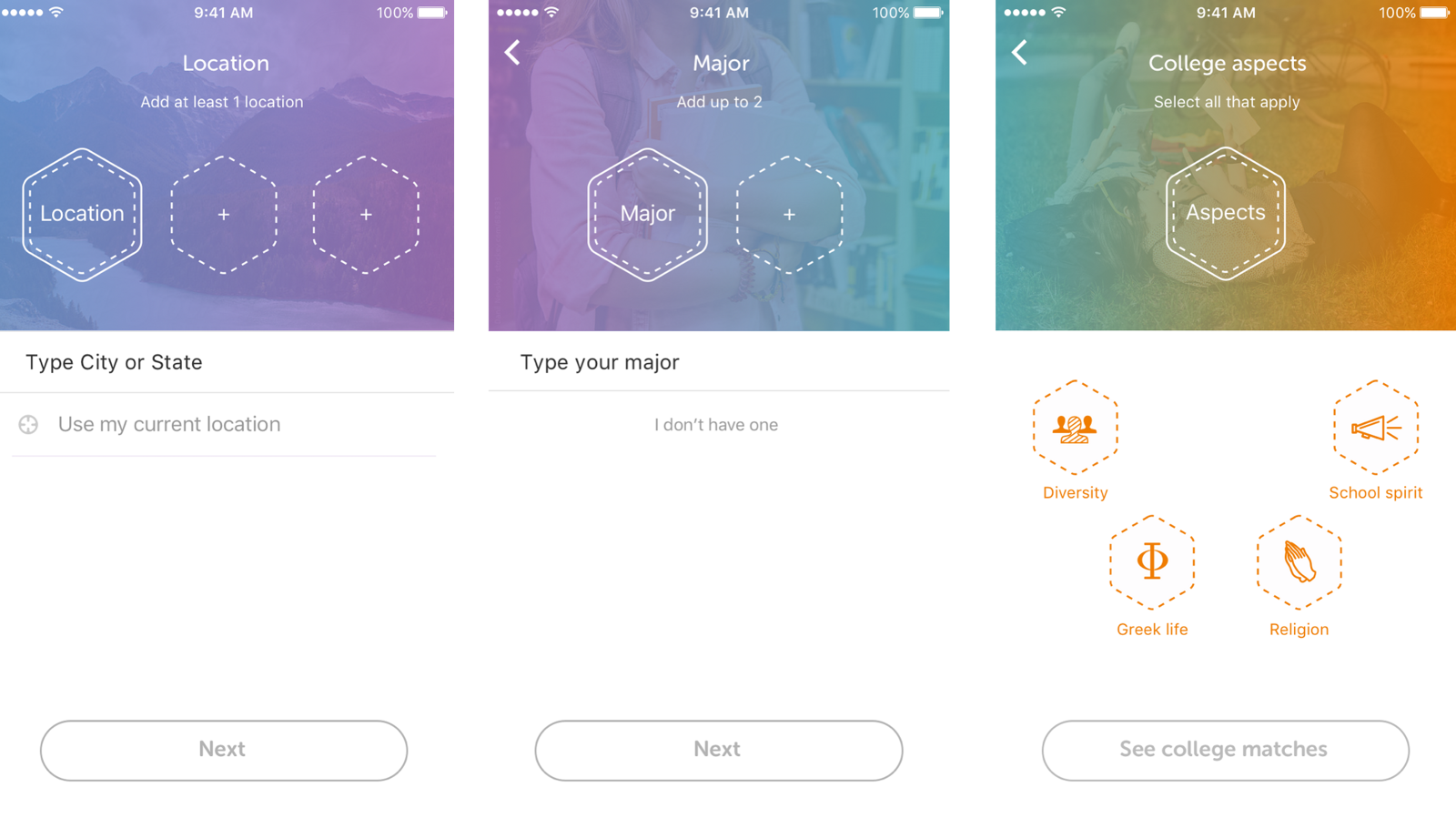
Two of those yellow concepts, “college match quiz” and “explore colleges by category,” are the first two screens of the shipped app at the top of this page. A third, “student bios and student made content,” is the one that later turned out to be the whole differentiator.
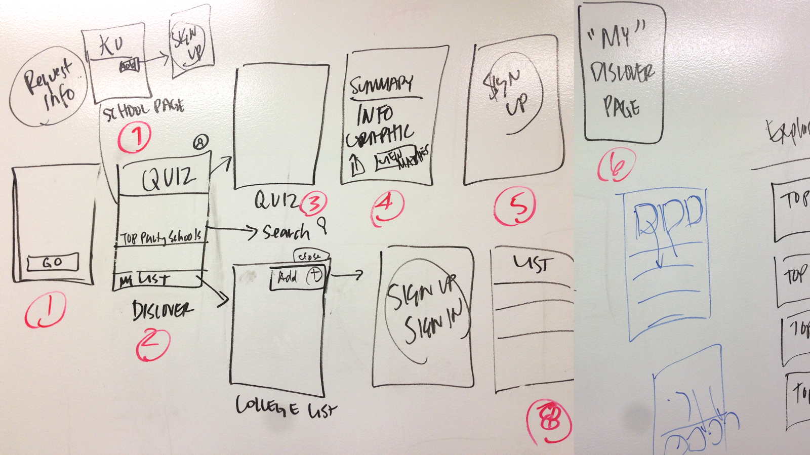
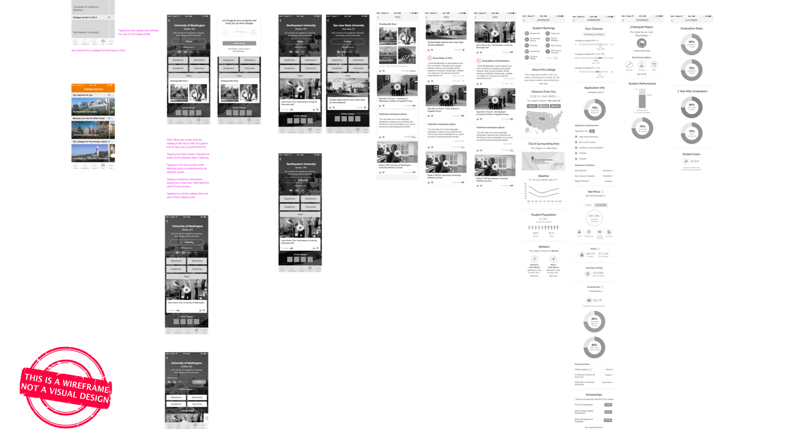
The flow, wireframed end to end
Stamped “this is a wireframe, not a visual design,” which saves a week of the wrong conversation. The pink annotations carry the interaction rules, down to what tapping the plus symbol under Matches does.
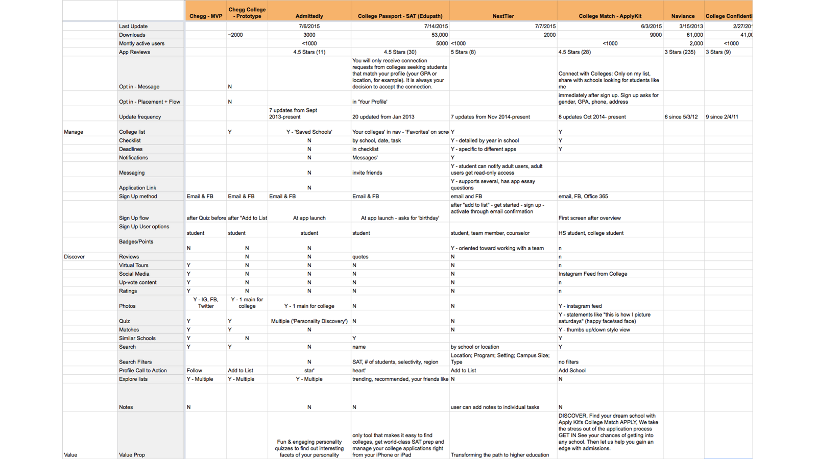
Competitive analysis, on value rather than parity
Competitors were entering constantly, so we tracked eight products across Manage, Discover, and Value. The point was never feature parity. It was finding the row where we could be different in a way that mattered.
06 · Changing how
we worked
What we were doing
Mini-waterfalls. The product manager wrote requirements, handed them to a designer, who produced designs and then specs, which went to development to build and test. And every week the requirements changed.
Part of a good process is recognizing when it needs to change. This was the actual bug, and better design would not have fixed it.
What we changed to
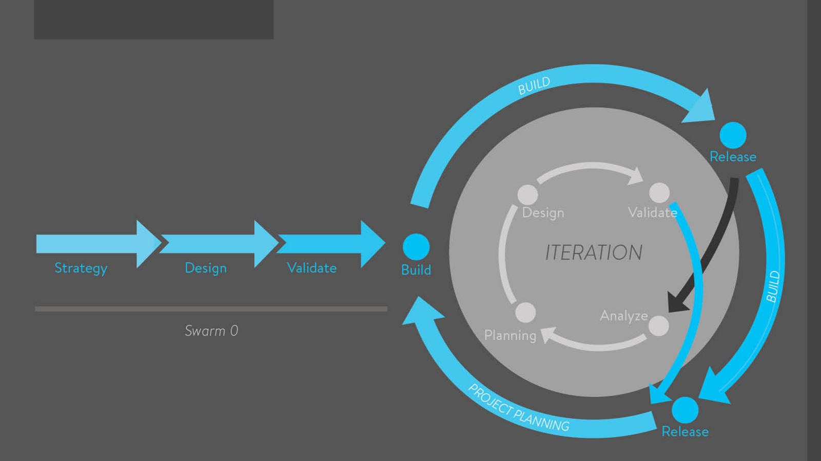
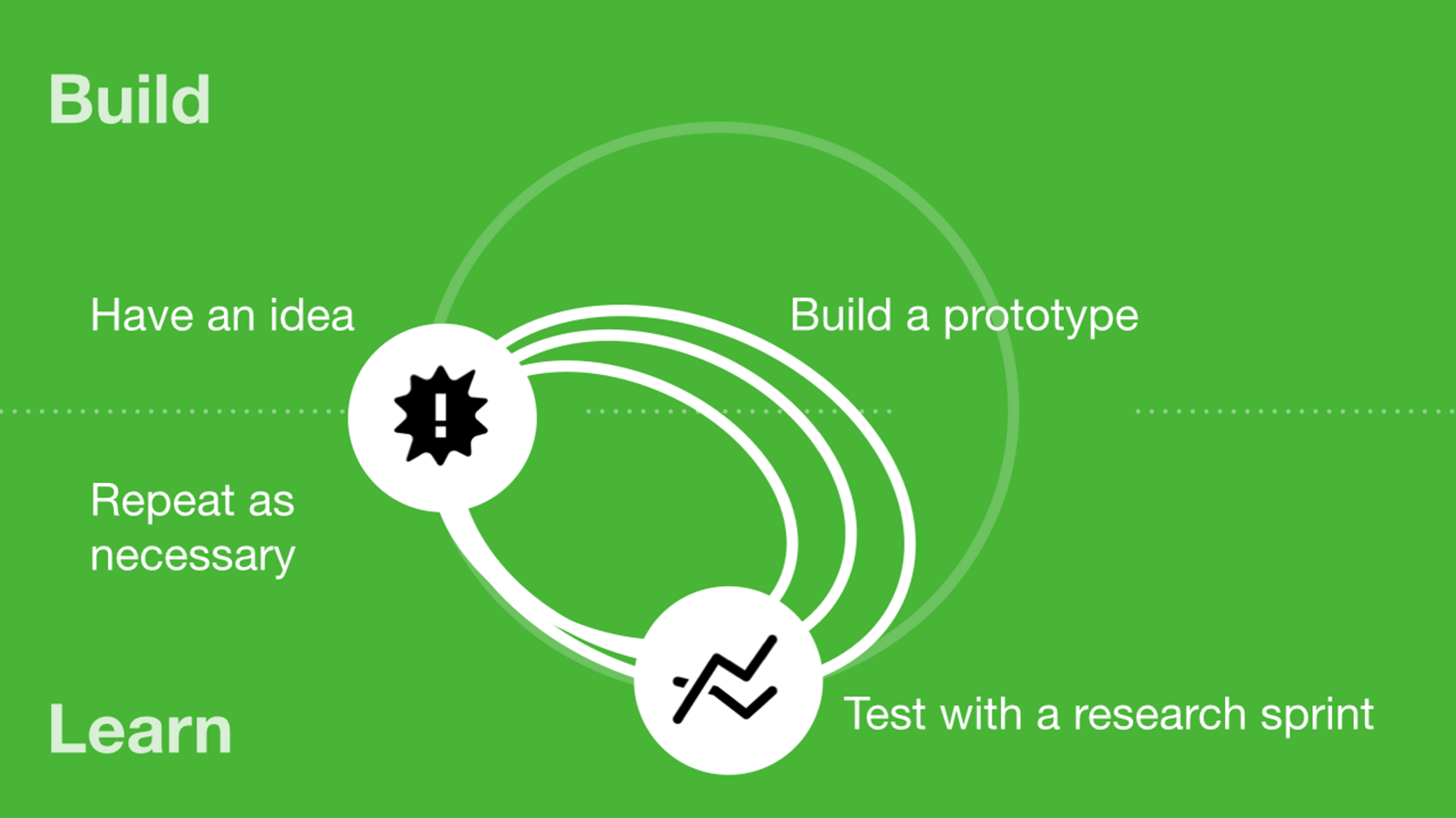
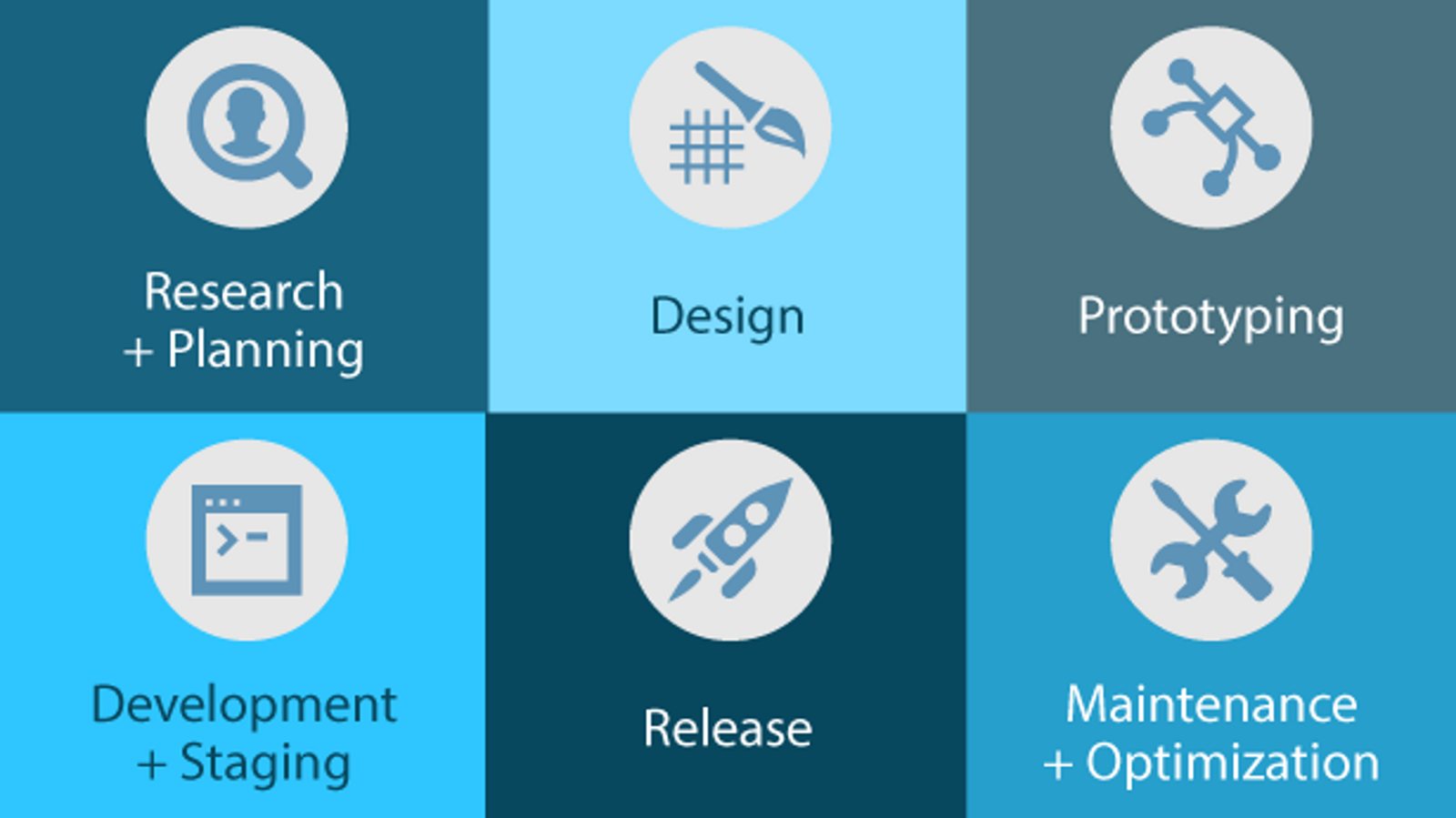
Dual-track agile. Discovery ran alongside delivery, with the focus on prototyping and validating as fast and as cheaply as possible before anyone wrote production code.
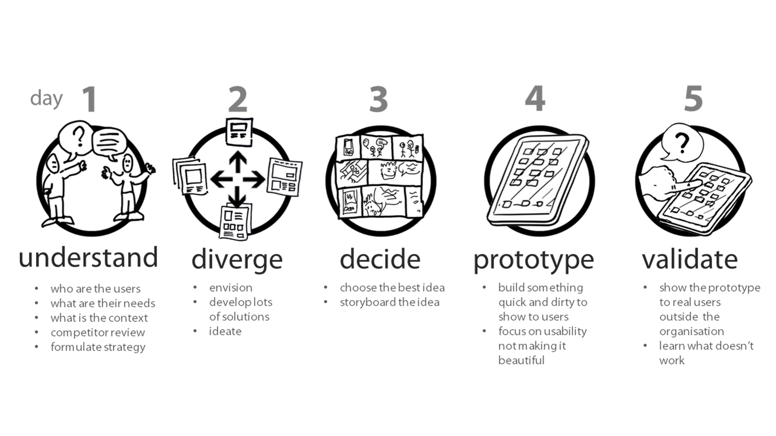
Less about each role finishing its step and handing over, more about working side by side to create and validate together. We adopted the Google Ventures design sprint to make that concrete.
07 · Finding the
voice
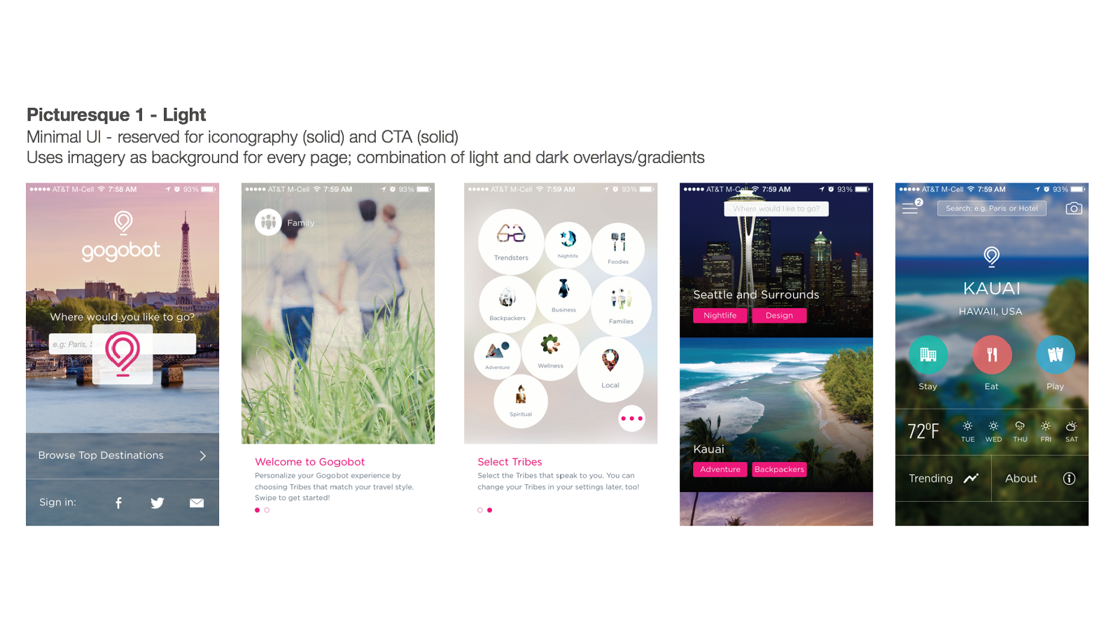
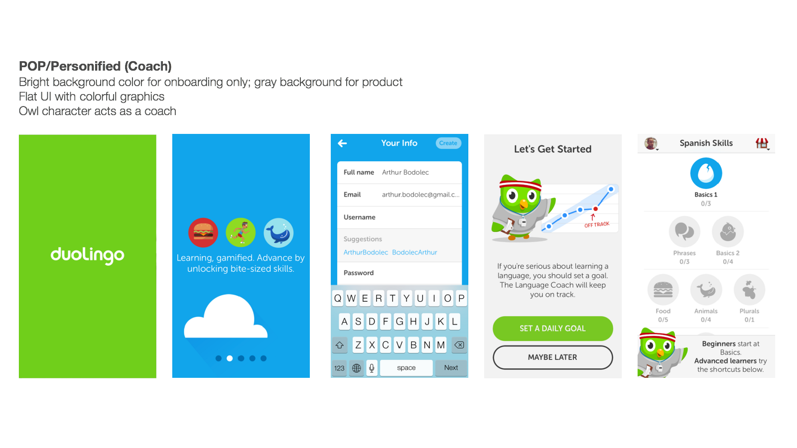
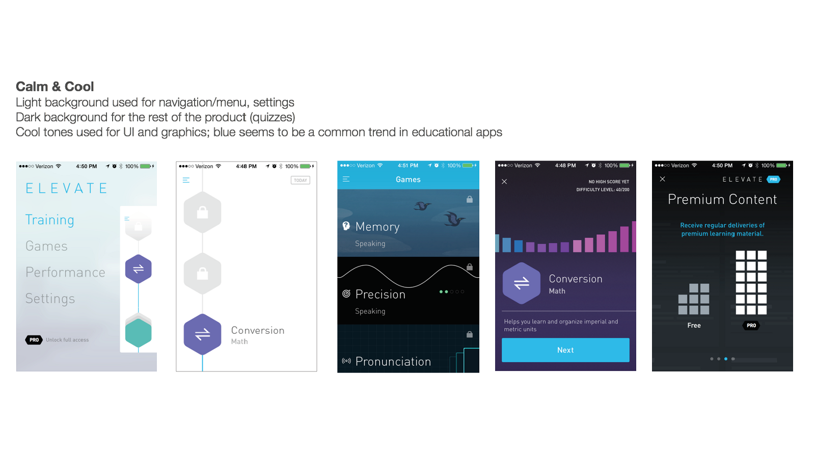
The audience was stressed high school students who needed guidance, so the product had to read as relief rather than as another obligation. We defined the brand attributes first, then tested six visual strategies against real products that already lived each one, instead of assembling mood boards.
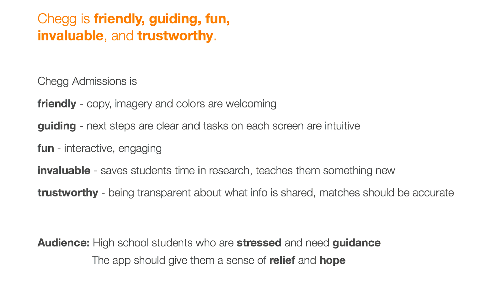
Six strategies, each benchmarked against a shipping product. Three of them here
08 · What
shipped
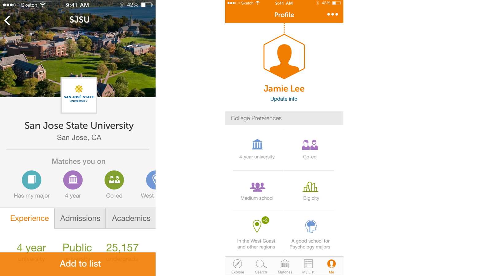
Beyond the quiz and Explore screens at the top of this page, the shipped app carried five tabs: Explore, Search, Matches, My List, and Me.
09 · Outcome
against an expected 3.5 3.9
hypothesis 03, validated 88%
hypothesis 04, validated 41%
over students who skipped it ~3
no marketing spend 2,000
from 5%, against a 10% goal 11%
across three months 200+
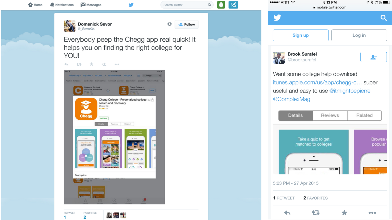
Three of the four hypotheses came back clearly. 88% of users chose to take the quiz, which settles the question of whether students would trade effort up front for relevance later. 41% signed up and went on to add a college to their list, so the saved artifact was worth building toward. Students also started tweeting at us unprompted, which is the earliest signal you get that a concept has landed.
The number I find most useful is the quiz differential. Students who took it added roughly three more schools to their list than those who skipped it, which says the personalization was not just tolerated, it changed behavior. And grouping matches by the reason they surfaced, rather than by rank, is the same commitment I made years later on an AI assistant for security analysts. A recommendation a person can inspect is worth more than a better one they cannot.
Shipped as a proof of concept to answer one question: whether students found features like matches and college profiles valuable enough to cut the time they spent researching. It did, and the findings in the next section are what shaped the MVP that followed. Longer-term retention figures are not in my possession, so none are claimed here.
10 · What the launch
taught us
88% taking the quiz validated the hypothesis, and then the qualitative findings told us to make the quiz smaller. That tension is the most useful thing this project produced.
Students arrived in three different mindsets
Major first
Knew what they wanted to study, needed to find schools that were strong in it.
School first
Had schools in mind already, often for reasons that had nothing to do with academics.
No idea
The group everyone forgets to design for, and the one most in need of the product.
Ask less, sooner
We moved away from a drawn-out quiz toward asking the bare minimum needed to get a student into the experience. A quiz that proves engagement is not the same as a quiz that should stay long.
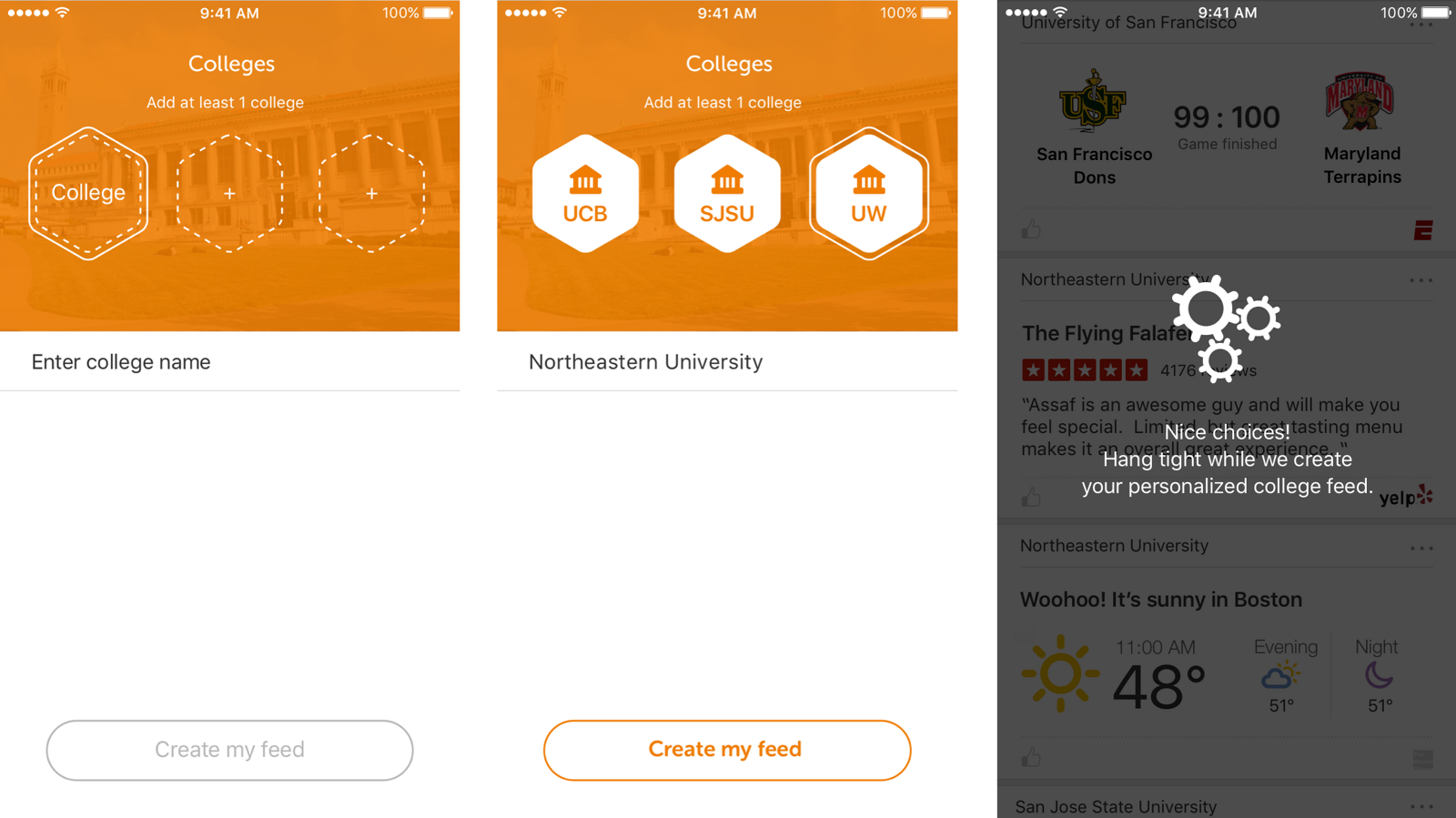
And for students further along, the ones already carrying a list of schools in their head, we let them enter those directly and get a personalized feed without answering anything.
One word changed the model
The prototype shipped with “Add to list.” For the MVP we replaced it with “Follow.”
Adding to a list is filing. Following is a relationship that keeps paying out, which is what you want when the thing on the other end is a stream of student-made content about a school someone is weighing for the next four years of their life.
The competitive grid in section 06 is the argument. Every other product used a filing verb: star, heart, add to list, add school. The same change moved sign-up from after the list to after the quiz, so activation stopped depending on a student committing to a school before they had a reason to.
The distinguishing factor
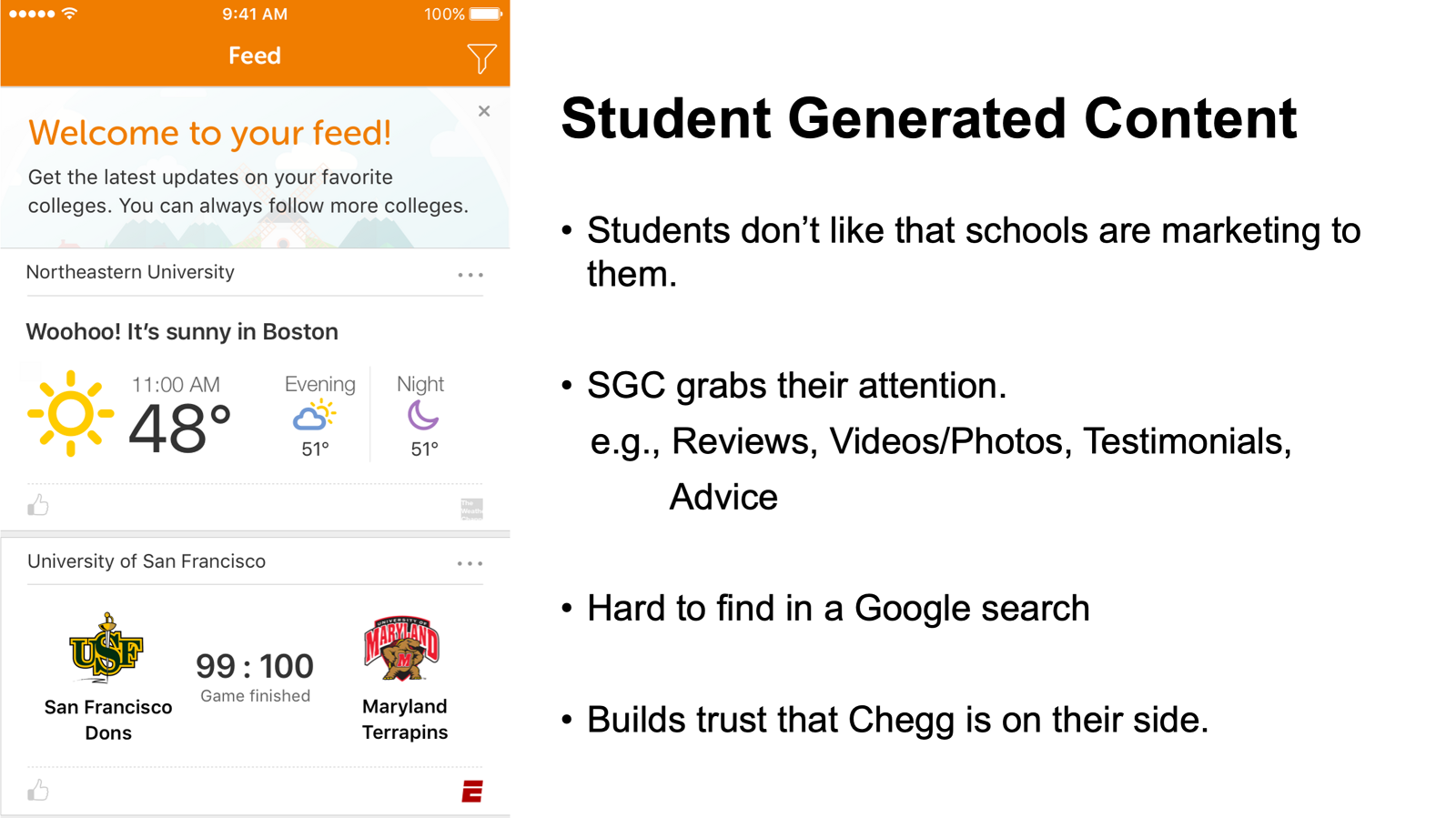
Student generated content. Rankings and statistics were available everywhere. What no competitor could copy was current students telling you what the place is actually like.
11 · The MVP
The proof of concept had done its job, so the next question was what the real product should be. Four commitments came out of it, and every one traces back to a finding above.
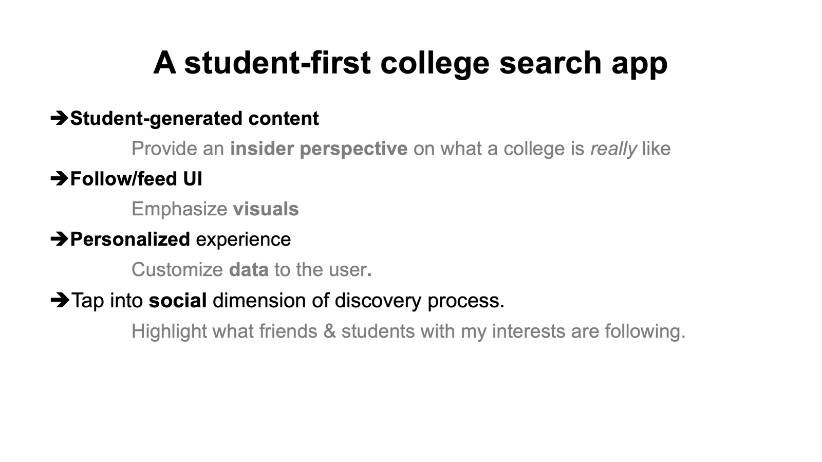
The three mindsets, shipped as a fork
Research said students arrive knowing a major, knowing some schools, or knowing nothing. So the MVP opens by asking, and the two answers lead to genuinely different products.
Why student-generated content was the bet
Follow, in students’ own words
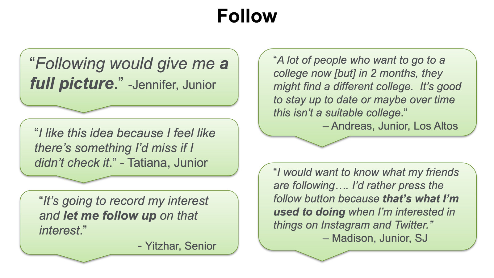
We tested the two verbs against each other and the students settled it.
Add to list
“Seems more final.” “More like a commitment.” “Means I'm applying.”
Follow
“I'm interested.” A sense of agency, as in I am choosing. And it feels more personal.
“A lot of people who want to go to a college now, but in 2 months, they might find a different college. It's good to stay up to date, or maybe over time this isn't a suitable college.”
Andreas, Junior, Los Altos
“I would want to know what my friends are following. I'd rather press the follow button because that's what I'm used to doing when I'm interested in things on Instagram and Twitter.”
Madison, Junior, San Jose
“Following would give me a full picture.”
Jennifer, Junior
“I like this idea because I feel like there's something I'd miss if I didn't check it.”
Tatiana, Junior
“It's going to record my interest and let me follow up on that interest.”
Yitzhar, Senior
Andreas made the argument better than any designer could. A student’s preference is not stable, it moves over two months, so the interaction has to accommodate revision rather than record a commitment. Madison supplied the other half: follow is already the verb these students use for interest everywhere else, so we were not teaching a convention, we were declining to break one.
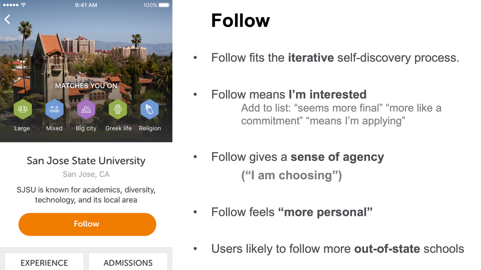
Add to list asked a seventeen year old to commit before they were ready. Follow let them stay curious, and curiosity is the actual state they were in.
12 · The school page
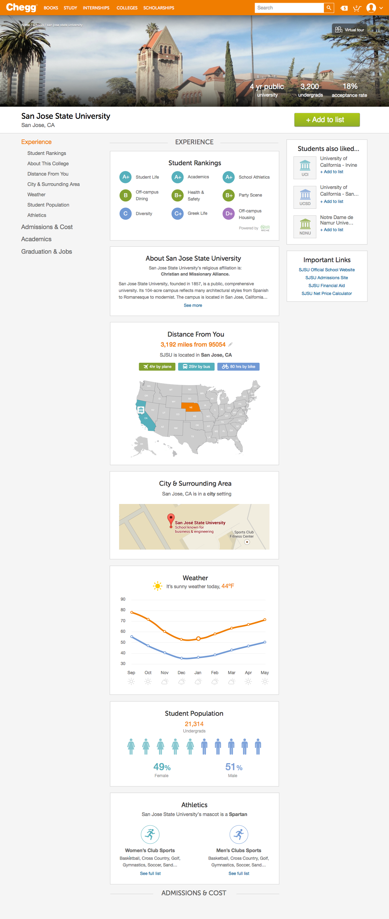
Matching a student to a school is only useful if the school page can hold up to the decision that follows. That page is where a suggestion either becomes a college on a list, or gets abandoned.
The user story
As a user, I can get valuable information about a school so that I can make a more informed decision.
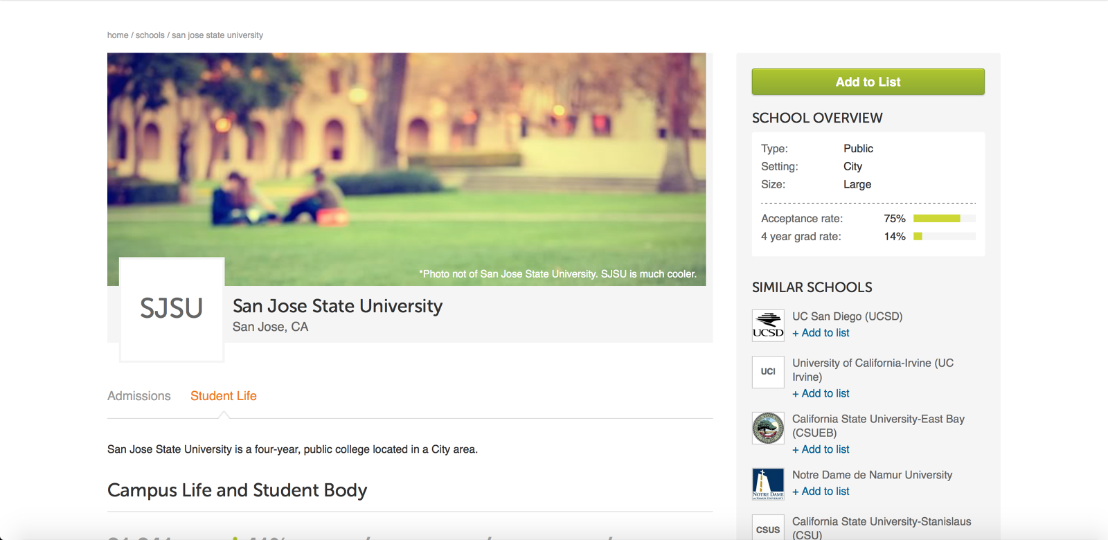
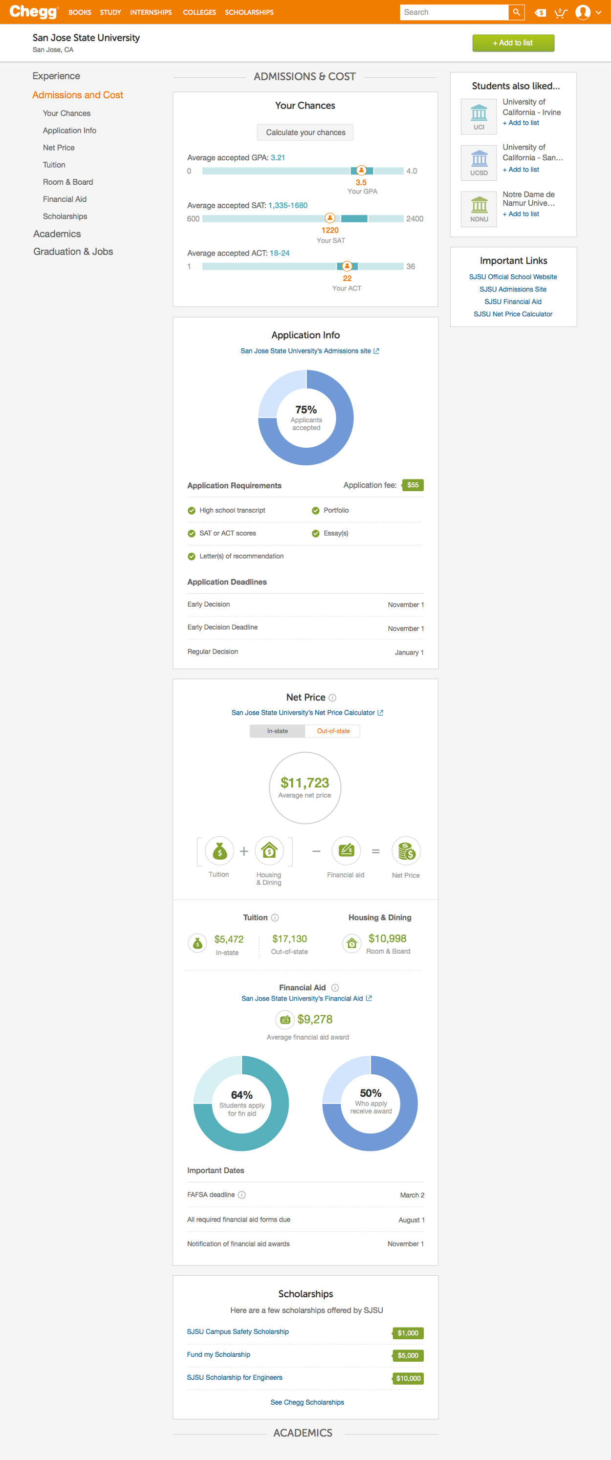
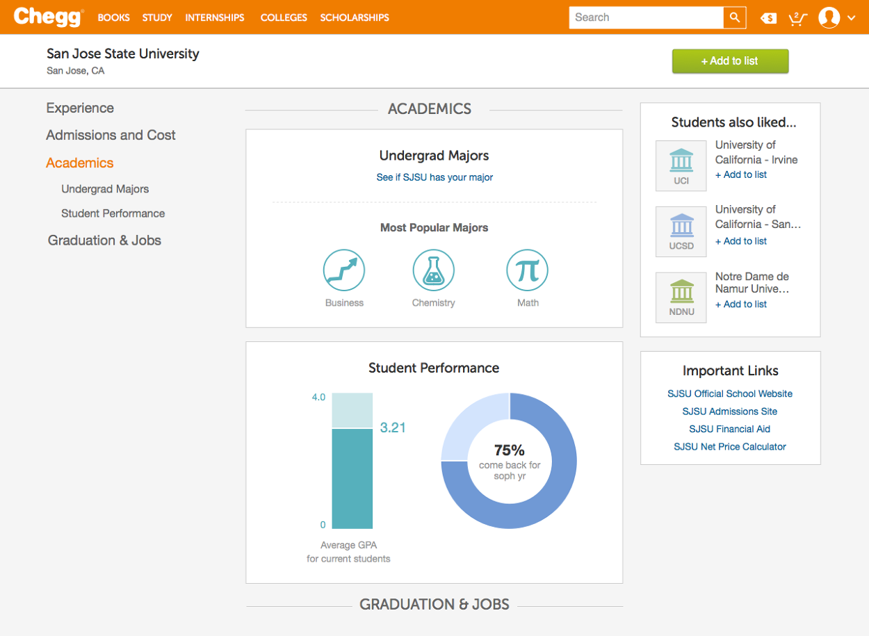
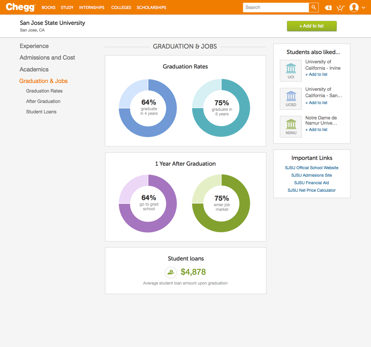
What it looked like
The data underneath
We moved off IPEDS onto Wintergreen. That is a procurement decision on paper and a design decision in practice, because it raised both the credibility and the sheer volume of what we could put on the page.
You cannot design for confident decisions on top of data you have to apologise for.
The goal, and the result
Add to list conversion was sitting at 5%. The target was 10%.
against a 10% goal
Three questions only the student can answer
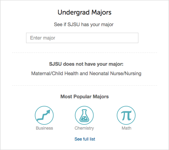
Every school page on the internet showed the same averages. None of them let a student put themselves into the data. So I built three inputs, each answering a question a ranking cannot.
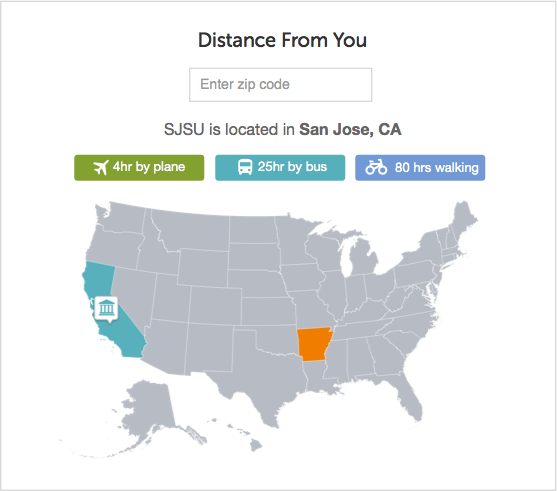
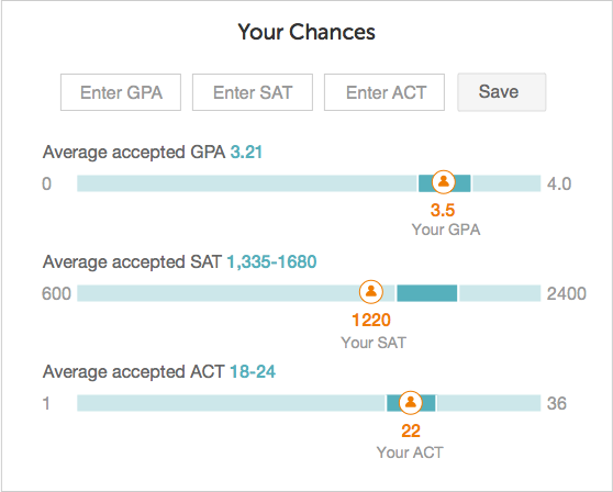
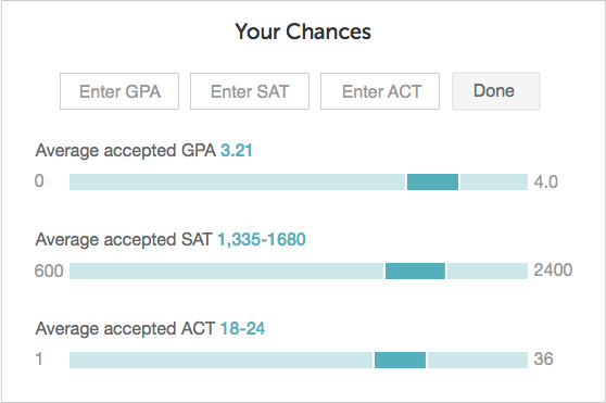
Why the empty state matters
34% of students who reached a school page clicked Calculate my chances. That is the highest engagement of anything on the page, and it happens because the empty state makes the payoff obvious before you commit to typing.
Ask for personal data without showing what it buys, and nobody fills it in.
Four sections, in decision order
Experience, then Admissions and Cost, then Academics, then Graduation and Jobs. Sequenced the way the questions actually arrive: what is it like, can I get in and afford it, what would I study, and where does it leave me.
What students did with it
Of students who viewed a school page:
And a quarter of the students who added a school went straight to View my list. The page was never the destination. It was the thing that made the list worth keeping.
13 · Takeaways
Ranked lists tell you what is best. Students needed to know what was right.