Shafeen Alam
Turning a job board into a learning-to-employment system
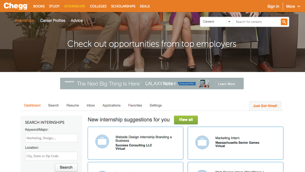
Chegg Career Center could show a student thousands of openings and nothing about how to become the person who gets one. I led UX for its evolution into a skills-driven readiness platform, where a career names the skills it needs, each skill resolves to something you can learn, and the chain ends at a real internship or job.
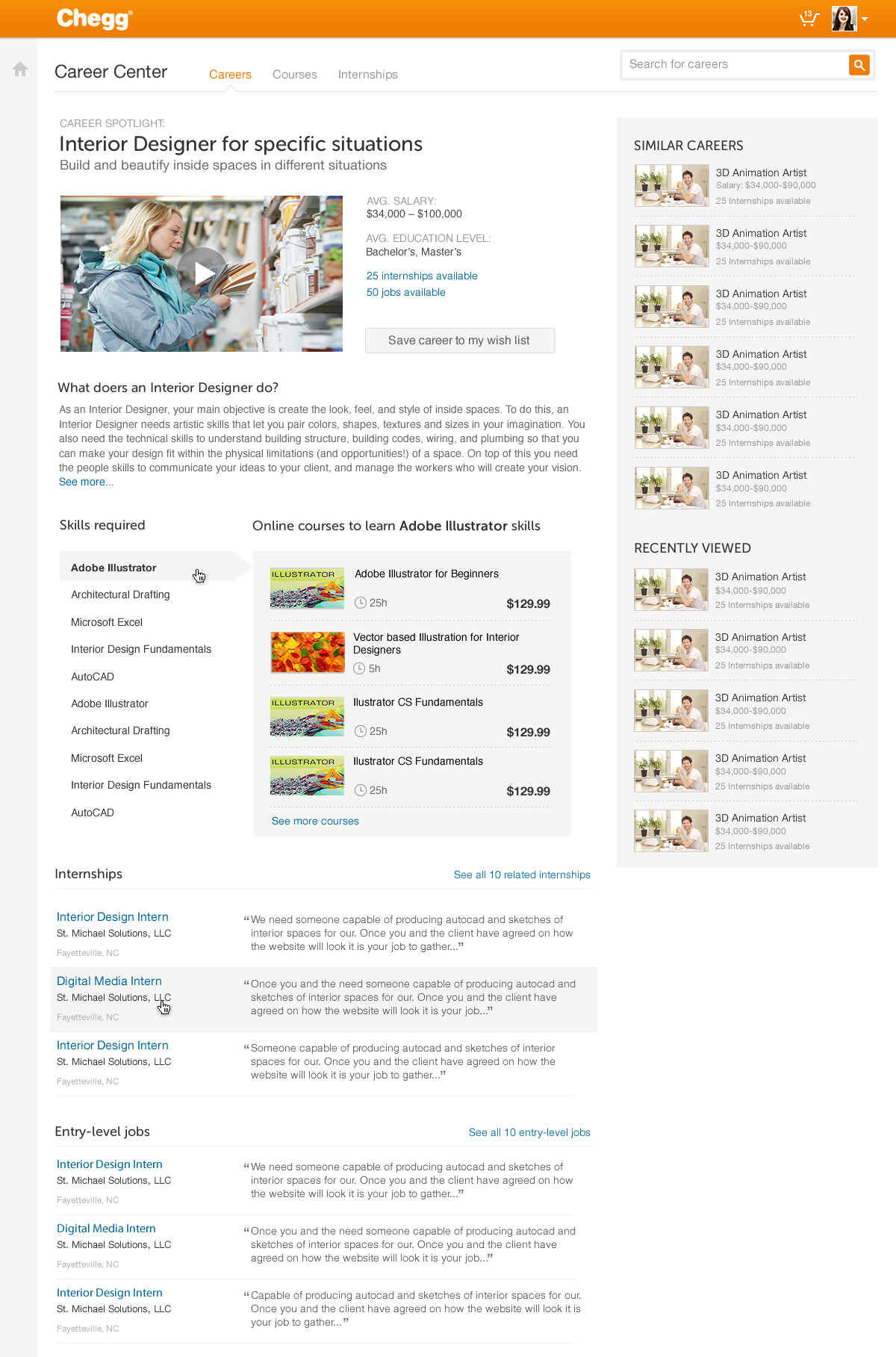
Students could see the jobs they wanted but not a path to qualifying for them.
60-second read
Career Center was a fragmented job board. Students could browse openings but nothing connected what a job required to what they were missing or what they could do about it.
Make the skill the unit that joins everything: a career names its required skills, each skill resolves to courses, and the chain lands on internships and entry-level jobs.
Led UX end to end across web and mobile with a team of six. Information architecture, the skills-gap model, personalization, and the component system.
Career preparation engagement up 20 to 35%, profile and résumé completion up 15 to 25%, early-session drop-off down 18 to 30%.
01 · Shipped
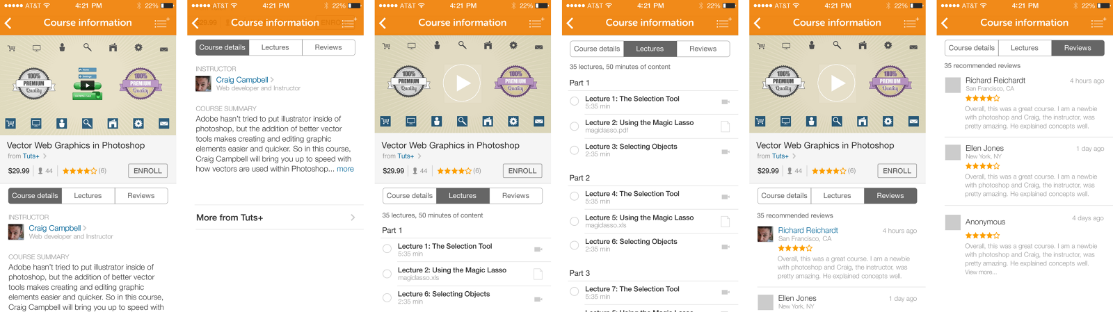
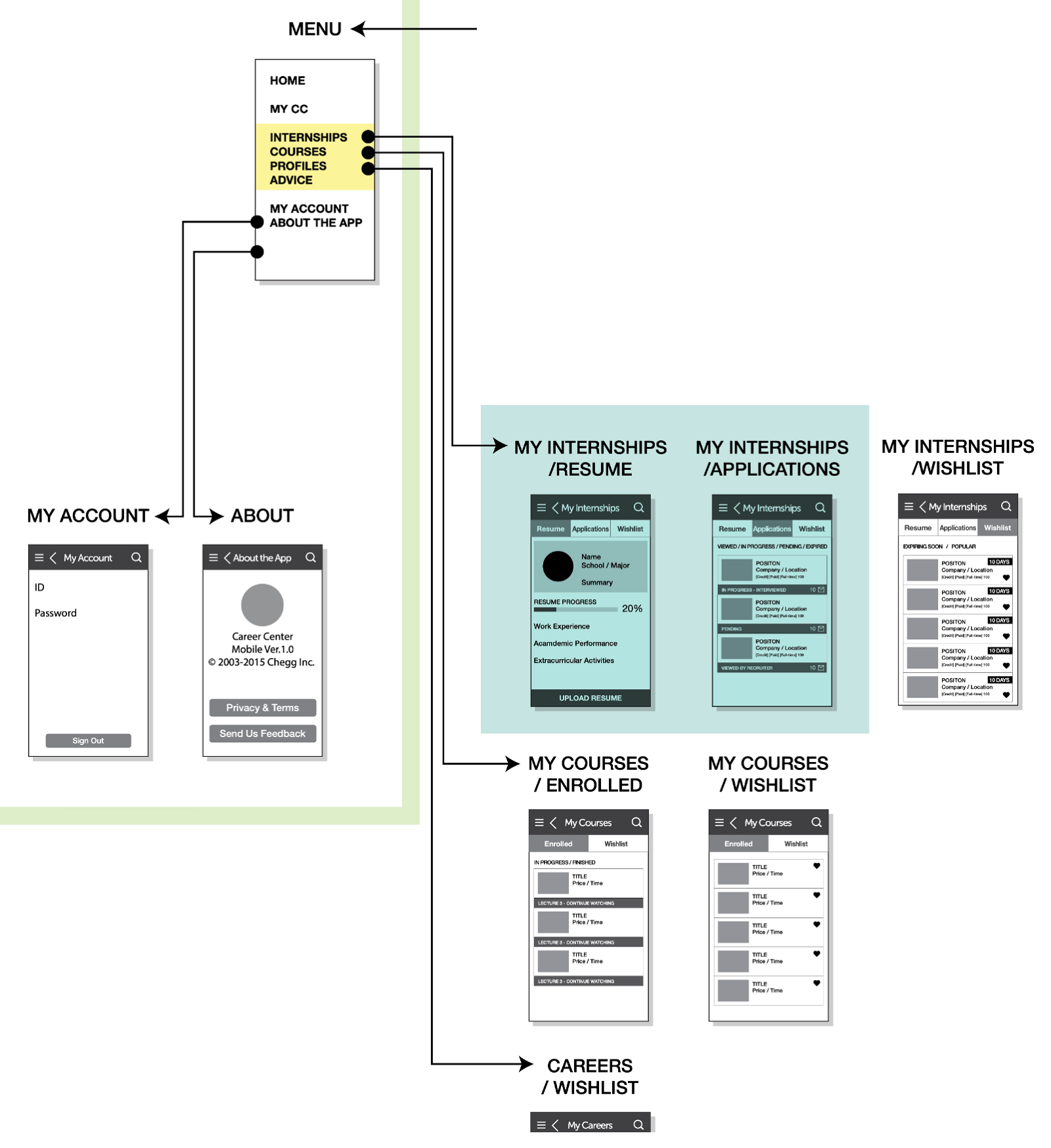
A connected system across web and mobile: over 600 career profiles, a course catalog, an internship marketplace, and a personalization layer that gave them a reason to talk to each other.
02 · The problem
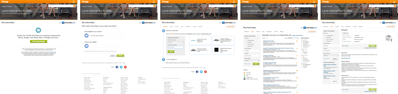
Chegg reached students at the moment they were deciding what to do with their lives, and answered with a search box. Careers lived in one place, courses in another, internships in a third through a partner. A student could browse all three and still not know what to do on Tuesday.
The gap was not content. Nothing in the product connected a job's requirements to a student's actual position, so every screen was a dead end dressed as a destination.

03 · The unit that
joins it
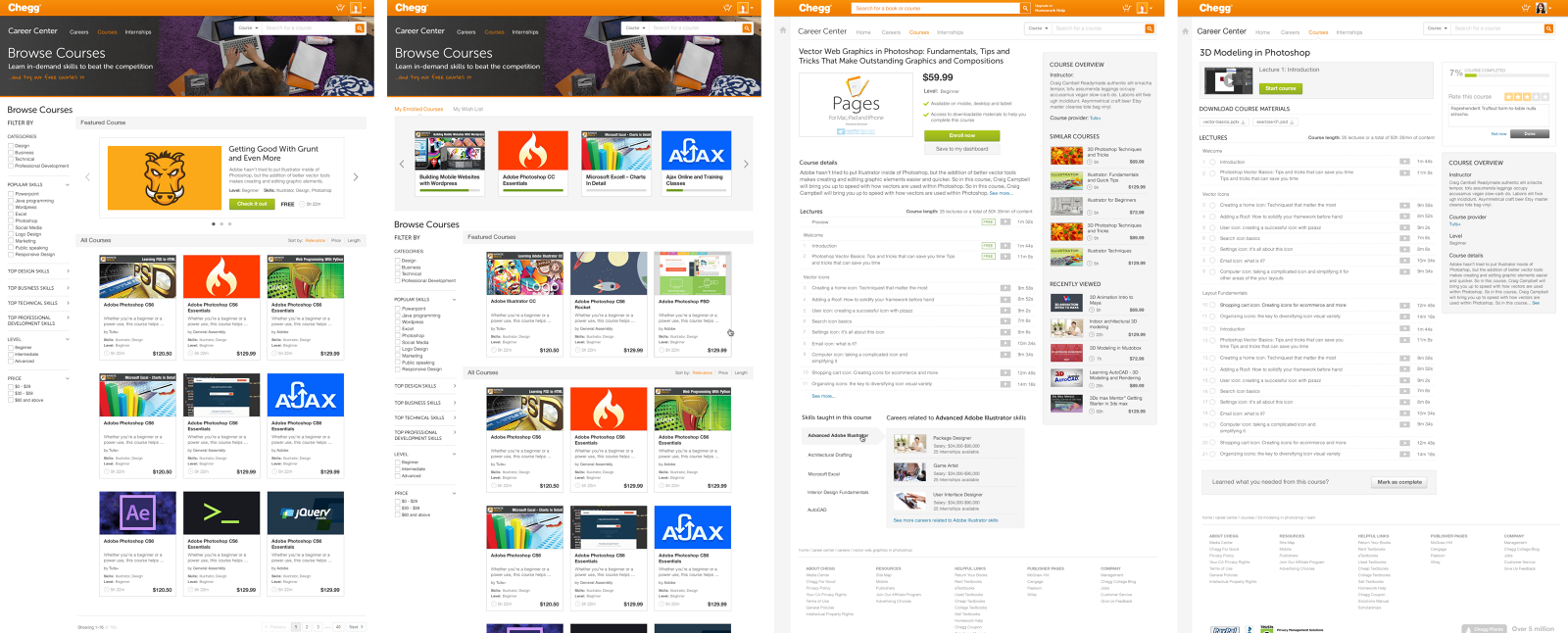
I made the skill the joining unit. Once a skill is a first-class object rather than a keyword, every relationship falls out of it: a career requires skills, a course teaches one, an internship tests them, and the distance between a student and a job becomes a list of specific, closable gaps.
04 · Personalization
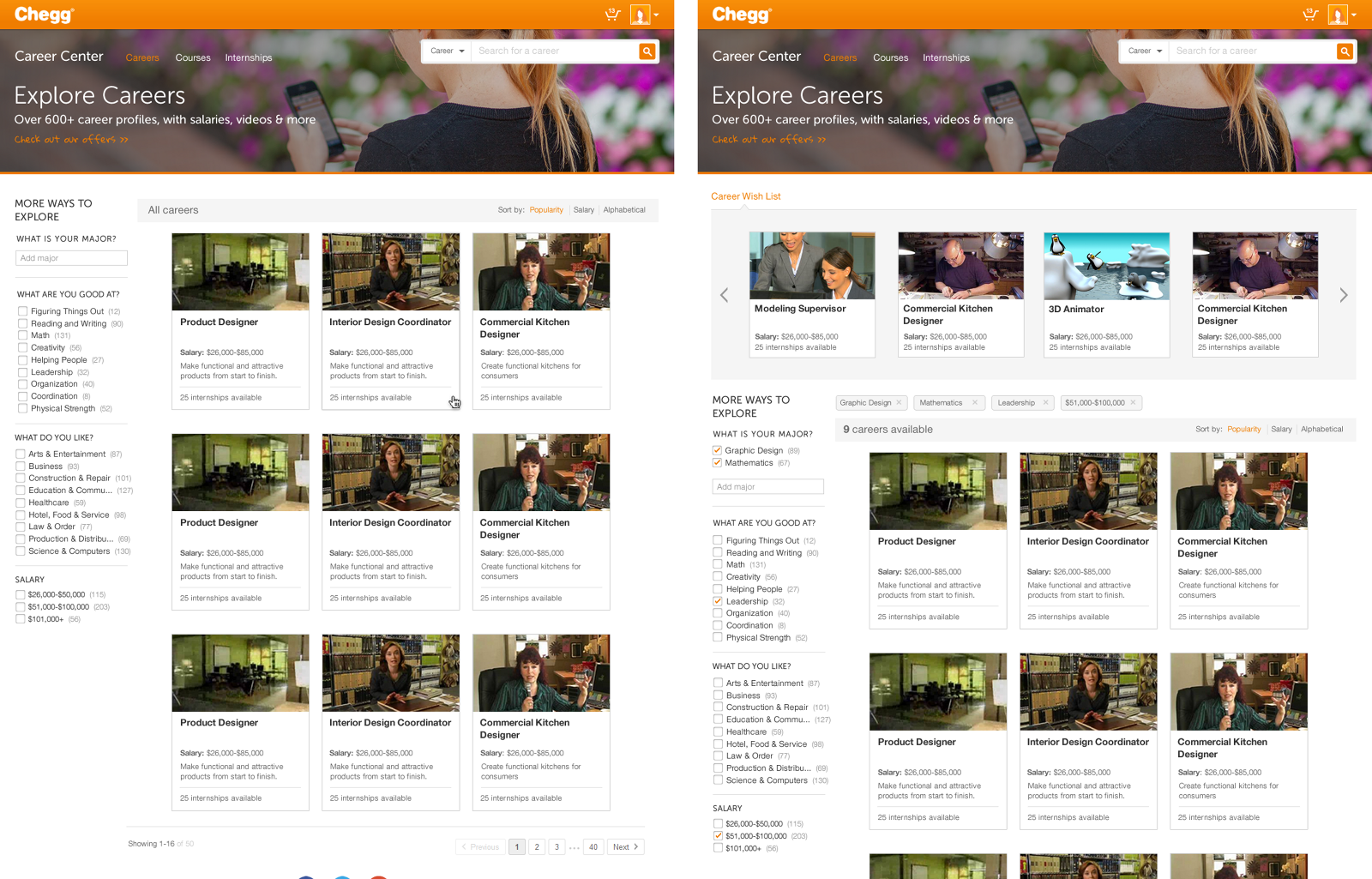
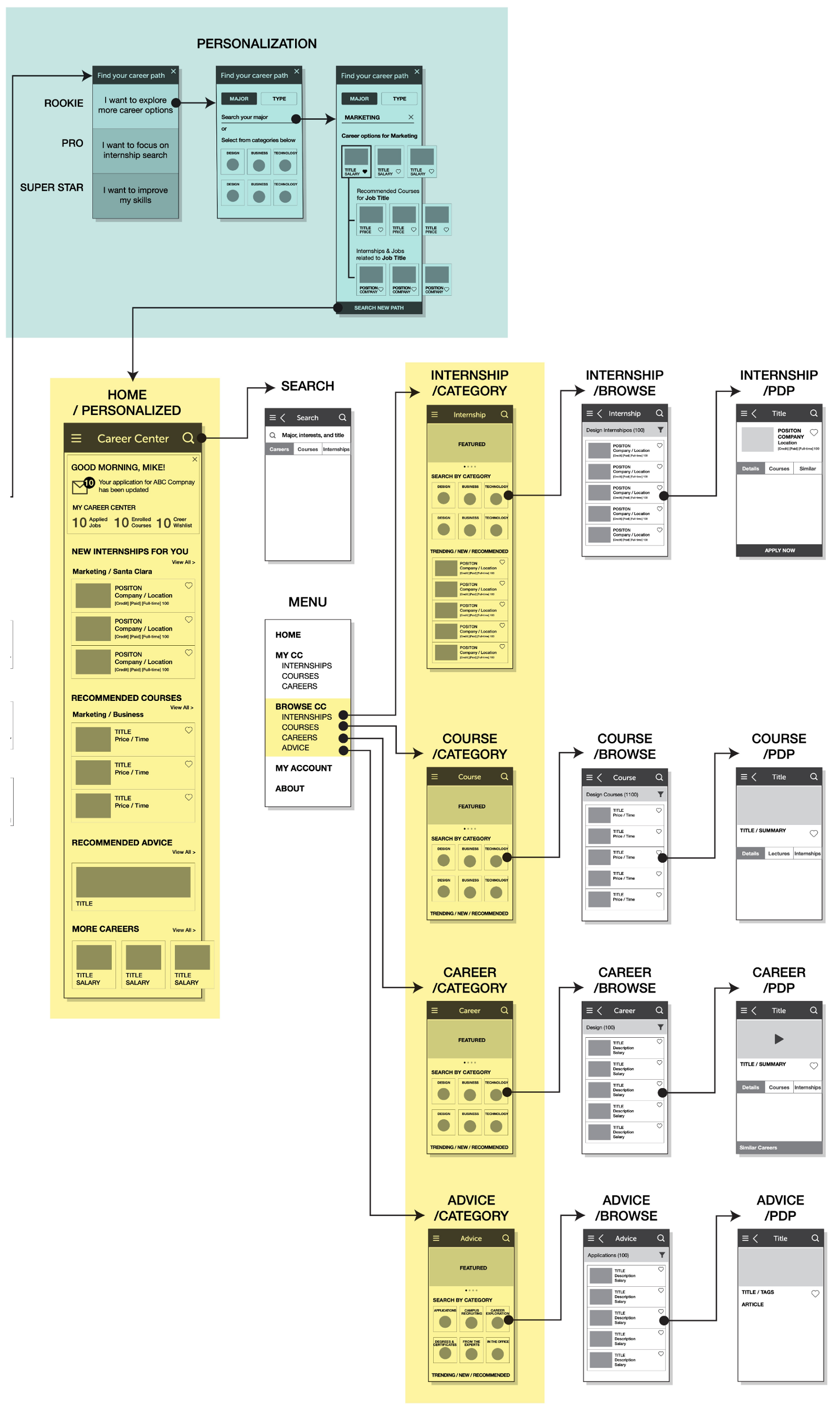
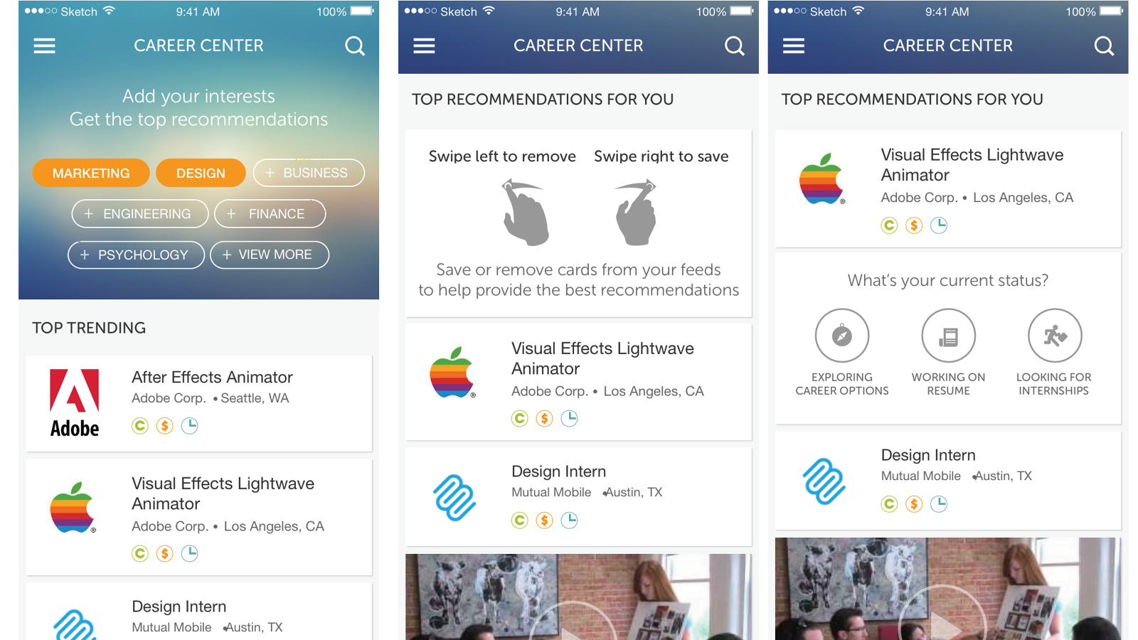
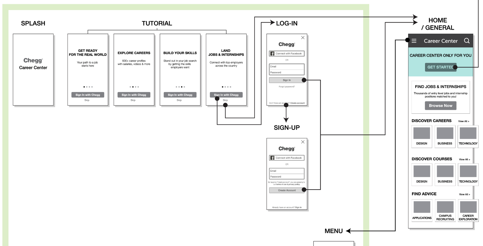
Rather than infer intent from behavior a new student had not produced yet, I asked one question and branched on the answer. Three postures, each with a different first screen: exploring options, focused on an internship search, or working on skills.
Internally we called them rookie, pro, and superstar. The label mattered less than the fact that a first-year student and a graduating senior no longer got the same homepage.
05 · Mobile
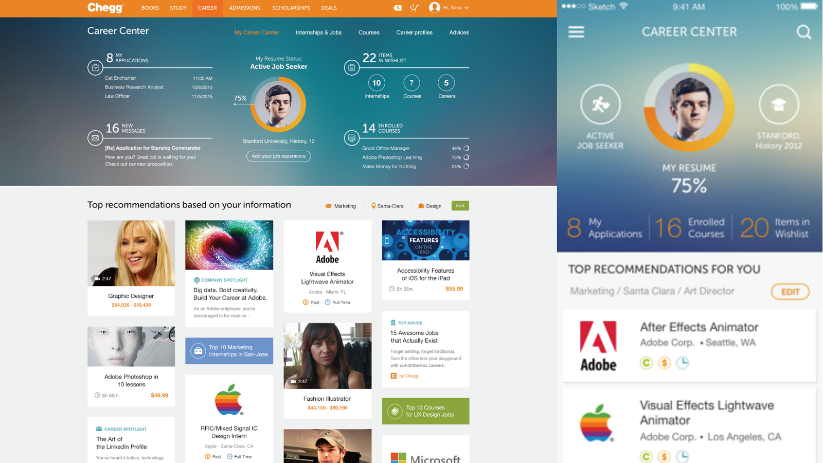
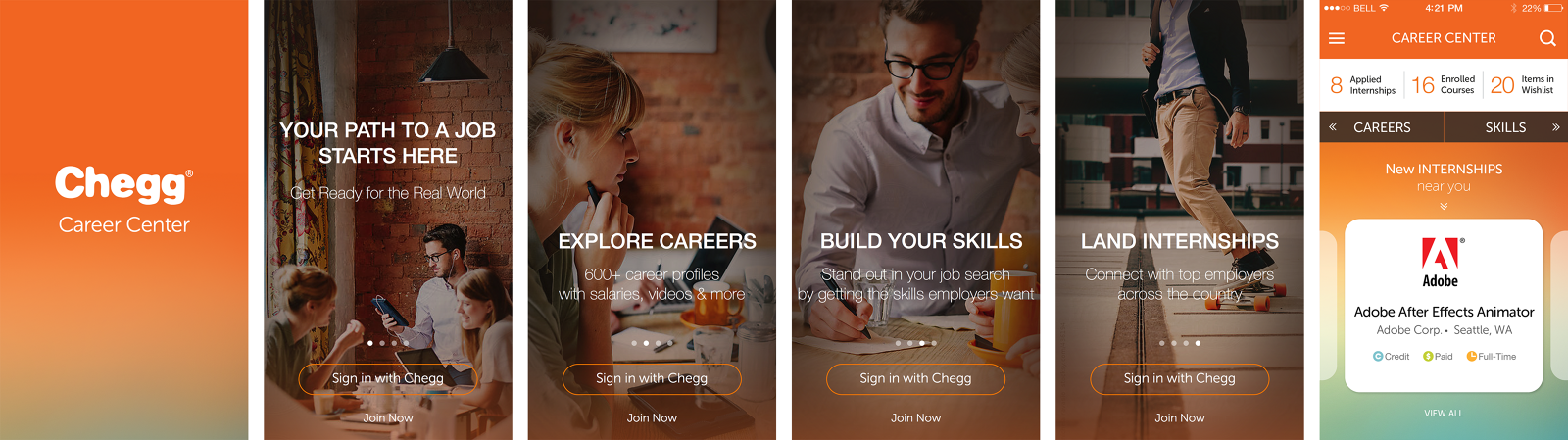
The app was not a reflow of the site. It assumed short sessions between classes, so it front-loaded the value proposition and reduced the core interaction to a judgment a student could make in a second.
06 · Making it
reproducible
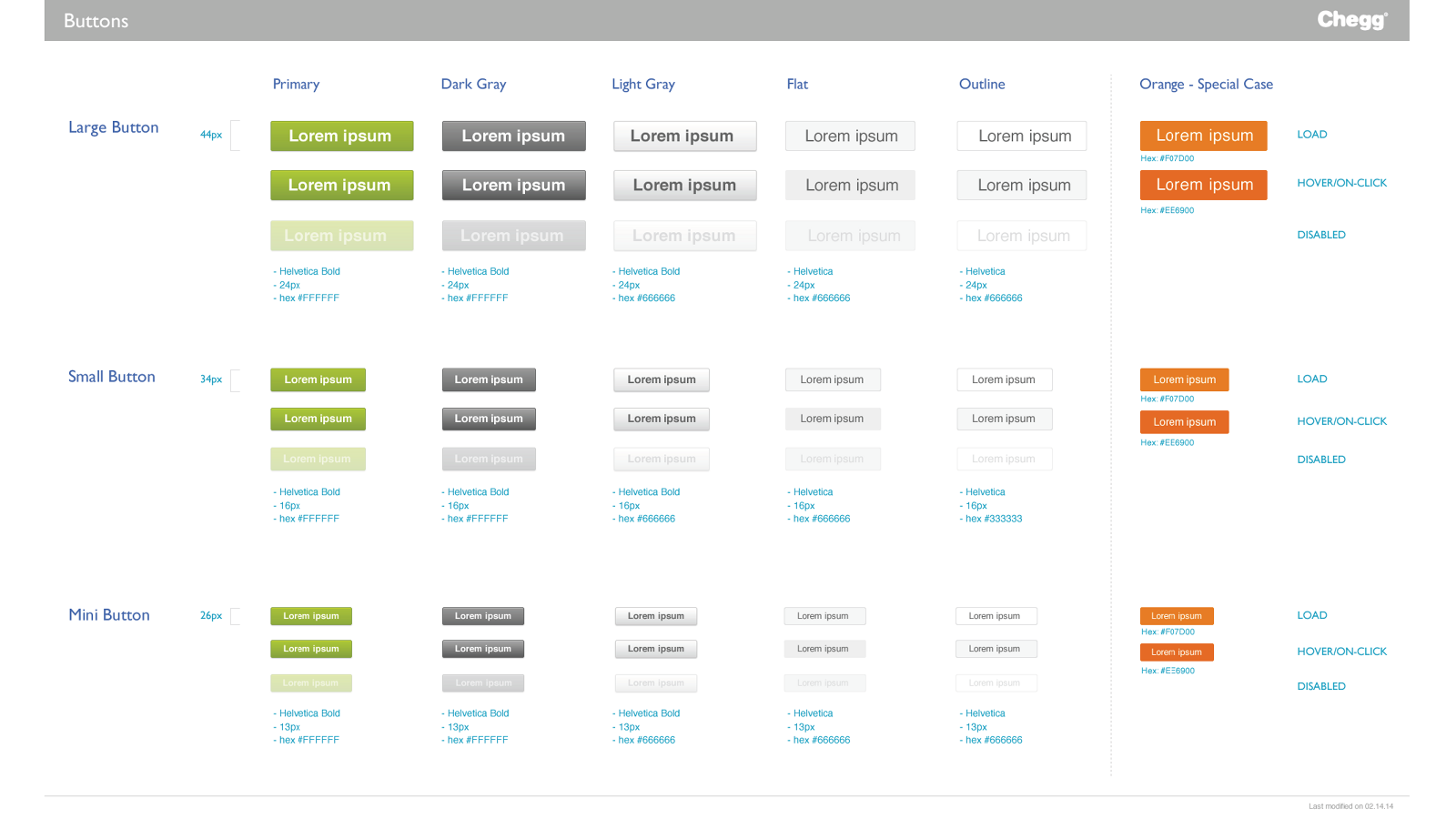
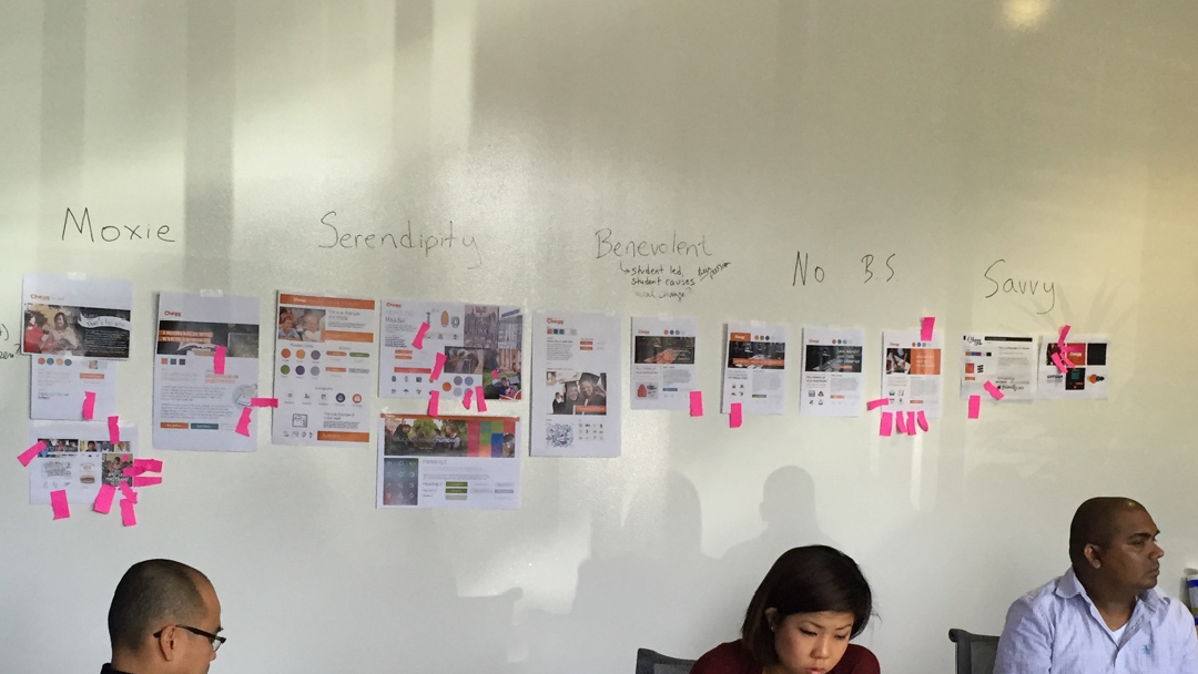
A system this size, built by six designers, holds together only if the parts are specified rather than improvised. We defined the components and the brand voice up front, so consistency was the default rather than a review note.

07 · First time
leading
Chegg was the first team I managed, six designers across web and mobile. I learned the obvious lesson the hard way: I could be the person who solved the interesting problems, or the person who raised what the team could attempt, but not both.
What worked was defining the system, the skills model, the component specs, the shared vocabulary, then handing over real problems inside it rather than safe ones. It is the same instinct I have used in every role since, including as a principal individual contributor.
08 · Measured
Drop-off is the number that tested the actual bet. Asking one honest question instead of inferring intent was supposed to stop students bouncing in the first few seconds, and it did. Résumé completion is the one I would defend hardest, because a student only fills in a profile when they believe what is on the other side is worth the effort.
09 · Takeaways
A list of openings is not opportunity. The path to one is.