Shafeen Alam
Continuous threat exposure management, made legible enough to act on
Interpres curated finished intelligence from more than 50 sources, aligned it to MITRE ATT&CK, NIST, ISO, and CIS, and prioritized controls and remediation. As the sole designer, I spent week one auditing it, then spent the following months fixing the four layers underneath: navigation, accessible color, consistency, and a design system that could take new modules without breaking.
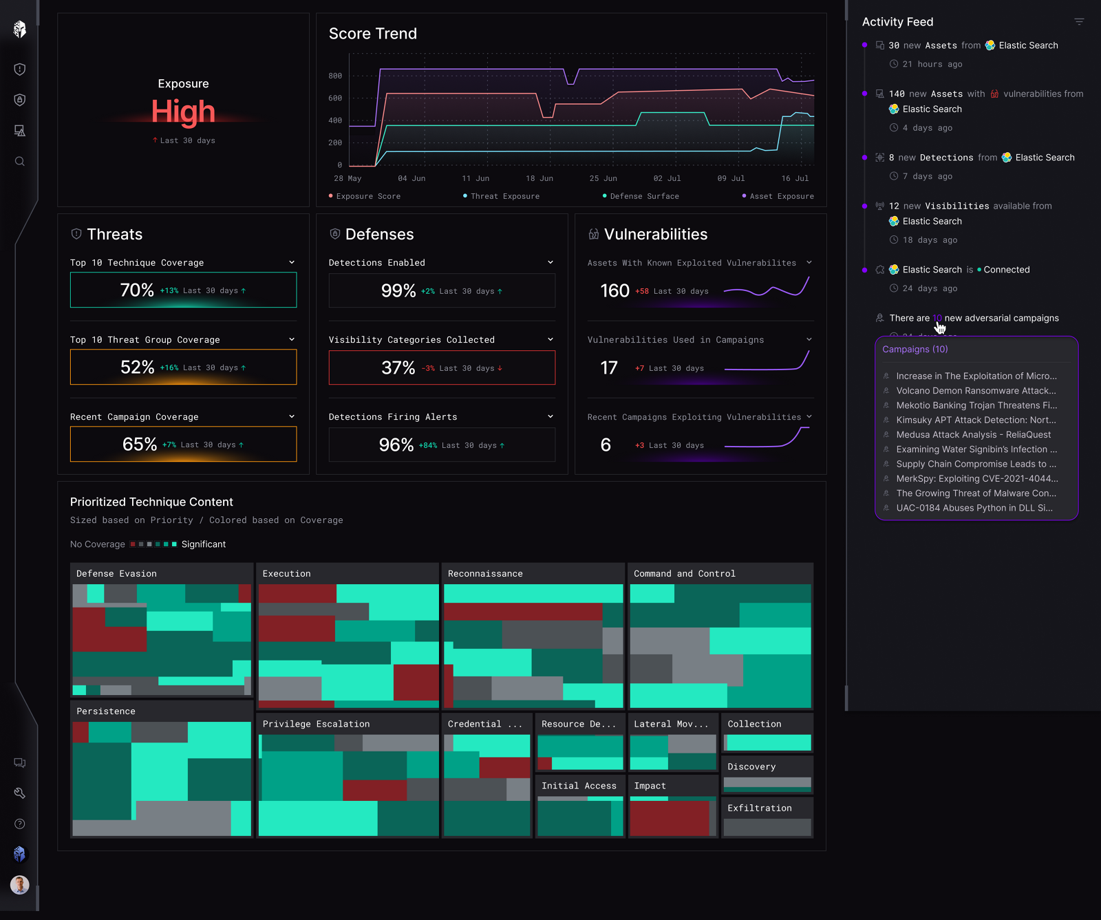
Inconsistent navigation and color made it harder for security teams to act on intel from 50 or more sources.
60-second read
A CTEM platform curating finished intel from 50 or more sources, with navigation, color, and component patterns that had grown faster than anyone could keep consistent.
Fix the four systemic layers rather than individual screens: information architecture, accessible color, component consistency, and a design system that could absorb new modules.
Sole designer. Audited the product in week one, shipped the first win in five days, then drove the migration to Tailwind and MUI with the front-end engineer.
Report generation up 42%. Repeat use settled at four to five times a month.
01 · Shipped
A redesigned reporting flow, an accessible color system, a consolidated information architecture, and a component library migrated onto Tailwind and MUI with the front-end engineer.
02 · Week one
I audited the whole experience with fresh eyes before proposing anything. Screenshots marked up with everything that struck me as odd: interactions, missing patterns, inconsistencies, plain questions. Then I presented it to stakeholders as a loose plan of action rather than a finished verdict.
I also scheduled recorded product walkthroughs with people across the company and stayed hands-off, letting each person run it as they saw fit. What someone shows you first, and what they skip, tells you more about the real information architecture than any sitemap. One of those happened over coffee with a front-end engineer who lived nearby. I took handwritten notes to avoid interrupting the flow, with a column for each person's opportunities and challenges.
Four areas the audit surfaced
I also set up a local environment so I could pull builds and see my designs running. That gave me Storybook, where the components actually lived, and the ability to QA in code rather than in a static file.
03 · The first win
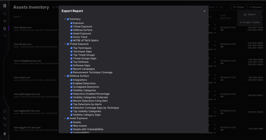
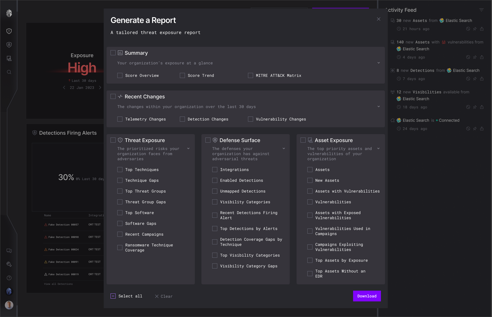
On my first day the CTO handed me the Export Report screen, a high-touch feature shipped just before I joined. A user generated a report of their current security landscape and hit OK. It asked for too many decisions upfront and pushed the key context below the fold.
This flow was the report card. It was how customers saw whether we were worth the investment, and how they identified problem areas in their own posture. Getting it right early also bought me the credibility to argue for the bigger structural work.
User story
As a user, I want to generate a personalized report of my current security posture, so I can prioritize threats and find the flaws in my ongoing controls.
One week, start to delivery
What I could and could not change
The brief I was given was plain: it works well as is, just style it better. Here is what I pushed on and where I landed.
The approach
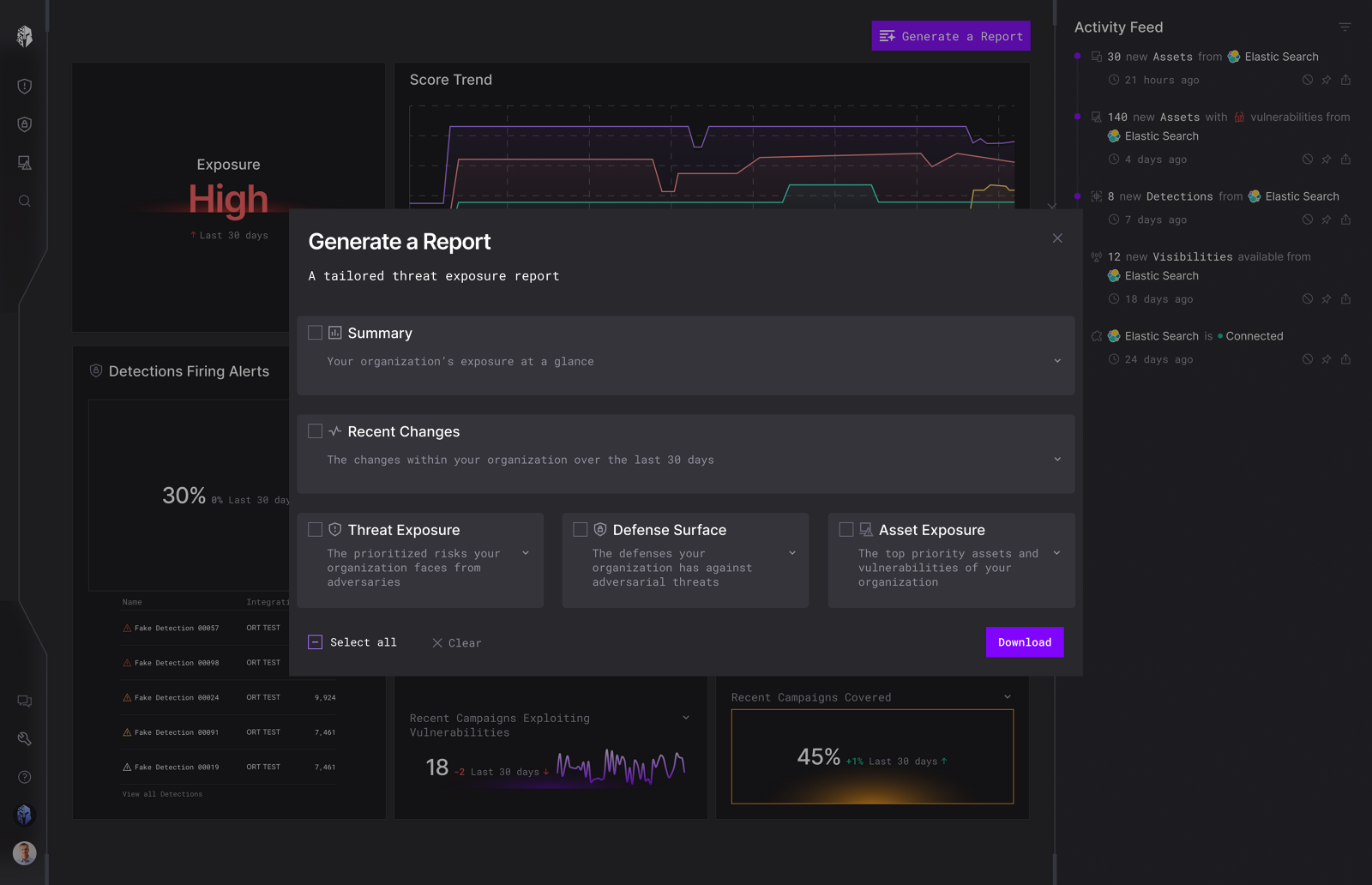
- Sensible defaults in the export dialog, with progressive disclosure, so the critical context stayed above the fold and the click count dropped.
- Users could expand only the areas relevant to them, drilling into the specifics behind each section.
- Changed the primary button from a download icon plus the word Report to Generate a Report, so the action named itself.
04 · Navigation and IA
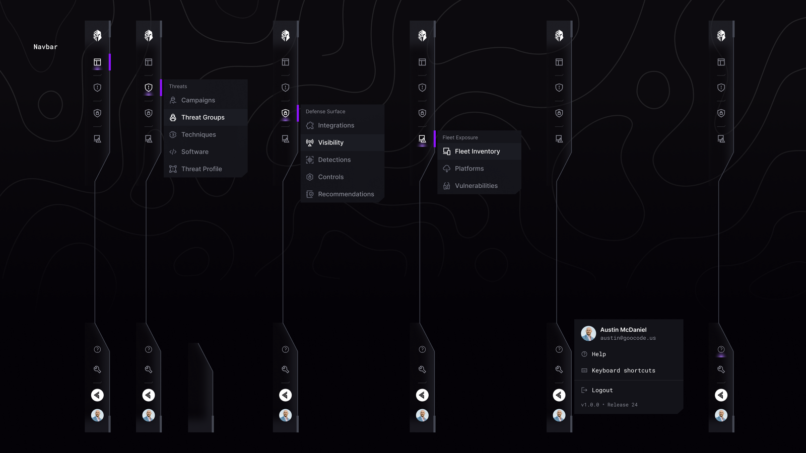
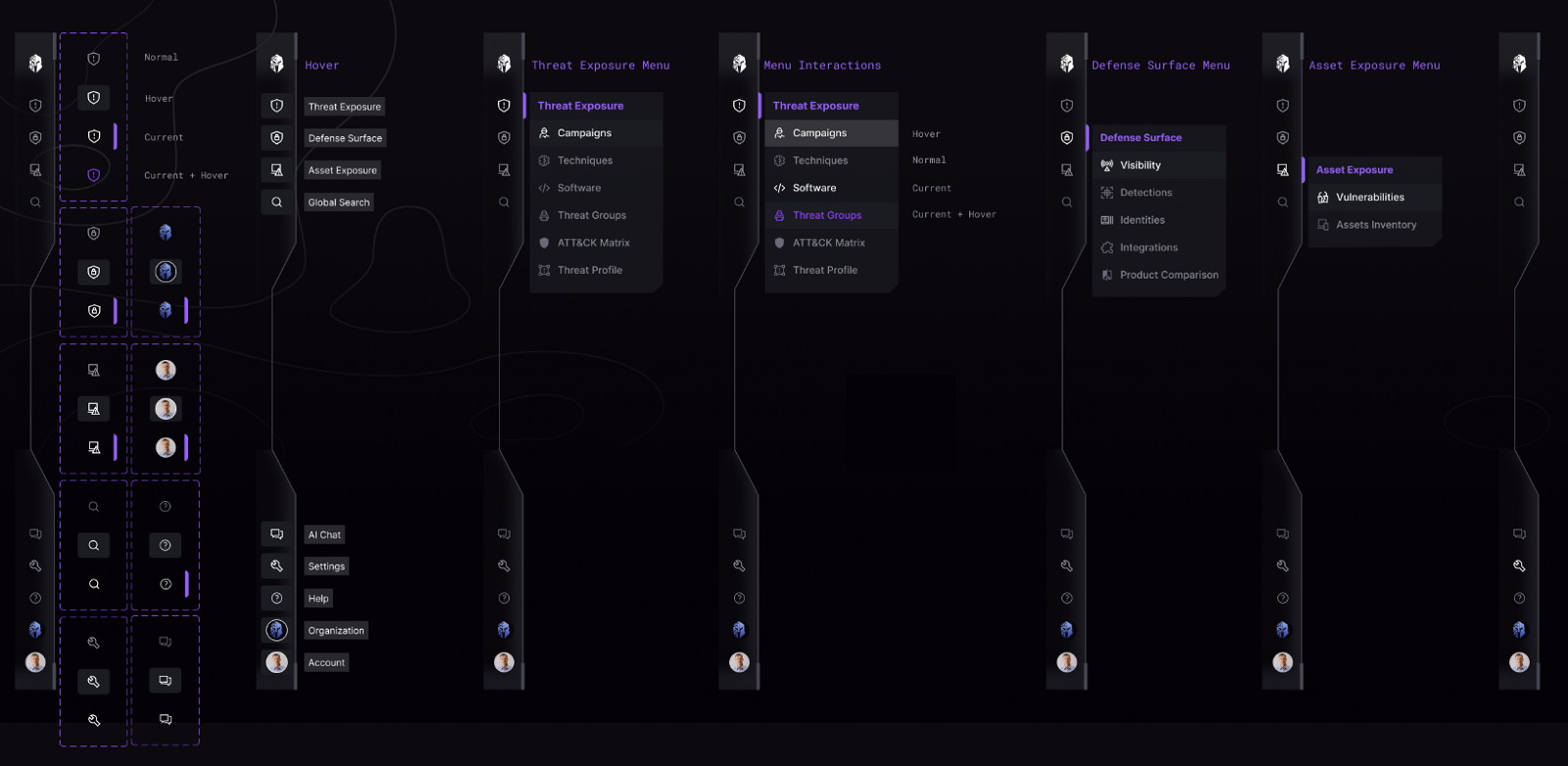
Menus and icons differed across modules, so users relearned the layout each time they moved between them. I consolidated the information architecture, added proper hover and active states, and removed the brittle dividers that were holding layouts together, so the structure could take new modules without being rebuilt.
05 · The system underneath
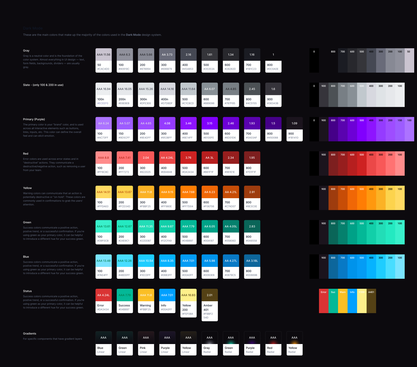
Two of the four audit priorities, accessibility and consistency, could not be solved screen by screen. Customers were raising ADA compliance, and the specific failure was concrete: analysts with a red-green color vision deficiency could not tell our statuses apart, which in a security product means the severity of a finding is invisible to some of the people responsible for acting on it.
So I built accessible color foundations, a component library on MUI and Tailwind with every state documented, and design QA running against Storybook and live builds. That work became its own system, including the interaction patterns the AI assistant later needed for evidence, uncertainty and human control.
Read the design system case study06 · Ongoing work
Three continuing threads, each about closing the distance between seeing something and doing something about it.
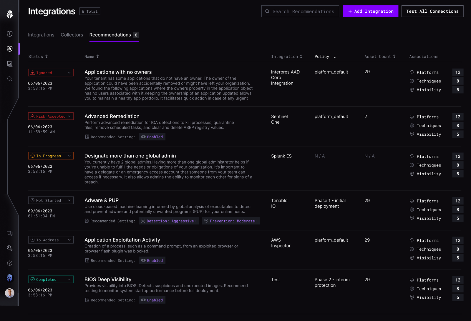
Integration recommendations
Introduced an actionable chip interaction so a recommendation could be remediated in place, rather than read in one screen and actioned in another.
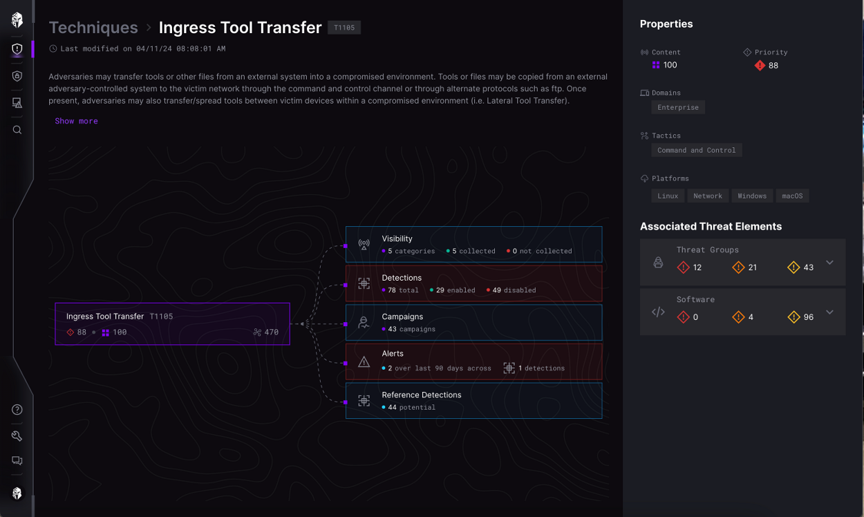
Technique flow page
Every node opened a new context with no way back, so you lost the parent you started from. Added breadcrumbs and a standardized layout to preserve context.
Integrated AI assistant
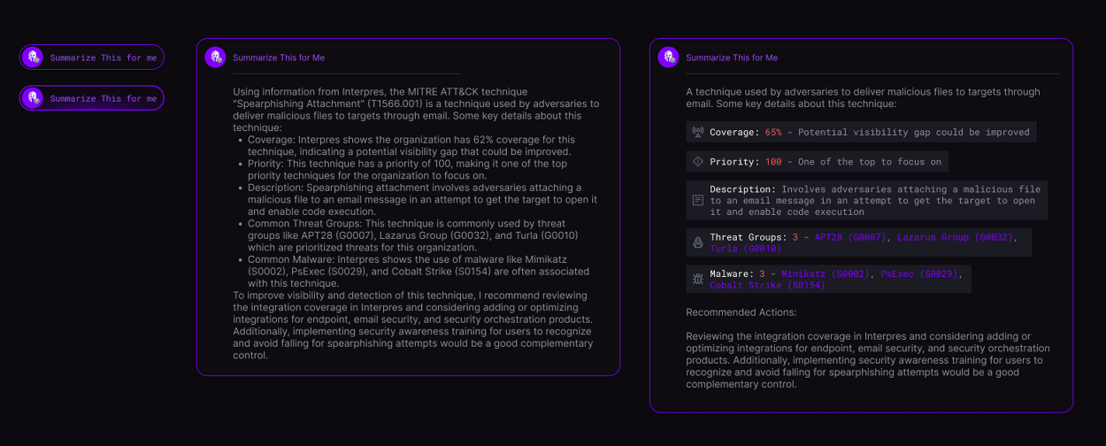
Product-wide in-context education. Tooltips and popups that explain security posture and the next action, at the moment the question comes up.
07 · Measured
We instrumented the reporting flow with OneStory to see whether the redesign held up over time, rather than trusting the launch spike.
The heat map answered the question the trade-off debate could not. Users opened at least two different sections per report, which is exactly the drill-in behavior progressive disclosure was meant to enable.
08 · Takeaways
Trade-offs
A finding nobody can read is not intelligence. It is noise with a severity label.
Interpres Security was acquired by CyberProof in late November 2024, and my position was eliminated in the transition.