Shafeen Alam
Designing a design system for trust
Interpres had powerful cybersecurity intelligence and an interface that had grown through isolated decisions. I introduced a shared visual and interaction system, partnered with engineering on an incremental MUI and Tailwind migration, and extended the system so AI-generated recommendations could be explained and acted on.
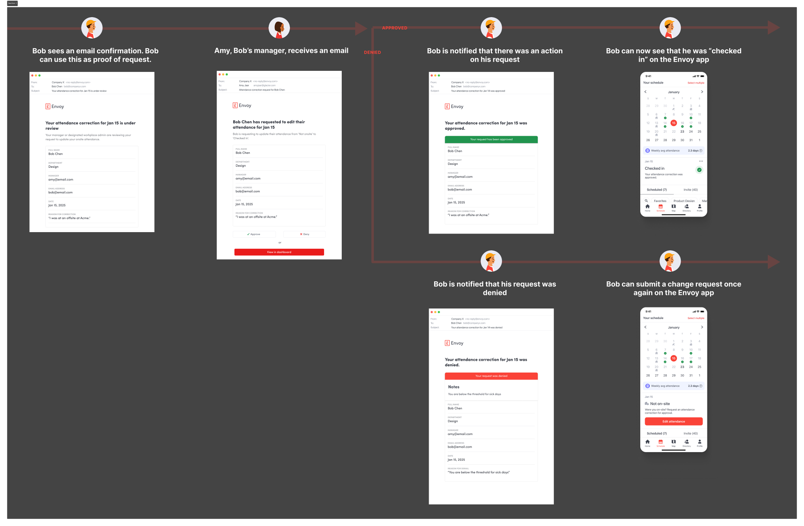
When status rests on red and green and controls behave differently, analysts cannot fully trust what they see.
60-second read
The interface had grown through isolated decisions. Similar controls behaved differently, status meaning rested on red and green, and components had no documented states.
Build a shared language for risk, coverage, evidence, confidence and action, incrementally, inside shipping work rather than as a redesign pause.
Sole designer. Audit, accessible foundations, component library on MUI and Tailwind, design QA in Storybook, and the AI interaction patterns.
A coverage model rebuilt from five levels to three with accessibility complaints dropping to zero, a component library on MUI and Tailwind, and ten reusable patterns for explainable AI.
Jump to
01 · Shipped
A shared language for how Interpres communicates risk, coverage, evidence, confidence and action, built inside shipping work rather than instead of it.
These describe specific product workflows the system enabled. They are not system adoption metrics. I did not have formal adoption analytics during the engagement, so I keep the two claims separate.
02 · The problem was not a missing UI kit
Analysts had to interpret dense data, move between related threat objects, compare coverage levels and decide what to address first. The product also had to keep growing inside two-week sprints on a constrained third-party framework. When I joined as the only designer, the interface reflected the speed the company had been building at.
- Similar controls behaved differently across modules.
- Navigation patterns did not scale as new areas were added.
- Status meaning depended heavily on red and green.
- Components lacked complete interaction and error states.
- Important workflows presented too many decisions at once.
- Design intent and implemented behavior were not always aligned.
- A new AI assistant raised fresh questions about evidence, confidence, latency, permissions and control.
Interpres did not need a component library. It needed a shared language for communicating risk, coverage, evidence, confidence and action.
03 · Where the priorities came from
I spent my first week auditing the product and running recorded walkthroughs with people across the company. Two of the four priorities that came out of it, accessibility and consistency, could not be solved screen by screen. This case study is what I built to solve them.
The audit, and the other two priorities04 · Building it without stopping delivery
A pre-seed company cannot pause feature work for a redesign, so the system had to earn its place incrementally. Four operating principles, and every shipped workflow improved the foundation while every system decision made the next workflow faster.
Start with recurring friction
I prioritized patterns that appeared across high-value workflows rather than beginning an abstract catalog. Dialogs came first because they combine inputs, selection, hierarchy, validation, progressive disclosure and a primary action.
Design for the real stack
The product was moving toward MUI and Tailwind. I worked with the front-end engineer to find where those foundations could replace one-off implementations while still serving Interpres-specific needs.
Define behavior, not appearance
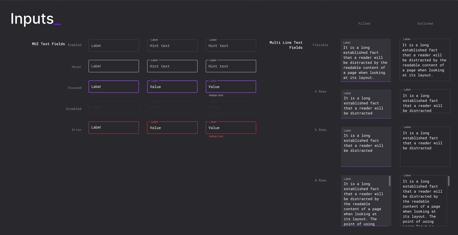
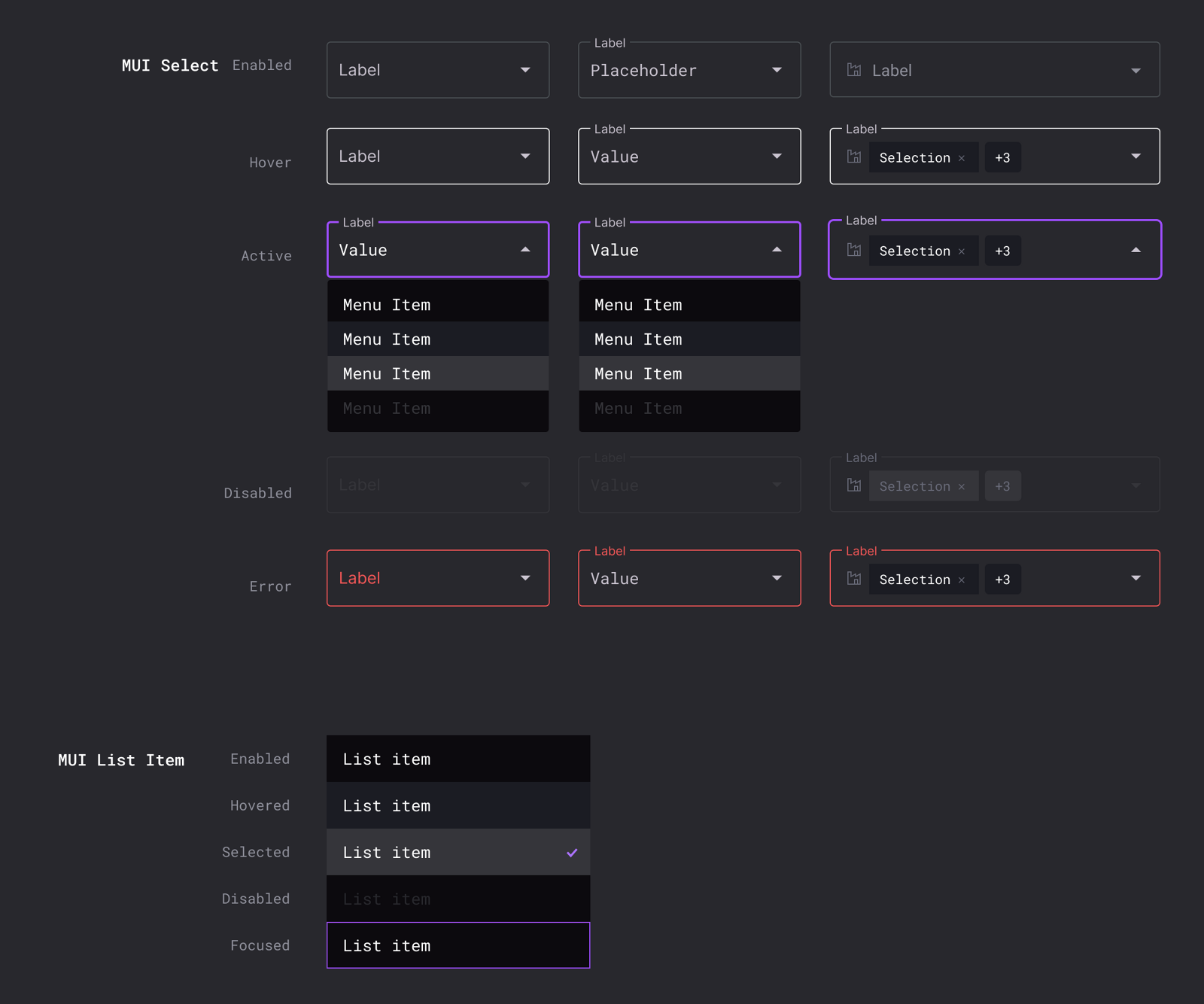
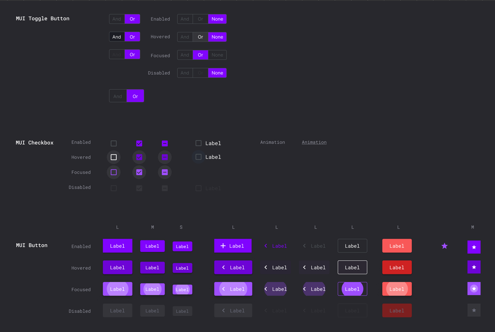
Every component documented its default, hover, focus, selected, disabled, error and loading behavior. The goal was predictable interaction, not a gallery of polished static examples.
Validate inside real workflows
Components were tested in reporting, navigation, investigation and remediation. That is where a generic component turns out to need a usage rule or a domain-specific composition.
05 · Accessibility-first architecture
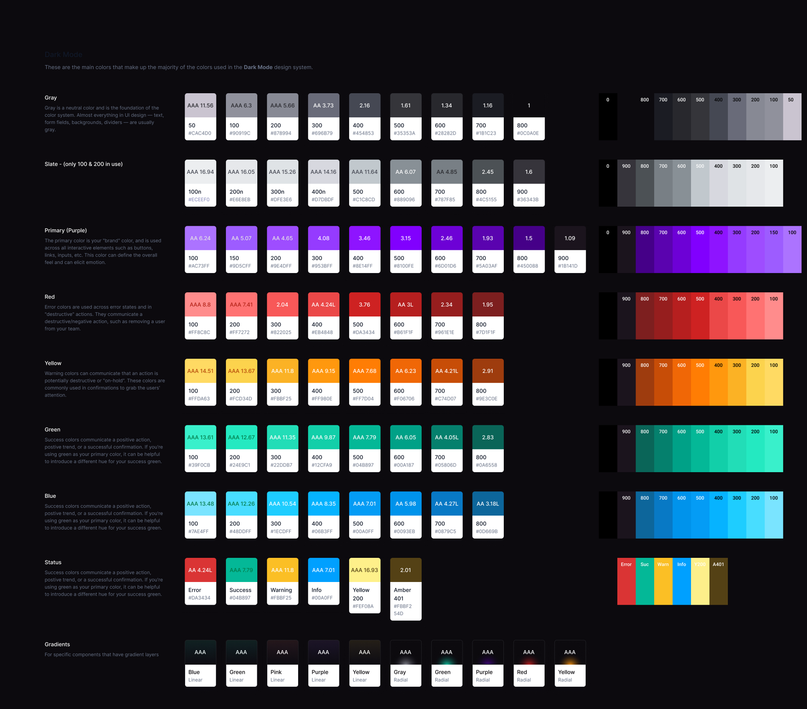
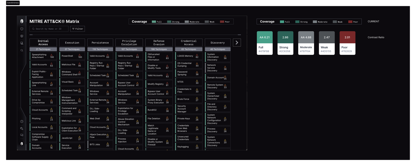
Our MITRE ATT&CK coverage matrix used a five-level color scale. Customers began raising valid concerns, particularly those with deuteranopia or protanopia, that the levels were indistinguishable and did not meet ADA and WCAG contrast standards.
The palette I was handed
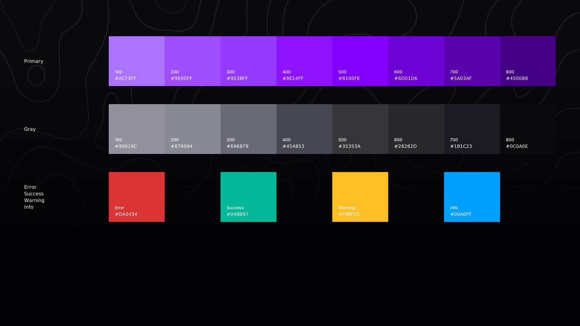
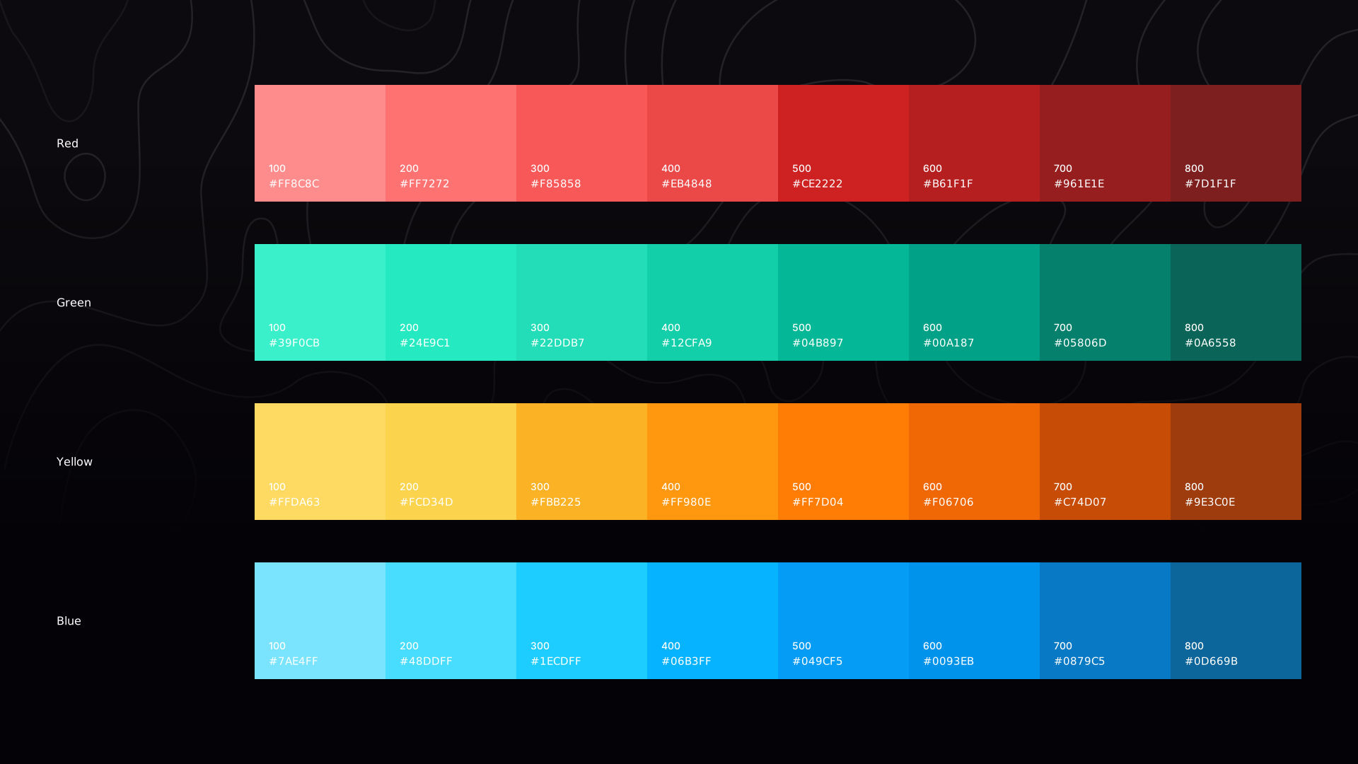
I audited the full palette in two passes. Every value went through a contrast ratio checker and was annotated with its AA or AAA result and the measured ratio, or left with the bare ratio where it failed. Then I re-rendered the interface under protanopia, deuteranopia and tritanopia filters to find which pairs were perceptually ambiguous rather than merely numerically compliant.
What the audit actually found
Compliance was not the blocker. Even where colors passed AA, the experience still failed. Five levels were too granular for anyone to interpret at a glance, nobody could articulate what separated full coverage from moderate coverage, and the distinctions rested on hue with almost no difference in luminance or shape.
This was not a compliance gap. It was a comprehension gap, and AAA does not fix one of those.
The incremental option was available and tempting: nudge the hues until every swatch passed. It would have closed the tickets without addressing the thing customers were actually describing.
What I changed
Simplified the scale
Five levels down to three. Less cognitive load, a distinction people could actually articulate, and closer to how threat coverage is conventionally visualized.
Designed for perceptual separation
Hues chosen to hold their distinction under simulated color-deficient vision, not just in a contrast calculator. Tested across multiple filters.
Added secondary cues
Tooltips and labeled indicators explaining what each level means, so the meaning no longer travels by color alone.
Documented it as a baseline
The palette shipped with WCAG ratios, use-case guidance, and worked examples of acceptable and unacceptable combinations.
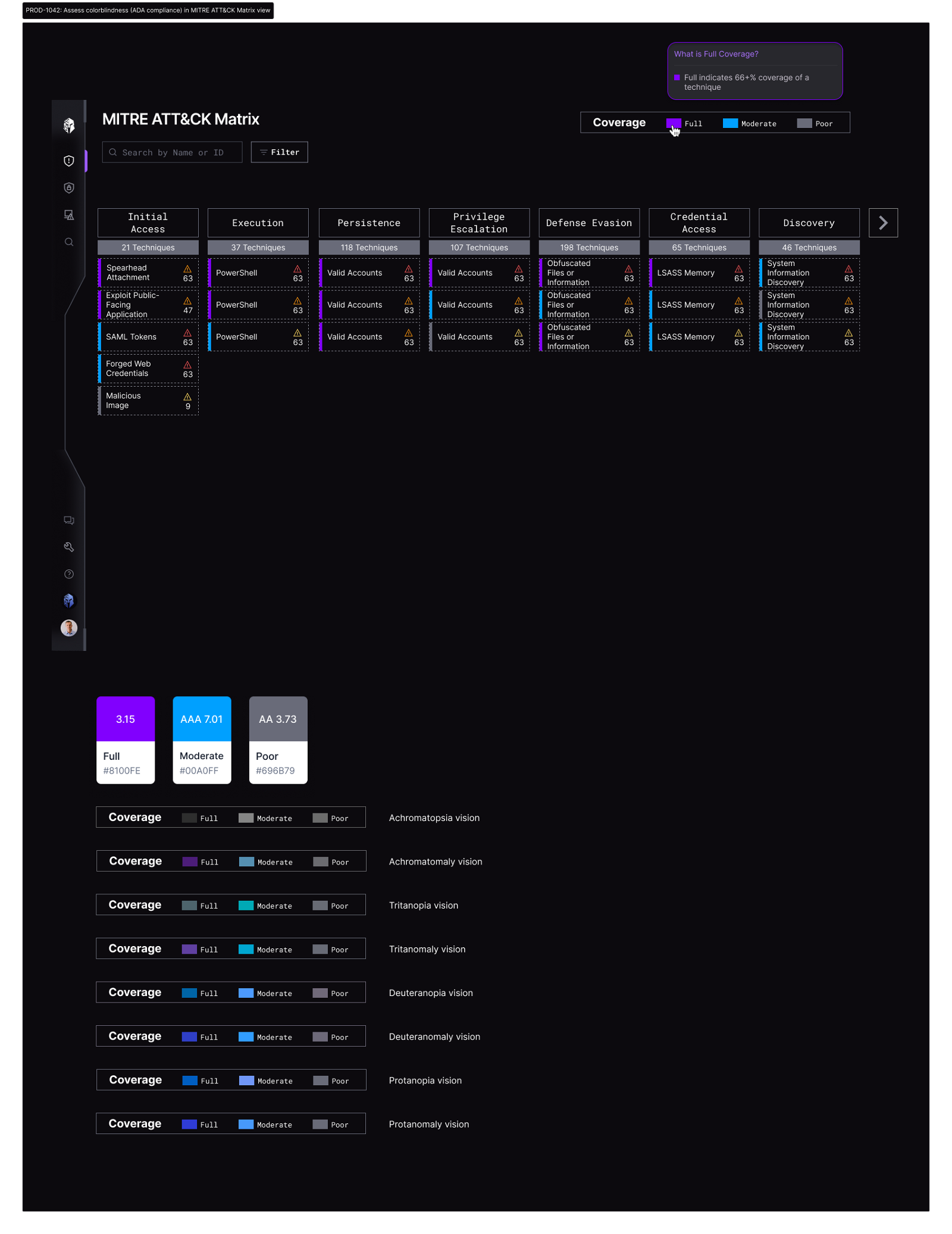
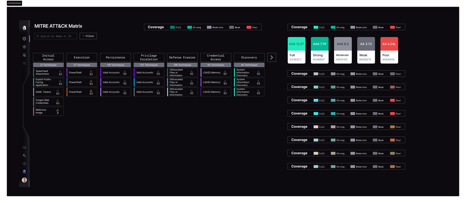
Accessibility is not a checkbox, it is a lens for clarity. Reframing the question from make it compliant to make it comprehensible for everyone changed the information model, not just the palette, and improved the visualization for every analyst who used it.
06 · From foundations to components
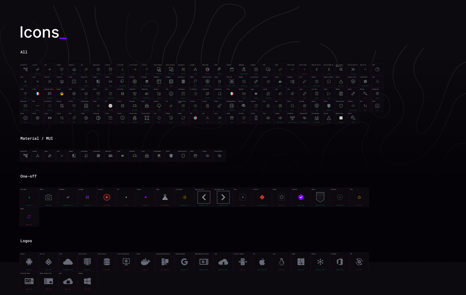
With the semantics settled I built reusable components on MUI primitives plus Interpres-specific behaviors: buttons and icon buttons, toggles and checkboxes, inputs, selects and list items, cards and status treatments, tooltips, dialogs and progressive disclosure, navigation and breadcrumbs, and iconography with usage guidance.
Each one was tied to product behavior rather than added for completeness. Breadcrumbs were not decoration, they solved a real investigation problem where an analyst could follow a chain of threat relationships and lose track of where they started.
07 · Closing the gap with code
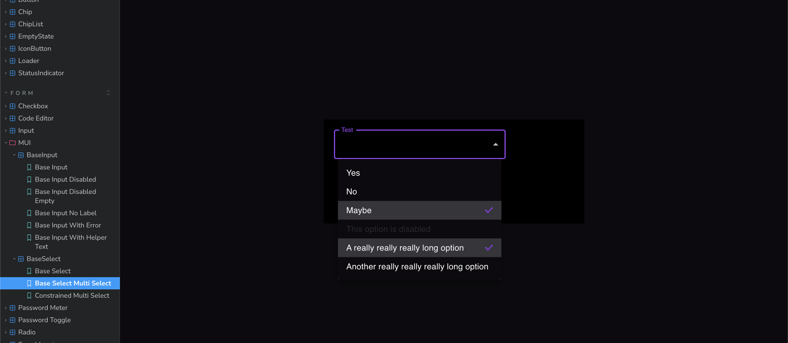
A system that exists only in Figma is a document. I set the product up locally so I could pull builds, inspect how components were actually constructed, and compare implementation against intent. That gave me Storybook, where I could review components in isolation, inspect awkward states, and watch changes behave inside live screens.
Working with the front-end engineer, that turned handoff from a one-directional delivery into a loop. Design decisions were informed by the component architecture, and implementation decisions were checked against user intent and system consistency.
08 · Proving it in a workflow
The report-generation redesign was the first workflow rebuilt on these components, and the composition it produced, a scrollable grouped selection with a persistent action area and indeterminate states, became the pattern every other selection-heavy dialog reused. That is the test a system has to pass: not whether one screen improved, but whether the next one was faster because of it.
The redesign, the trade-offs, and what it measured09 · Extending the system for explainable AI
Interpres was also building a conversational assistant so analysts could interrogate exposure data without synthesizing it across dashboards by hand. A conventional chat surface was not enough. In security, an answer has to be understandable, traceable and safe to act on, which means the assistant needs a consistent language for explaining how it got there.
One reasoning structure, reused everywhere
Response cards
Findings in a predictable hierarchy instead of open prose
Evidence and source tags
Every claim tied back to underlying Interpres data
Confidence indicators
So an analyst can calibrate how much to rely on a result
Why this matters
Technical findings translated into decision context
AI uncertain
Incomplete or conflicting information admitted, with recovery paths
Human confirmation
Sensitive actions stop for an explicit decision
Role-based permissions
Limits on what the assistant is allowed to execute
Traceability panels
The origin and logic behind a recommendation, on request
Streaming and fallback
Progress made legible when analysis is slow
Persona-aware depth
The same finding framed for an analyst, a SOC lead, or a CISO
The AI layer reused the same visual hierarchy, status semantics, navigation logic and accessible component states as everything else, which is why the assistant reads as part of Interpres rather than a chatbot bolted onto it.
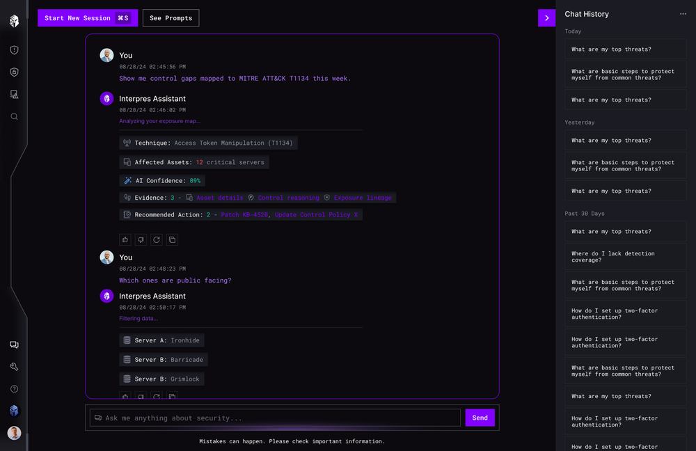
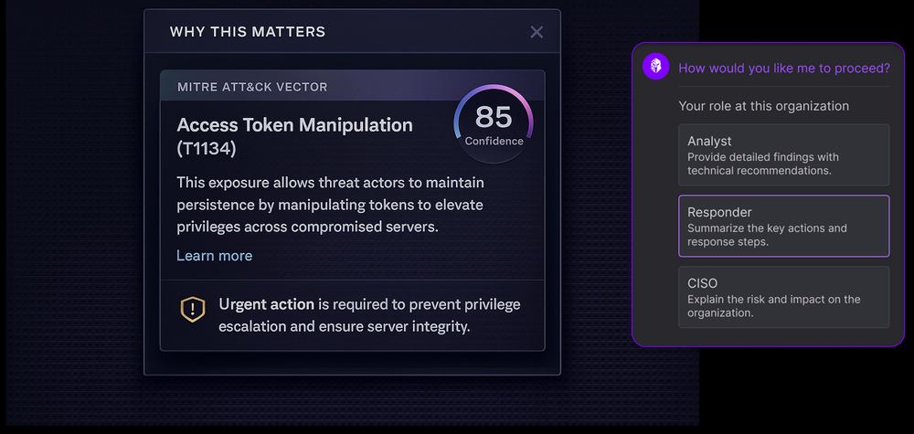
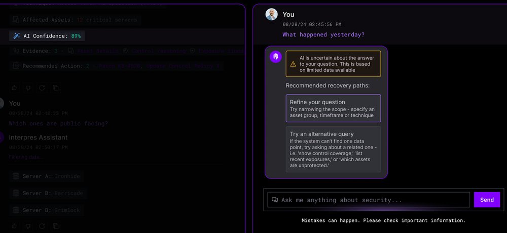
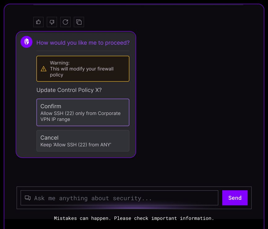
In prototype validation this cut average time to insight from about 45 minutes to 27, and analyst trust rose from 62% to 81% in post-task feedback.
This was a design system for an AI product. AI was not materially used to build the system itself in 2024. The section below is about what I would do differently now.
10 · What I would measure next
I did not have formal adoption analytics during the engagement, which is why the outcomes above are scoped to workflows. If the system had continued, I would have stood up a small health dashboard around five measures, none of which is the number of components.
11 · Retrospective
Written in 2026, not part of the shipped 2024 workThe original system was built for people making an AI product. It was not built through an AI-assisted process. Today I would take the next step and make the system legible to both people and tools, by encoding component intent, supported states, accessibility requirements and usage constraints as structured context rather than as visual examples alone.
The loop I would build
- An agent retrieves approved components, props, examples and usage rules.
- It composes the requested workflow from existing patterns rather than inventing new ones.
- Storybook renders the result across default, loading, empty, error, permission and responsive states.
- Automated interaction, accessibility and visual tests identify violations.
- The agent corrects the failures and reruns the checks.
- A designer and engineer review the result, including whether the pattern suits the user problem at all.
The goal is not automating design judgment. It is giving a model the same constraints and feedback loops that help a human team produce coherent, accessible work.
12 · What changed
For customers
- Important workflows became easier to scan and finish.
- Coverage and status became readable with a color vision deficiency.
- Navigation preserved context across long investigations.
- AI recommendations became structured, evidence-backed and checkable.
For the team
- Designers and engineers shared component references and states.
- Storybook made implemented behavior visible and reviewable.
- MUI and Tailwind gave the product a more scalable foundation.
- Design QA moved next to implementation instead of after it.
The most important outcome was not a library of controls. It was a clearer agreement about how Interpres should communicate risk and support a decision.
13 · Takeaways
Trade-offs
In cybersecurity, ambiguity creates risk. The system's job was to reduce it at every layer, from a checkbox state to an AI recommendation.