Shafeen Alam
Connecting offline seniors to the families who miss them
Project Luminary was an early Asurion product: a repurposed Android tablet built for one job, closing the communication gap between seniors who are offline and their remote family members. I helped define the vision and design strategy, made the design artifacts, and tested and iterated against the success metrics with a multidisciplinary team. This was years before Apple introduced its accessibility offering for older adults.
The people who most want to hear from their families are often the ones least able to use the devices that would let them.
60-second read
Seniors who are offline are cut off from family who live far away, and standard devices are not built for them.
Repurpose an Android tablet to do one thing: keep a senior and their family in touch.
Product vision, design strategy, artifacts, testing, and iteration, plus recruiting and managing the pilot group.
60% of the pilot group felt communication improved, and they were willing to pay $20 to $30 a month to keep it.
01 · Product vision
Start with the pain points, then map them with the whole team.
I led the creation of Luminary’s product vision through pain point research, using ethnography and market research, and mapping exercises with the multidisciplinary team. Working from what seniors and their families actually described gave engineering, product, and design the same picture of the problem before anyone drew a screen.
02 · The pilot
112 seniors and 394 family members, for continuous discovery.
I acquired and managed the pilot group and used it for continuous product discovery rather than a one-off test. Because family members were part of the pilot, we could see both sides of each conversation: the senior at the tablet and the relative on the other end.
03 · The buyer
The person who pays is rarely the person who uses it.
I built Luminary’s buyer persona through qualitative and quantitative research. That gave the team a clear audience for the digital acquisition campaigns at launch, aimed at the family member who would buy the service for a parent or grandparent.
04 · The interface
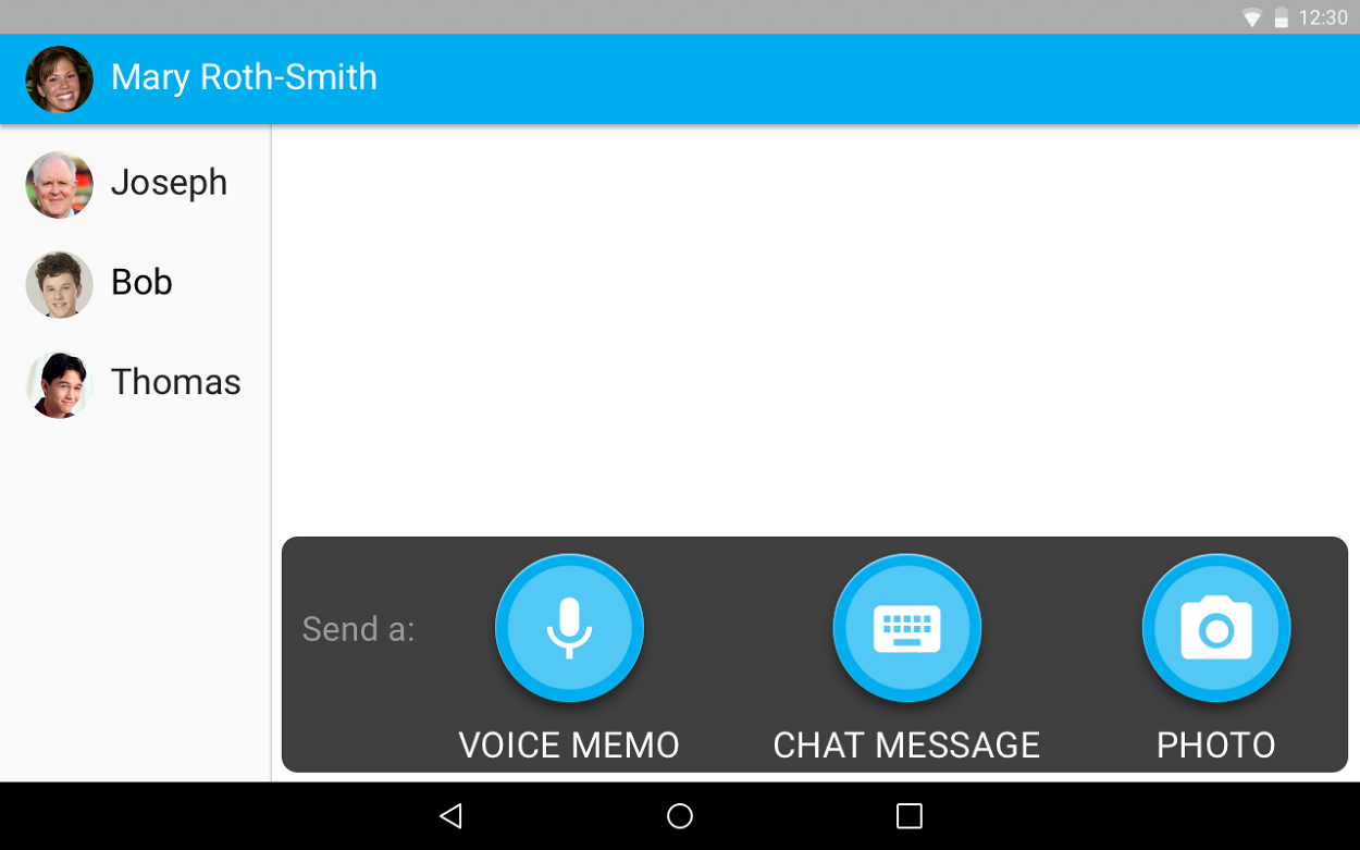
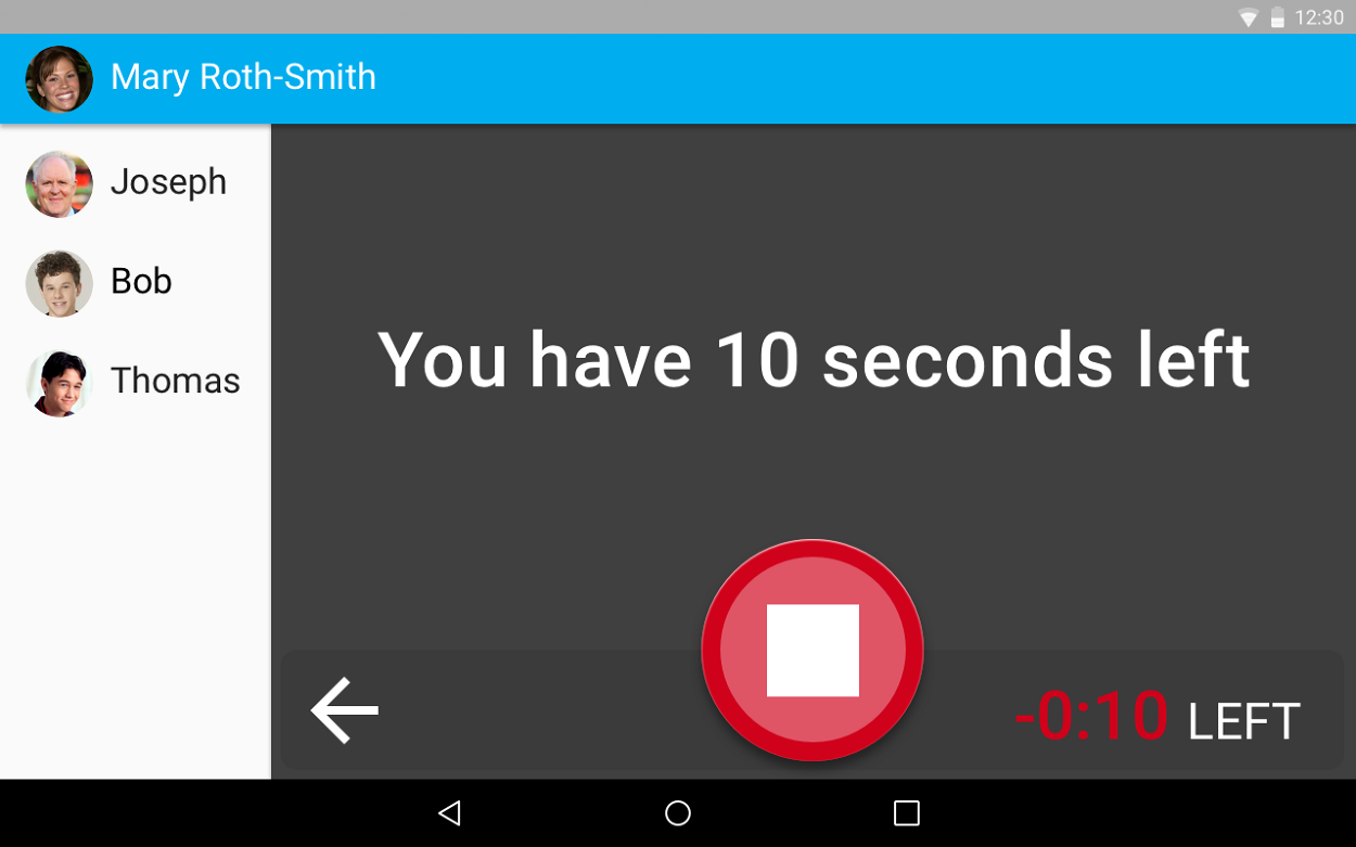
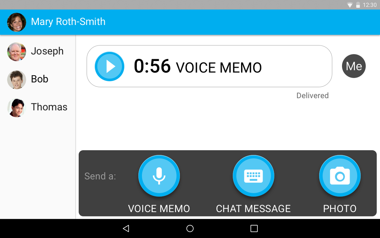
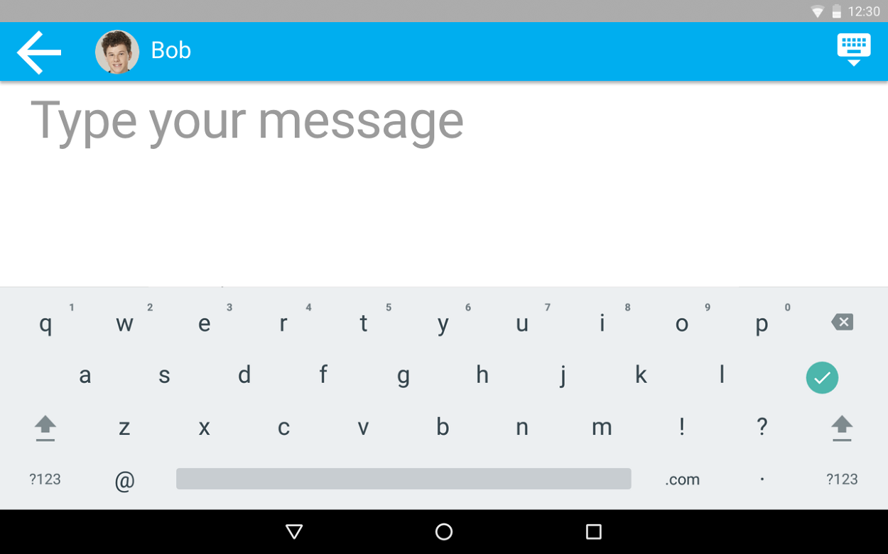
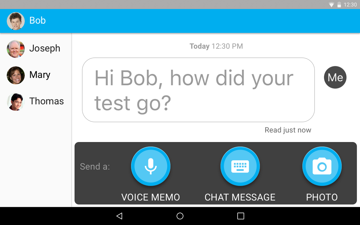
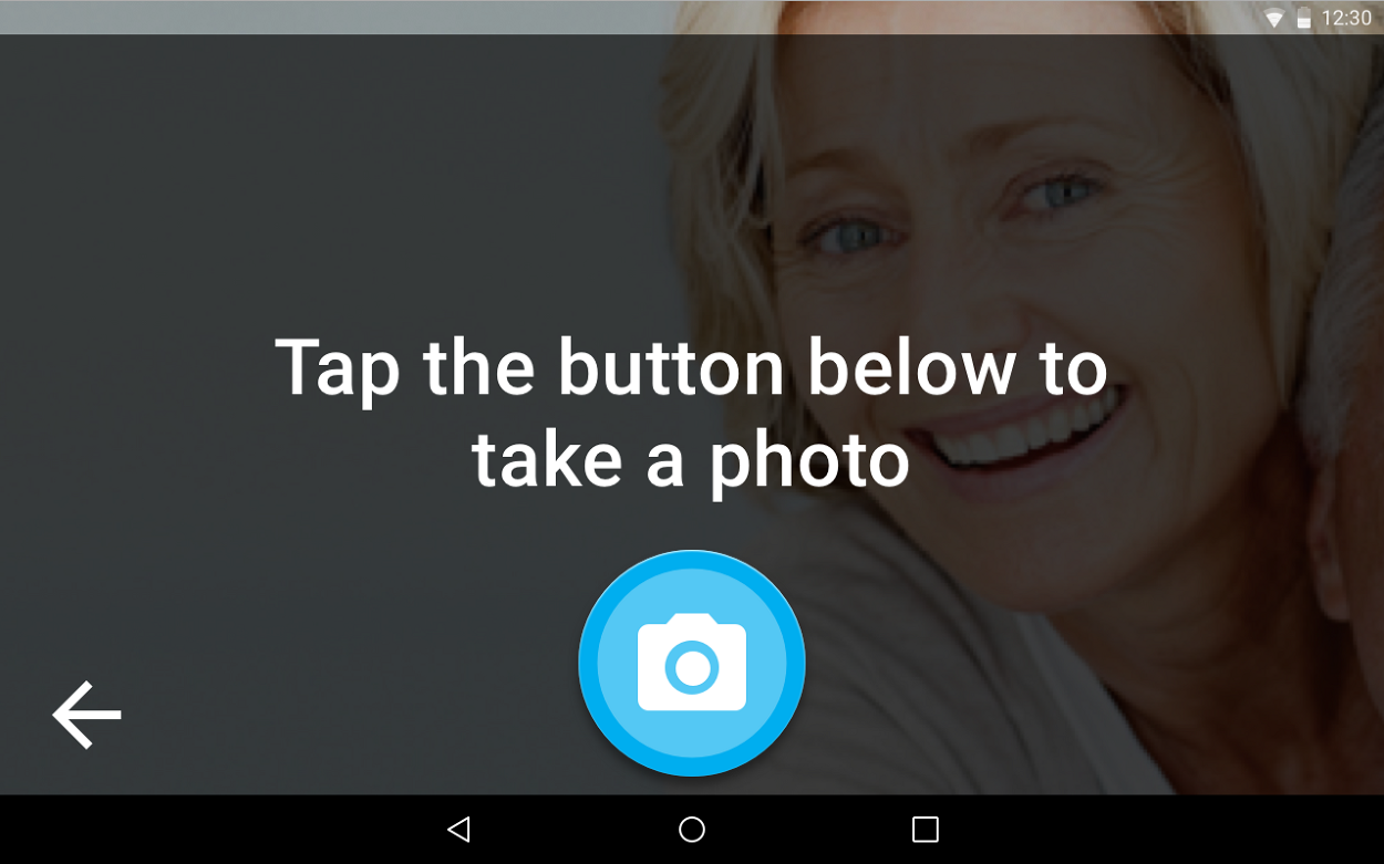
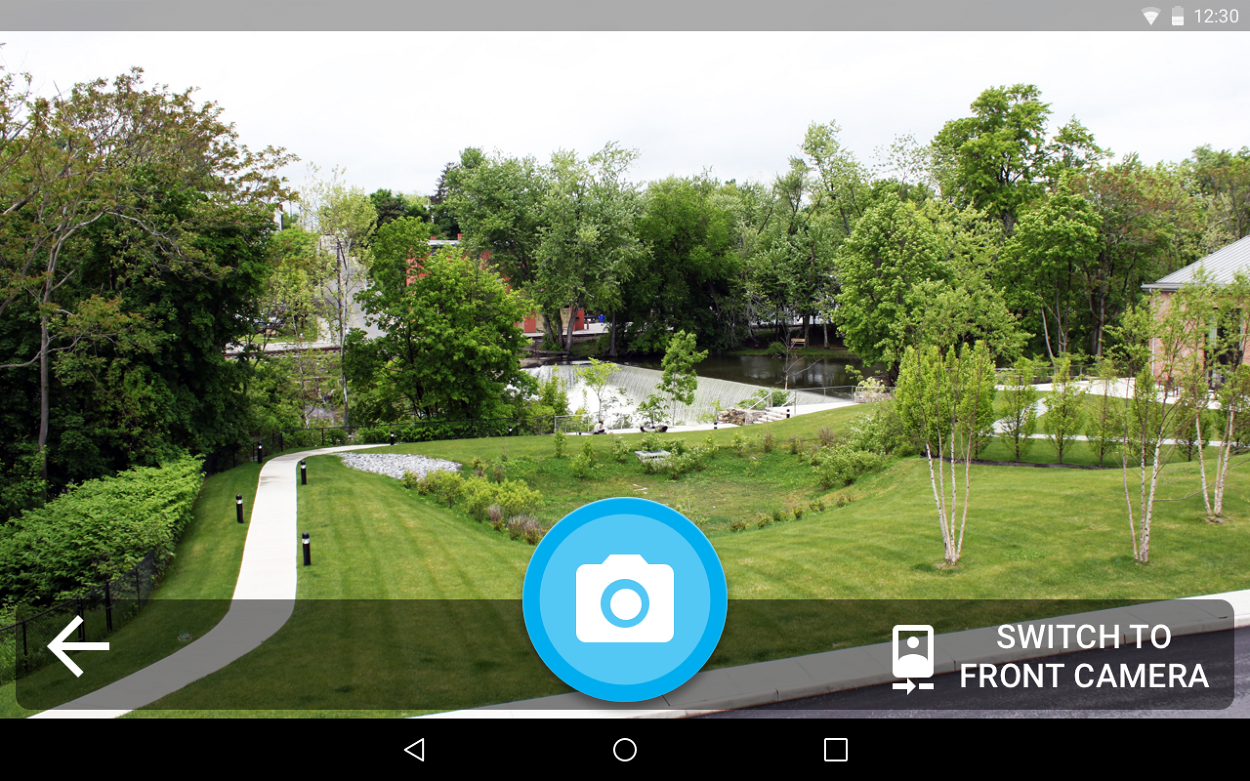
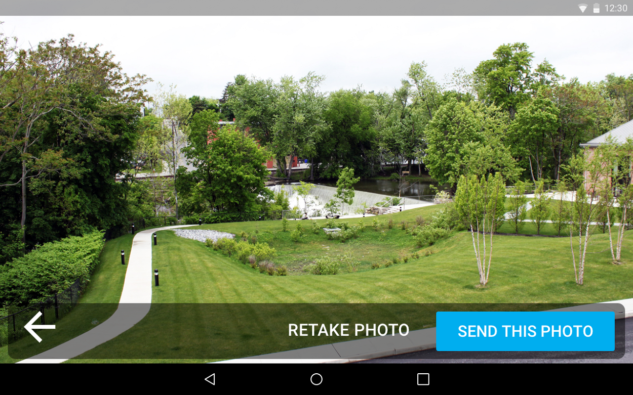
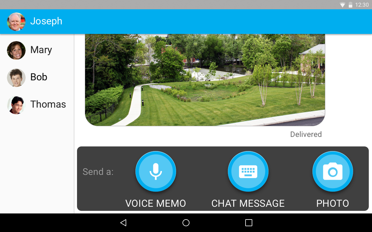
Three things a person can send, each one a single button.
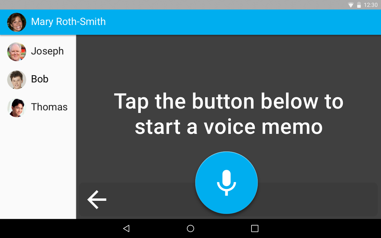
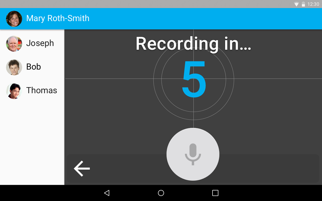
Every action follows the same pattern: a plain instruction, one large button, and a back arrow. Each step names what will happen next, and the thread confirms delivery.
05 · What the pilot showed
The best interface for some people is one that asks for almost nothing.