Shafeen Alam
All work
Realtor.comReal estate discovery platformConsumer

Rebuilding home search for the buyer we actually had

I joined Realtor.com in October 2015 as Director of Experience Design, responsible for the core experience across responsive web, iOS and Android. I was asked to revamp it from scratch. The first thing we found was that we were serving the wrong audience, and the fix was less about screens than about what the product assumed a home shopper needed.
Role
Director of Experience Design
Scope
Core experience: responsive web, iOS, Android
Team
Four to six designers, growing
Started
October 2015
case.md
$ cat outcome
responsive_site: shipped 10 Dec
ios_app: rebuilt in Swift
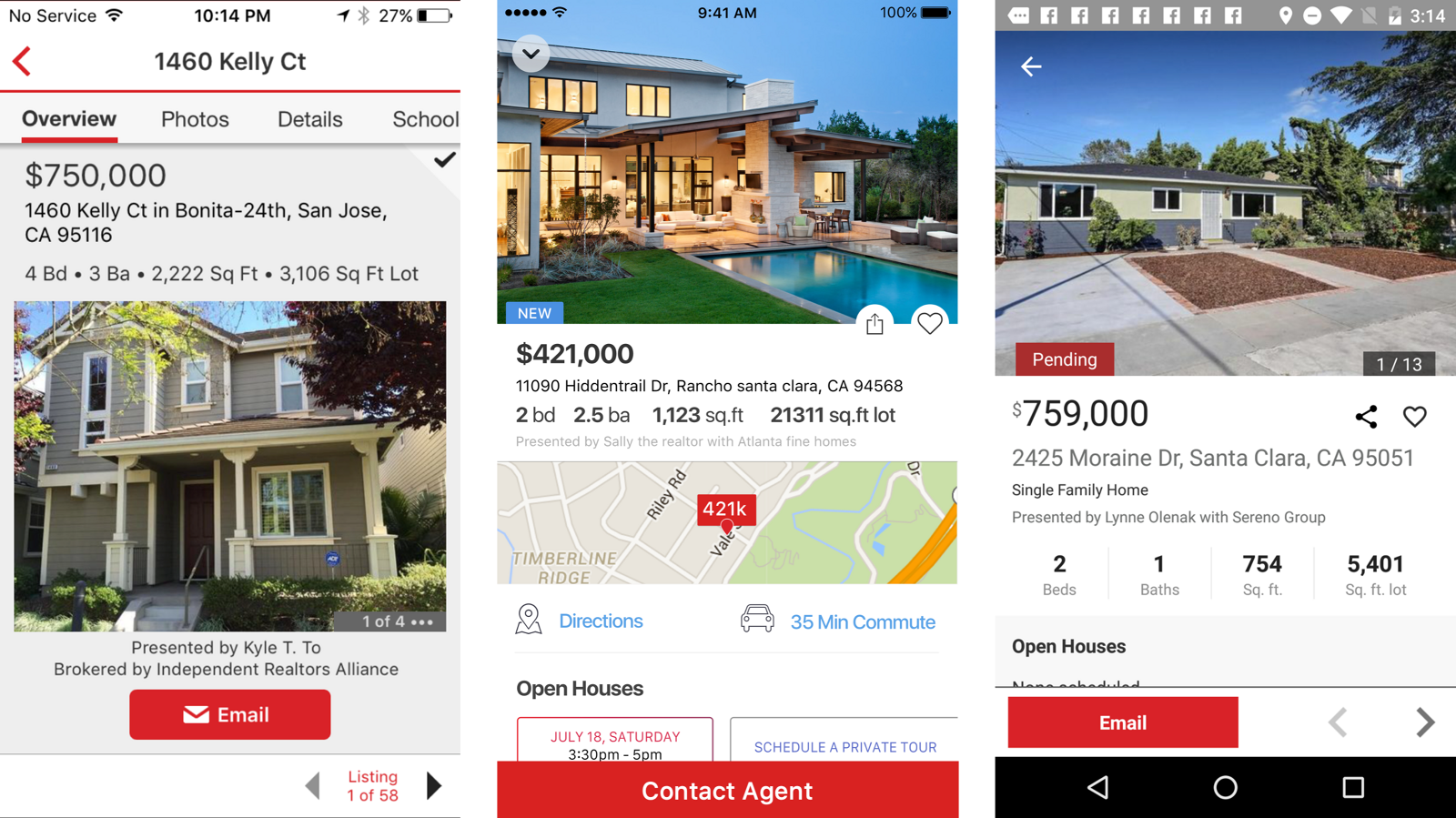
Three listing detail screens compared. The first is the old dense layout with a small photo. The second and third are redesigned, leading with a large photo, then price, beds, baths, a map with commute time, and open house times
The old listing page, the redesign, and where it landed. Millennial buyers were researching on their phones and deciding from photographs, so we cut the density, moved the pertinent details above the fold, and let the images do the work.
Why it mattered

The site was built for yesterday's buyer while the actual market had moved to self-directed search on a phone.

60-second read

Problem

Realtor.com was built for the buyer it used to have. The self-directed millennial buyer searched on different criteria, brought an agent in far later, and did all of it on a phone.

System decision

Rebuild search around where you are and whether you can afford to live there, not around listing attributes. Ship responsive first so we could move faster afterwards.

My contribution

Directed the core experience across responsive web, iOS and Android with a team of four to six. Ran the app audit, instrumented tracking, and set the research cadence.

Impact

Fully responsive site shipped 10 December. An iOS app untouched for three years rebuilt in Swift, with tracking and weekly experiments in place.

Jump to

01 · Getting back to
the basics

I hit the ground running with four other designers. The brief was to revamp the experience from scratch, and my read was that it was really about doing the brilliant basics better.

The first initiative was making Realtor.com responsive. We launched on 10 December, a site accessible on every phone. That was strategic rather than cosmetic: our users were already trending toward smaller devices, and one fluid codebase let us innovate faster on everything that followed.
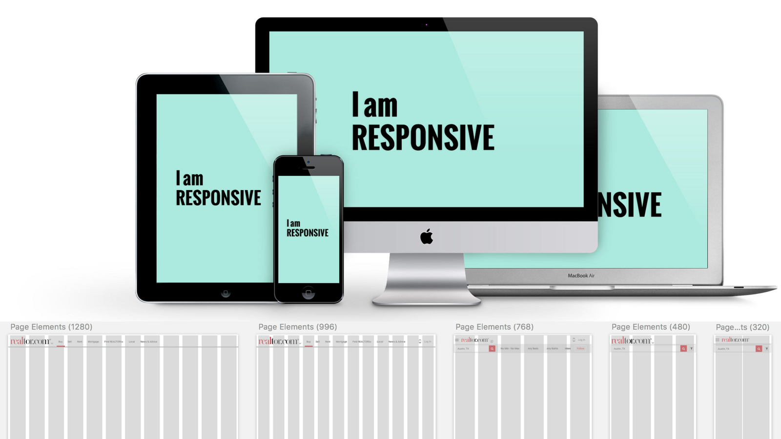
Realtor.com shown responsively across desktop, laptop, tablet and phone above a row of page element breakdowns at 1280, 996, 768, 480 and 320 pixels
The responsive system, specified breakpoint by breakpoint. Unglamorous work that made every later initiative cheaper to ship.

02 · The wrong
audience

We quickly identified that we were serving the wrong target audience. The numbers made the gap plain.

31
average age of a first-time buyer
44
average age of a repeat buyer
57
median age of the average realtor, who was female

Millennial buyers were significantly more self-directed. They searched on different criteria and involved an agent much later in the process than previous cohorts. And they were on their phones. A product organized around handing you to a realtor was answering a question this buyer had not asked yet.

A young couple sitting against a wall looking up at hand-drawn illustrations of money, buildings, a house with a sale sign, and question marks
This was our actual buyer, rather than the buyer the product was originally built for before I joined.

03 · The approach

Five principles for a millennial focus. Each one is a bet about what a self-directed buyer needs that the old product did not provide.

Guided trade-offs

Home buying is a sequence of compromises. Guide people through them rather than pretending a perfect match exists.

Blur search and discovery

Stop treating them as separate modes. Browsing an area should teach the system what you care about.

Value-added research

Give the shopper the information that empowers them, since this buyer was not relying on an agent to supply it.

Visualize living there

Convey what it is like to be in the home and the area without physically going.

Integrate financials

Put cost of ownership inside the shopping process, not in a separate mortgage tool.

04 · State of the app

Before proposing anything, we assessed what we had. I loosely called it the State of the App: go through the current experience, identify the opportunities, and be specific about what is broken.
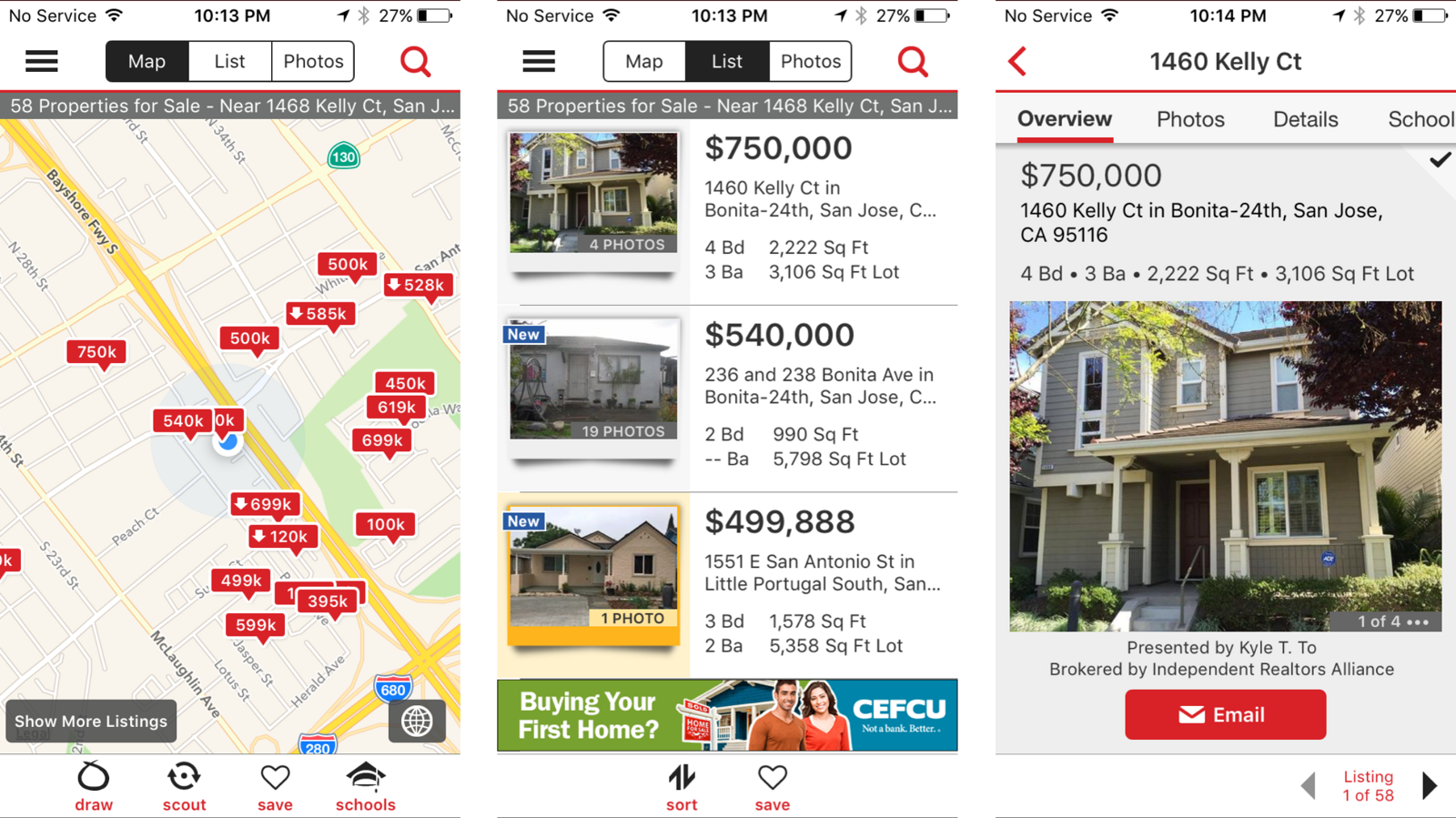
Three Realtor.com iOS screens before the redesign: a map with red price pins and draw, scout, save and schools tabs, a dense list view with small thumbnails and a banner ad, and a listing detail page with tabbed navigation
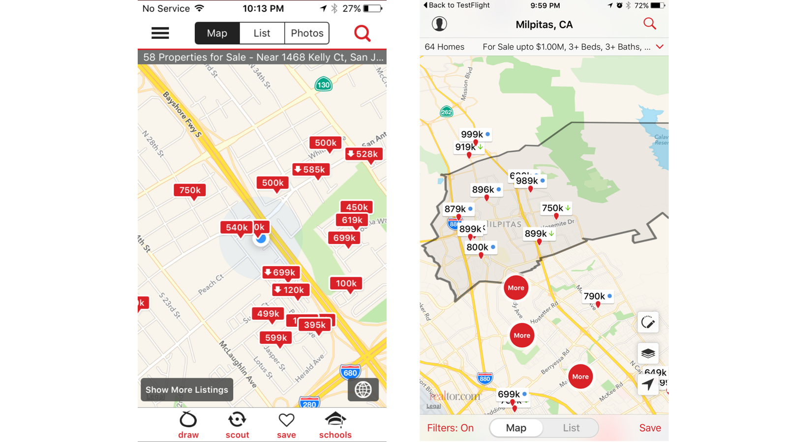
iOS, before. Major flaws in how information was displayed and no general focus: small images, a banner ad above the fold, and pertinent detail pushed below it. The app had not been touched in three years. I helped instrument actual tracking, because we were going about it blindly, and pushed to adopt Swift and optimize for iOS 9.
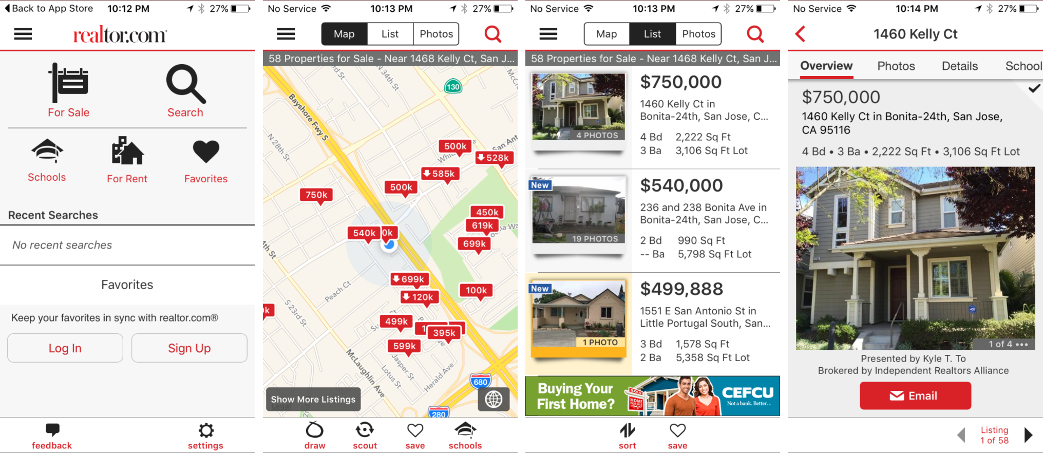
Four Realtor.com iOS screens before the redesign: a For Sale, Search, Schools, For Rent and Favorites entry hub with no recent searches, a map with red price pins, a dense list view with a CEFCU banner ad, and a tabbed listing detail page
The full entry sequence, before. The app opened onto a grid of five destinations and an empty Recent Searches list, which is a menu rather than a starting point. Nothing about it knew where you were or what you had been looking at.
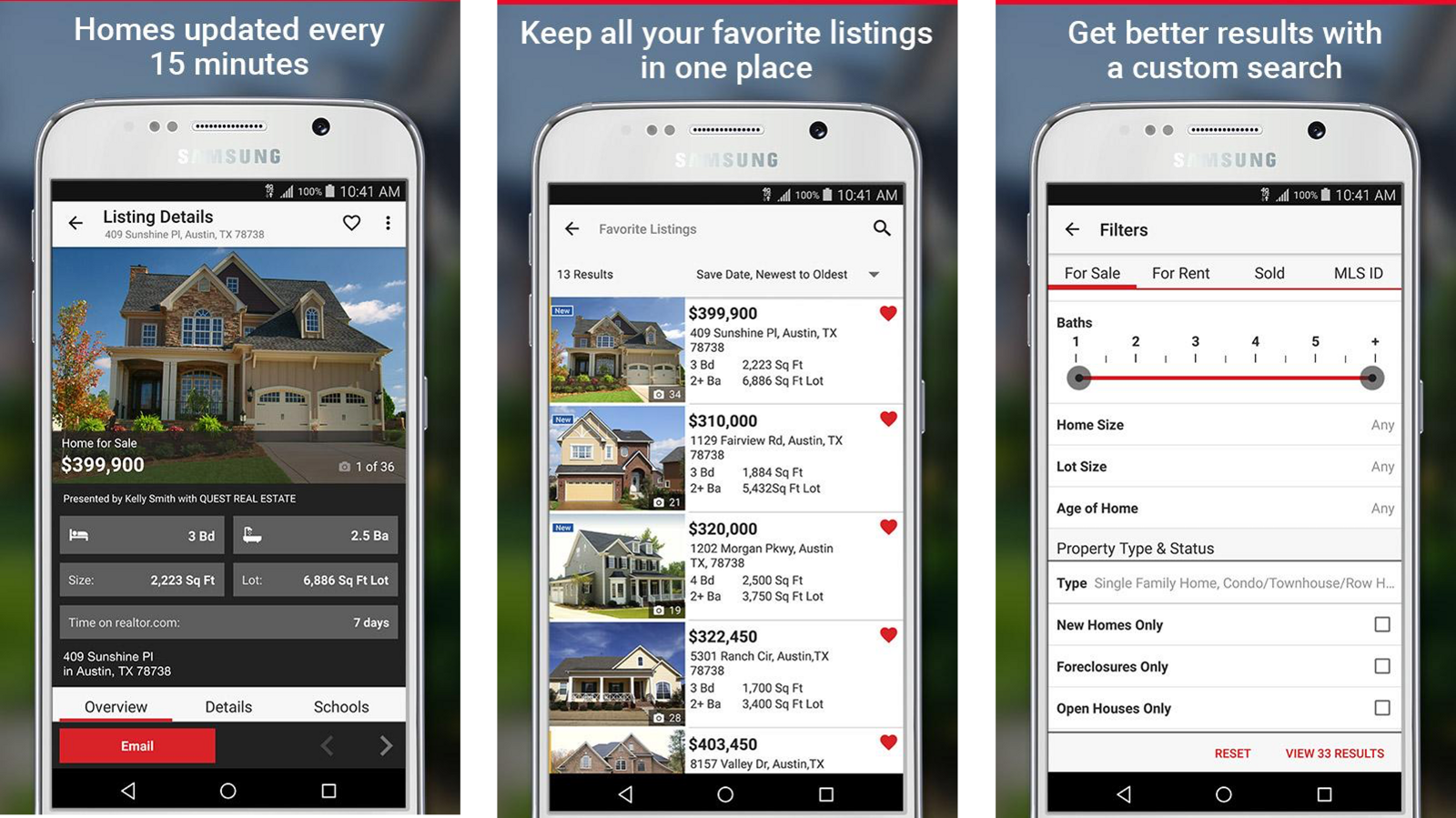
Three Realtor.com Android screens with Material Design applied: listing details, favorite listings, and a filters panel
Android, before. A far better starting point. Material Design had been applied, though screen by screen and only when a sprint had spare time. Here I pushed for experiments released to a large enough subset of users that we could actually learn from them.

05 · Research

We kicked off diary studies to learn about app engagement and kept a running list of open questions, running tests against them each week. That cadence mattered more than any single study, because it meant we were learning continuously while shipping.

Four themes came back

01 Area Knowing where you are, and whether you can afford this area, at a glance.
02 Show me what's new to me Not new listings in general. New since I last looked.
03 Big pictures Users engaged more with larger images, consistently.
04 Get to know me Make suggestions. Do not make me re-specify myself every session.

06 · What we
changed

With research in hand and learning weekly, we changed the native app experiences incrementally rather than in one redesign. Each of these traces back to a specific theme.
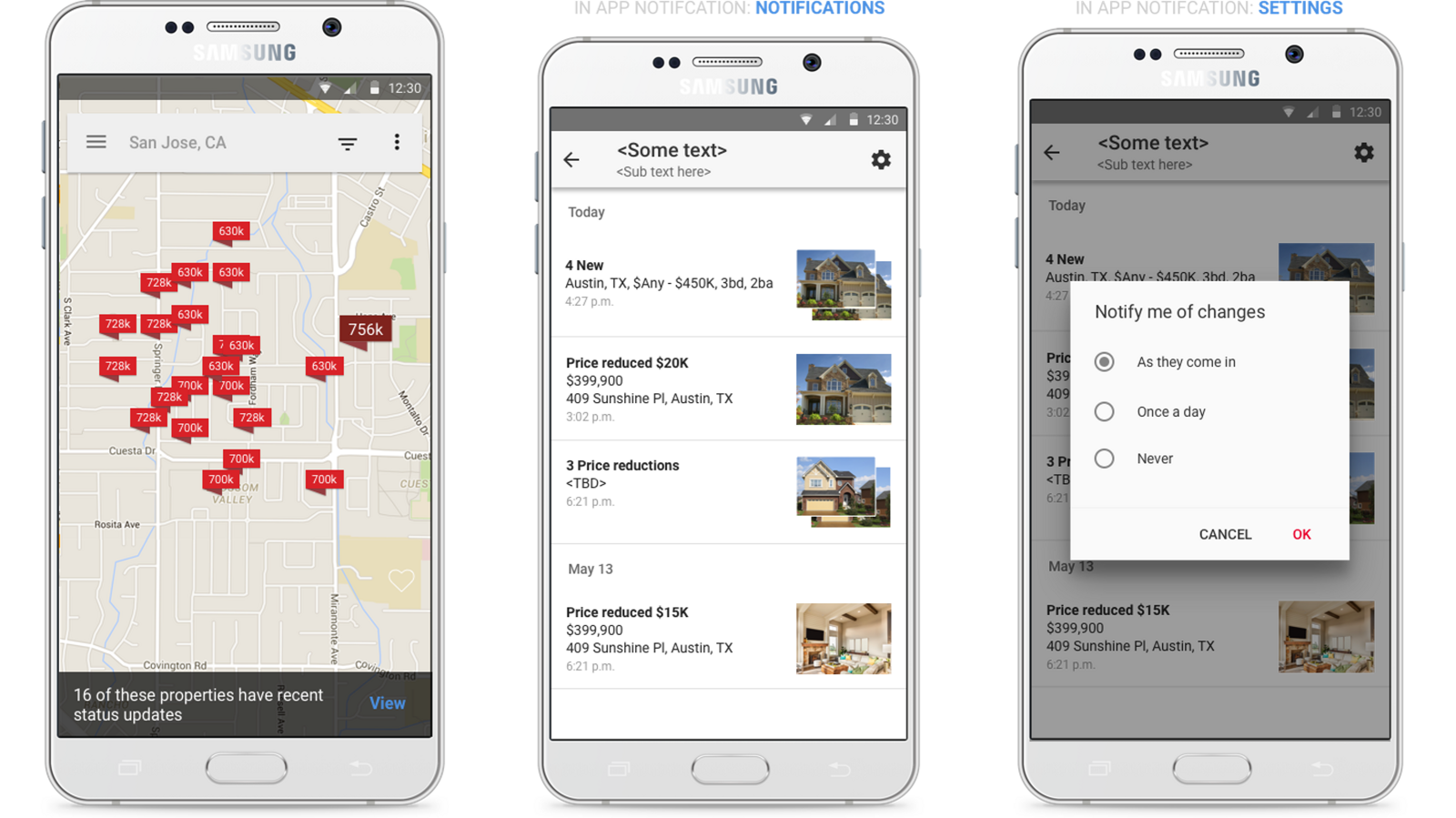
Three Android screens: a map noting sixteen properties have recent status updates, a notification feed listing new homes and price reductions by day, and a dialog offering notify me of changes as they come in, once a day, or never
Show me what's new to me, run as an Android experiment testing a hypothesis about engagement. Users could see only listings new since their last visit, and set their own notification frequency. The frequency control is the part I would defend: a feed that respects the user's tolerance stays useful.
Two Realtor.com iOS map screens side by side. The left has price pins on a plain map with no area context. The right shows the same map with the Milpitas city boundary outlined and the city name labelled
The change that mattered most, and the smallest one to describe. Before, you had no sense of where you were. After, panning the map named the city you were looking at and drew its boundary. We later added school district boundaries on the same principle.
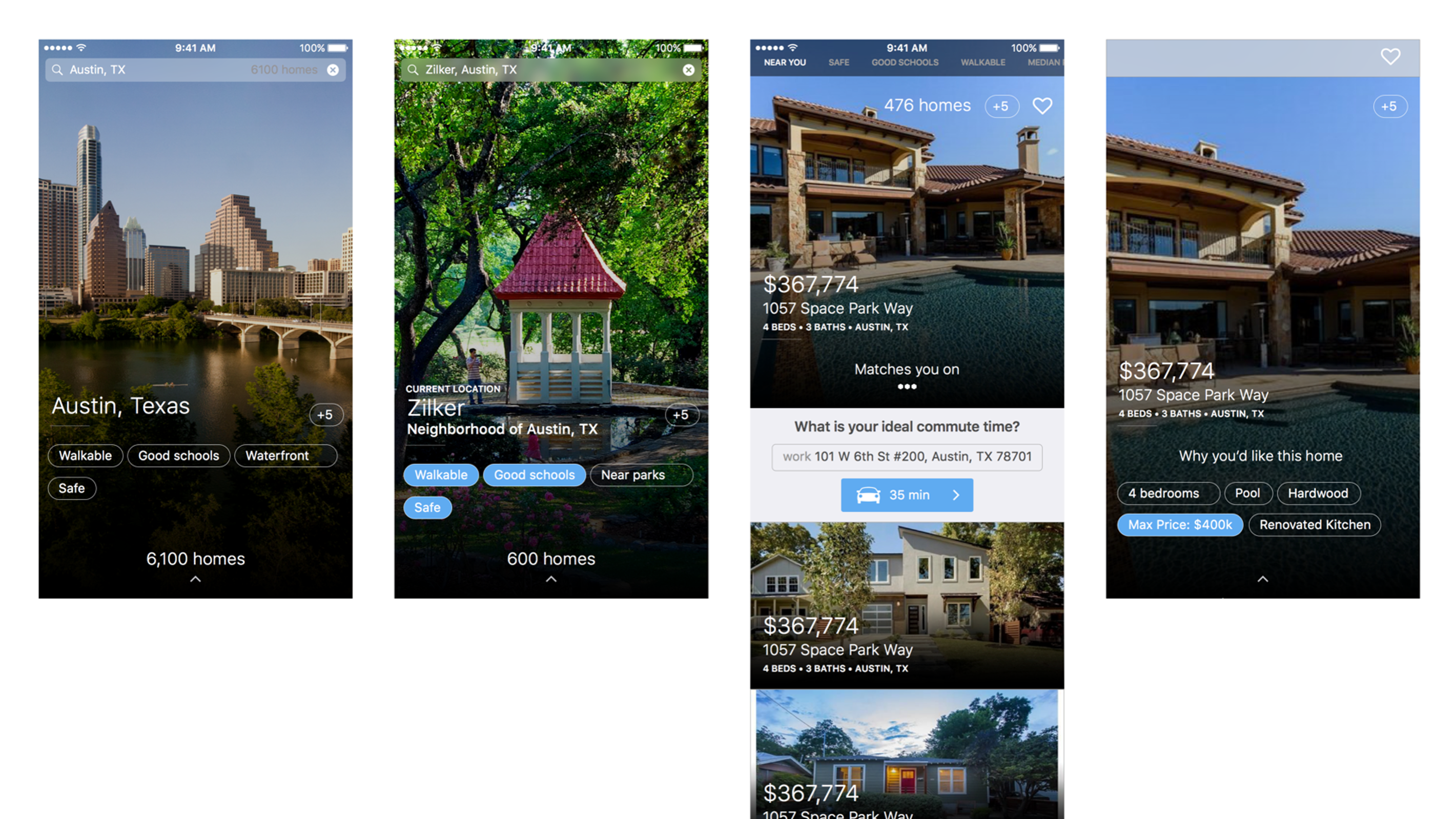
Four immersive area screens: a full-bleed Austin skyline labelled with walkable, good schools, waterfront and safe attributes and 6,100 homes, a Zilker neighborhood screen with selected attributes, a listing showing what is your ideal commute time, and a listing showing why you would like this home with matched attribute chips
An idea I played with: make the area you are exploring immersive. Swiping up dives into that city or neighborhood, exposing the attributes it is known for as interactive chips. Tapping them tells us what matters to you, and the experience caters to that as you keep going. This is where blurring search and discovery becomes literal.
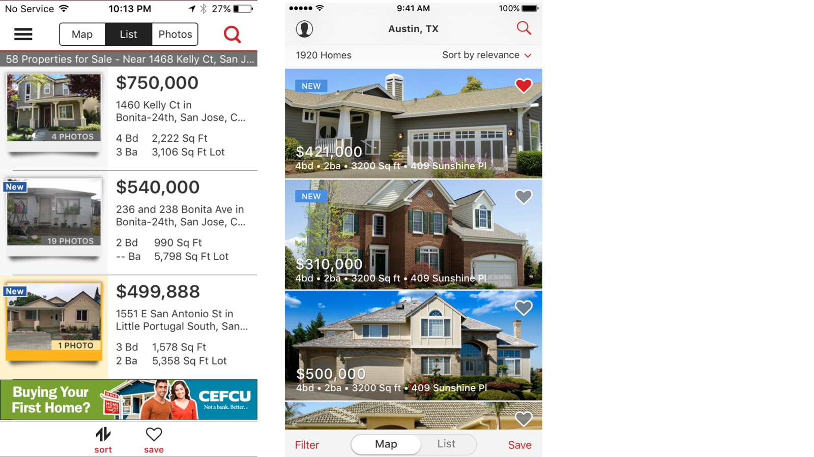
Two list views compared. The left is the old dense list with small thumbnails and a banner ad. The right is the redesigned edge-to-edge photo list with price and details overlaid on each image
Bigger photos carried into list view for the same reason they worked on the detail page. Users engaged more with larger images, so we gave them fewer results per screen and made each one worth looking at.
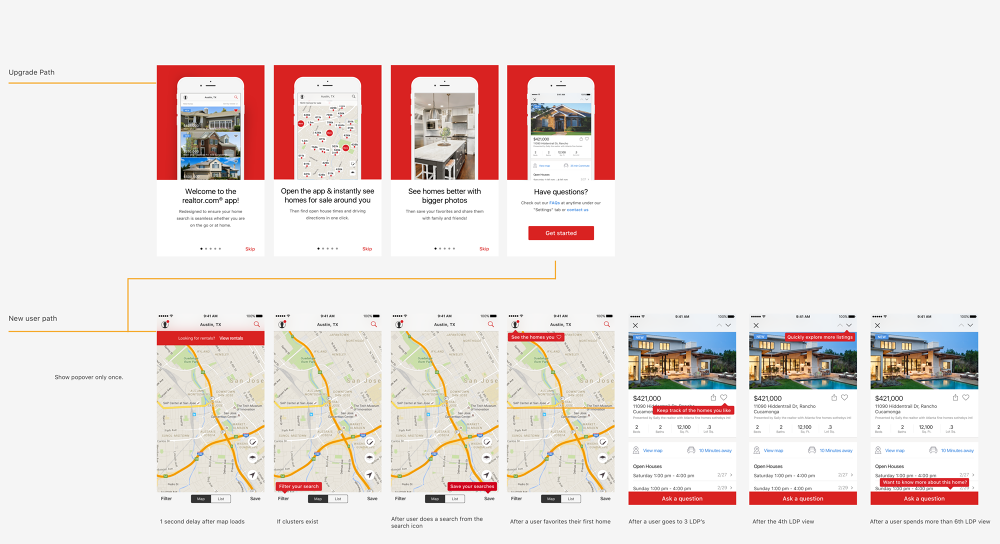
A flow map with two tracks. The upgrade path shows four red onboarding panels welcoming users to the app, promising homes around you, bigger photos, and help. The new user path below shows a map with timed coach marks and listing pages with prompts appearing after the third, fourth and sixth listing view, annotated show popover only once
Onboarding split into two tracks, because an existing user upgrading and a brand new user need different first minutes. Below it, each prompt is gated on a specific condition rather than fired on launch: rentals surface one second after the map loads, the filter hint only if clusters exist, save your searches after a search from the search icon, see the homes you liked once you favorite your first home, keep track of the homes you like at the third listing, explore more listings at the fourth, and want to know more about this home only past the sixth. Each popover shows once. Teaching in the moment beats a tour nobody finishes.
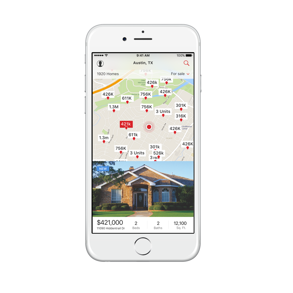
Realtor.com iOS search results on an iPhone showing a map of Austin with price pins and a selected listing card below it with a large photo, price, beds, baths and square footage
The resolved map and card pattern: pins above, the selected home as a full-width photo card below, with the essentials on one line.
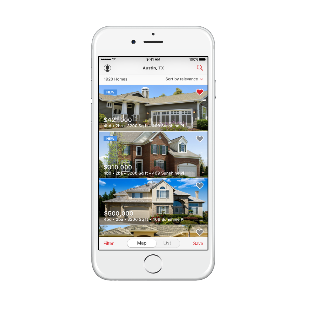
Realtor.com iOS list view on an iPhone showing edge-to-edge home photos with price and details overlaid, new badges, and save hearts, with a map and list toggle at the bottom
And the list, edge to edge. Price and details sit on the photograph rather than beside it, with the map and list toggle always reachable at the bottom.

07 · Android,
properly

Android had Material Design applied unevenly, screen by screen, whenever a sprint had spare time. We finished the job as a system rather than a backlog, and the platform got its own resolution of each pattern instead of an iOS port.
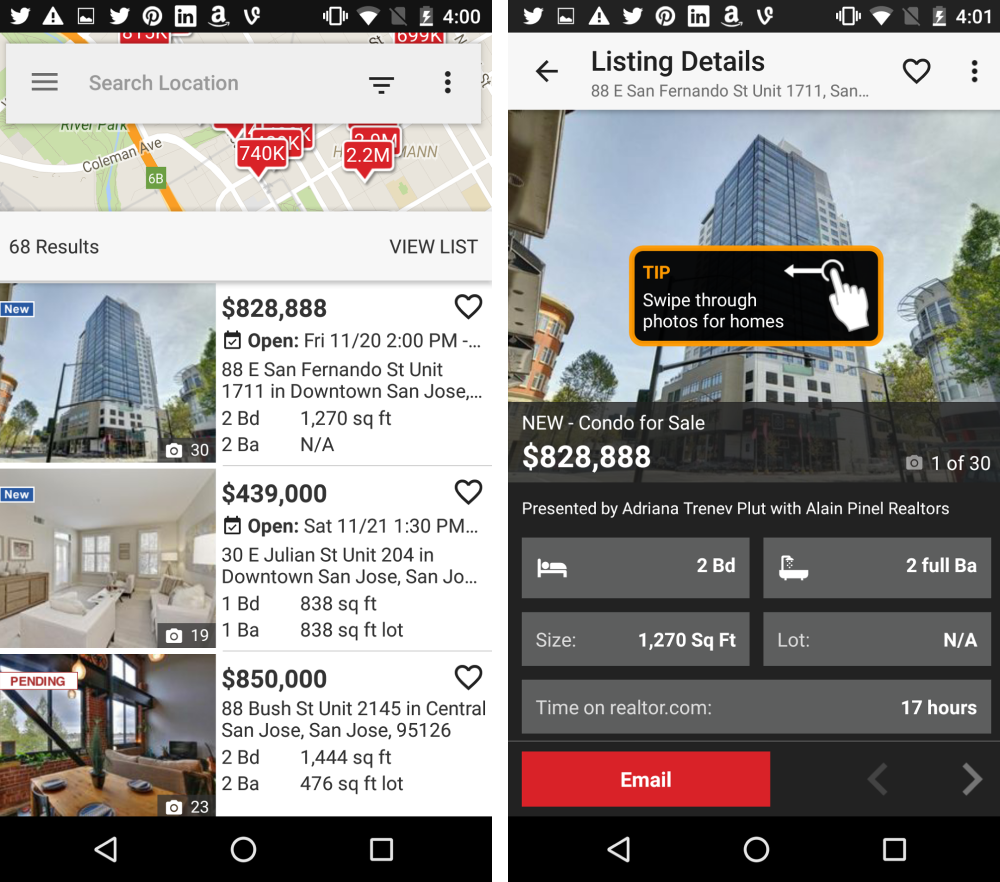
Two Android screens before the redesign. A cramped map with a search field over it and a list of listings below, and a listing detail page in dark chrome with an orange TIP coach mark reading swipe through photos for homes
Before. The map is squeezed above a list so neither is usable, the detail page is dark gray chrome, and there is an orange coach mark explaining that photos can be swiped. When the interface needs a tooltip to explain a swipe, the interface is the problem.
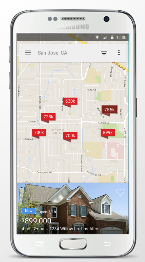
Samsung phone showing the redesigned Realtor.com Android map for San Jose with price pins and a selected listing card at the bottom showing a large photo, New and Open badges, price and details
Map, after. One selected home as a photo card docked to the bottom, on the same pattern as iOS but built from Material components rather than ported pixel for pixel.
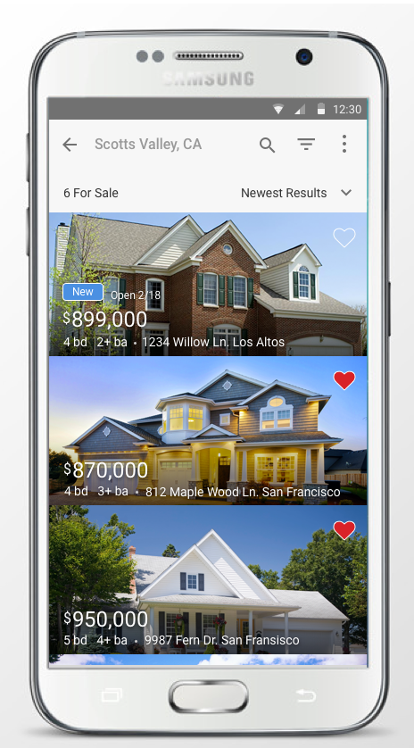
Samsung phone showing the redesigned Android list for Scotts Valley with three edge-to-edge home photos, price and details overlaid, and save hearts
List, after. Edge-to-edge photography with the details set on the image, so the same big-pictures finding carried across both platforms.
Redesigned Android listing detail page in a Samsung frame with a large photo, price, open house schedule, directions and street view, description, key facts, assigned schools with ratings, listing agent details, and an agent contact form
Listing detail, after. Structured into cards: the home, then the description and key facts, then assigned schools with ratings, then the agents. Contacting someone sits at the bottom, after the information a self-directed buyer wanted first.
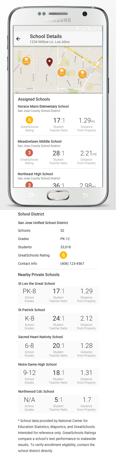
Android School Details page showing a map with elementary, middle and high school markers, assigned schools with GreatSchools ratings, student teacher ratios and distances, district summary, and nearby private schools
The schools page that grew out of the area findings. Ratings, student to teacher ratio and distance for each assigned school, the district summary, and nearby private options, with the data sources named at the bottom.
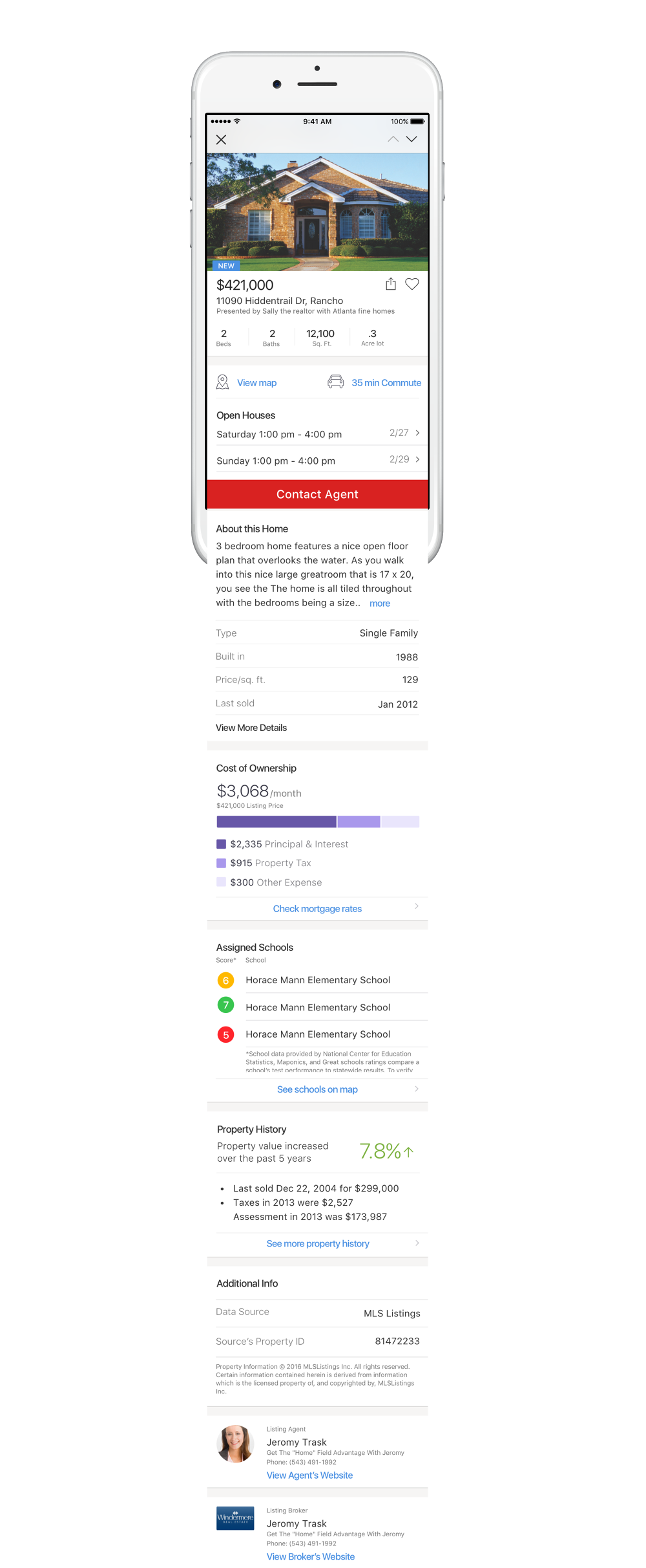
Full-length Realtor.com iOS listing detail page in an iPhone frame showing photo, price, beds baths and lot, view map and 35 minute commute, open houses, contact agent, about this home, property facts, cost of ownership breakdown, assigned schools with ratings, property history, data source and listing agent and broker
And the iOS listing page end to end, which is where most of these threads meet. Commute, open houses, cost of ownership, assigned schools and property history all resolve on one scroll, in that order. The contact button sits high, but everything a self-directed buyer wanted before talking to anyone is below it.

08 · Personalization

Home buying is about location and everything around the home, so personalization meant vicinity, affordability, and the specific things a buyer will not compromise on.
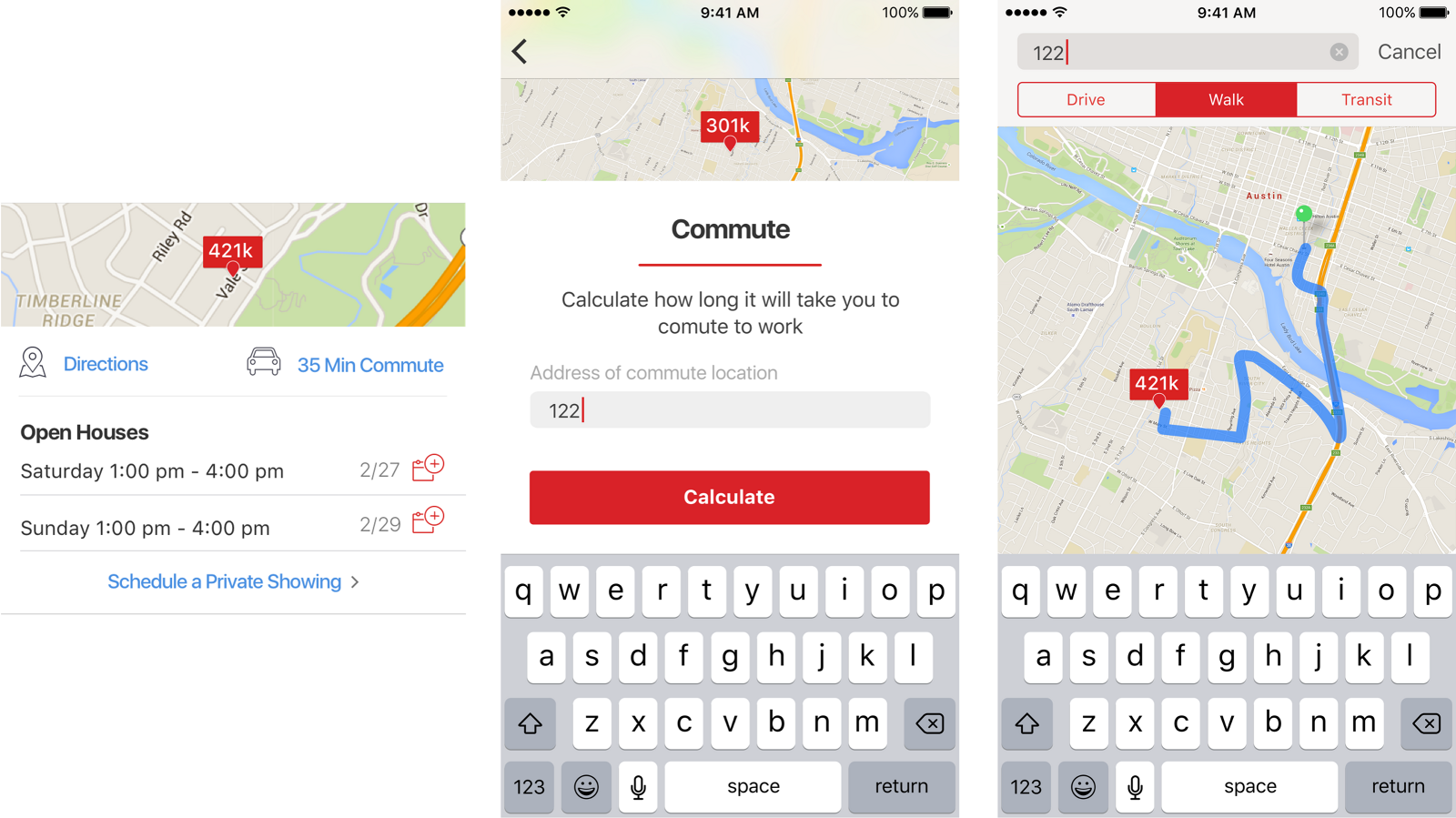
Three screens showing a listing with a 35 minute commute link, a commute calculator asking for a work address, and a map displaying the calculated route with drive, walk and transit options
Commute as a first-class attribute. Enter a location and we return the distance and travel time, with drive, walk and transit. This is the idea of vicinity made concrete: not how nice is this house, but what is my life like from this house.
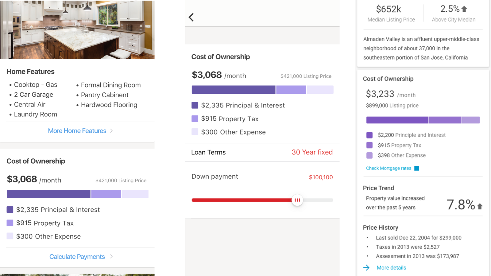
Three screens showing cost of ownership: a monthly total of $3,068 broken into principal and interest, property tax and other expense, a calculator with loan terms and a down payment slider, and a neighborhood panel combining cost of ownership with price trend and history
Integrating financials directly into shopping. Buyers routinely factored in only the list price and missed utilities, property tax, and the rest. Showing $3,068 a month against a $421,000 listing gives a realistic sense of ownership, and it adjusts expectations before someone falls in love with the wrong house.
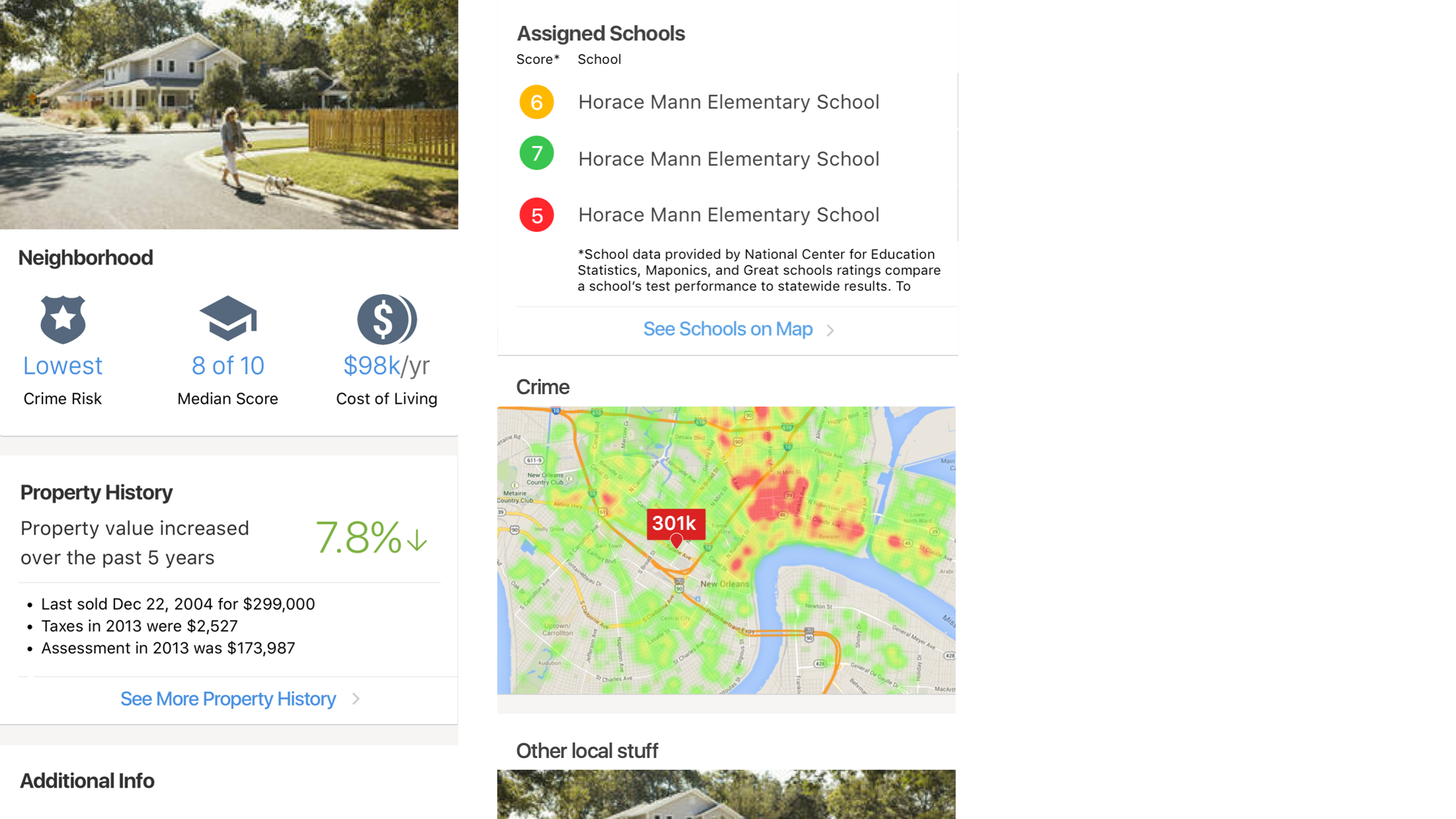
Two screens showing neighborhood information: crime risk, school median score and cost of living summarized with icons, and a detail view listing assigned schools with scores plus a color-coded crime heat map
Schools and crime, tied back to the sense of area. Summarized at a glance first, with the underlying detail one level down, including a heat map rather than a single number.
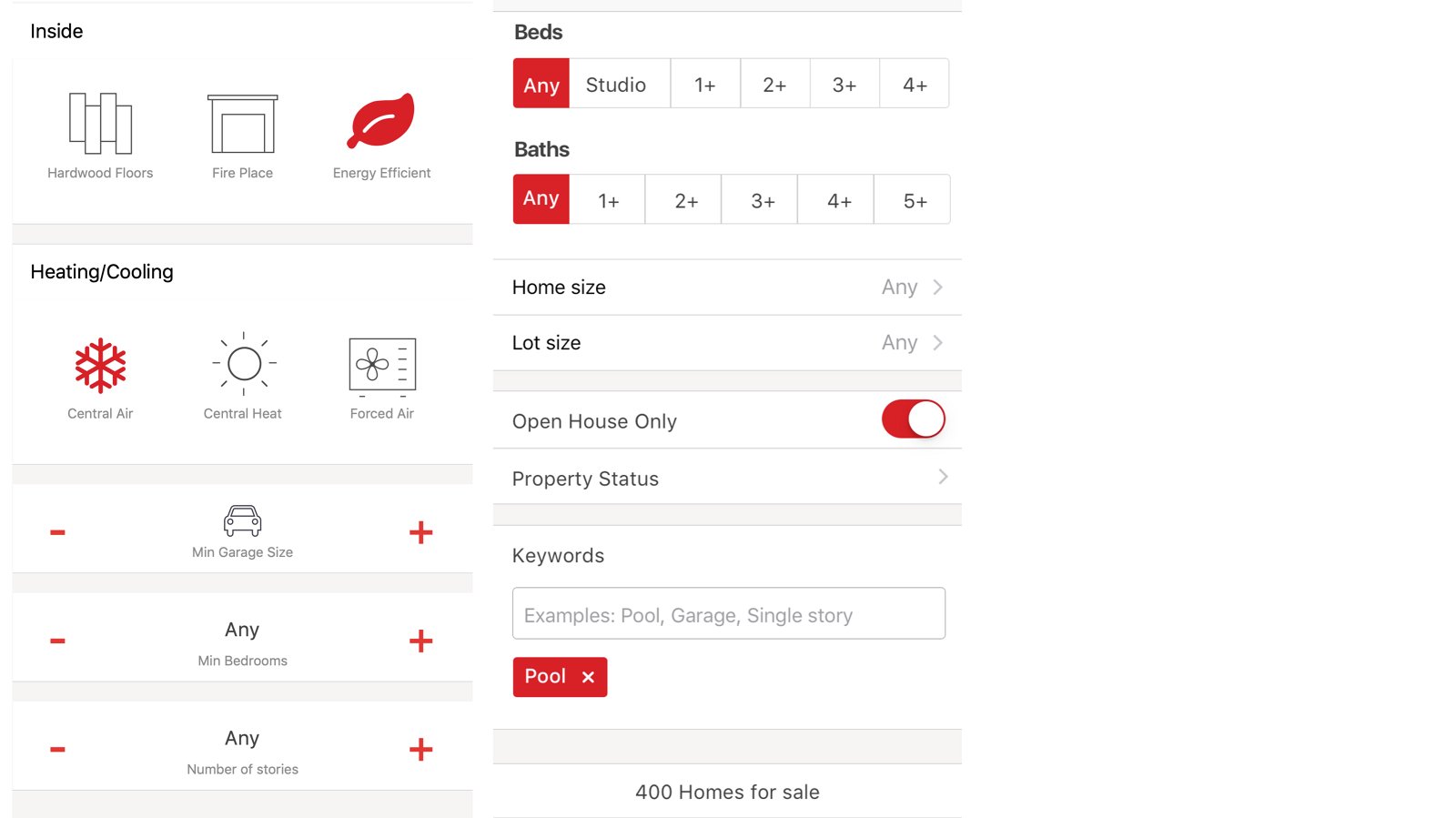
Two filter screens. The left shows feature icons for hardwood floors, fireplace, energy efficient, central air, central heat and forced air plus steppers for garage size, bedrooms and stories. The right shows beds and baths selectors, an open house only toggle, and a keywords field with a Pool chip applied
Must-haves, made easy to enter. We made this dynamic so the options reflected the area and the attributes that geography was actually known for, rather than showing the same generic checklist everywhere.
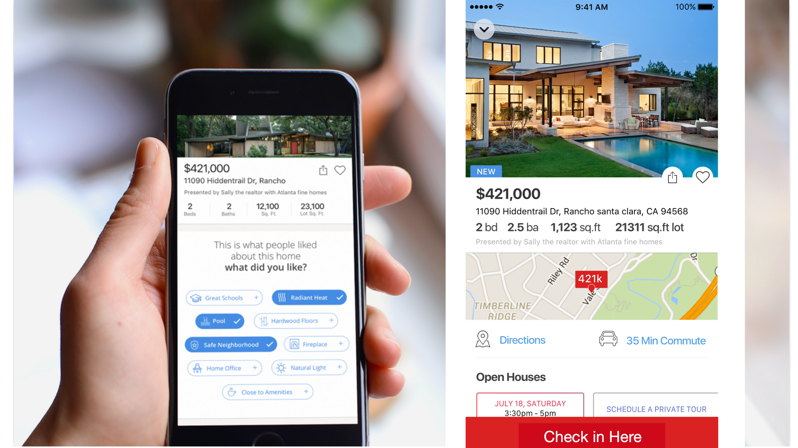
A hand holding a phone showing a prompt reading this is what people liked about this home, what did you like, with selectable attribute chips, beside a listing screen with a Check in Here button
What we called contextualization, or Curbside. We could detect you were near an open house and surface that home, letting you take notes and record what you liked and did not. Those notes pay forward to the next person who views it, which turns a private act into a small piece of shared research.

09 · Running the
team

These initiatives were among many in the pipeline, and most of them were not mine. I empowered the team to come up with their own and advocate for them, which meant giving them a format for it.

Google Slides turned out to be the right container: fast to make, easy to comment on, and shareable with people who were never going to open a design file. Each deck starts with a problem statement, then a hypothesis, then proposed solutions.

We used them in kickoffs, and they became the main instrument for communicating a UX vision and strategy upward. A designer proposing an initiative in that format was making an argument, not asking permission.
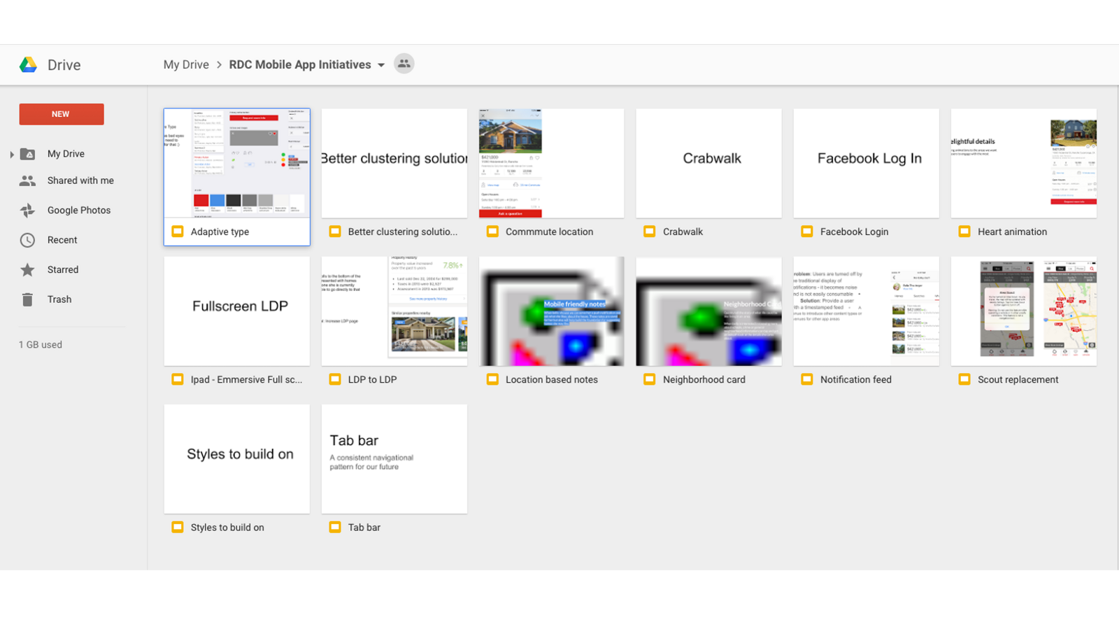
A Google Drive folder titled RDC Mobile App Initiatives containing fourteen decks including adaptive type, better clustering solution, commute location, crabwalk, heart animation, fullscreen LDP, location based notes, neighborhood card, notification feed, scout replacement, styles to build on and tab bar
The initiative folder. Fourteen proposals, most of them written by the team rather than by me.

10 · Takeaways

01 Find out who you are actually serving before you redesign anything. We were designing for a buyer we no longer had.
02 Instrument first. We were shipping blind, and no amount of opinion substitutes for knowing what people do.
03 Ship the platform change that unlocks speed, even when it is not the visible win. Responsive was strategy, not styling.
04 A diary study plus a weekly question is a better research engine than one big study, because it compounds.
05 The most useful thing I did as a director was give the team a format for proposing their own initiatives, then advocate for the ones they brought.

Nobody buys a house. They buy a life in a particular place.

Next case studyAmazon Kindle, first generationRead the case study