Shafeen Alam
Rebuilding home search for the buyer we actually had
I joined Realtor.com in October 2015 as Director of Experience Design, responsible for the core experience across responsive web, iOS and Android. I was asked to revamp it from scratch. The first thing we found was that we were serving the wrong audience, and the fix was less about screens than about what the product assumed a home shopper needed.
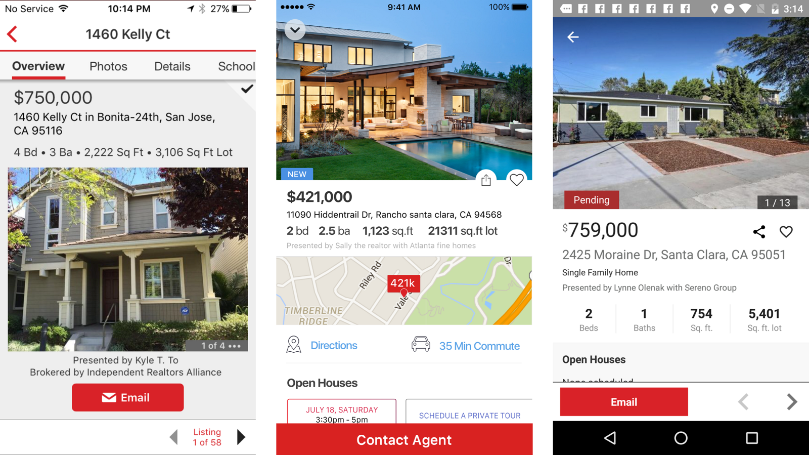
The site was built for yesterday's buyer while the actual market had moved to self-directed search on a phone.
60-second read
Realtor.com was built for the buyer it used to have. The self-directed millennial buyer searched on different criteria, brought an agent in far later, and did all of it on a phone.
Rebuild search around where you are and whether you can afford to live there, not around listing attributes. Ship responsive first so we could move faster afterwards.
Directed the core experience across responsive web, iOS and Android with a team of four to six. Ran the app audit, instrumented tracking, and set the research cadence.
Fully responsive site shipped 10 December. An iOS app untouched for three years rebuilt in Swift, with tracking and weekly experiments in place.
Jump to
01 · Getting back to
the basics
I hit the ground running with four other designers. The brief was to revamp the experience from scratch, and my read was that it was really about doing the brilliant basics better.
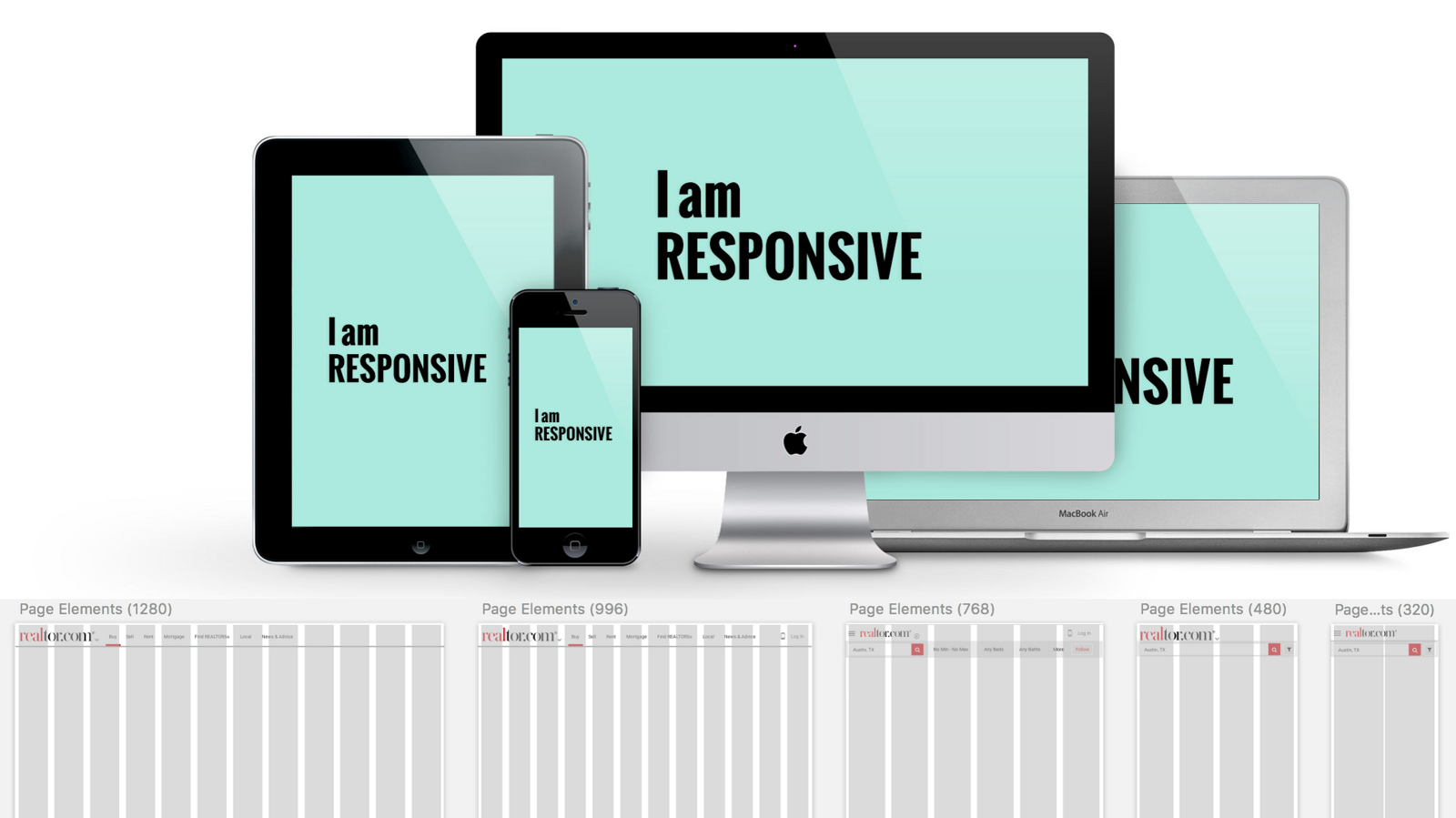
The first initiative was making Realtor.com responsive. We launched on 10 December, a site accessible on every phone. That was strategic rather than cosmetic: our users were already trending toward smaller devices, and one fluid codebase let us innovate faster on everything that followed.
02 · The wrong
audience
We quickly identified that we were serving the wrong target audience. The numbers made the gap plain.
Millennial buyers were significantly more self-directed. They searched on different criteria and involved an agent much later in the process than previous cohorts. And they were on their phones. A product organized around handing you to a realtor was answering a question this buyer had not asked yet.

03 · The approach
Five principles for a millennial focus. Each one is a bet about what a self-directed buyer needs that the old product did not provide.
Guided trade-offs
Home buying is a sequence of compromises. Guide people through them rather than pretending a perfect match exists.
Blur search and discovery
Stop treating them as separate modes. Browsing an area should teach the system what you care about.
Value-added research
Give the shopper the information that empowers them, since this buyer was not relying on an agent to supply it.
Visualize living there
Convey what it is like to be in the home and the area without physically going.
Integrate financials
Put cost of ownership inside the shopping process, not in a separate mortgage tool.
04 · State of the app
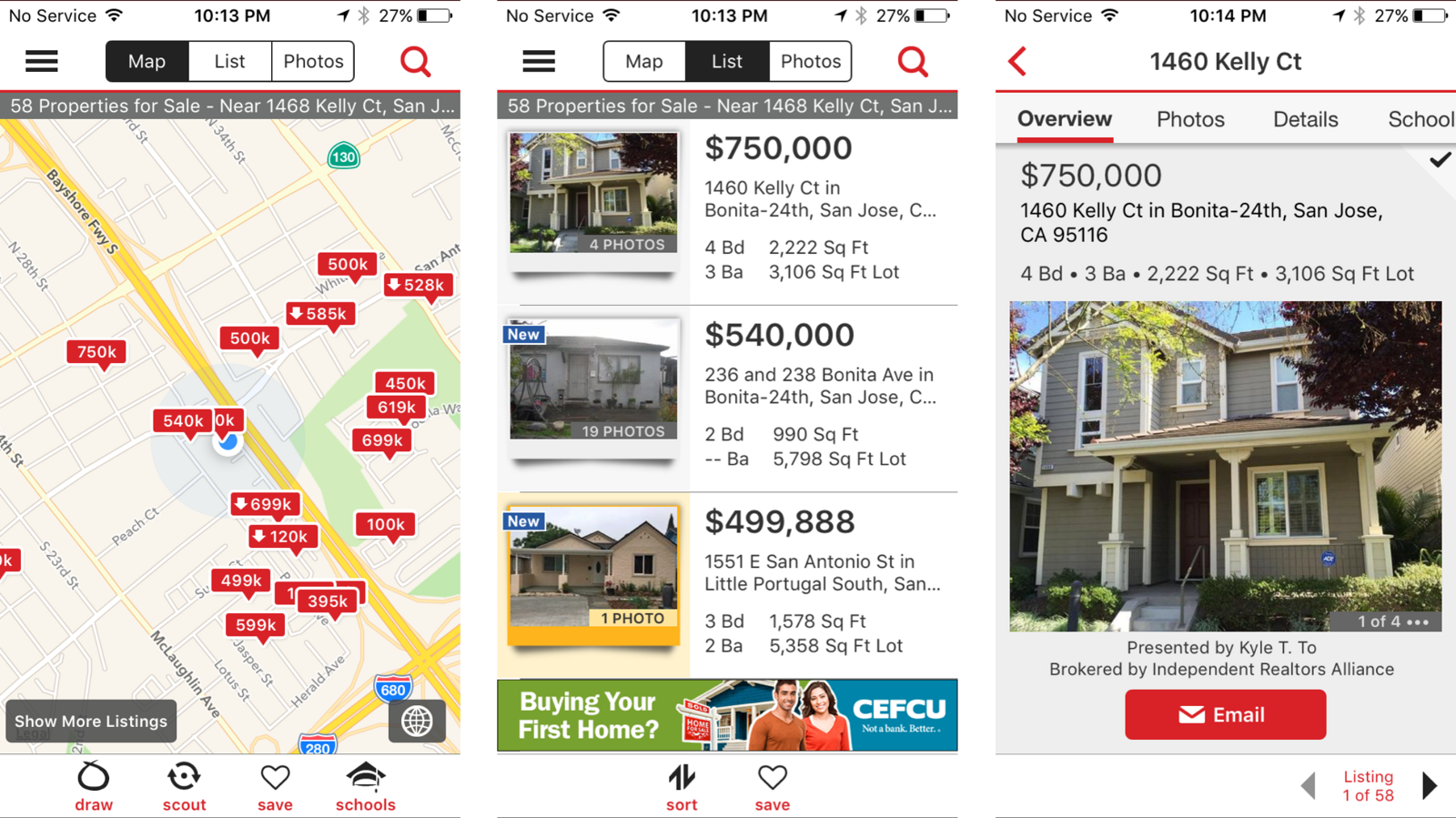
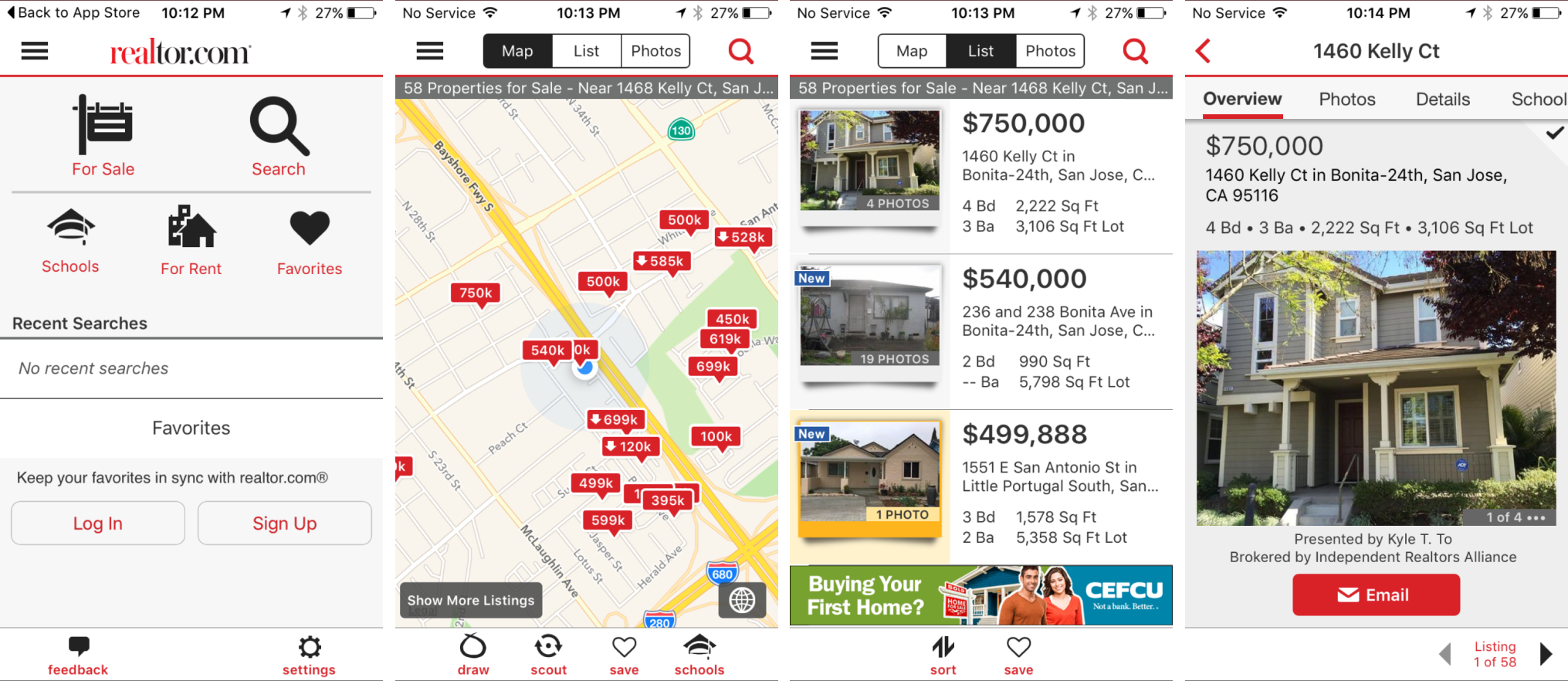
Before proposing anything, we assessed what we had. I loosely called it the State of the App: go through the current experience, identify the opportunities, and be specific about what is broken.
05 · Research
We kicked off diary studies to learn about app engagement and kept a running list of open questions, running tests against them each week. That cadence mattered more than any single study, because it meant we were learning continuously while shipping.
Four themes came back
06 · What we
changed
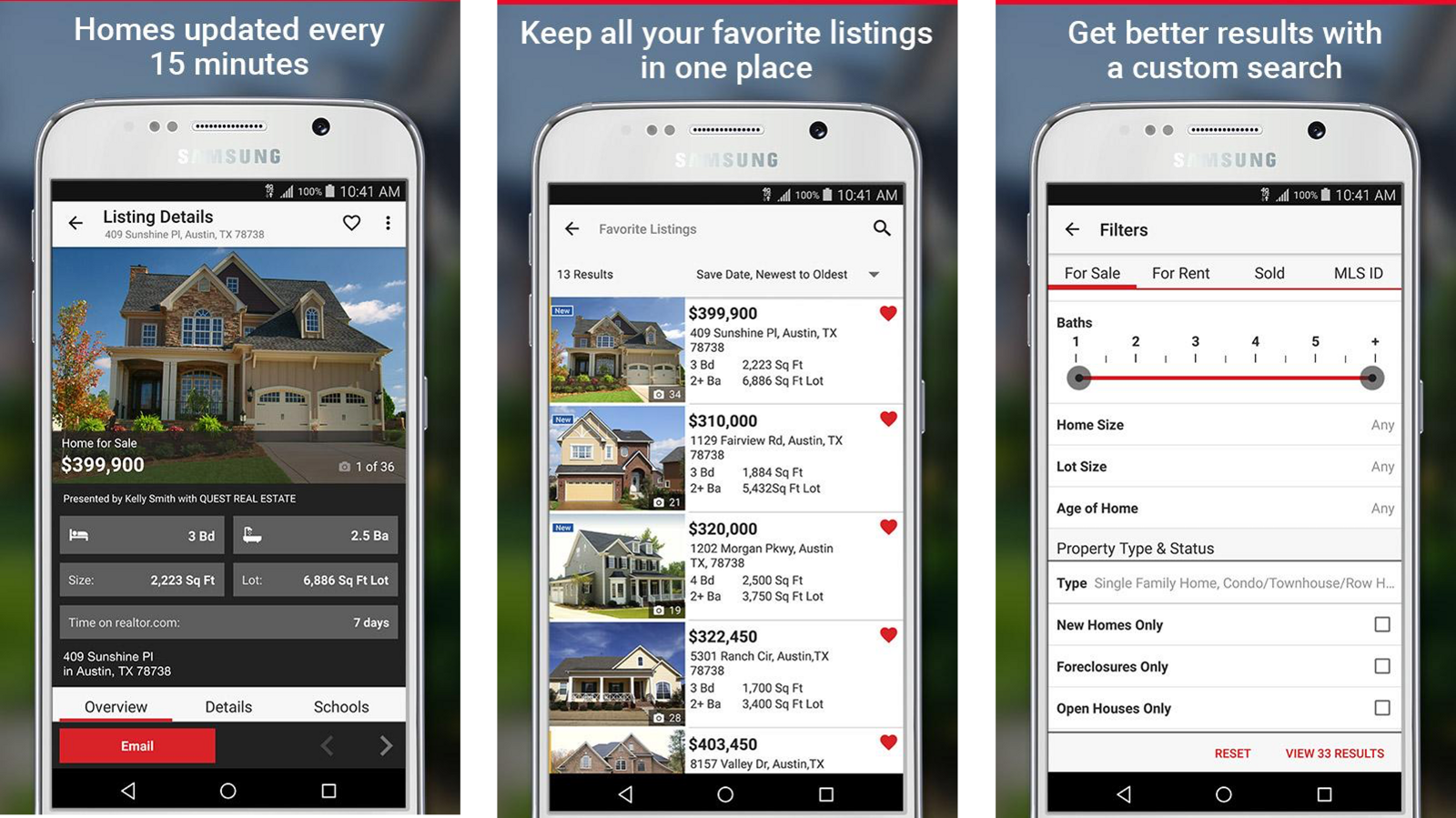
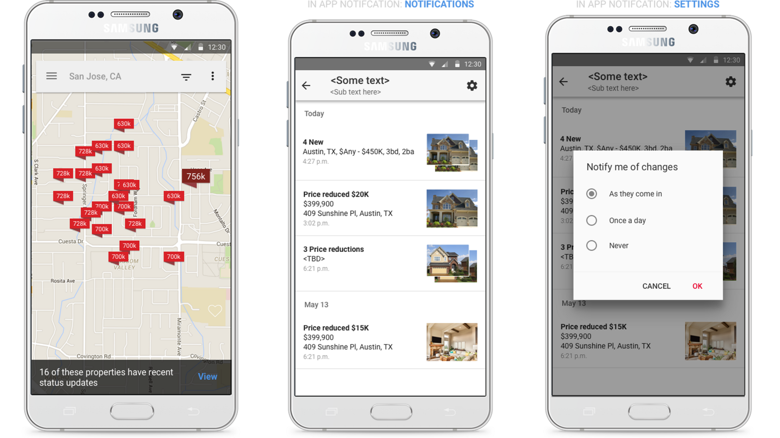
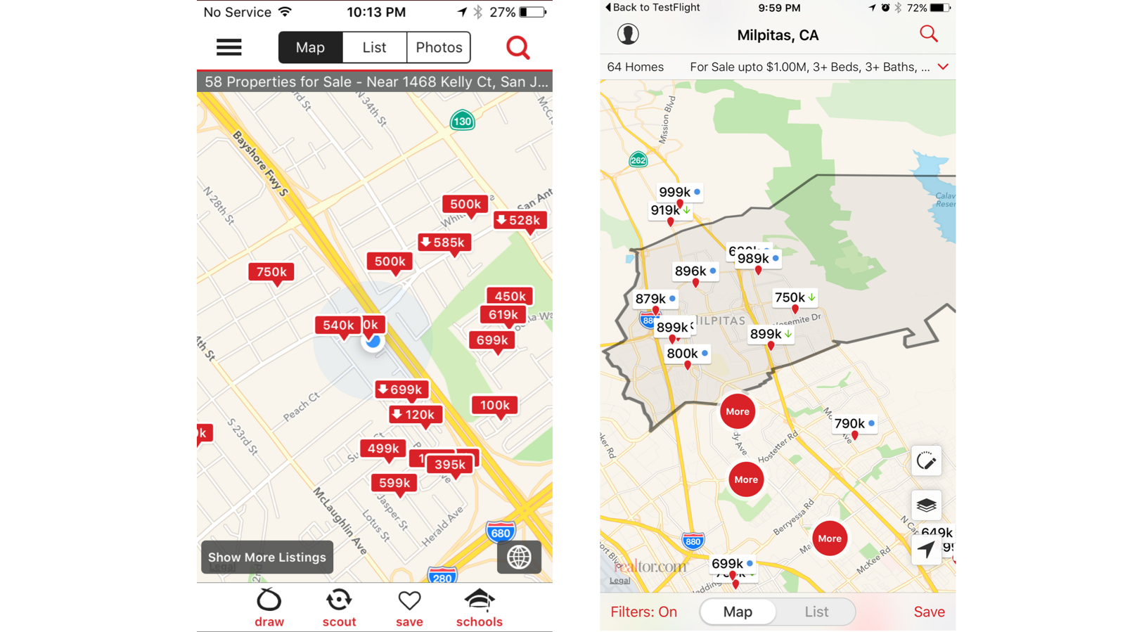
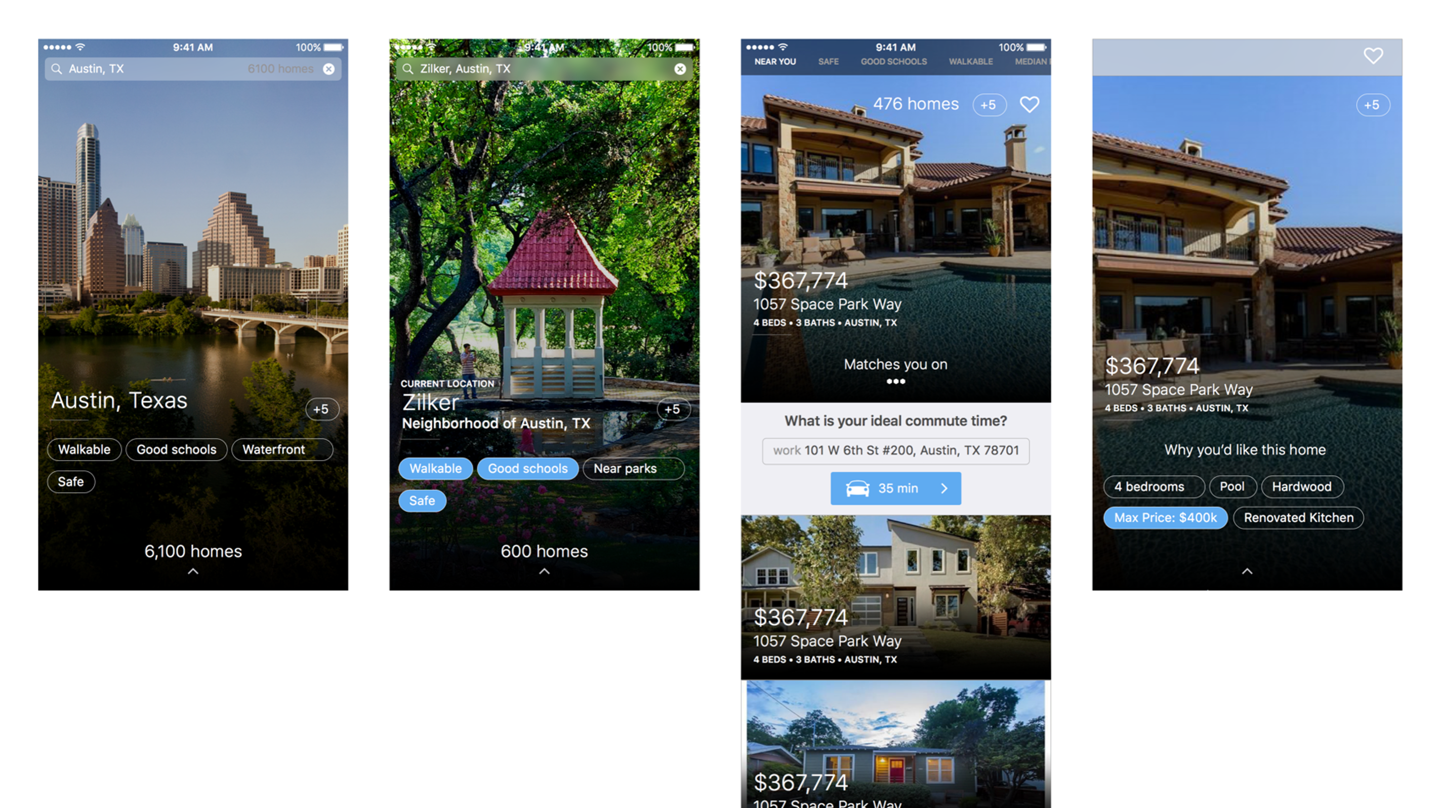
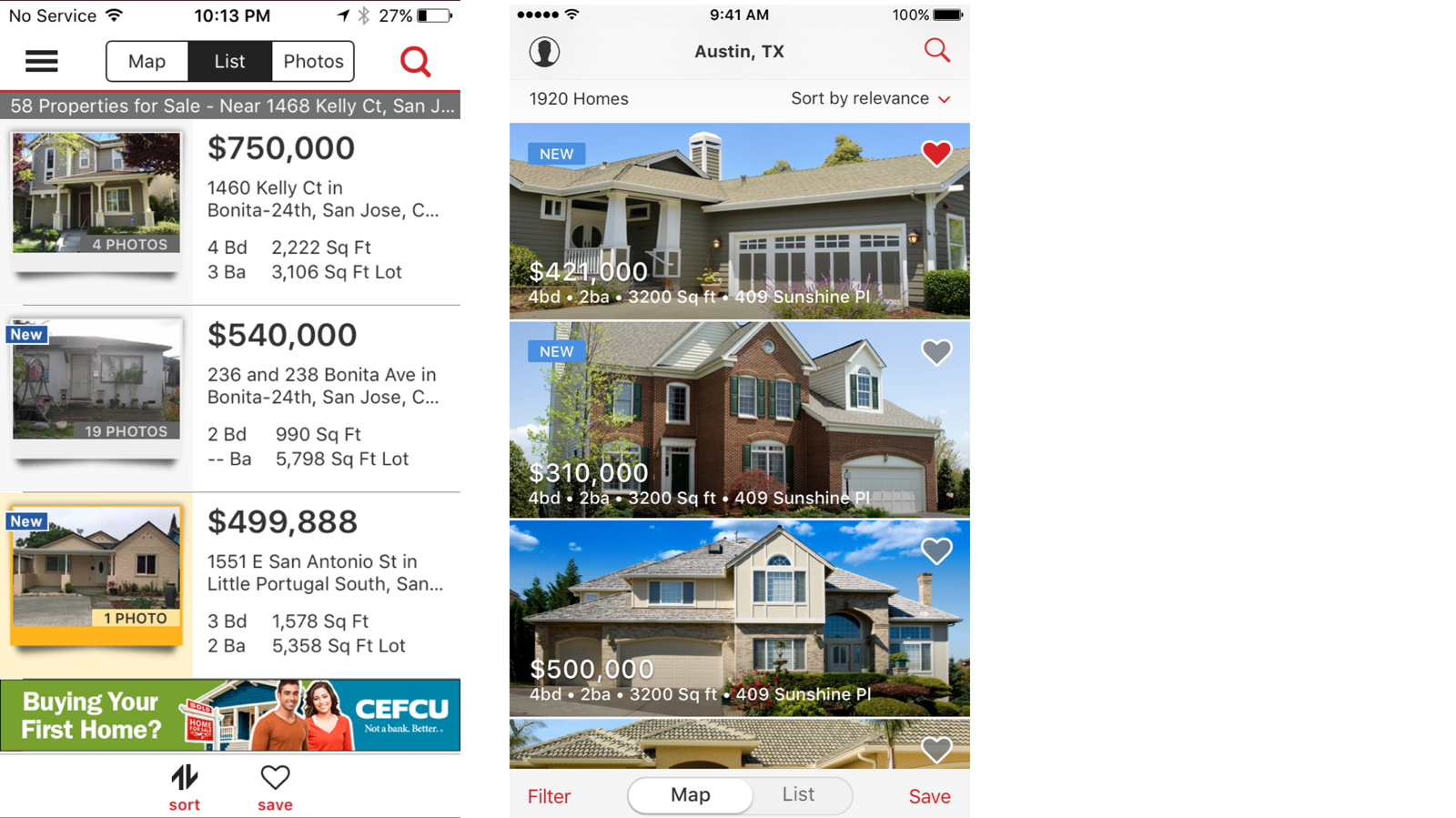
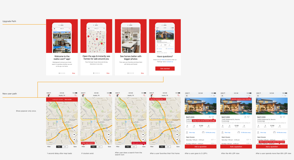
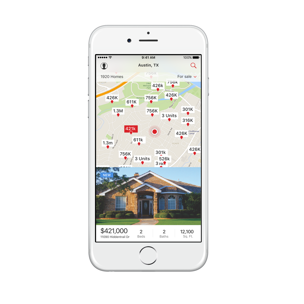
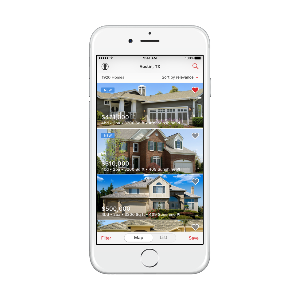
With research in hand and learning weekly, we changed the native app experiences incrementally rather than in one redesign. Each of these traces back to a specific theme.
07 · Android,
properly
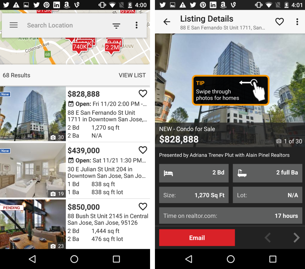
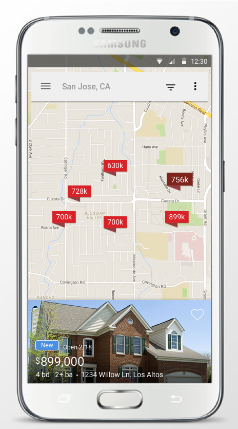
Android had Material Design applied unevenly, screen by screen, whenever a sprint had spare time. We finished the job as a system rather than a backlog, and the platform got its own resolution of each pattern instead of an iOS port.

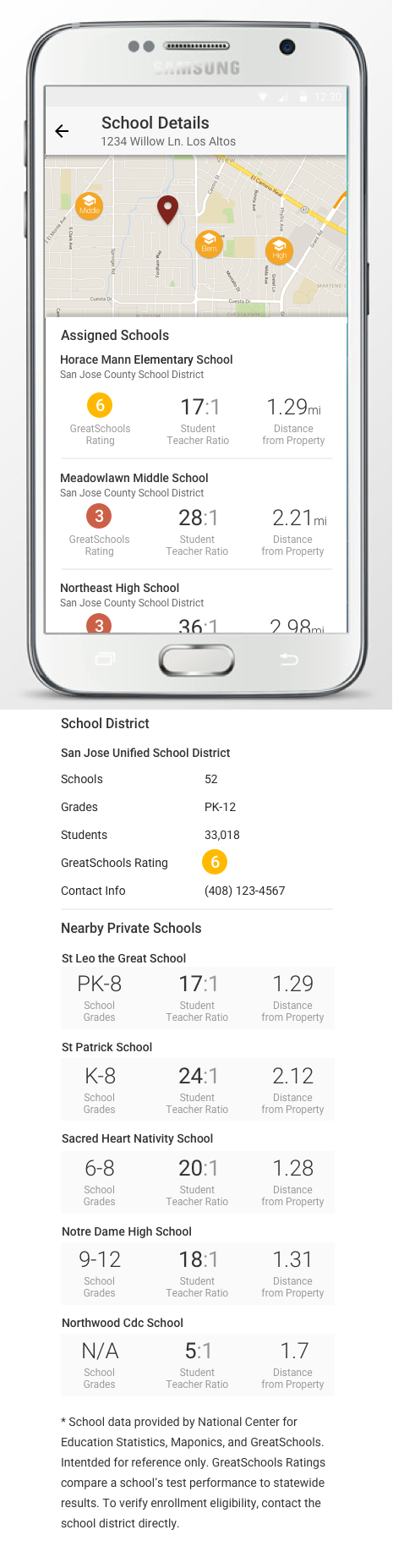
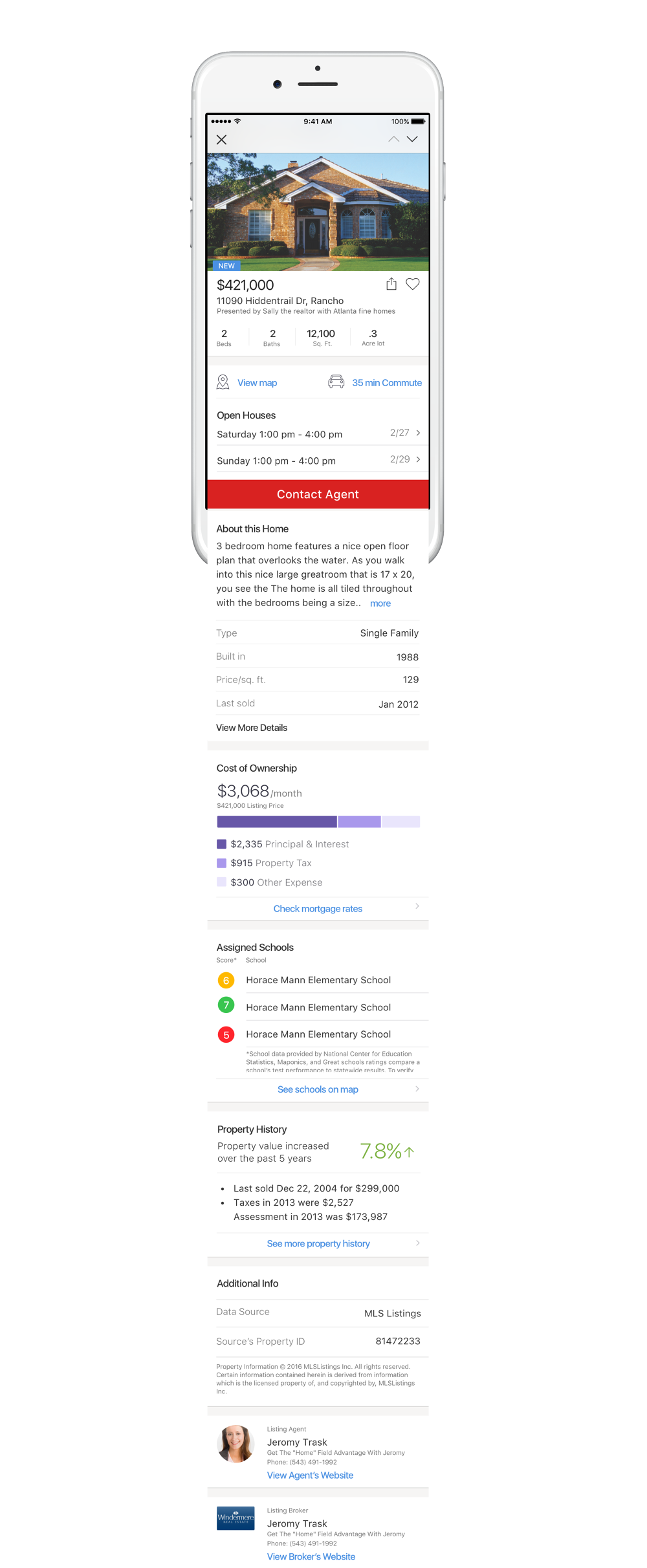
08 · Personalization
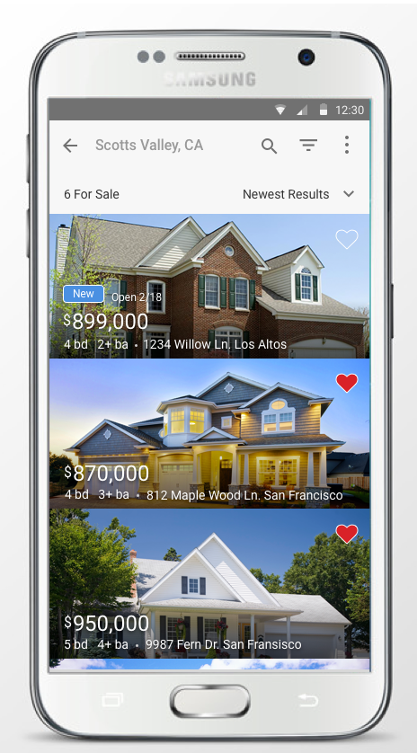
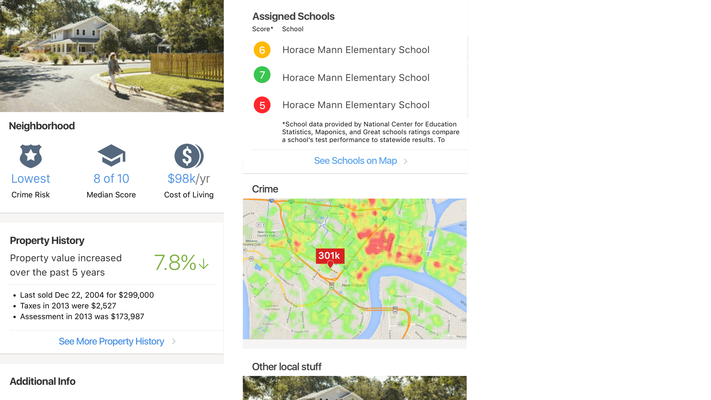
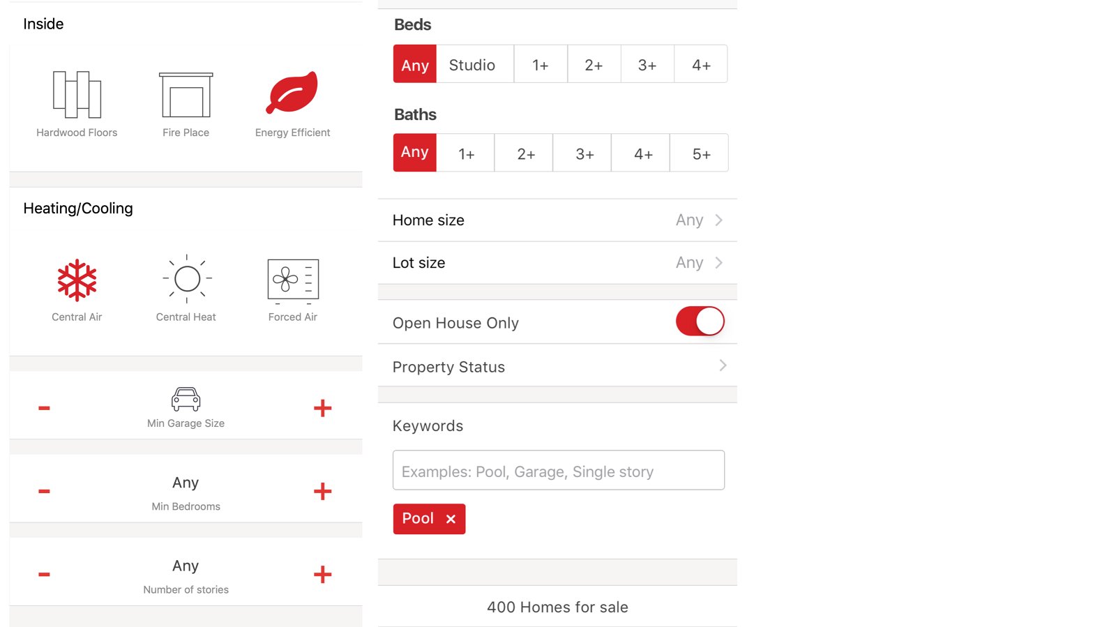
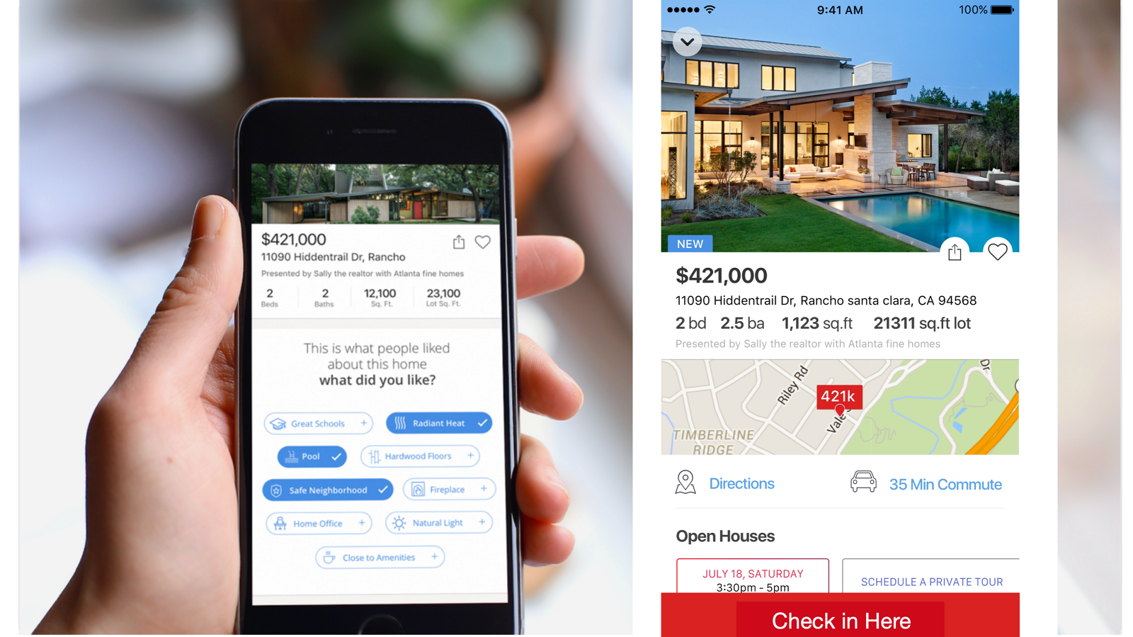
Home buying is about location and everything around the home, so personalization meant vicinity, affordability, and the specific things a buyer will not compromise on.
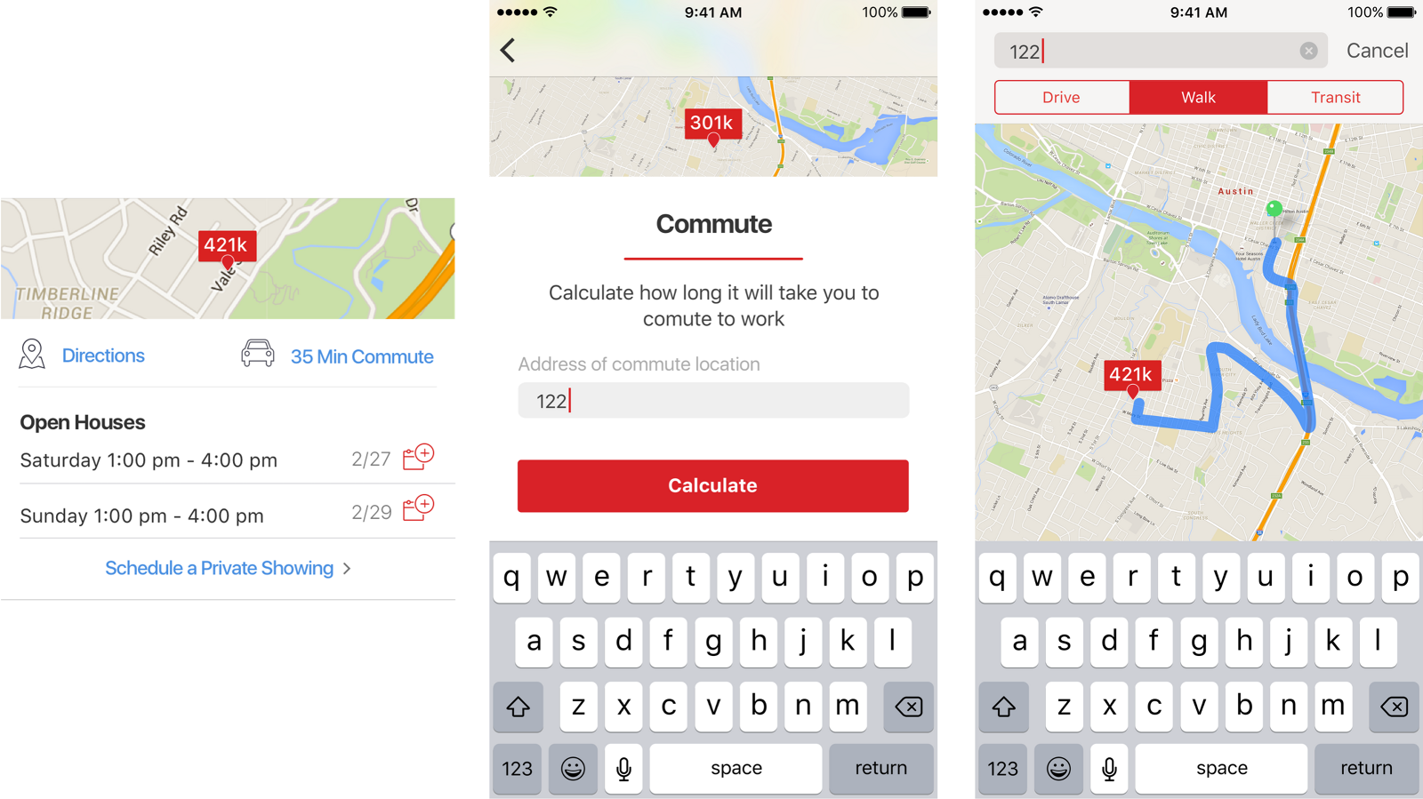
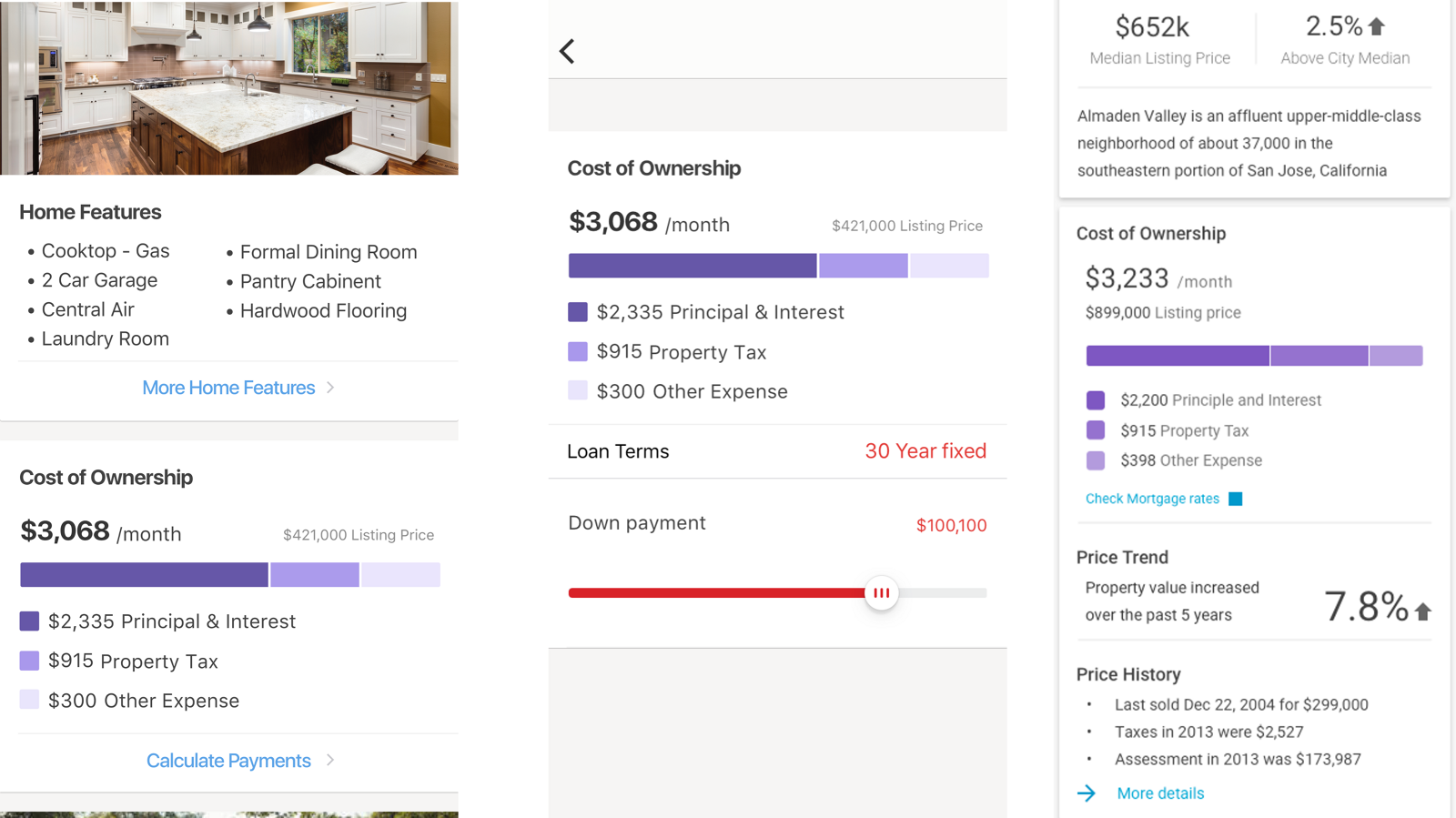
09 · Running the
team
These initiatives were among many in the pipeline, and most of them were not mine. I empowered the team to come up with their own and advocate for them, which meant giving them a format for it.
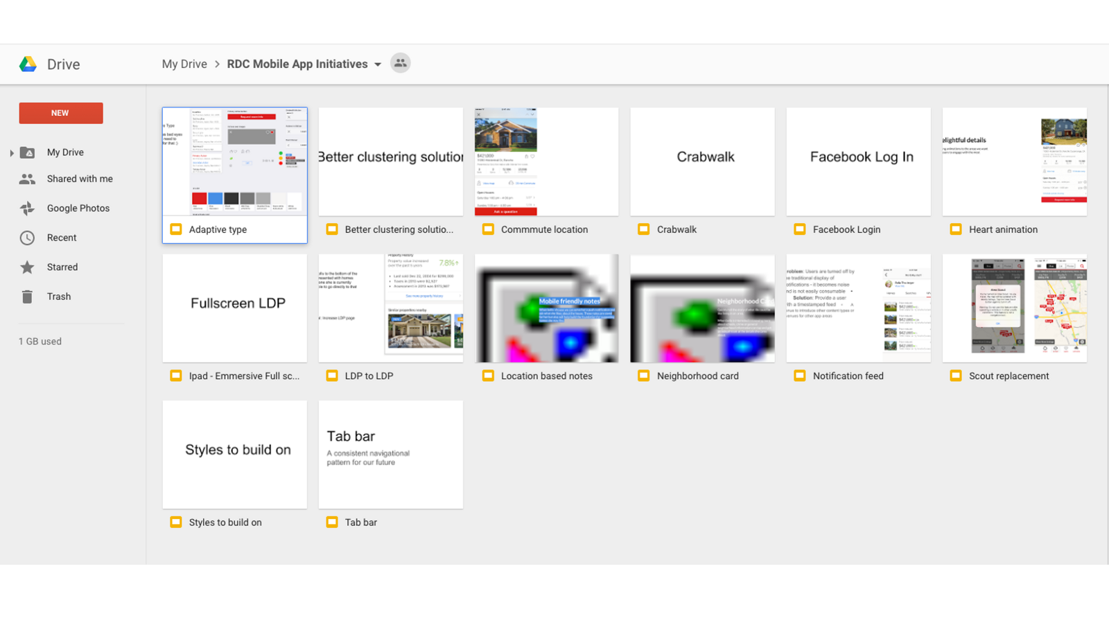
Google Slides turned out to be the right container: fast to make, easy to comment on, and shareable with people who were never going to open a design file. Each deck starts with a problem statement, then a hypothesis, then proposed solutions.
We used them in kickoffs, and they became the main instrument for communicating a UX vision and strategy upward. A designer proposing an initiative in that format was making an argument, not asking permission.
10 · Takeaways
Nobody buys a house. They buy a life in a particular place.