Shafeen Alam
All work
This siteDesigning in the openSelf-initiated

Designing my portfolio in the open, one interaction at a time

I rebuilt this site the way I'd build a product. Every page, hover and animation went through the same loop: try it live, watch how it feels, then keep it, change it or cut it. This is the record of those decisions, with a focus on the interactions.
Role
Designer and builder
Scope
29 pages, motion and interaction
Stack
Static HTML, CSS and JavaScript
Constraint
Motion must never cost usability
case.md
$ cat outcome
pages: 29
hero_slides: 8
motion_rule: explain, never block
reduced_motion: respected
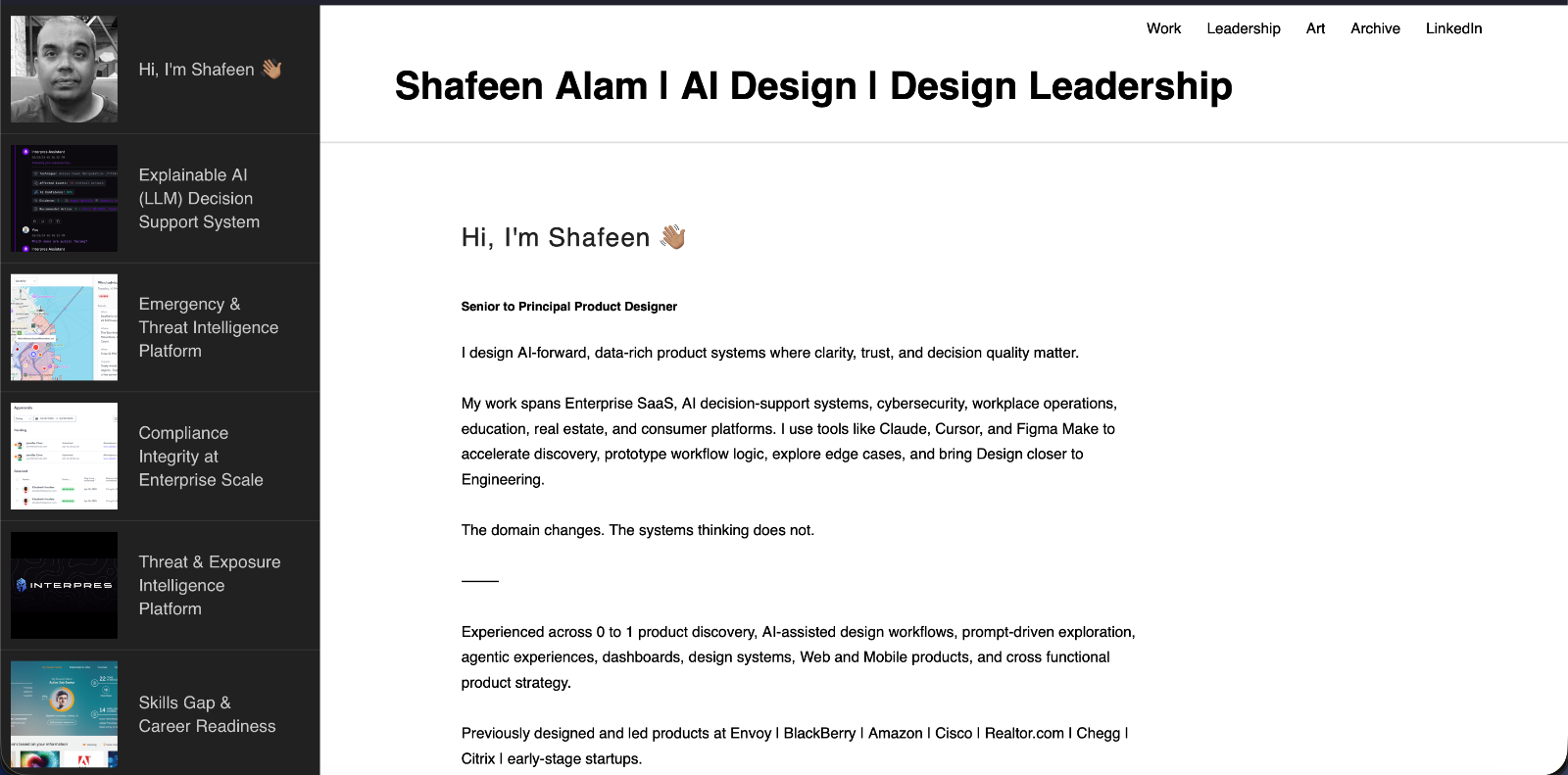
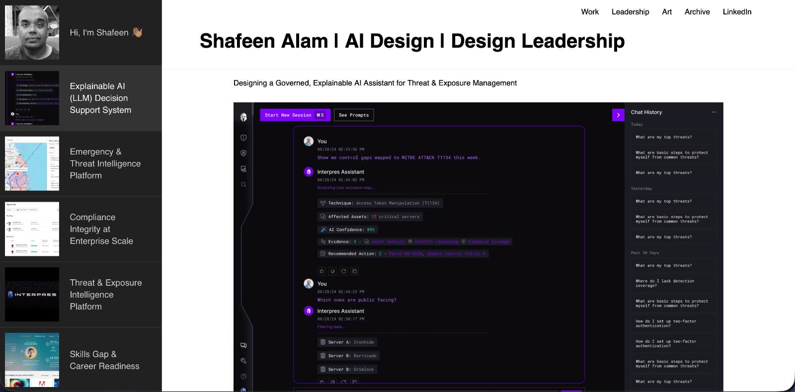
The old Cargo site with the Interpres case study open and the project rail on the left
Where it started: the Cargo site, with its project rail on the left.

01 · Before and after

My old site was a Cargo template. It had one good idea that I wanted to keep: it always showed you where you were.
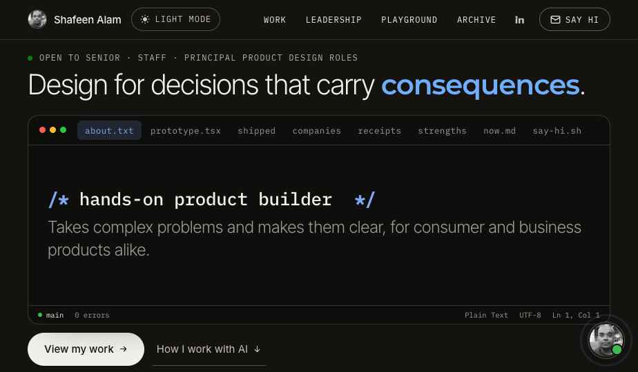
The new homepage, with the hero panel styled as a code editorAfter
Old Cargo siteScreenshot goes here
Before
Drag to compare. Left: the old Cargo site. Right: the site now.
Before: the rail

Project thumbnails ran down the left side. Pressing one opened its case study. Scrolling to the end landed you on the next project, and the rail updated to show which one you were on.

After: what carried over

The idea stayed, built differently. A jump nav inside the top bar shows where you are in a case study, and a "Next case study" card at the end shows what comes next.

02 · The rules

The old site was a template. I wanted one that behaved the way I work: clear, quick to scan and honest about process. I set three rules and held every effect to them.

01
Explain, don't decorate
Motion has to show where something came from, what changed, or where I am.
02
Never block content
No effect can hide text, delay a link or sit on top of what someone is reading.
03
One pattern everywhere
If a button, jump nav or card works one way on a page, it works that way on every page.

03 · Decision log

Eight decisions where the first version didn’t survive. Flip each one between what I tried and what I kept.

Jump toRulesLogDemos
RulesLogDemos
01 · Rules
02 · Log
03 · Demos
scroll
Jump nav

A “Jump to” row of pills that looked different on every page.

One sub nav inside the top nav pill, the same on every page.

Ask me anything
Ask me anything
Assistant

A pill that said “Ask me anything” sat on the left and covered section labels.

A round avatar on the right, out of the way of the content.

Quick takeIt covers Amazon, Cisco, Citrix and more.
Quick takeIt covers Amazon, Cisco, Citrix and more.×
Quick take

The bubble faded after a few seconds, before anyone could read it.

The bubble stays until the visitor closes it.

about.txtshipped
/* hands-on product designer */
about.txtshipped
/* hands-on product designer */
mainUTF-8
Hero panel

A tinted title bar and tab strip that added weight and meant nothing.

The three dots and the status bar stayed, on a plain background.

Bento cards

The cards waited for a scroll to spread out, so many visitors never saw them.

They play once on load, so every visitor sees the full set.

03 · Next section
Section threads

A short connector between sections ended in a dot with nothing to lead to.

A line runs the height of each section and draws as you scroll, ending in a dot.

Senior Product Designer2025-26Lead Product Experience Designer2024Product Designer2019-24Product Designer2017-19
Principal UI/UX Designer2024Director of Product Design2017-23Director of Experience Design2015-16Product Designer2010-13
June 2024 to Aug 2024Lead Product Experience DesignerBuilt design leadership for a Web3 content creation platform, establishing brand identity and design system across anime, manga and original IP, positioning creators and collectors in an emerging NFT ecosystem.Read the case study →
Senior Product Designer2025-26Lead Product Experience Designer2024Product Designer2019-24Product Designer2017-19
Principal UI/UX Designer2024Director of Product Design2017-23Director of Experience Design2015-16Product Designer2010-13
June 2024 to Aug 2024Lead Product Experience DesignerBuilt design leadership for a Web3 content creation platform, establishing brand identity and design system across anime, manga and original IP, positioning creators and collectors in an emerging NFT ecosystem.Read the case study →
Where I've been

The first card opened on top of the rows below it.

Now desktop opens it beside the logo, and mobile opens it inline.

4531min
4527min
Metrics

A fade-in hid the number while it counted.

The number is visible from the start and counts up.

Theme toggle

A pill with a half-filled dot and the words “Dark mode” and “Light mode”.

A sun that folds into a moon. It takes less room and fits inside the nav pill.

04 · Try them

Nine of the interactions from around the site, small enough to try here. Each one uses the same timing as the real one.

Opening sequence
Press to run
Journey map
Press to replay
Receipts count
Press to replay 45 to 27
01 · Rules
02 · Log
03 · Demos
04 · Lessons
01/ 04Rules
Progress pill
Scroll inside, then stop
Jump nav
Press a label
Lead Product DesignerOct 2023 to May 2025Designed explainable AI for security analysts.AI decision support
Senior Product DesignerMay 2025 to Jan 2026Turned emergency messaging into incident coordination.Emergency response
Where I've been
Press a row
Quick takeStart with Interpres. It shows how he designs for trust.
Quick take
Close it, then press the avatar
ALARM PM ----
Alarm clock
Press snooze
Say hi button
Hover it

05 · What went wrong

Most of what I learned came from things I got wrong.

Effects overlapped.
When I asked for micro-interactions, three were already partly built. I merged them rather than layering a second set on top.
A decoration broke a layout.
A rule I added above section titles on the Interpres page became its own grid item and pushed every title into the wrong column. It's now part of the title.
A new effect hid an old one.
The left-to-right slide faded in counting numbers while they counted, so they looked frozen. I fixed it by keeping counted columns fully visible.

The habit that came out of it: check every change on desktop and phone, in light and dark, with motion on and off.

06 · Working with AI

I built this with Claude, directing it live. It wrote most of the code. I decided what stayed.

What worked was describing the feeling I wanted, looking at the result, and saying what was wrong in a sentence. It also built what I asked for even when I asked for too much. The tinted editor window is an example: I tried it, disliked it and took it back out.

Motion should answer a question the visitor already has.
The Playground
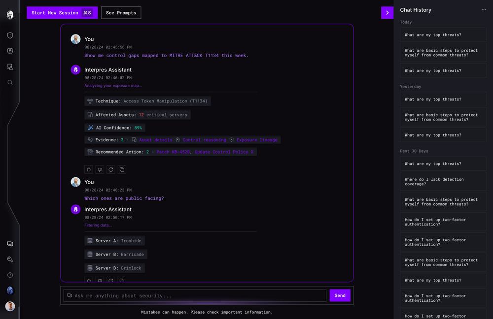
Next case studyExplainable AI decision supportRead the case study