Shafeen Alam
Archive
Future Today, Inc.HappyKidsTVConsumer

Designing for an audience that cannot read

HappyKidsTV, from Future Today, Inc., is a free, ad-free streaming app with more than 60,000 kid-safe videos, carrying Blippi, Paw Patrol, Peppa Pig, Pinkfong and others. As the only designer in 2020, I had two months to rebuild the iOS and Android experience for children who navigate by picture, not by label, while giving their parents a way to set limits.
Role
Sole product designer
Timeline
2 months, 2020
Platforms
iOS and Android
Library
60,000+ videos
case.md
$ cat summary
videos: 60,000+
timeline: 2 months, sole designer
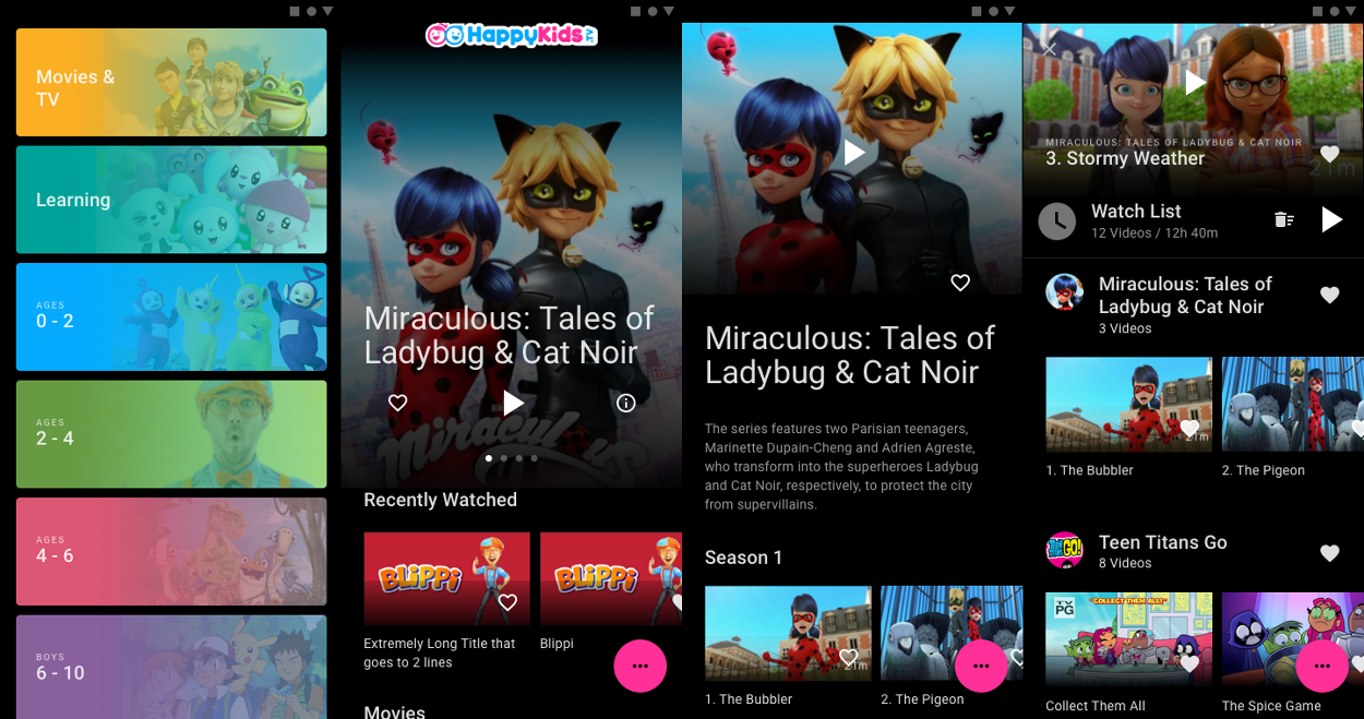
Four screens from the rebuilt HappyKids app side by side: the color-coded Browse list, the Home screen with a full-bleed Miraculous hero, a show detail page with episode rows, and the Watch List
What shipped. Browse, Home, show detail and Watch List, rebuilt so artwork carries the navigation and the interface gets out of its way.↗ open full size
Why it mattered

Kids who cannot read navigate by picture, and the app was hiding the pictures.

60-second read

Problem

Browse showed characters cropped into small circles, categories fell below the fold, and a fixed bottom nav held actions rather than destinations.

System decision

Let each category claim real estate and color, give discovery a dedicated top area, and move actions out of the nav bar into one expanding control.

My contribution

Only designer on the project. Information architecture, both platforms, the parent timer, and guidance to developers through implementation.

Constraint

The primary user cannot read. Every affordance had to work as an image, a color, or a shape.

01 · What was wrong

The app worked, but it was built as though its users could read and scan. For a four year old holding a phone, that is five separate problems at once.
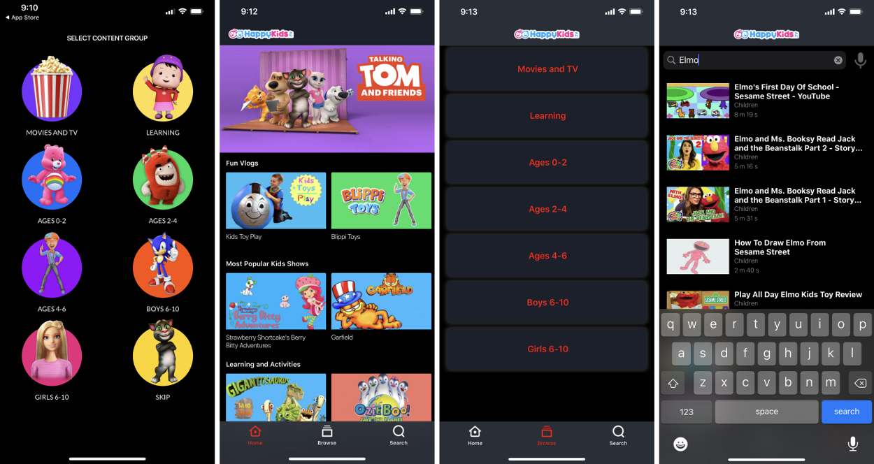
Four screens of the original HappyKids app: a Select Content Group grid of characters cropped into circles with captions beneath, a home screen of small two-up thumbnails under category headings, a Browse screen listing seven category names as plain red text in empty dark boxes, and a search results list with a keyboard open
Before. Characters cropped into circles on the entry screen, and a Browse screen where seven categories are nothing but red words in empty boxes, which is unusable to a child who cannot read them. The bottom bar carries Home, Browse and Search on every screen.↗ open full size
01 Characters in circles Browse cropped each category's artwork into a small circle, so a child saw a fragment of a face and had to infer the rest.
02 Categories below the fold The full offering under each category was neither discoverable nor obviously tappable.
03 No route to new content Nothing in the app existed to surface something a child had not already seen.
04 Titles pushing content down Video titles took vertical space ahead of the artwork, which is the only thing a pre-reader can use.
05 A nav bar of verbs The fixed bottom nav held actions like search and cast rather than places, spending permanent screen height on things used occasionally.

02 · Finding the structure

I started with the information architecture rather than the visuals. If common list and grid patterns were applied here, what would each one cost in artwork size, and how much of a category could a child glimpse before tapping?
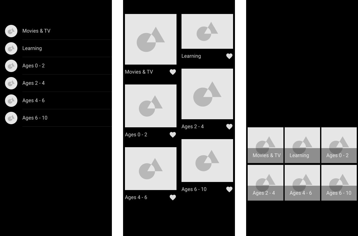
Three grayscale wireframe options for Browse: a simple text list with small circular thumbnails, a two-column staggered card grid, and a compact three-column tile grid
Three structures, tested against the same six categories. The list on the left is the closest to what existed, and it gives artwork the least room of the three. Reading them side by side is what made the trade-off concrete.↗ open full size
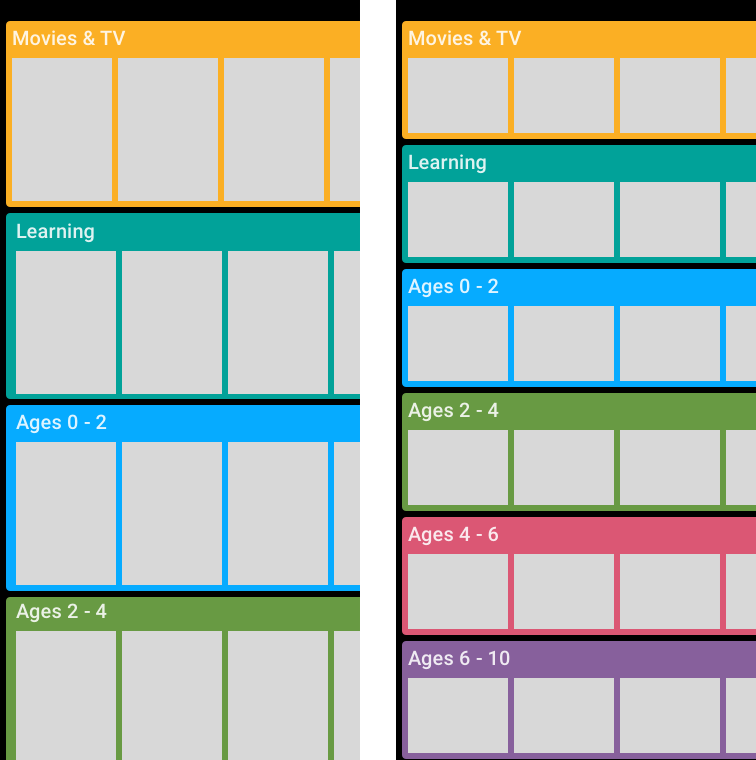
Two color-coded wireframe variants where each category is a full-width horizontal band with its own hue, containing a scrollable row of content tiles
The direction that won. Each category becomes a full-width band with its own color, holding a horizontal row of content, so vertical space names the category and horizontal space previews what is inside it.↗ open full size

03 · Browse

Categories became large, color-coded tap targets with the characters visible rather than cropped into a circle. Age bands carry a small label above a large number, so a parent can read the range while a child recognizes the show.
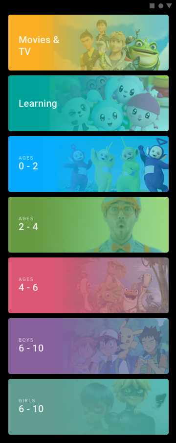
The rebuilt Browse screen showing seven full-width color-coded bands: Movies and TV in amber, Learning in teal, Ages 0 to 2 in blue with Teletubbies, Ages 2 to 4 in green with Blippi, Ages 4 to 6 in pink, Boys 6 to 10 in purple with Pokemon, and Girls 6 to 10
Seven categories, seven colors, each band wide enough to show who is actually in it. A child who cannot read Ages 2 to 4 can still recognize Blippi.↗ open full size

Why color, not labels

Color gives a pre-reader a second recognition channel that arrives faster than text and survives being seen at arm's length on a small screen. The label is still there for the parent, but the child never needs it.

Each band is also a single large tap target, which matters when the person tapping has less precise motor control than the interface usually assumes.

04 · A dedicated place for discovery

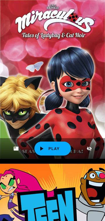
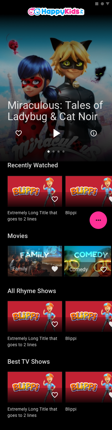
Rather than adding another row to scroll past, I gave discovery the top of the Home screen outright. A full-bleed show fills the area, and swiping up or down moves to the next one, with the following show peeking in beneath as a hint that more exists.
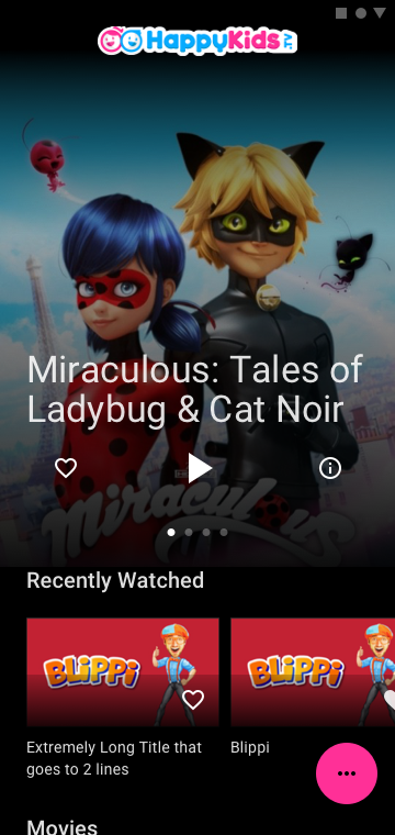
The HappyKids home screen with a full-bleed Miraculous hero image, the title over it, and three controls beneath: a heart, a large play triangle and an information icon, with page dots and a Recently Watched row below
Three controls, no words: add to Watch List, play, more information. Page dots show there are four shows to swipe through, and Recently Watched sits directly beneath.↗ open full size
The discovery area mid-swipe, showing the Miraculous show filling the screen with a Play button, while the next show, Teen Titans Go, is visible peeking in below
Mid-swipe. The next show appears underneath before you commit to it, which is what makes the gesture discoverable without instructions.↗ open full size

05 · Reclaiming the bottom of the screen

The old bottom navigation was mostly verbs. Cast, search, timer and parent mode are actions taken occasionally, but the bar charged full-time vertical rent for them on a screen where artwork is the product.

I removed it and moved those actions into a single expanding control in the corner. Tapping it fans the four secondary actions out vertically, and everything closes back into one button.

What that bought

A seamless surface where content reaches the bottom edge, and a header that locks on scroll to keep parent mode, cast and search reachable without a permanent bar.

Varying the size of content blocks down the page then does the work the nav bar was pretending to do: it gives the eye somewhere to rest.
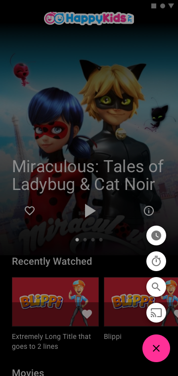
The quick access menu expanded, showing four circular icons stacked above the pink button: a clock, a timer, a search magnifier and a cast icon, with the page dimmed behind
Expanded. Timer, parent mode, search and cast, available in one tap and gone in the next.↗ open full size
The full home screen scrolled, showing the hero area followed by Recently Watched, a Movies row with Family and Comedy tiles, All Rhyme Shows, and Best TV Shows, with the quick access button floating over it
Scrolled. Block sizes change down the page rather than repeating one grid, and the floating control travels with the reader instead of occupying the bottom edge.↗ open full size

06 · Detail and the Watch List

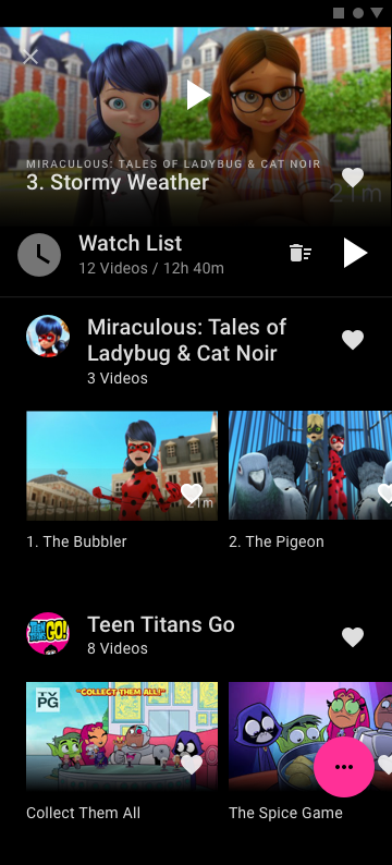
Adding to the Watch List had to be one tap on a heart, from anywhere. The list itself then had to answer the question a parent actually asks, which is how much is in here and how long would it take.
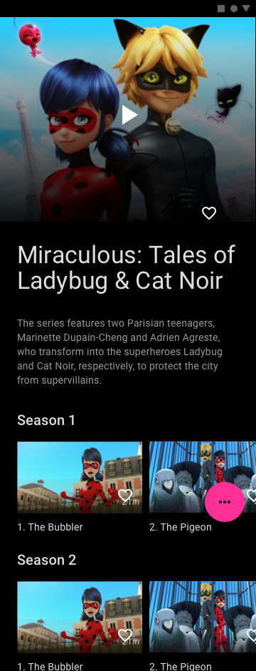
The show detail page for Miraculous, with a large hero image and play button, a heart, the show synopsis, and episodes grouped under Season 1 and Season 2 headings with duration badges
Show detail. Artwork first, a short synopsis for the parent, then seasons as horizontal rows with runtimes on each episode.↗ open full size
The Watch List screen, topped by an in-progress episode with a resume control, then a summary bar reading Watch List, 12 videos, 12 hours 40 minutes, with a delete and play-all control, followed by saved shows grouped by series
The Watch List, with the in-progress episode pinned at the top so a child can resume without navigating, and a summary reading twelve videos, twelve hours forty minutes.↗ open full size

07 · Parent mode

I was asked to add a way for parents to set a time limit. The design problem is that the person configuring it and the person it applies to are different people using the same device, minutes apart.

So setup is a single slider with one decision, and a checkbox to make it the default so the parent does not repeat themselves tomorrow. The expiry is written for the child: it apologizes, it explains, and it gives one button.
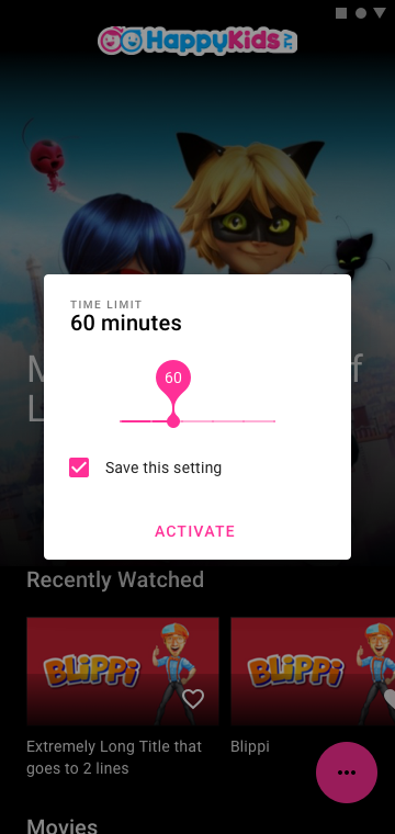
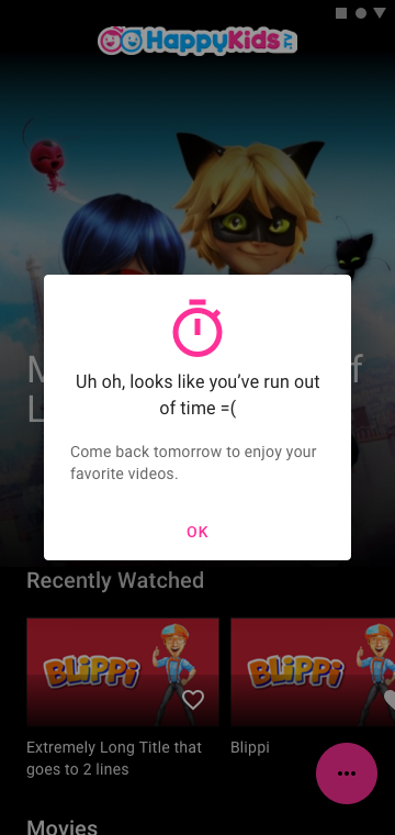
The time limit dialog showing sixty minutes on a slider with a pink handle, a Save this setting checkbox, and an Activate action
Setup. One slider, one number, and an option to make it stick.↗ open full size
The expired state, a dialog with a pink stopwatch icon reading uh oh, looks like you've run out of time, come back tomorrow to enjoy your favorite videos, with an OK button
Expiry, written for a child rather than a user. It is sorry, it says when to come back, and it does not offer a way to argue.↗ open full size

08 · What changed

For the child

  • Characters are visible rather than cropped into circles.
  • Categories are large colored targets, recognizable before they are readable.
  • Swiping the top of Home surfaces something new.
  • One heart adds anything to the Watch List.

For the parent

  • A time limit that takes one decision to set.
  • Cast, search and parent mode reachable without a permanent bar.
  • The Watch List states its size and total runtime.
  • Age ranges still labeled in text for the adult reading over a shoulder.

Almost every decision here came from the same constraint. The person using this app cannot read the interface, so the interface has to be made of things they can already recognize.

Two months, one designer, both platforms. I have no post-launch metrics from this engagement, so none are claimed.

09 · Takeaways

01 When the user cannot read, the artwork is the interface. Anything that crops it, shrinks it, or pushes it down the screen is removing the only wayfinding they have.
02 A fixed bottom nav is expensive. It costs permanent vertical space, so it should hold destinations rather than actions used once a session.
03 Color as a second channel does work children can use before literacy. Each category owns a hue, so the row is recognizable before the label is legible.
04 Discovery needs its own dedicated real estate. Bolting a carousel onto an existing grid makes it another row to scroll past.
05 Designing for two audiences on one surface means separating them: the child gets the full screen, the parent gets a deliberate, out-of-the-way control.

If your user cannot read, the artwork is not decoration. It is the navigation.
Amazon Kindle
Next case studyIncident coordination on early wearablesRead the case study